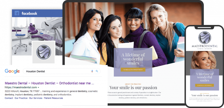
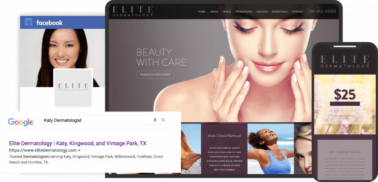
Whether you’re working with an optometry website builder or are spending time exploring the top optometry websites, it’s essential that you know what you’re looking at before you begin designing your site. The best optometry websites combine stunning color palettes with stylish designs and rich functionality, making them an asset to your visitors. While optometry website templates can be a great place to start, they don’t always provide everything you need to make a great site. See why a website template may not be the best option.
Most of the leading optometry websites have integrated important features like click-to-dial integration, mobile-optimized design, and direct-to-map functionality, and these are just the basics. HIPAA secure forms are essential for allowing patients to reach your office while protecting their information. Below we’ve compiled a series of websites that exemplify some of the most important elements of optometry website design.
1. Eye Smile Optometry & Dental Care
Visit Eye Smile Optometry & Dental Care
Aesthetics
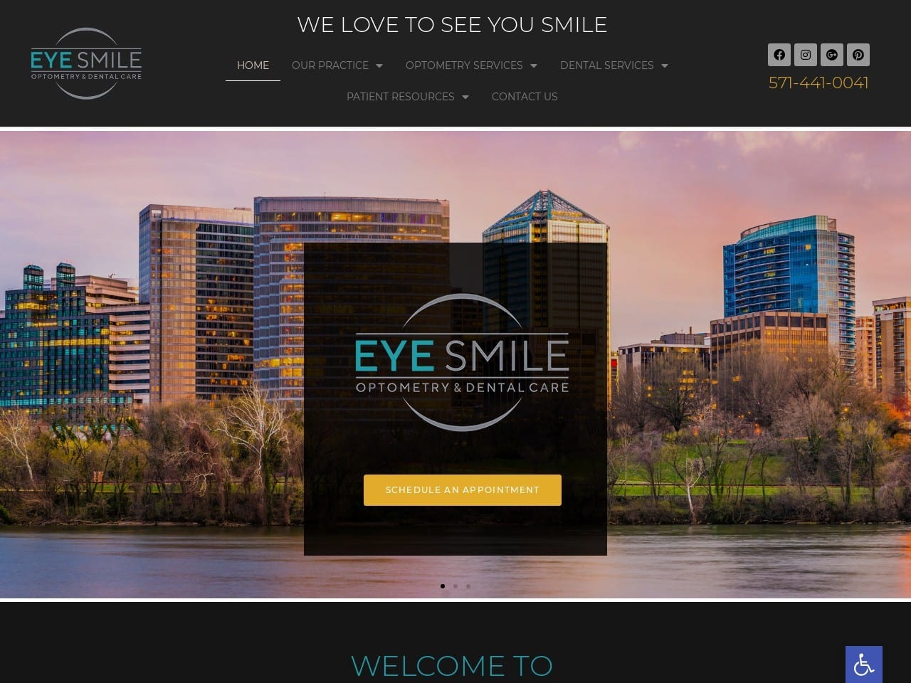
Eye Smile Optometry & Dental Care greets its visitors with stunning vistas of the city it calls home. Local imagery creates a sense of rapport for those who live near the clinic, connecting it to the community it serves. Black, gray, blue, and a sparingly used orange tone create a palette that is at once sophisticated and eye-catching. It is used effectively to section out the site and direct visitors to places they can provide or request new information. The black background really makes the images pop, showcasing the smiling faces and beautiful results patients of the clinic can expect. Potential patients are introduced to the staff using beautiful photos alongside information about the practitioner and their qualifications.
Optometry websites, what you don’t see.

Functionality
This clinic’s website provides substantial functionality through convenient appointment scheduling options. As patients scroll through the site, they’ll find HIPAA secure forms that allow them to contact the facility and request appointments easily. Social Media links are made available to visitors to connect to the clinic’s Facebook or Instagram accounts, and emailing the staff is just a click away. Accessibility options can be accessed immediately through the blue tab in the bottom right-hand corner bearing the universal handicapped icon. Through their Contact Us page, visitors will find a prominently displayed click-to-dial phone number that lets them easily reach out from mobile devices.
Don’t use directories to build your optometry website!
2. Complete Eye Care Inc
Aesthetics
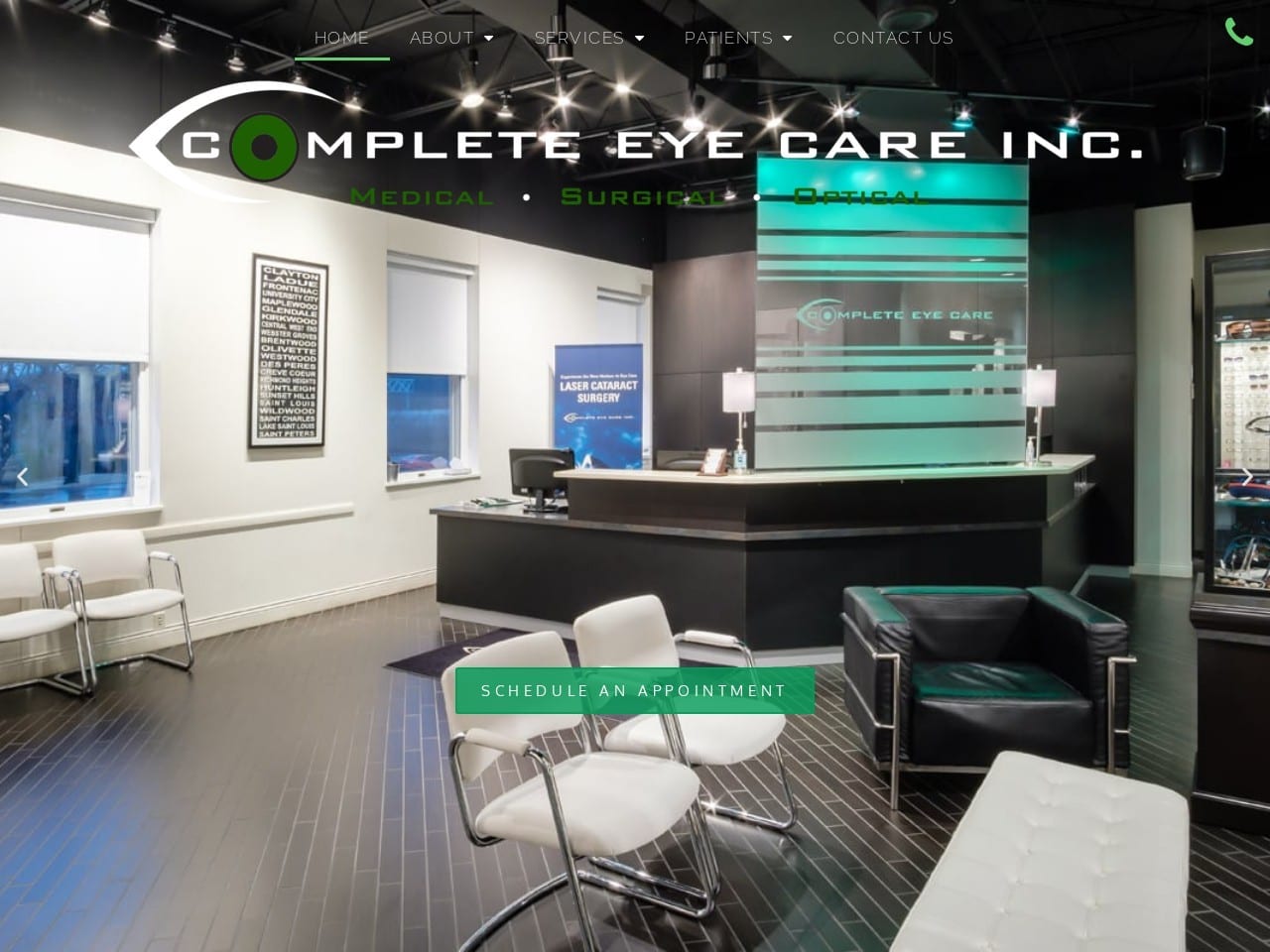
Complete Eye Care Inc welcomes you into their offices and introduces their staff immediately with a hero image slideshow that features pictures of their location and the experts who’ll serve patients. The color scheme incorporates the green, white, and black palette that’s found in their logo, creating an aesthetically pleasing and open format that makes excellent use of white space. Green serves as the action color for the site but is generally used delicately as the outline of buttons enticing visitors to click thru and learn more. Stylized gray icons are used to guide patients to additional pages with more information about the services offered. The testimonial section uses a beautiful image of a happy interaction between a customer and one of the cheerful service staff found at the clinic. The page wraps up with a bright sunny image of the outside of one of their locations.
Functionality
The photos used in the hero image are selected to help build rapport between the office, its staff, and the potential patient right from the beginning. The imagery shows a sharp modern office with friendly staff, while each image provides access to a different portion of the site with an integrated cycling button. Click-to-dial functionality lets visitors immediately reach out to the office by clicking the green phone in the upper right-hand corner, making it easy for mobile users. Mobile optimization is a central focus of this site’s design, as demonstrated by the clearly delineated sections of the size using an alternating pattern of open space and images. As patients reach the bottom of the page, they encounter direct-to-map options for both of the facilities and a HIPAA secure form for requesting more information or asking questions.
3. CCRS Clear Vision
Aesthetics
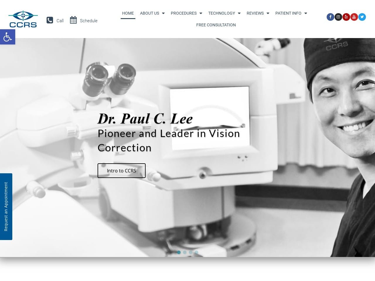
Rapport is an essential element of a clinic’s relationship with its patients. This site starts by making a solid first impression on visitors with a striking black-and-white image that introduces the office equipment and their optometrist. The color palette for the site leans heavily on grays and whites, using varying shades of blue for accent and action points. The large round buttons, each in their shade, invite visitors to explore the various aspects of the service. At the same time, the ‘Meet The Doctor’ section introduces the physician in multiple situations while giving an outline of their credentials. Striking imagery is used to highlight each of the procedure and technology sections. Testimonials gain extra weight thanks to the use of video testimonials over simple text, ensuring visitors feel confident in their veracity.
Functionality
This site is a picture of a modern website that beautifully integrates aesthetics with powerful functionality. From the opening gun, CCRS Clear Vision’s site provides patients immediate access to the clinic through the “request an appointment” button on the left screen. Accessibility functionality ensures the site is approachable to a range of visitors, and the clearly visible click-to-call button makes reaching out to the clinic a one-click operation. The use of imagery throughout the procedure and technology sections does more than capture the eye; it educates the visitor on the names of the procedures and machinery used before they ever enter the office. Text testimonials are not only old tech but also easily faked. Video testimonials give the site and review credibility while also appealing to modern browsers. The integration with Yelp, Google, and Facebook reviews shows an understanding of modern trends and where patients gather information.
4. Shelburne Optometry
Aesthetics
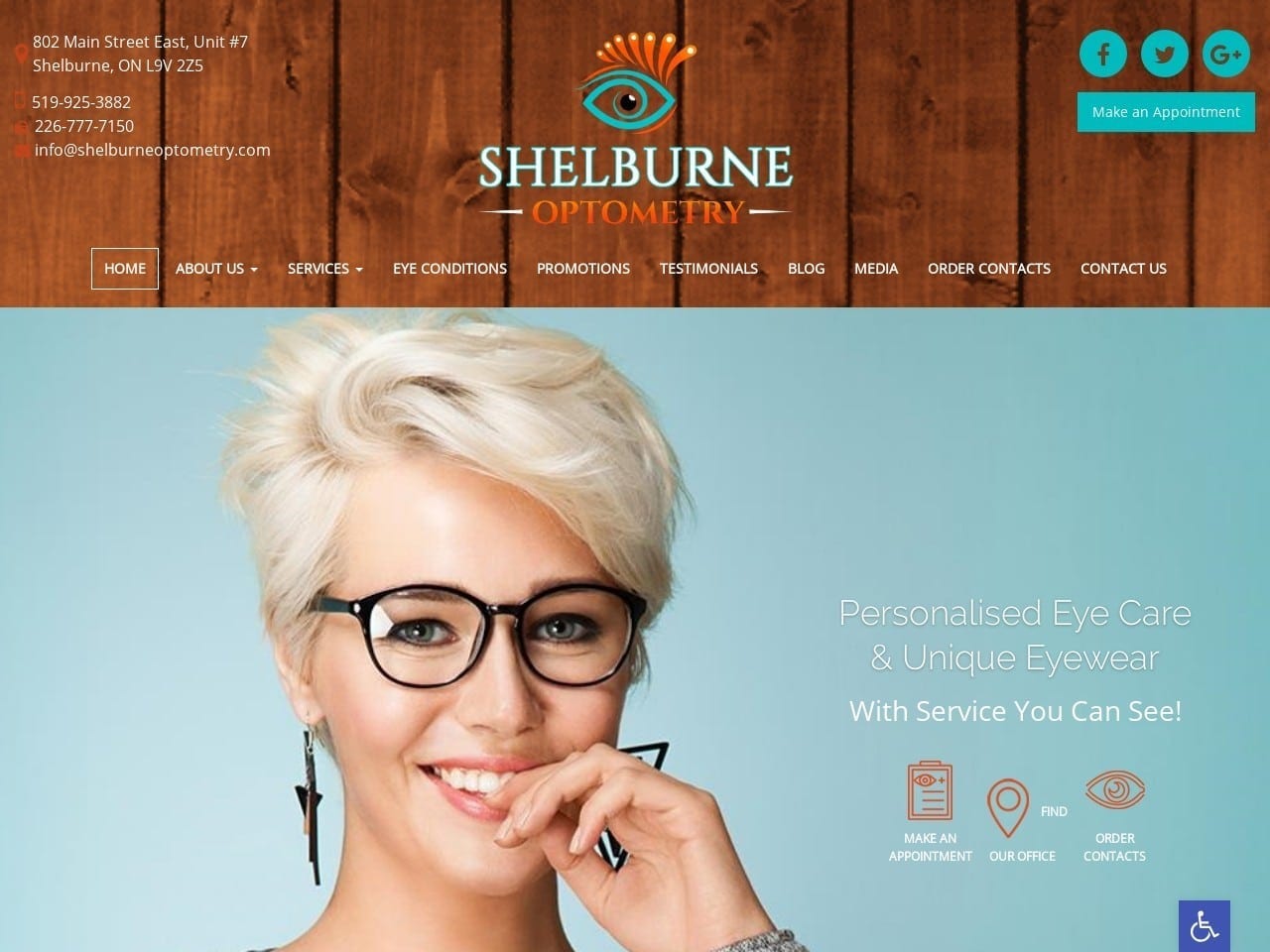
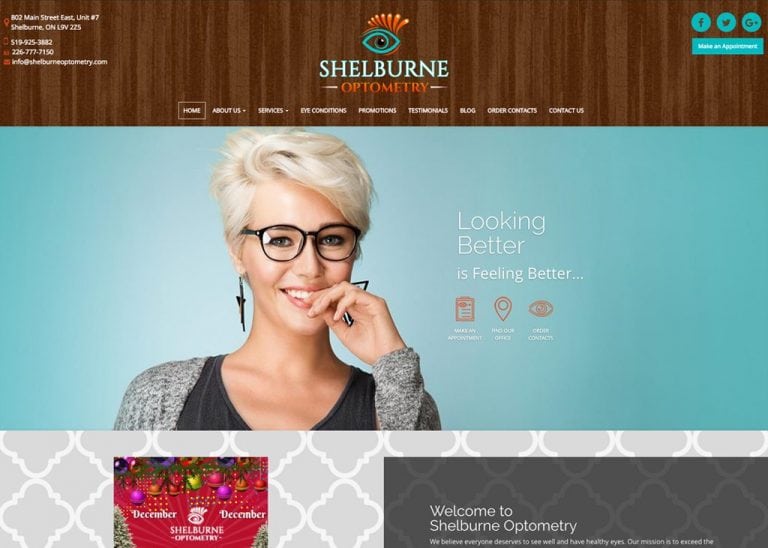
Shelburne Optometry demonstrates a focus on stylish glasses from the first moment with its beautifully stylized logo. The hero image continues this trend by showing a smiling woman with a quirky style and amazing glasses that show just how striking glasses can be. The color palette combines rich reddish-brown woods with bright sky blues to create an eye-popping contrast that brightens visitors’ spirits and guides them to important action points as visitors scroll through the site, its color palette changes to a calmer gray and white, with the blue and wood tones being used for action points on the site. Images throughout the site highlight different sections and convey information about what each text blurb and action button will contain.
Functionality
Providing quick and easy-to-access features for the website was clearly a focus during the design. The header alone contains click-to-call, click-to-email, social media, and appointment-scheduling links. The hero image has an integrated direct-to-map button alongside a link to order contacts online. All of this occurs before you even start scrolling, making it an incredibly function-packed arrival. The testimonials section contains links to Facebook and Google Reviews, and just underneath this area can be found windows into the social media platforms used by the site. The media page uses video to convey information to visitors and help build rapport with new or potential patients. As the bottom of the page approached, we found a list of the office operating hours and a map of its location.
5. Vision Plus Family Eye Care
Visit Vision Plus Family Eye Care
Aesthetics
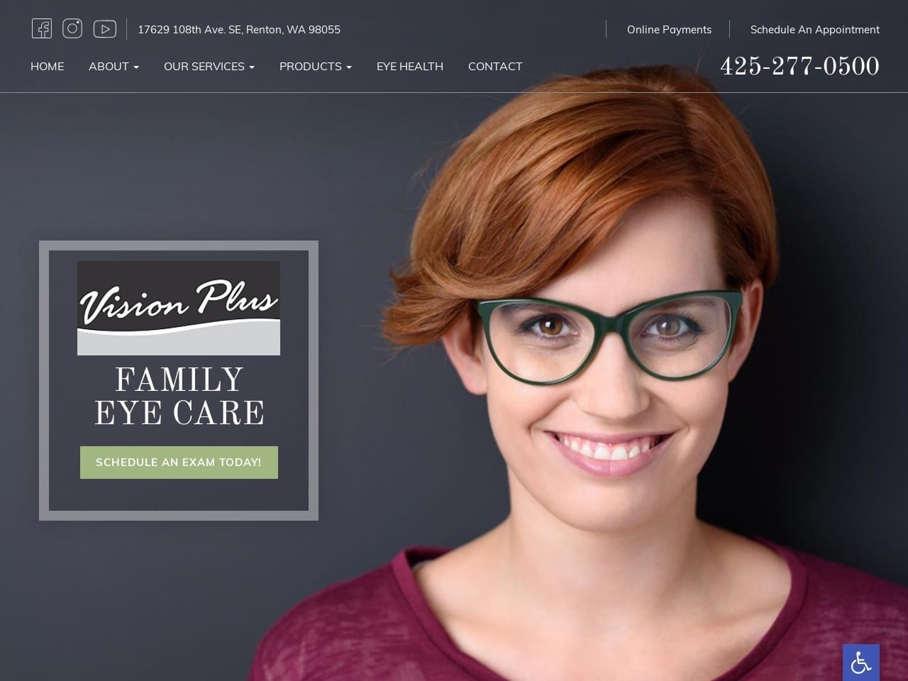
This lightweight page opens with a striking image of an attractive woman against a dark blue background, demonstrating how glasses can enhance a patient’s appearance. An image of the office’s interior is used further down the site to introduce patients to the location while providing a map of the area. Dark blue, white, and green are used throughout the site in a visually striking palette. Social media, direct-to-map, and click-to-dial links in the header use attractive clip-art style imagery in white against a black background for a clear contrast.
Functionality
This website’s static header ensures its full functionality is available anytime during a patient’s visit. It starts with access to three different social media platforms, direct-to-map for navigation, and click-to-dial options, the latter two being especially useful for mobile users. Paying for services and scheduling appointments couldn’t be easier with links to these features included. Online access to patient intake forms makes preparing for a visit effortless and saves the physician and patient time. Including insurance, the page is an important step in conversion, as patients are more likely to reach out to clinics they know accept their insurance. All these things combine to create a fantastic first impression on new visitors, which is important since you may never know it even occurred.
6. Lyles Eye Center
Aesthetics
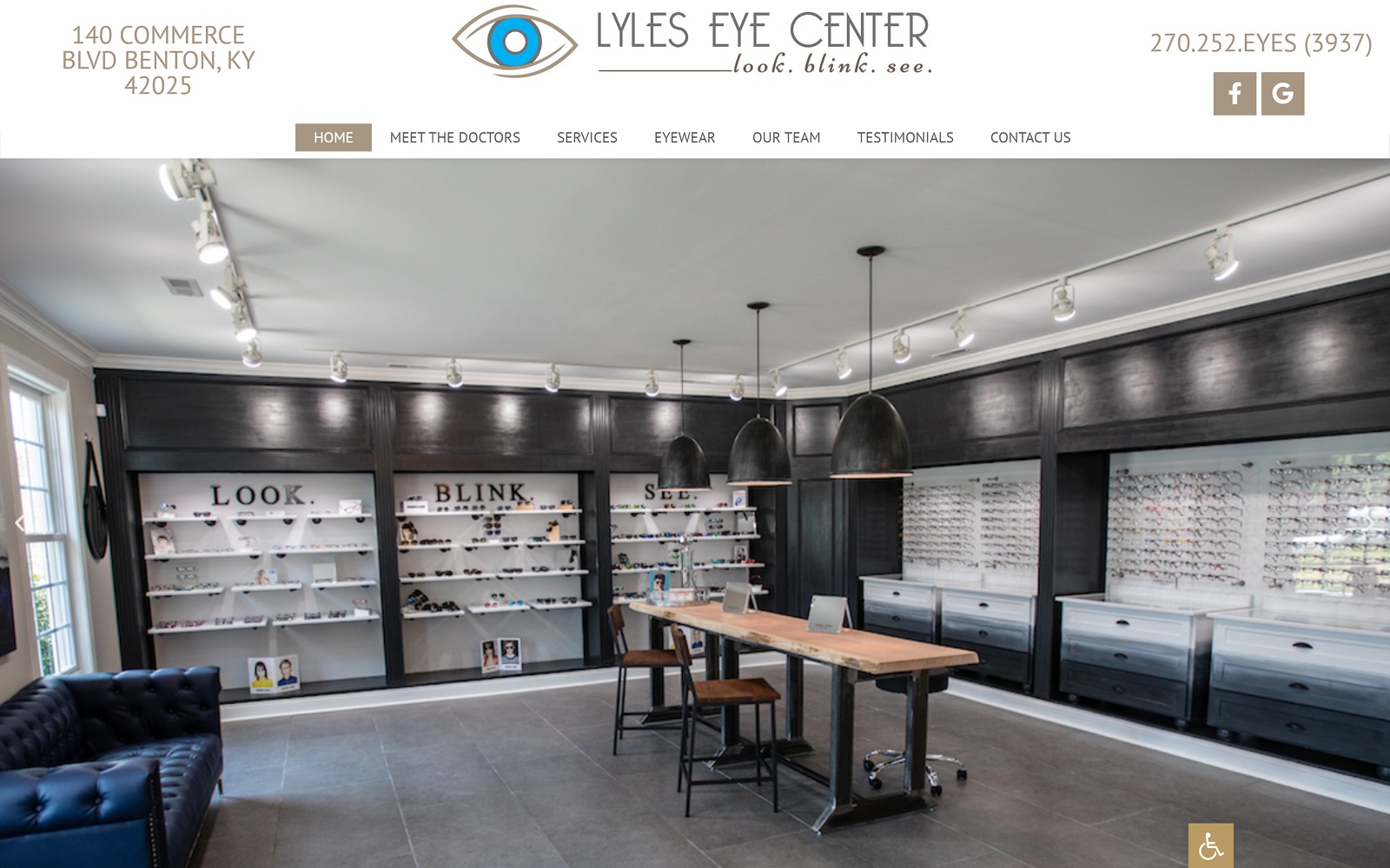
The Lyles Eye Center opens with a slide show of images that show the office and the selection of eyewear that they have to offer their patients. Their logo incorporates largely neutral tones with an eye-catching bright blue center. Imagery is well used throughout the site to enhance its aesthetic appeal while simultaneously transmitting valuable information and directing patients to useful areas of the site. Nothing about the site’s design is overstated. The images beautifully blended into the overall design and each section marked by a beige-lined button that catches the eye despite its downplayed color. Along with the use of static imagery, a video gives the site a modern and relevant feel.
Functionality
Static headers are a strong point in any website that incorporates them, especially when packed with valuable navigation points and contact information, as with Lyles Eye Center. Click-to-dial functionality means that mobile users can reach out to the office with a single finger press, and connecting with their social media platforms is a breeze. The video integrated into the site is an important information point while also building the ever-critical rapport. As patients near the end of the page, they’ll encounter HIPAA-compliant forms to reach out for additional information or schedule an appointment. Direct-to-map functionality allows mobile users to pull up directions to the office quickly. At the same time, click-to-email integration allows visitors to gather additional information from the clinic easily.
7. Northwest Eye Design
Aesthetics
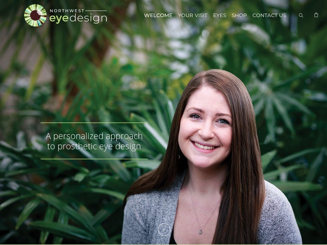
Natural energy and a welcoming atmosphere are integral to Northwest Eye Design’s website, as indicated by the friendly opening picture against a background of lush foliage. The image’s earthy browns and verdant green are also reflected in the site’s logo, which has a rainbow of natural eye colors circling a lustrous bistre pupil. The emphasis on a natural approach is subtly carried through in each image of the staff, apparent in the choice of an outdoor location against rich natural greenery.
Functionality
Northwest Eye Design contains multiple functionality points for visitors, including links to scheduling options and the forms necessary to prepare for your first visit. Their testimonial section takes an unusual approach, referring to these as patient journeys, giving the content a more personal and relatable feel. A significant amount of information is provided about their specialty, prosthetic eyes. One of the rarer features offered by this website is the inclusion of a store page where visitors and patients can order needed supplies that are part of their day-to-day vision care. Each product is featured on its page; patients can check out and have these items delivered to their homes. The bottom of the page contains direct-to-map functionality and click-to-call integration. The Contact Us page contains additional information and access points, including HIPAA secure forms that patients can use to request information or schedule an appointment. Also included on this page is a patient registration form that makes preparing for their first visit a breeze.
TOP 7 EYE CARE WEBSITES DESIGNED IN 2021
Eye care specialty sites serve a broad range of clientele, which is just one factor that influences the unique designs you can find in them. Each site needs to know its clientele and how to provide them with the needed services. Family eye specialists must focus on connecting with their area and community. This means knowing what brands to offer, how to connect with them easily, and creating solid roots in their community.

1. Lyles Eye Center

How Lyles Eye Center Envisioned Their Website: Lyles Eye Center works with familiarity and simplicity, using contrasting warm tones and cool tones against a neutral white background to emphasize its pleasant appearance. Its warm browns and bright blues accent the website’s action buttons and hyperlinks, and its choice of imagery impacts its users. Clean photography and its sparing use of color help create a clean platform for new patients. Overall, their website provides a delightful space for new visitors to scroll through and have access to their services.
2. Spectrum Eye Care
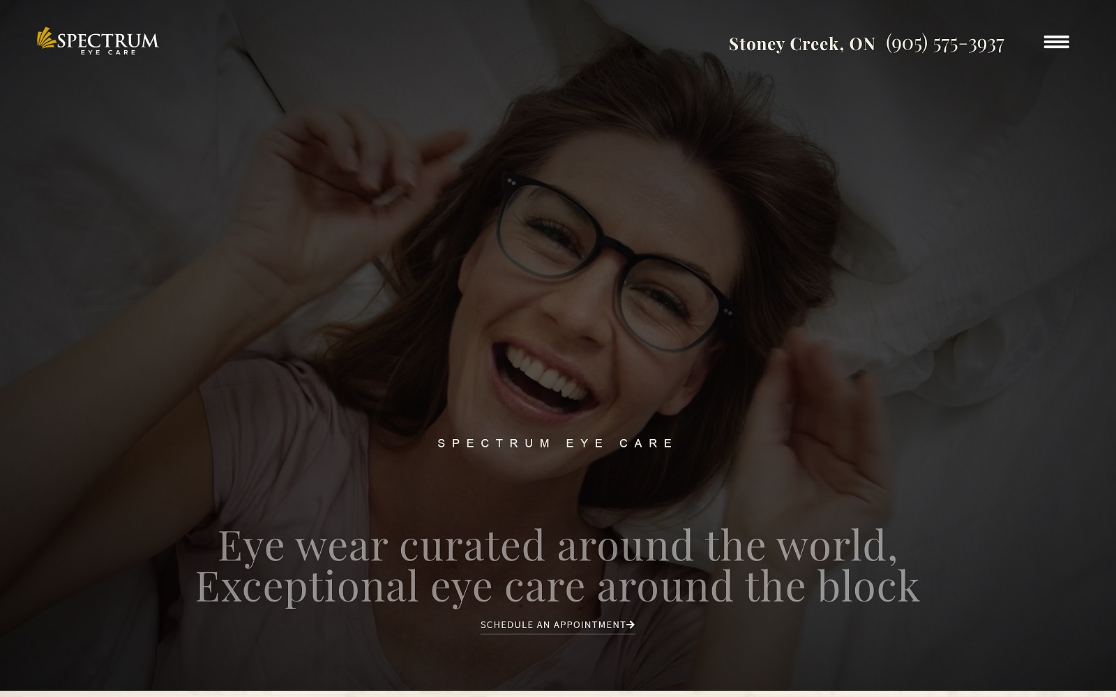
What We Love About This Optometry Website: Spectrum Eye Care focuses on optics, technology, and stylized images as its core themes. Its website highly uses visual elements of professional photography to represent an attention to detail and dedication to quality eye care. However, instead of relying on action buttons, large font text accompanied by hyperlinks is used to direct and attract new patients, allowing new patients to explore the website in further detail thoroughly. Its sleek black and golden yellow color scheme presents an elegant touch to its professionalism and presents a sophisticated practice to new patients looking for eye care.
3. Modern Eye Optometry
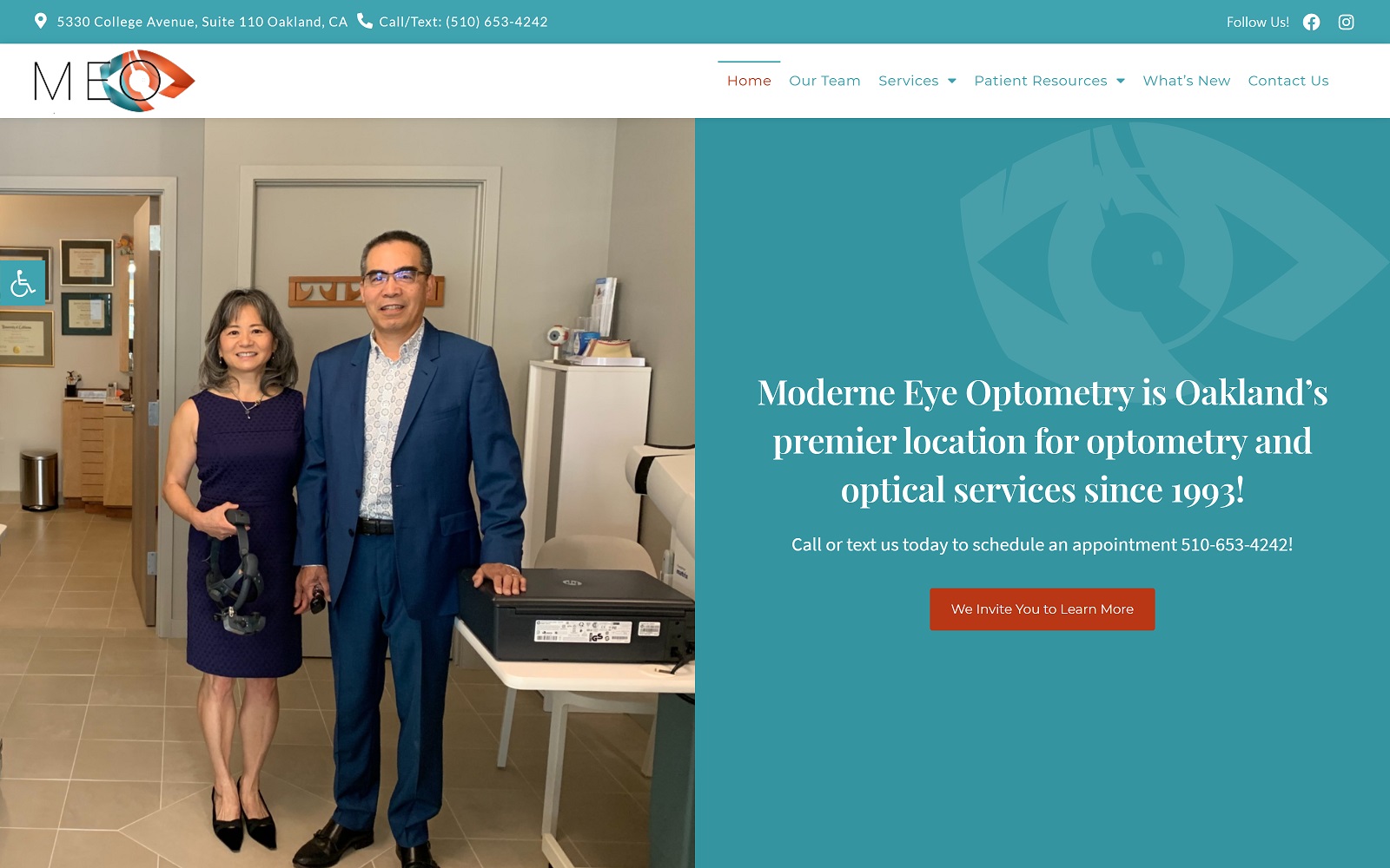
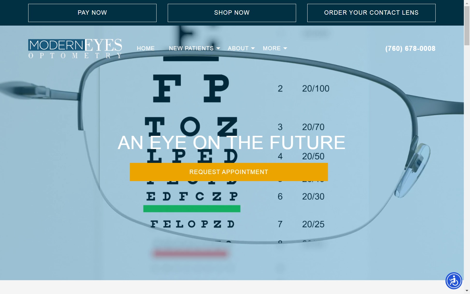
What We Love About This Optometry Website: Sleek, professional, modern, and inviting. Those four concepts are present in every aspect of the design of this site. A comforting blue and white color scheme adds a splash of orange to draw the eye and encourage visitors to take action. When visitors are ready to visit, they only need to click the address at the top to start directions. They can call or text with a touch of the phone number that remains prominent at the top of the page. Navigation throughout the site is a breeze, thanks to the static menu found at the top. The reflexive design makes it equally beautiful on desktop or mobile, while the accessibility options mean it provides service for all visitors.
4. Optometric Associates
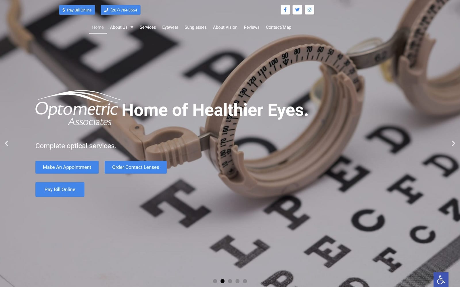
What We Love About This Optometry Website: Tradition and simplicity are evident in this site’s design, with just a touch of leading-edge design to round it out. There’s a prevalence of tans, off-whites, and blacks that, without being ostentatious, send a clear message about the clinic’s personality. Working with Optometric Associates promises a no-fuss, no-gimmicks experience focusing on providing great eye care. Underlying this traditional look is a modern design that makes it reflexive and convenient to use. Just like their glasses, function takes precedence. Online payment options and appointment setting options are available with a touch. Want to register as a new patient or order contact lenses without a phone call? It’s all right there.
5. Lodestar Family Eye Care PC
Visit Lodestar Family Eye Care PC
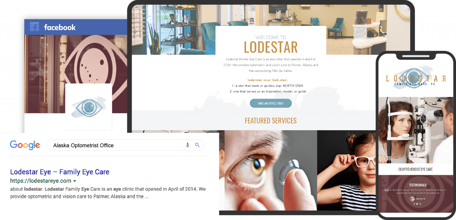
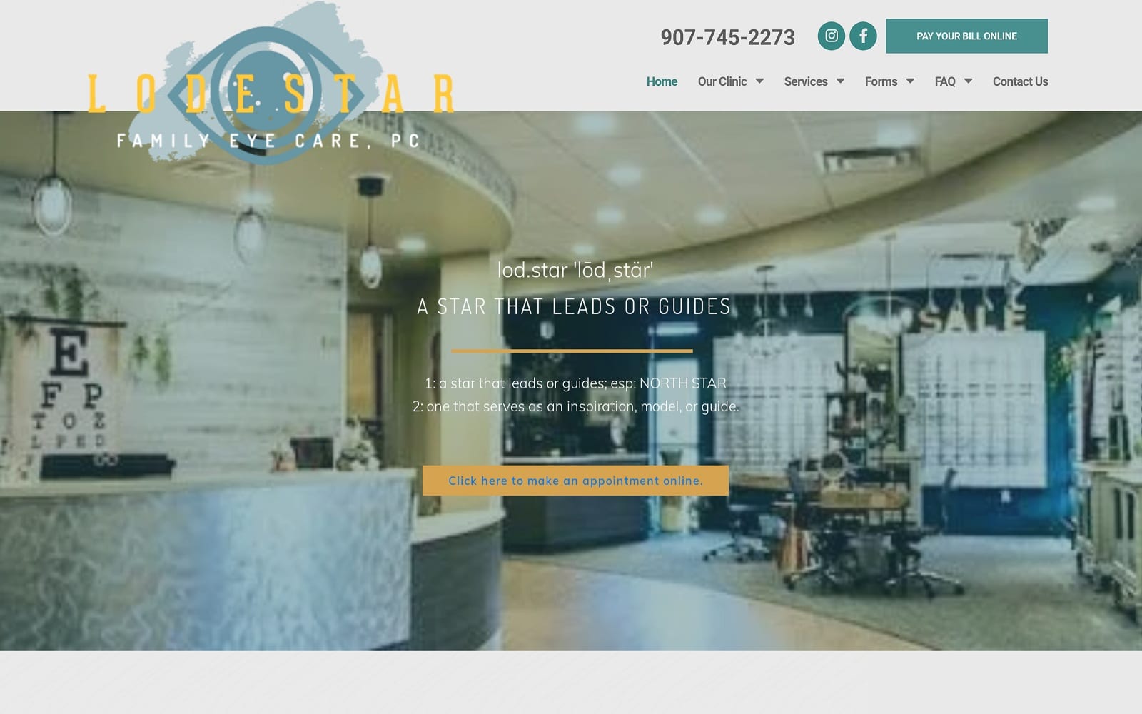
What We Love About This Optometry Website: Lodestar’s site is distinctive, standing out from the crowd without doing anything extraordinary. Proof that simple design doesn’t mean boring or unremarkable. The central slideshow features their community, their office, and even a bit of their inventory. These elements tie the clinic in with its community, while images of the owner and his family drive to create a feeling of friendly familiarity. Accessibility and function are also core elements of its design, along with convenience. The online payments button is prominently visible at the top of the page, along with the click-to-call link. The overall simple and minimalist design of the site combines with the use of elements and imagery to create a versatile, functional, and beautiful result.
6. The Optical Shoppe
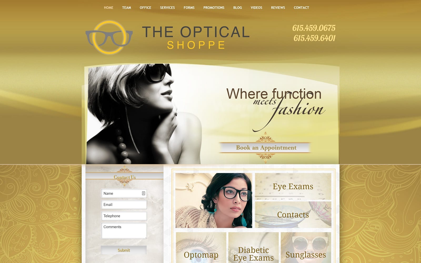
What We Love About This Optometry Website: When it comes to lightweight design, The Optical Shoppe has it down. Its golds, off-whites, and yellows come together to create a striking visual, adding to the elegance of its images. The home page is no-nonsense, giving you just the information you need while providing access to more. Address, operating time, contact forms, and phone numbers are right where you need them to reach out for an appointment. You can even book your appointment online by following their elegantly designed link button. Landing pages are intended to serve those who need basic information, while the added links connect them with in-depth information about the offered services.
7. Eyes On You Optometry
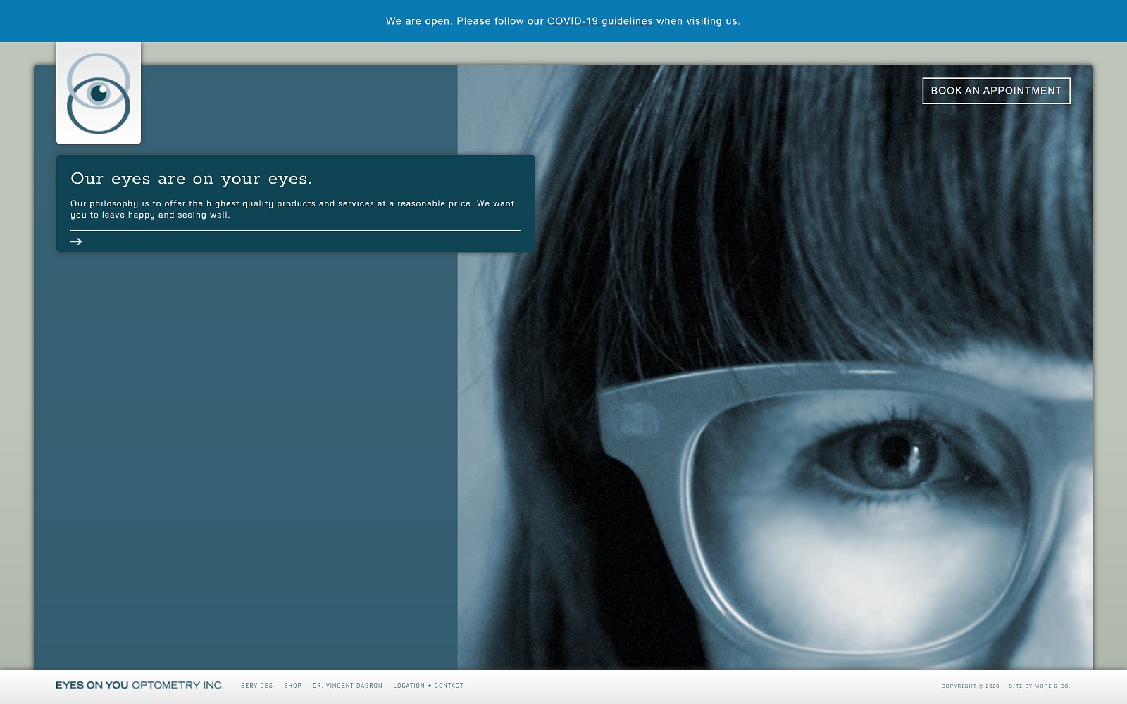
What We Love About This Optometry Website: The design found on this website was clearly inspired with an artistic flair. This site comes across as utterly minimalist at first glance, but looking a little deeper reveals a depth of information and function. Rather than scrolling traditionally, the slideshow presents everything you’ll need. From the brands they offer to information about the doctor and their location, it’s all there. You can also use the subtle menu found at the bottom. Booking an appointment, getting directions, and even shopping for new glasses are all made easy through this site’s integrated functionality. It’s unique and deserves a place on the list of 2021’s best.
TOP 7 EYE CARE SPECIALTY WEBSITES OF 2018
Let’s be clear… eye specialists deserve to have great-looking websites and effective online marketing, too. Here are just a few of the best Optometry Websites through mid-2018. Feel free to click on the image to take a closer look at the details of the project and how these websites came to be.
1. Shelbourne Optometry
Overview Of The Design
The entire site was designed to combine an earthy yet professional air with bright smiles and promises of a future with better eyesight. The complex patterned backgrounds that appear as you scroll down the page further represent the overall cheerful wistfulness of the office. No one wants their visit to the optometrist to be serious and dire, and this design promises that it won’t be. Further, there are subtle promises of life much improved that can be found in the images they offer. Despite all this evident whimsy, a clear trail of information is provided as you go down the page, showing that the professional isn’t afraid to step up and share what the patient needs to know.
Use Of Colors
Color use on this website is decidedly driven by color accents, with a primarily white and gray tone background covered with splashes of color that immediately draw the eye. Is there a splash of blue? Information ahead; take note. The feeling portrayed by the site is welcoming and joyful, subtly promising that this can be the patient’s life once they get new glasses without pushing hard selling in their face. Overall the colors seem to play across the page rather than stark and constrained.
2. 730 North Optometry
Overview of the Design
We attempted to capture the image and stature of every medical practice we serve here at Optomized360. For 730 North Optometry, that takes on a unique meaning since, unlike many other practices, this one operates as both a vision care center and a retail shop. Our goal was to create a custom optometrist website that depicts a visit at 730 North Optometry as more of an all-inclusive luxury experience rather than just another visit to the eye doctor.
We spotlighted the beautiful office for this design, from the ornate chandelier hanging in the lobby to the seating area’s plush opulence. Visitors can immediately explore three sections of the website based on their interests and needs – vision care, vision therapy, and eyewear. From there, we offer a brief introduction and history of the practice, followed by links to other pages within the website that describe more about the practice and all that it has to offer.
3. Vision Plus on Benson – Ophtalmology

Clean, cool, hip, and modern. That’s how web visitors describe the Vision Plus website. Visitors experience a virtual tour of the practice’s modern office and can even browse an inventory of designer and safety glass frames.
The navigation on this optometric website is about as innovative as it gets. Testimonials and special offers help guide the visitor’s eye throughout this attractive website.
4. Lodestar Family Eye Care
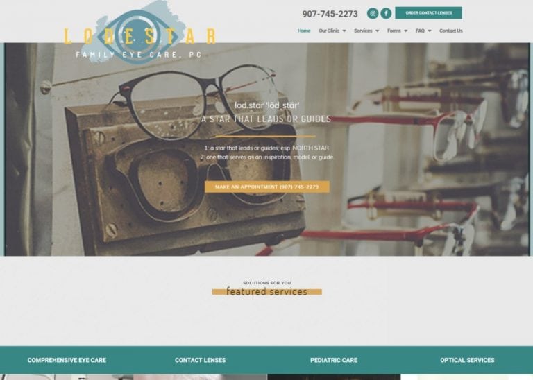
This website is just plain cool. For rural Alaska, it’s one impressive website design. Great navigation, mobile responsiveness that makes the website look like an app on smartphones, and super easy contact information make visiting a real breeze.
5. Modern Eye Optometry
Overview of the Design
With a name like Modern Eye Optometry, it makes sense that you would need a modern website that reflects your practice’s mission. We enjoyed creating this custom optometry website, which features slight tweaks to the traditional components of the home page. The header images are slim yet fill up the full width of the browser screen. The featured services section, however, adapts to a standard width, followed by featured conditions that expand back to a full-screen view.
Use of Colors
This website is based on a green and orange color scheme, which contrast nicely against each other and directly correspond to the colors within the practice logo. Orange is a bright and cheerful color, whereas green demonstrates youth, health, and vitality. These hues make sense considering this practice exists to help patients maintain the youthful health and function of their eyes.
6. Spectrum Family Eyecare
Spectrum Family Eyecare is a group of professional providers of quality eye care to mall visitors. They present a clean, straightforward environment that ensures comfort and convenience to its visitors. When clients stop in, they’re met by a clean, professional staff, and their site needs to present that same impression. This site came into existence from the ideals of professionalism and convenience, reassuring visitors that they will have a clean, comfortable appointment in their mall-based clinics.
Overview Of The Design
The design of this website is simplistic and understated, focused on building confidence in the visitor through the imagery of the doctors and the strong presence of testimonials. The site is immaculate and minimalist, which helps lend an air of efficiency and convenience to visitors who will stop by a mall to check their vision. While optometrist stations are familiar sights in a mall environment, the mall is rarely considered a relaxing experience. This site seeks to overcome those preconceptions through excellent design.
7. Retina Institute
Overview of the Design
When designing a custom surgical eye center website, we recognize the importance of quality, information, and extreme attention to detail. For The Retina Institute, a group of recognized ophthalmologists, this meant creating a space highlighting the practice’s cutting-edge technology, advanced procedures, and knowledgeable physicians. We acknowledged the surgical center’s New Orleans location immediately but invited patients from all over the country to experience what sets The Retina Institute apart from the rest.
Use of Colors
For this website, blues, reds, and purples set the stage. The deep, rich blue-purple colors lend mystery and depth to the website. Much like the eye, it speaks of a detail-centered space with much more to offer than is evident on the surface.
Things To Look For When Designing Your Optometry Website
There are a few fundamental elements to creating a website for any business, but optometry has special concerns.
- Accessibility – Perhaps more than any other site, accessibility has to be a primary concern. By definition, optometrists work with patients who have vision difficulties. This means the ability to alter the visual appearance of your site is essential to serve the broadest body of patients.
- Functionality – Ease of use is essential to good web design. Visitors must be able to find what they’re looking for quickly and easily. As such, your site should be optimized for navigation on desktop or mobile devices.
- Valuable Content – Visitors to your site may often seek answers to their vision health questions. While functionality and navigability are core components, don’t sacrifice valuable information to achieve them.
These three elements are core to what defines a high-quality and effective optometry site. Optimized360 has an extensive collection of galleries for every medical profession, including optometry.
Conclusion
Each of the above websites demonstrates how a few basic concepts can be integrated into many ways to produce a website that stands out and represents your office and its personality. From a stylish and striking logo that stands out in correspondence to online appointment settings and patient portals, patients now expect more from their provider’s websites. The mobile-optimized design used to be a selling point. Now, it’s essential as more and more patients use their mobile devices to enhance their lives, navigation, and communication.
As you peruse websites looking for inspiration for your office’s site, be sure to collect a list of the important elements that stand out to you. Whether it’s a particular color palette, a feature you know your office can’t live without, or something you do not want on your site, record it all. That way, when you’re ready to approach the professionals about building a site, you’ll have everything you need to make it great. Looking for a great optometry website design company? check O360.
