
Having a solid website to represent your clinic can be an important part of keeping a steady flow of new patients in your office. While urology website design doesn’t differ dramatically from building a website for any other medical practice, there are distinct differences between them and websites for other businesses. It starts with a need for security that can meet the rigorous standards imposed by HIPAA and continues into the need for providing valuable information to patients that can be life-critical.

The best urology websites are created with eye-catching color palettes that are integrated into their logo for a seamless theme. Mobile-responsive technology is essential in modern web design due to the growing trend in patients connecting using their phones, tablets, and other personal devices. This form of integration can provide patients with click-to-dial and direct-to-map options that make their relationship with your clinic all the more convenient.
Below we’ve compiled a list of seven urology websites that are exemplars of their style:

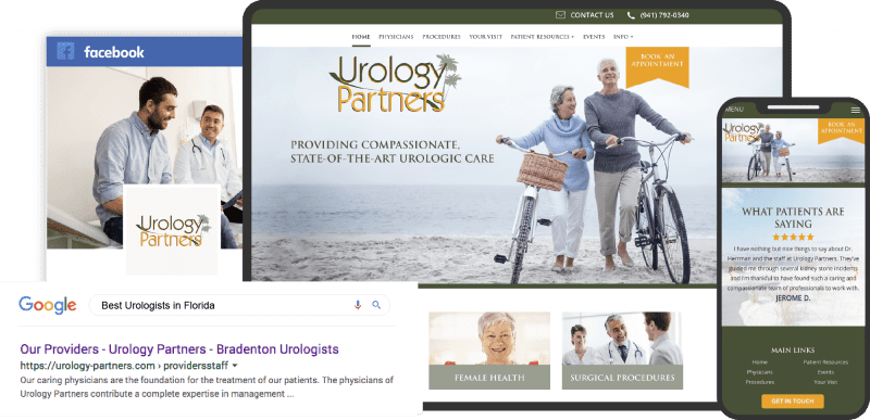
1. Urology Partners

Aesthetics
Tranquility and serenity mark the aesthetics of Urology Partners, focusing on Florida forest greens and deep golden yellows as their color scheme. Contrasting its main page with black and white sans serif font text, yellow serves as the action color, while green provides its Floridian roots to its viewers. Its choice in photography and layout of information over time allows the viewer to interpret its target audience for older generations easily. Viewers can scan through its main page while also retaining a sense of calm, healing positivity throughout the website.
Functionality
Visitors to the website can immediately see the action button, “book an appointment,” at the right corner of the header. While giving links to the business’s medical services, the website previews the entire list of physicians as the last but essential focus to the company’s image. The accessibility controls are presented along the lower right side of the screen. The website has both a direct click-to-call link and a click-to-email link at the top of the screen for immediate services. At the bottom of the main page, links to the website’s main resources, maps link, and a prominent “Get in Touch” button highlighted in its action color all reinforce its attractive qualities.
2. Bryan Allen MD
Aesthetics
Deep-sea blue, sandy beach beige, and seafoam green take precedence over the entirety of the main page, building confidence while also emphasizing its direct attribution to its Floridian environment and sunny locations. The website uses the sea foam as a lighter, subtler addition, making it the highlight for all associated links. All photography is used as an accent to the page’s information, and its use of white and medium blue sans serif text completes the overall aesthetic, giving a sense of assurance and security to the web visitor.
Functionality
Taking a minimalist approach, its sections provide all the essential information without taking up the entirety of the main page. Its header remains at the top of the page. The first highlight any visitor would notice is the main doctor in focus, Dr. Bryan Allen. All information related to contacting him, including addresses and phone numbers, is present, and each phone number has a click-to-call option. The section also includes an action button and social media links. In the middle of the page, a testimonial slideshow plugin is present, and at the bottom, contact forms are immediately available, along with links to the website’s services. A unique aspect of this design includes the option to pay for an appointment using a Bitcoin QR code for the uninsured patient.
3. Florida Urology Associates
Visit Florida Urology Associates
Aesthetics
Defined by cool gray and whites with touches of greens and blues, the website uses cool tones to direct the visitors’ attention to its business’s purity, safety, and cleanliness. Visitors to the website can denote any information presented to them through its bold but delicate headers. Its picture choice informs the viewer of its versatility with its patients, giving them the impression of fully-encompassed care without isolation. With white and gray as the action colors and blues and greens as the passives, the relationship between the business and its visitors is established as one where light and clarity are harmonically present.
Functionality
With the company logo immediately at the top of the header, the first pieces of information visitors notice are the click-to-call phone number and address, both allowing reoccurring visitors to have immediate contact with the business underneath the header slideshows that include images and statements of the business’s overall success. Its introduction is therefore preceded by its featured services and testimonials. The overall function of the website navigates the viewer toward various parts of the office’s services and qualifications, reassuring its authenticity. At the page’s footer, a repeated main menu page can be clicked on for more information, and the accessibility link presides throughout the lower right side of the page for quality assurance.
4. El Camino Urology Medical Group
Visit El Camino Urology Medical Group
Aesthetics
Minimalistic and compact, the website utilizes cool browns and beige with green undertones as its core action color scheme, associating itself with dependability, stability, and modesty. Its expansive, horizontal bands of colors combined with a nominal selection of header pictures give the website a firm foundation. Its use of sans serif text and various hyperlinks allow the visitor to immediately search for what they need while giving off an impression of sophistication.
Functionality
Overall, the immediate access to its click-to-call links and social media profiles gives the website a unique edge, as it emphasizes its ability to treat its patients above all else. Its header includes the office’s patient forms and a patient portal to immediately access the necessary procedures for new patients. The collection of hyperlinks to the office’s various services is information in a compact view. The foot contains the latest therapies and treatments available at the facility and its contact information, including a click-to-view address.
5. Kansas City Urology Care P.A.
Visit Kansas City Urology Care P.A.
Aesthetics
Kansas City Urology Care gives an impression of authority with its light brown and beige color scheme. While brown and beige present stability and maturity to the attention of its viewers, dark purple and blue, while normally used to convey a sense of soothing calmness and tranquility, is primarily used as a highlighter for important information and headers, intermixed with black text for emphasis. Through simple, organized design, the website’s aesthetic achieves order and a reserved sense of reliability.
Functionality
All information presented on the page is formatted vertically in sectioned boxes for organizing, allowing its viewers to scan throughout the page for what they need without the need to scroll. Relevant links remain at the top header alongside the facility logo, and a search bar is present, allowing visitors to search for information. The beige patient form button presents itself as an action button, and in the sectioned boxes, hyperlinks to pages and videos help direct the viewer’s eye to the website’s content.
6. Florida Urology Partners
Visit Florida Urology Partners
Aesthetics
A blue gradient is the key action color throughout the main page, contrasting with the light beige as the background filler. The cool cerulean to azure blue transition evokes peace, confidence, and cleanliness; the website combines this use of blue with a cool beige to present information clearly, allowing the website to expand along with the page. Its combination of sans serif and serif font gives a sense of variety to the viewer’s eye, reinforcing a striking appearance to the present information and allowing the visitor to comprehend their website easily.
Functionality
The header remains steady at the top of the page while the core information takes control over the main page, allowing the visitor to dive into the material on the page. As the visitor scrolls, certain sections contain hyperlinks to the services and conditions the facility treats and inform the viewer of its associated hospitals without clutter or unnecessary details. The primary photo gives an inviting atmosphere to the page, and the action buttons, located down at the page’s footer, give easy access to patients needing their necessary health insurance information.
7. The Urology Group
Aesthetics
This website utilizes tertiary colors in dark, warm hues of orange, green, and blue to convey a sense of success, dependability, safety, and sincerity. The blues and greens act as a passive but ever-present impression to the visitor, allowing them to take in information at their own pace and absorb the various options presented on the website. Subtle headers, horizontal slideshows, and hyperlink overlays across various photographs give a sense of sophistication and innovation to the company’s image.
Functionality
Immediately at the front of the page, visitors are shown the soft green action button at the top right of the page alongside its dark blue header for immediate access. The main page showcases a slideshow with highlighted hyperlinks, sectioned search bars, and online appointment requests to contact the office. The middle of the page contains testimonials, services, and hyperlinks to other resources to help harmonize the site’s aesthetic and bring together the website. Alongside the right side of the scroll bar, the website contains a virtual assistant for web visitors to find out more about their health care as the footer reinstates its header links.
Conclusion
These websites have one overreaching thing in common. They’re optimized for representing the business and providing useful features to their patient base. Even with this similar focus, each of them stands out as a unique example of what the best urology websites can be. If you’re setting out to do your own urology website design, be sure to start by exploring the competition. Each of the above websites can reveal a new idea you may not have considered, or something you are certain doesn’t belong on your clinic’s digital face.
Once you’ve created a list that describes what you want on your site, it’s time to contact the professionals. It can be tempting to do in-house design for a website, but it’s always a good idea to at least pay for a consultation with a professional design firm specializing in medical websites. They’ll know all the specific concerns that face medical sites and ensure you don’t miss something critical.


