
No matter what the current market says, eyecare will always be in demand as the growing population ages and faces troubles with vision. As the number of practitioners remains static, these great demands make ophthalmology a highly valuable landscape. For many eye specialists, this means taking advantage of the available channels and expanding outward to reach more patients. What more effective way to do that than through an online presence? Having an online presence can boost your practice in your social sphere, give your patients more access to your services, and offer you new marketing opportunities that can help attract and retain new patients.

Digital marketing is all about maintaining a strong, ever-constant internet image, and these methods can be achieved through many avenues, including social media, email, and videos. Websites present a multifaceted opportunity for any ophthalmologists looking to expand their outreach to new patients seeking their care. With this in mind, we’ll be looking at some of the best ophthalmology websites provided for this year and showcase some ways to improve your marketing practices:
1. Complete Eye Care Inc


How Complete Eye Care Inc Envisioned Their Website: Complete Eye Care Inc takes on modern themes, showcasing their practice to create a sense of trust and authority in their field. Shades of green are used as accents to the page’s central focus and are added to action buttons, transparent layers, and hyperlinks to highlight the practice’s essential information. Through clean imagery, clean-cut designs, and the use of modern elements such as slideshows and icons, this website welcomes new patients by showing off its technology and professionally advertising its expertise.
2. Vision Veritas Eye Care
How Vision Veritas Eye Care Envisioned Their Website: Vision Veritas Eye Care welcomes its visitors with warm, sunny tones, emphasizing the eyes and its local touch with mosaic themes. Golden tans and yellows encompass the page, leaving behind a sense of warmth and friendliness that provides a sense of security to their patients.

Its script text, illustrative icons, and center-aligned format give the website a country-western feel, appealing to its location and sense of community. Through these methods, Vision Veritas Eye Care takes the traditional approaches to website design and creates a personal touch that matters in their field.
3. South Shore Eye Care
How South Shore Eye Care Envisioned Their Website: South Shore Eye Care sticks with traditional blues and whites as its color palette but lessens the impact of its blues through softer tones and clean imagery. The website works with large-size texts, list-formatted service icons, and transparent layers, and South Shore appeals to a unique audience and works to assure their patients of their qualifications. Its cooler tones help soothe patients’ fears, while its format helps to educate their patients on their services, team members, and advantages as a practice. Overall, this straightforward design makes them iconic and classic in their specialty.
4. Summerlin Vision
How Summerlin Vision Envisioned Their Website: As a multifaceted practice, Summerlin Vision worked to set up expectations right from the start by presenting new visitors with an insider’s tour of their practice, establishing their accomplishments and proficiency. To complement their dedication to vision care, white and mauve purple help accent the website, color coding their icons, action buttons, and hyperlinks. While its video tour takes center stage as the attractive primary point, other aspects help emanate its warmth and ambient appearance, providing an overall sense of open space within the site.
5. Eye Care for the Adirondacks
Visit Eye Care for the Adirondacks
How Eye Care For The Adirondacks Envisioned Their Website: Eye Care for the Adirondacks uses nature-themed colors and natural landscapes to evoke their patients with a sense of community and renewal. Its recognizable brand logo helps synchronize with its forest elements, and its heavy use of transparent layers helps reestablish its themes. Throughout the website, patients can easily scroll and find information through its various hyperlinks and action buttons. With an overarching header that follows through, Eye Care for the Adirondacks presents its information clearly while giving its website a polished finish.
6. Texas Eye Surgeons
How Texas Eye Surgeons Envisioned Their Website: Texas Eye Surgeons works within a specific field of ophthalmology, hence envisions their website through a cleaner, simpler, and more technological lens. By utilizing imagery, a recognizable icon, neutral backgrounds, and light blue accents, this website attempts to draw patients in through its videos, interactive links, and slideshows to create an overall immersive experience. Through this experience, all information is easily presented through large font text, bullet points, and engaging images. Because of its clean appearance, many new patients can take in all Texas Eye Surgeons has to offer and see their state-of-the-art practice in a clear light.
7. New York Opthalmology
How New York Opthalmology Envisioned Their Website: New York Opthalmology focuses on its care for its community, appealing to multiple age groups and ethnicities as its target audience. Their uniqueness comes from how the website takes full advantage of the animated aspects of their images and uses them as the highlights for allowing new patients to engage with the site further. Through its use of friendly illustrations and a light blue color scheme, parents, older patients, and even children can go through the website’s content easily and be actively engaged.
TOP OPHTHALMOLOGY WEBSITE DESIGNS OF 2020
Every business needs a digital presence on the web these days, and ophthalmology clinics are no exception to this rule. Ophthalmology website design can be tricky, especially if you’re trying to do it all yourself. There’s so much to consider, from the design of your logo to color palettes and HIPAA-grade security, that many choose to involve professionals. Whether you’re researching Ophthalmology Website Design for the purposes of building your own or only as a guideline for the experts you ultimately hire, this guide is for you.
The best ophthalmology websites do more than highlight your business; they also provide a valuable range of features that patients will use to make their lives more convenient. These features can include patient forms that can be downloaded or filled out online, click-to-call, and direct-to-map functionality. The best sites add patient education videos and online tours of the office for an incredible first impression. Each site is an excellent example of an Ophthalmology website design.
1. Vision Veritas

Aesthetics
Vision Veritas Eyecare opted for a color scheme that is warm and welcoming and sends a subtle message of elegance and quality with its gold undertones. This color and the blue found elsewhere in the site come together in the site’s logo, which incorporates a stylized filigree eye for an impossible-to-miss appearance. To further this impression of old-time elegance, the site uses clip-art images to promote the various information sections of the site. The overall design is attractive and informative and changes to become accessible on narrower format viewing platforms, such as mobile devices.
Functionality
This website brings a remarkable amount of functionality to its visitors. In addition to being entirely accessible regardless of whether you’re using a desktop or a mobile device, the website provides multiple other features of value to the end user. These include click-to-dial functions integrated into the header, conveniently located beneath the access points for three social channels related to the clinic. New or returning patients looking to schedule an appointment with the office can do so using the schedule an appointment button, and all this is before the visitor even digs deep into the page. Further down the page, patients will find links to promotions, reviews, and a convenient way to order their contact lenses without picking up the phone or visiting the office. At the bottom of the page are directions to the clinic, a direct-to-map feature, and office hours. It all wraps up with a HIPAA secure form that allows patients yet another avenue to request an appointment.
2. The Optical Shoppe
Aesthetics
Gold, pink, and gray are the foundation of The Optical Shoppe’s color palette, reflecting the elegance of fine eyewear, the nurturing nature of their staff, and subtle sophistication. The site’s main layout heavily uses imagery, from the opening scene to the buttons that direct visitors around the site. This practice changes as visitors explore deeper, providing valuable information on the service pages in a readable black-text on white background format. Combined with these colors, the stylish accents that draw attention to action areas make for a truly stunning site.
Functionality
This website packs a lot into a small space from a functionality standpoint. Visitors can make an appointment through a convenient HIPAA secure form when they arrive on the site. Using the schedule an appointment button provides access to a similar form and the clinic’s contact information. Even more importantly, visitors can use direct-to-map functionality to get directions sent directly to their preferred mapping program. Both of these locations also provide access to the clinic’s social media channels, allowing those who sign up to keep apprised of the latest news and opportunities the office presents. The eye-catching mouse-over transformation of the navigation images found beneath the Book an Appointment button does more than look pretty. The transition from text to descriptive images encourages visitors to click through and positively affects SEO.
3. Walsh Eye
Aesthetics
Walsh Eye stuck to basics with its color palette, sticking the basic blue and white with just a splash of gray here and there. This produces a visually approachable site that focuses on delivering information over glitz. The logo for the sight is a lightly stylized human eye next to the clinic’s name. The main page is a very minimalistic design that is light on imagery and text, aiming to serve the mobile community with a responsive site that loads instantly. This focus continues through every page of the website, with the services, reviews, and offices page all relying on a minimal degree of content to portray the maximum amount of information.
Functionality
For all that Walsh Eye prefers, a distinctly minimalistic approach on the visual and aesthetic level, the site is packed with functions that help visitors accomplish their goals with the clinic. The page begins with a list of social media channel links to help patients immediately connect and receive news and updates. A striking red “Request an Appointment” button helps to set them on the path to becoming members of the clinic’s patient family. By focusing on text to transmit information, the website remains lightweight and easy to load on any platform, almost entirely free of lag from loading times. Patients wanting to prepare for their next visit will find patient forms available in a downloadable format on every page.
4. Whittington Eyecare
Aesthetics
The Whittington Eyecare website opens with a strikingly rendered icon for the business rendered very simply out of light blue, dark blue, and black for the text. It gets right down to business by presenting the viewer with a black-and-white image of a photoreceptor and an announcement that states the clinic’s motto, “Your Vision, Our Focus”. The site uses a sectioned approach to delivering information and stylized optometry-related imagery to mark areas where more information about the clinic’s services can be obtained. The blue and gray colors used prominently throughout the site promote calmness and hope for better eyes.
Functionality
Much attention has been paid to providing visitors to Whittington Eyecare with ample functionality. The site’s header provides access to a click-to-dial feature that connects mobile users to the clinic’s phone number with a single click. Links to email communication, direct-to-map features, appointment setting, and payment options are also packed in there. There’s little need to scan through the site further for the returning patient. The menu for the site stays locked securely at the top of the page, making patient forms for return visits also just a quick click and print away. A scrolling testimonial section allows for maximum use of minimal space, highlighting all the great things existing patients have to say about the clinic. At the bottom of the page can be found a HIPAA secure form that allows patients to reach out to the clinic safely and conveniently.
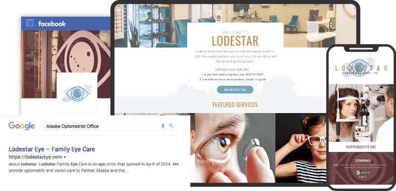
5. Lodestar Family Eye Care
Visit Lodestar Family Eye Care
Aesthetics
A unique and stylish logo rendered in blue and gold greets visitors to the site above an introduction to the clinic’s name and what it stands for. These colors, along with the basic contrast of white, are the foundation of the clinic’s color scheme and provide a visually gentle site that’s still filled with vibrant contrasts. The bounce-over design of the images used to highlight service sections creates a visually interesting design that entices visitors to click thru to learn more. Striking black and white photos present the staff to viewers, showing a touch of their personality and beginning the rapport-building process.
Functionality
Convenience is key for Lodestar Family Eye Care. It starts with easy click-to-dial functionality, social media connections, and a payment portal built into the header just above the menu. As visitors move through the site, they’ll come across buttons that make setting up an appointment a breeze. In contrast, HIPAA secure forms make it possible for patients to deliver information to the clinic without fear of the wrong hands getting a hold of it. Thanks to the security incorporated into the site, there are two ways patients can fill out forms for their visits, either online or via a printable format. Thanks to these features, patients will always be prepared when they show up for their first visit, with no waiting required.
6. Conway Eye Care
Aesthetics
Conway and Coos Eye Care share a website that truly makes the most of attractive design to impress visitors. Dark Navy Blue combines with a striking white to enhance contrast and direct new visitors to valuable information. An image of a handsome young man in glasses helps to assuage visitors’ concerns that having glasses means they’ll be less attractive or have reason to be embarrassed by their appearance. The image of the clinic’s trade sign on the nearby highway helps to demonstrate a sense of locality. In contrast, the beautiful outdoor sunset image by the testimonials helps instill hope in the site’s visitors.
Functionality
The entire website is geared toward mobile support, starting with a standard text menu that collapses into a hamburger menu on smaller screens. This menu also sticks with visitors as they scroll through the site, ensuring they can easily reach any information they desire without ever having to hunt for it. Click-to-dial functionality is immediately available through a phone-shaped button standing next to the office’s phone number and a button for scheduling an appointment. Scrolling down the page will find strikingly stylized icons that offer the ability to make an appointment, direct-to-map functionality, and a form for ordering contacts. A scrolling testimonial section at the bottom of the page builds visitor confidence and drives conversion. At the same time, a HIPAA secure form makes it easy for those who decide to join the patient’s family.
7. Eye Care For The Adirondacks
Visit Eye Care for the Adirondacks
Aesthetics
Eye Care For The Adirondacks opens with a beautiful image of the namesake mountain ranges, helping to create a sense of locality and build rapport with their visitors. The colors of the mountains are reflected in the site’s overall color scheme, with the blue of the skies and the green of the trees playing prominently. The associations with health and vibrancy that come with green make it a perfect choice for the service buttons, with white text standing out in bold but complimentary contrast. A series of images introduce the staff that works at the clinic, something that further builds rapport as patients familiarize themselves with their friendly faces. Their logo is a striking and impossible-to-mistake combination of black, green, and white that shows a moonlit night in the Adirondacks outlined by a stylized eye and their name.
Functionality
The header of this website makes it clear that returning patients will be able to click and go with an easily accessible patient portal and contract order form right there on the home page. What appears to be a simple text posting of their phone number has click-to-dial functionality located right above a button that makes requesting an appointment a breeze. The site sticks to the imagery of the area local to the clinic to help instill a sense of rapport in visitors that helps assure them that this is the right clinic for them. Also included on the site are the forms necessary to become a patient or undergo surgery at their clinic and a patient bill of rights. At the bottom of the page are direct-to-map locations for all of the clinics and a HIPAA secure form for reaching out to the clinic.
Improving Your Ophthalmology Practice Through Online Marketing Techniques
Marketing efforts go beyond websites and into a whole sphere of online interaction to outreach to new patients. As the competitive scene constantly changes, ophthalmologists working to improve their practice may find this aspect challenging, to say the least. Marketing plans rely on more than just the technology used – it also relies on the measurable goals you set to keep you moving forward.
So, what goals should you start with before considering a marketing plan? It starts with looking at your business without the rose-tinted glasses:
- Assess Your Financial Revenue: Documenting your influx of patients, your yearly revenue, and other financial aspects can create the boundaries that your marketing plan can work. It can also act as a self-examination for critically assessing your business.
- Define Your Goals: When you look at your practice from a peripheral point of view, it can be hard to see what you need to do to change your circumstances. Start with measurable, achievable, and specific goals to help any marketing services you use to provide what you need.
- Manage Your Plans and Budgets: Besides running a business, your marketing plans will always need constant attention, including how your budget is used to achieve your goals.
Our online world is changing daily with new marketing trends to keep up with the economic pressure of the medical industry.
Conclusion
As you’ve seen, each of these websites takes a separate approach to how they can best serve their patients online. That being said, they also stick to a distinct set of guidelines and practices that help to enhance the experience of anyone who uses their site as part of their relationship with the clinic. Every year, more and more patients expect high-end technological features on the clinics’ websites, so it pays to stay apprised of the latest trends.
If you want to design your own website for ophthalmology services, these eight are a great place to start. Continue looking and marking down what kind of ideas appeal to you and which ones you’d rather give a pass. When you’ve finally compiled a list of all the things you want to see on your site and several things that you don’t, it’s time to contact the professionals and start your Ophthalmology website design journey. This list will help guide both your clinic and yourself when deciding if the work performed was right for you.


