
Creating a website for your neurology practice can be daunting, especially if you’re unfamiliar with the ins and outs of web design. The more you look into designing neurology websites, the more you’ll discover there is to learn about it. Website design is an art, and the best neurology websites are created by those who know exactly what they want in their clinic’s digital presence. One thing is certain: given that your website is often the first impression you never know you’ve made, you want to ensure you’re not building one from neurology website templates. Cookie-cutter design results in an utterly forgettable website that won’t properly serve your site.

It all starts with a color palette that will create the character of your site and, ultimately, a custom logo. Repeating the imagery throughout your site will help brand your site and ensure your patients immediately recognize your correspondence. HIPAA-grade security needs to combine with functionality to ensure your site is approachable to your target audience, and accessibility is key for those who face challenges with disability. Below we’ve showcased several sites that demonstrate good use of these concepts while remaining unique and distinct from their competitors.
1. Fort Worth Neurosurgical and Spine

Visit Fort Worth Neurosurgical and Spine

Aesthetics
Images of active people, green grass, and blue sky greet visitors to this site set with a color palette of blue and gray. Gray is known to be a cool and professional color, but it is blue with its associations with the hope that plays prominently throughout the site. The logo for the site is stylish and immediately recognizable and integrates the clinic’s colors well. Gray and white are the primary background colors, leveraging the ability of both to contrast with any other color from the palette. Blue is primarily used as a highlight and the site’s action color, capturing the eye and directing patients to portions of the site where they can interact, send, or receive information.
Functionality
The communication of contact information begins immediately at the top of the screen, where the address and phone number of the clinic are immediately available. The prominent placement of the patient portal link in the header lets visitors know that patients can conveniently communicate with their care provider through a secure interface.
Immediately visible at the bottom of the page is the blue accessibility link allowing patients to customize their experience to maximize their time on the site. The images selected for the slideshow do more than capture the eye; they start building hope for a long and active life with limited spinal pain. Fort Worth Neuro’s website is mobile responsive, enabled to be used on mobile devices while seamlessly supporting those using desktop browsers. This is evident in converting a standard full-width text menu into a hamburger menu for convenient access.
2. Manouchehr Nikpour MD
Aesthetics
In the design of this site, Dr. Nikpour opted for a striking futuristic look that is undeniably striking. Red and blue combine to produce a visual effect that draws the eye and inspires confidence and hope. The theme of the hero image is carried through the site, serving as the foundation for all the imagery on the site related to services offered. There is an interesting contrast in the use of red and blue; blue is a color of hope and optimism, while red is a more complicated color. It is used in the site both to indicate pain areas in imagery and draw attention to various action points. The information pages, such as the Team and Service pages, use a very basic format to present information in a clear and uncluttered way that makes it easy for patients to find what they need.
Functionality
The site’s home page is dedicated to minimalist simplicity, providing ample information and function in limited space. From the immediate presence of the red ‘contact us’ button, the easily accessible hamburger menu, and the direct-to-map functionality integrated at the bottom, it’s clear this site’s purpose is a convenience for the visitor. While the site is light in overall technical features, it has a lot to offer to prospective patients, including the ability to access and fill out their forms before the day of their appointment. In a clear indicator that less is more, Dr. Nikpour’s site epitomizes sleek efficiency and lightweight design, making it easily accessible from any mobile device.
3. Cascade Brain & Spine Center
Visit Cascade Brain & Spine Center
Aesthetics
The stunning photo selected for the hero image does more than make the site look gorgeous; it conveys information on a subconscious level to the visitor. Water is known for its fluidity and its part in healing, and the ocean waves themselves speak of an active life outdoors. Combined with the text, this imagery conveys a strong message of hope for an active future ahead. Orange and black serve as the foundation of the color palette, bringing warmth, energy, and professionalism to the site while providing great contrast for text.
Orange stands out as this site’s action color, drawing the customer’s eye to places to interact to receive or provide information. The stylish logo uses one of nature’s strongest shapes, the triangle, integrated with the S-curve of a spine to convey a subtle message. Your time with Cascade Brain & Spine will help strengthen your nervous and spinal systems.
Functionality
In terms of functionality, the Cascade Brain & Spine Center has a lot to offer visitors and patients alike. A new patient packet is immediately available in the header for the patient’s convenience and to get them thinking about their first appointment. Central on the hero image is a button compelling the patient to schedule their visit and get started on the road to better neuro and spinal health. Active imagery is used in the buttons that direct visitors to additional information about the services offered by the clinic, drawing the eye and suggesting the high-tech nature of the clinic’s practices.
4. Nevada Neuro
Aesthetics
Spinal and neurological pain is often considered burning, fiery, and agitating. The soothing blue tones that are the foundation of the site’s color palette immediately offset those ideas. The calm hope patients experience from the color establishes their first impression of the site. The site’s design is fairly minimalistic on the home page, allowing imagery and limited text to transmit the clinic’s message to the patient. The broadly open design results in a site that is full of useful information without feeling cramped or pushy. Visitors to this site will surely receive an excellent first impression thanks to the site’s ease of use, feature-rich design, and soothing color scheme.
Functionality
The website’s design focuses heavily on providing useful content to the visitor, starting with the prominently displayed link to the patient portal on the main page. Modern patients expect their medical providers to offer feature-heavy sites that will make their care more convenient. The ability to easily send and receive information from the physician is key.
Additional information is available in video format through the educational video section, ensuring that patients are informed about the services the clinic can provide and how their health. The direct-to-map feature included on the contact us page ensures that patients will never have difficulty finding the clinic and have easy access to the clinic number. HIPAA-compliant forms are also available throughout the sight to promote communication while simultaneously ensuring the visitor or patient’s information is protected.
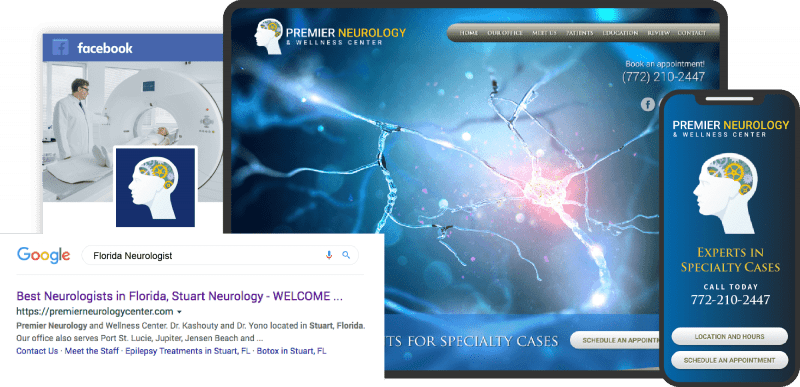
5. Premier Neurology & Wellness Center
Visit Premier Neurology & Wellness Center
Aesthetics
Premier Neurology its slide-show images to convey everything a potential patient needs to know about the clinic. They’ll discover the friendly team, feel that the clinic is using the latest technology, and gather some serenity from the image of a physician against green grass with a peaceful smile on her face. Throughout the site, blue, red, and white are the primary basis of the color palette, while the golden-orange tone draws the patient’s attention to action points. Everything about this site’s choice of imagery emphasizes the latest tech in neuroscience, instilling hope and confidence in the viewer. Even the buttons are slick and modern, using a mouse-over design to direct patients to get more information about their chosen subject.
Functionality
This site is packed with feature-rich content from the moment the patient arrives. As we have seen in other examples of Neuro sites, the patient portal is immediately and prominently available, in this case, alongside a convenient payment option. Subtly tucked beneath it is the site’s menu, which collapses to an attractive light-blue hamburger menu on smaller screens. Click-To-Call functionality is subtly integrated, allowing patients to easily contact the clinic from their mobile devices without typing in the number. Action tends to beget action, resulting in a button design that responds to users mousing over to draw them to click through. At the bottom of the site can be found the contact information for the clinic, as well as a HIPAA secure request appointment form the patient can use to reach out. The address in this area can also be clicked to produce instant directions.
6. Lanham Neurology
Aesthetics
Lanham Neurology greets you with a bright and light-hearted landing page. The smiling faces of families from every walk of life demonstrate the character of the clinic and its clientele. When it comes to color palettes, there’s nothing fancy here, just a simple black-and-white design that emphasizes content over color. Black and white are commonly associated with professionalism and clarity, serving as a perfect backdrop for visitors looking for answers for themselves and their families. The introduction of brown further down the page gives the site a warm, down-to-earth feeling that is perfect for family care. The images used to feature their services are simple and compelling, sticking to simple clip art to transmit information.
Functionality
Immediately upon arrival, the functionality of the site becomes apparent. Contact information and points are available through the social media links in the upper right-hand corner, while the menu is prominently available at the top of the page. On smaller screens, it condenses down to a hamburger menu on the upper left, though the Contact-Us link is still front and center to help make getting started easy. Modern internet technology is subtly integrated throughout the site, with each instance of the clinic’s number being a method of reaching out with a click on mobile devices. As we approach the bottom of the page, we discover a convenient tool for reaching the clinic, a direct-to-map link. Alongside this link is the standard HIPAA-compliant form for contacting the clinic without picking up the phone.
7. Salem Neurological
Aesthetics
At first glance, Salem Neurological provides a very simple and straightforward design. A simple image of the friendly faces you will meet at the clinic is framed against a simple white background with black text. As you move through the site, you discover there’s more here than meets the eye, as simple blues join the color palette. For all the information the site supplies, it respects the use of space by leaving ample room around information and texts to ensure nothing feels crowded or packed in. Blue is used as the primary action color on this site, drawing the patient’s eyes and directing them to useful aspects of the website.
Functionality
This site comprises subtle functionality that portrays a powerful message; this site is here for the patient. The menu contains various useful links, prominently displaying patient information and contact. The opening image was selected to introduce the patient to the clinic’s physicians, starting to build rapport with your staff when they arrive.
Reactive backgrounds lend visual interest to the site, while the mouse-over responses of the physician’s images provide information without requiring changing pages. The main page is designed to ensure patients can learn everything they need to know, including a comprehensive list of concerns treated, without ever having to leave it. Additional information is provided just a click away for those wanting more data. The patient information button continues this trend by providing the information in a pop-up rather than opening a new page.
Conclusion
Each of these sites has a character all its own, but each of them follows the precepts laid out in the intro to this article. They each focus on providing functionality to the end user while maintaining a striking appearance that will stick with your visitors long after they leave. Accessibility is a cornerstone of each site listed above, essential in an evolving marketplace. It becomes clear that creating a website of this caliber requires a variety of skills and knowledge that is often hard to find in a single designer.
Working with a professional designer or consultant when planning your website design is often beneficial. You’ll be able to discuss the various elements of the site and get guidance on what will work for your clinic and what may be wasted effort. If you’re going to go it alone, just be sure you research plenty of sites to create a comprehensive list of the elements you find that appeal to you. Once the list is made, you can begin the process of winnowing it down. Eventually, you’ll have a selection of design elements that will have your patient’s cheering.
Get your neurology websites from the best designers in the industry.


