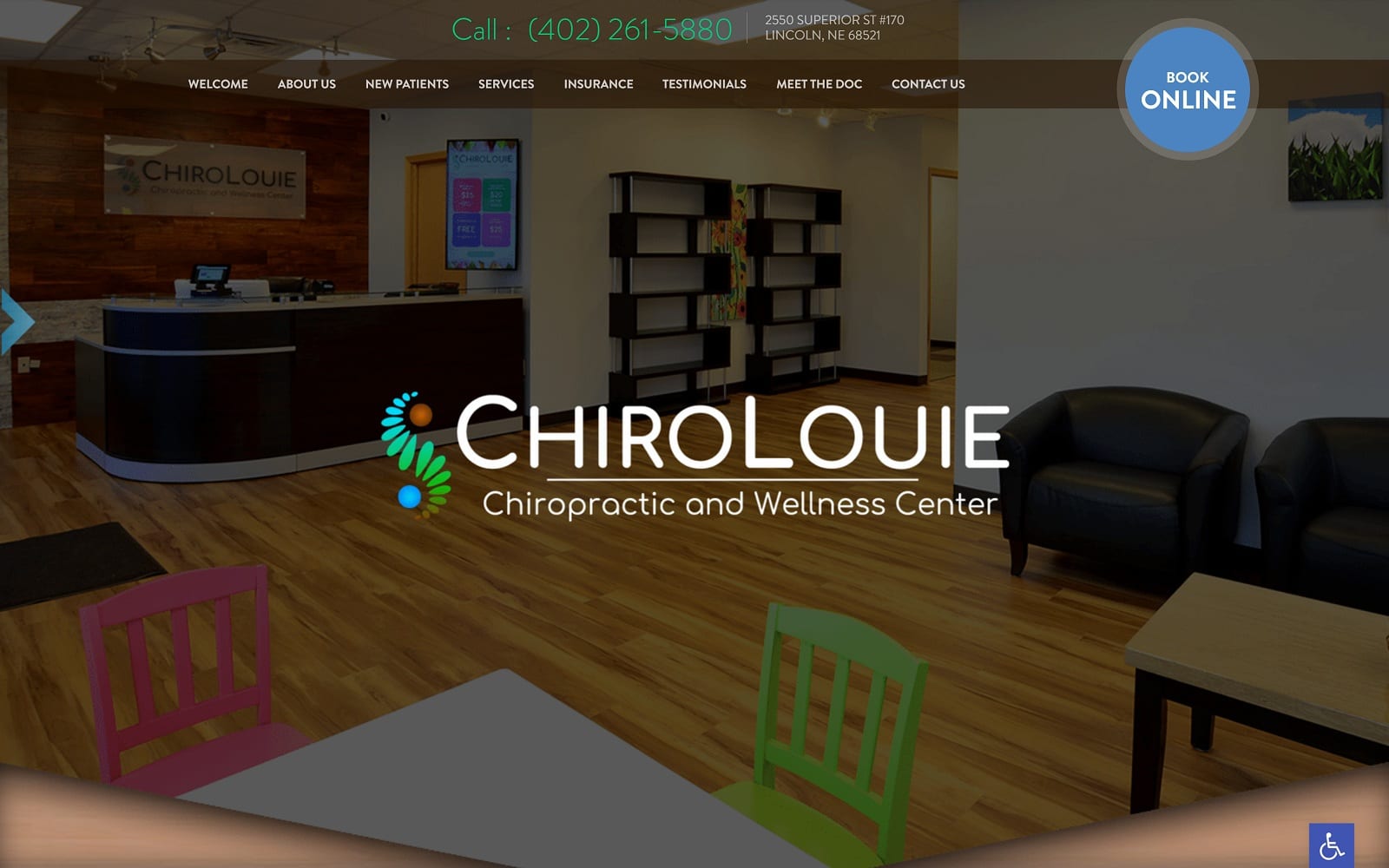
The color scheme is the first thing one notices on this website. The background of the office and the logo are cheerfully colorful and give a pleasing effect. Contact information and a book-an-appointment button is the first thing the visitor notices on the landing page.
Overview of the Design
The most attractive thing on the website is the logo which represents a spinal cord as well as the yin and yang symbol. It is very tastefully crafted and the colors shift from red to green in the upward fashion showing release of pain. The logo says it all. The office in the background is of earthy tones with a hue of color providing a comfortable vibe. The landing page is a slide down/scroll down the page that enables the visitor to see all the necessary information like types of packages Chiro Louie provides, client testimonials, the services they provide, about the esteemed Dr. Louie Yang and the most important how to reach there. In one scroll the visitor can get a good understanding of what the business provides.

Use of Colors
The colors are very skillfully used. The colors of fertility and distressing are used more. The schematics are chosen to be a cheerful one to make the patients have a happy vibe which is essential in this mode of treatment. The happy people trekking to the person running represent the curing power of Chiro Louie. The color combination of the entire website gives a fresh and relaxing vibe that relates to the practice.

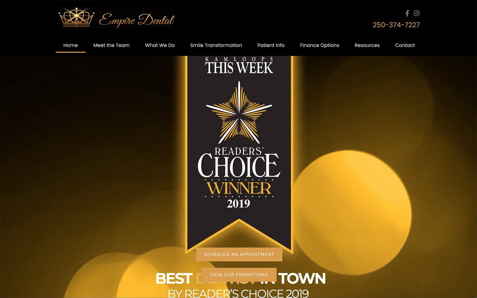
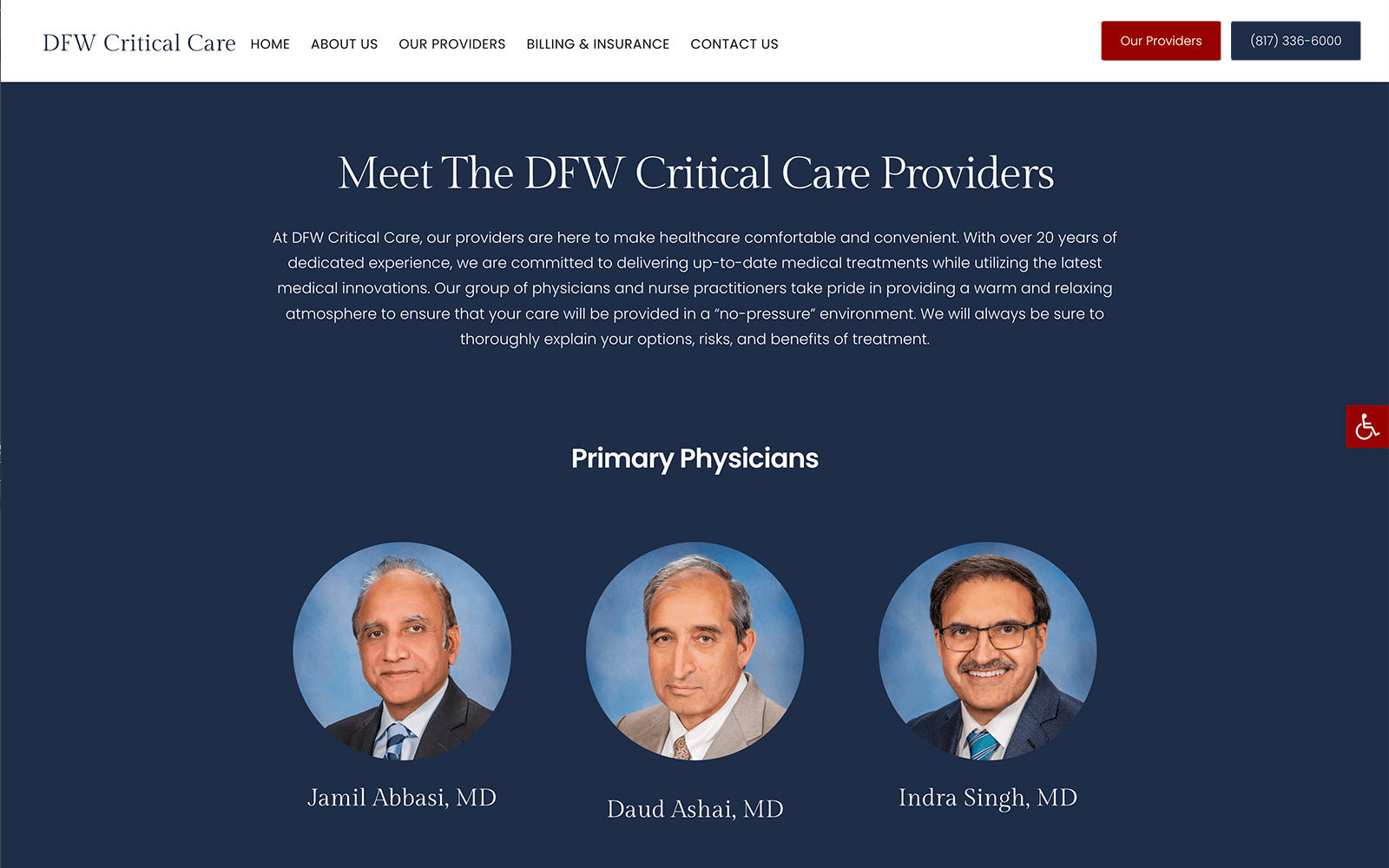
Here are some other examples of websites Optimized360 has successfully delivered to their clients that implement the color green.
Children’s International Medical Group
Analysis of Design Elements
The design element of the website is very chic yet simple. All the information needed can be easily found from the top bar of the website. The website is not at all misleading or confusing in any way. It educates the visitor on how it can be useful for him in an apt way.
Marketing Aspect
There are different packages available as per the need of customers. There is even a free consultation for people who are hesitant in the power of chiropractic care. People can leave their phone numbers and problems online for Dr. Yang to reach out to them. This helps people in knowing that is it a good fit for them without getting billed and people get a sense of credibility by such marketing techniques. There is a special package for new patients. There is even a single treatment package where one can avail the facility for one-time use. And lastly, there is treatment subscription for people who have found their right fit in chiropractic care.

Image the Website Reflects
This website reflects a boost of energy to the patients in need. It is inviting and relaxing at the same time. The simplicity of the website makes it more useful for visitors and the packages of free consultation and one-time use are a win-win. Dr. Yang knows what he is doing; that reflects on his website. The positive and fresh vibe appeals to the visitor to give it a try and get the help they need.
Chiro Louie Website Designed by Optimized360


