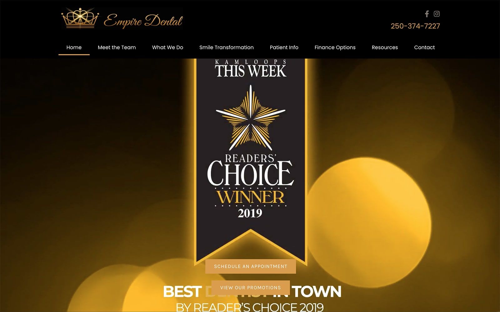
Empire Dental focuses on cosmetic, restorative, and preventive dentistry. Utilizing advanced dental technology, the Canadian natives aim to set themselves apart from the competition – starting with a completely custom website design from O360. Dental care is all about the small details; so is website design and development. We aimed to push Prime Dental ahead of the competition by creating a modern and professional website that highlighted their dental office, services, and patient care – all in one.
Overview of the Design
First impressions matter! We made sure local visitors would feel welcomed in when visiting the website by adding a backdrop of Canada along with a catchy slogan and call-to-actions. We made sure that all the typography and design elements matched the high-quality office photos provided by the practice. We also made sure to highlight the office’s associations on the homepage along with utilizing several motion effects to create a modern appeal that would captivate visitors as they maneuvered through the inner-pages.
Use of Colors
To match Empire Dental’s logo, we went with a predominately black website with gold highlights to balance out the dark shade. Black provides the background and a sleek silhouette for the high-quality images. When used in unison, the black and gold contrast creates a lux, high-end appeal that invites patients to dive deeper into the website. It is not merely out of coincidence that we also made the buttons gold too. Branding is especially important when working with a logo. Branding alone can make or break a site. We made sure that all the pages on Empire Dental’s website were classy and elegant from top to bottom.
Design Elements
Good websites have good design elements. We utilized various entrance and fading special effects on different widgets and links throughout the website to help catch the reader’s eye along with adding a subtle pop to the text. To match the black background, we opted for square borders to keep the images and text in perfect harmony. We never want one aspect of the website to overpower another.
As with the images throughout the website, we made sure that the overall design elements would directly reflect the services provided at. Professional shots and actual photos from the office give the webpage a mixture of personality and modern professionalism as well.
On the Team page on the navigation menu, we included an image gallery of real office shots to help give visitors a stunning visual of the Canadian office. We also placed square borders to help create a subtle border effect on the different team members. Parallax is also a great visual design element. We used it sparingly on the bottom of the homepage to create a fluid transition from one section to the next.
Marketing Aspect
We included many different marketing elements with Empire Dental’s design. In addition to the contact forms and social media widgets on the header, we also highlighted the practice’s testimonials and blogs on the homepage near the footer. Both blogging and showing testimonials are great ways to increase your acceptance rate! Not only that, but it also shows that your practice cares about education and informing, in addition to just dental work.
There is also a plethora of patient information available on the navigation menu. From the FAQ page to financing options, patients can help minimize their real-time office wait by finding additional information already on the site. There are even office forms for patients to download and fill out beforehand.
Image the Website Reflects
The website is a direct reflection of Empire Dental’s knowledge of the current dental landscape. From the images to the color theme of the website, all the design elements enunciate the practice’s use of advanced dental technology. The office images utilized throughout the website give the practice a phenomenal first impression to the locals around the area. To view more dental websites created by O360, please visit our gallery.