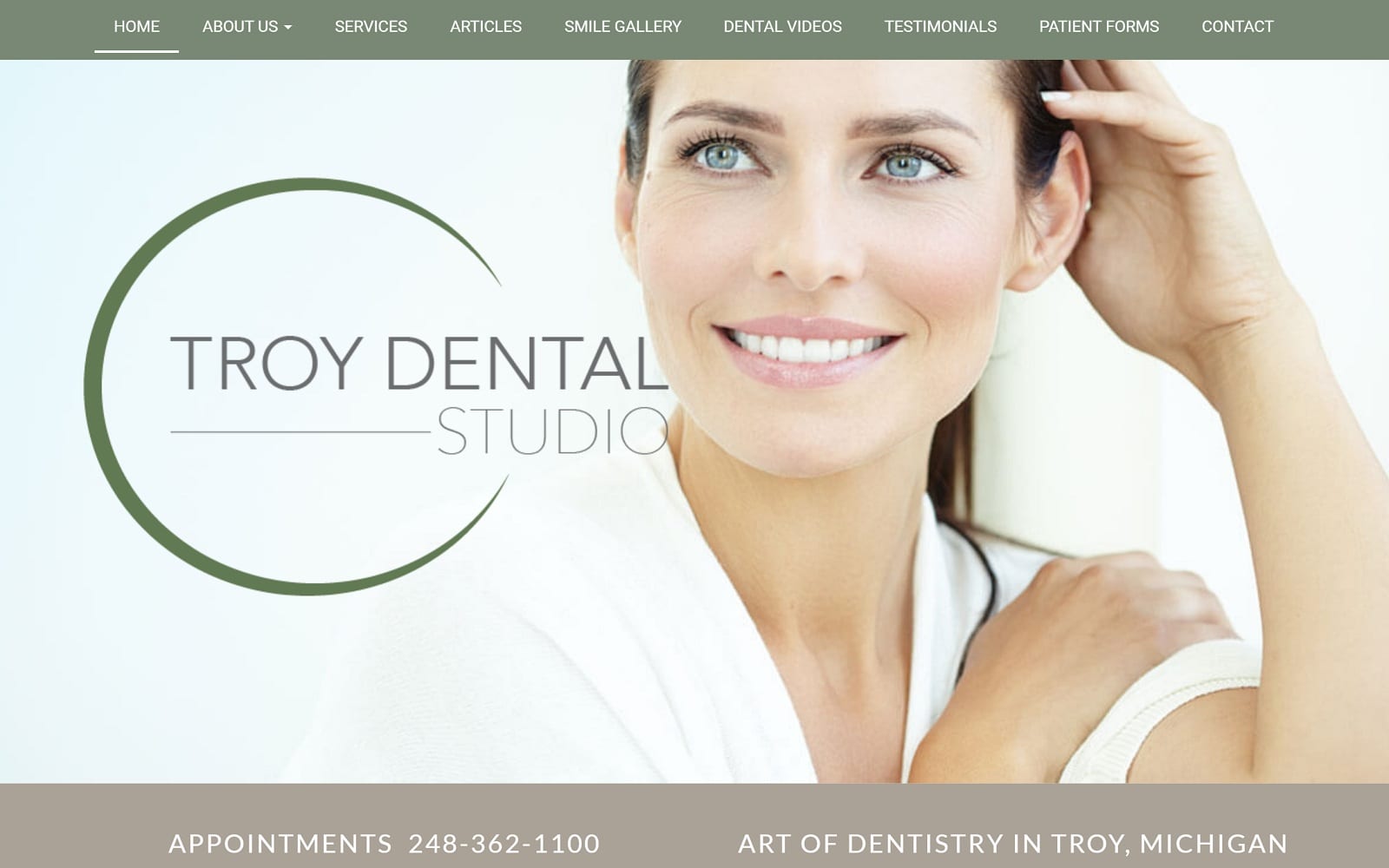
Troy Dental Studio projects itself as a progressive and chic center for comprehensive cosmetic and restorative dentistry. For this custom dental website, we utilized minimal home page content, instead opting to direct visitors toward various sections of the website that are most appealing to them. Other than a brief welcome from Dr. Batra and a few patient reviews at the bottom of the page, viewers are encouraged to either schedule an appointment right away or otherwise find out more about the types of services that are most appealing to them.
Overview of the Design
A traditional menu bar tops the home page with links to additional information about the practice, staff, services, and current promotions. We also implemented an extensive patient education section, with space for articles and dental videos. For the convenience of new patients and to ease the burden on office staff, we also implemented new patient forms directly into the website.
Use of Colors
Color sets the tone for a dental website. We opted for brown and green Earth tones, which help the practice appear grounded and professional. These are contrasted nicely with a bright white background that alludes to the cleanliness and organization of the practice. Colors play a large part in reader engagement on any website. By using only Earthy tones, we made sure that all the typography and images were legible and clear.
Analysis of Design Elements
This website utilizes a full-width layout, which ensures all of the available space on the site works together for the benefit of the visitor across all types of viewing platforms. We also included a tile-image menu on the home page, which includes subtle responses when the viewer mouses over each tile. This allowed Dr. Batra to feature specific types of services, including teeth whitening treatments, veneers, and Botox. We also provided a widget available on each web page. This allows increases the chances of site visitors committing to an actual procedure or consultation.
Marketing Aspect
Online dental marketing is multi-faceted. In addition to advertising efforts, it is also important to build a website that draws in traffic and converts visitors into new patients. For that reason, we included a before and after smile gallery depicting the types of results, patients might expect to achieve under the care of Dr. Batra. We also highlighted promotions and a patient testimonial section, with many of the glowing reviews featured on the home page. Finally, we made it easy to schedule an appointment, with direct links from the home page and an appointment request form on the contact page.
Image the Website Represents
We wanted visitors to look at this website and recognize Troy Dental Studio as a results-oriented practice. Our team of dental website designers created a clean space that allows the excellence of the practice to shine through. All the images, along with the videos, insinuate the feeling of relief and happiness the patients will feel after swinging by Troy Dental!
Dental Studio Website Designed by Optimized360


