Overview of the Design
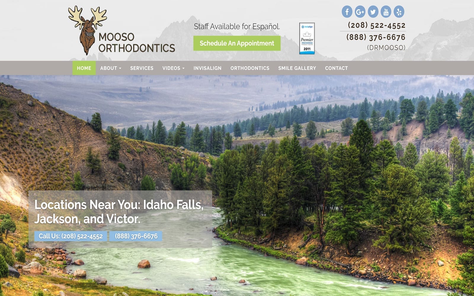
Mooso Orthodontics gets its namesake from its founding orthodontist – Dr. Mooso. The practice is fun and laid-back with a cartoon moose that serves as its mascot. In keeping with that theme, we created a custom orthodontic website that is playful, yet professional, appealing to the interests of patients of all ages and their parents.
We opted for a traditional layout with a few modern elements. The header menu navigates to areas of the website that highlight various information about the practice. From the home page, visitors are welcomed and introduced to Dr. Mooso, as well as given a summary of the types of services offered by the practices, such as 3D imaging, Invisalign, clear brackets, and traditional orthodontic appliances.
Use of Colors
We chose light and bright colors for this website with pops of bright green throughout. It keeps the site interesting and visually appealing without appearing too serious or intimidating. Gray, white, and green also create a complementary look to the nature theme that dominates the website. Together, they create a palette that lets you highlight specific areas of your site and easily direct traffic to where you need it on your site. The palette used in this site also ensures that your images are going to be the star of the show, especially important when they play a central role in your visitor’s navigation throughout the site.
Analysis of Design Elements
Despite having a traditional layout, the Mooso Orthodontics website does not shy away from modern design elements. We created scrolling images atop the home page, along with a three-dimensional element that allows a stationary background image while text scrolls in the foreground. We also created a responsive secondary menu that redirects visitors to specific points of interest deep-linked throughout the site.
Marketing Aspect
Online orthodontic marketing is all about converting website visitors into new patients. We created multiple opportunities for visitors to schedule a first-time appointment directly from the website, and we also spotlighted the practice phone numbers at the top of the home page. For those looking for more information about the practice, we linked directly to the Mooso Orthodontics social media accounts. Finally, a smile gallery unveils before and after shots of smiles that have undergone orthodontic treatment. This allows potential patients to see the types of results they might expect to achieve with care from Mooso Orthodontics.
Image the Website Represents
We created a custom orthodontic web design that complements the nature theme and the local geography throughout the Jackson and Idaho Falls areas. Pictures of the mountains grace the top of the home page, and beautiful pictures of vistas and colorful foliage serve as a carousel of header imagery. The site makes the practice appear down-to-Earth, yet pictures of people with beautiful, healthy smiles remind visitors that Dr. Mooso and his staff are highly qualified to handle a wide range of orthodontic needs.
Mooso Orthodontics Website Designed by Optimized360


