Overview of the Design
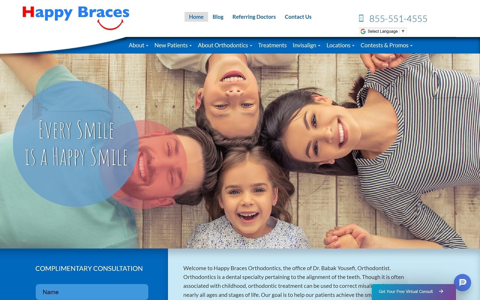
The Happy Braces orthodontic website projects a lighthearted feel for visitors who are exploring options for orthodontic treatment in the Southern California area. In a region that is dense with competition, online orthodontic marketing requires that practices represent themselves in a way that sets them apart from the rest. For this site, we took a less serious approach, instead of playing off of the themes found within the practice name and logo.
The home page includes plenty of smiling faces, easy-to-understand terminology, and multiple navigation points from which to explore various sections of the website, including the types of services offered at Happy Braces. The remainder of the site expounds upon the science of orthodontics, the various types of treatments, and how new patients can schedule a first-time consultation. At the request of the practice, we also included a special page dedicated specifically to contests and promotions available to new and existing patients.
Use of Colors
![]()
The Happy Braces practice logo is red and blue. Since these colors contrast well against each other and are already a foundational component of the practice’s brand, we carried them through the website, using them for headers, navigational buttons, and in sectional backgrounds. We even considered these shades in our selection of header images, which have subtle shades and undertones that match the website theming.
Analysis of Design Elements

This website is built upon a full-width background with a welcoming header that includes scrolling images of people with beautiful, happy smiles. A gentle curve bends into the header, softening the website image. A traditional upper menu bar is modernized with responsive tabs that come to life when selected. We also implemented the same responsive features in navigational buttons throughout the home page, whether they change to another color or seemingly ‘bounce’ forward off the page.
Marketing Aspect
This website does not waste time converting visitors into new patients. An appointment request form is spotlighted near the top of the home page, along with special tools for referring friends and obtaining treatment financing. For visitors who do not speak English, a translation feature is integrated into the site, allowing for marketability to a broader demographic. We also included the logos of professional organizations the practice is affiliated with, as well as an integrated blog roll featuring the latest posts. Finally, we included interactive maps to each of the practice locations, as well as the social media account links for each of them.

Image the Website Represents
Per the practice name, this website has a ‘happy’ and jovial image without appearing too juvenile. It appeals to physicians, adult patients, and the parents of children without seeming too uptight or intimidating. Overall, our goal was to create a custom orthodontic web design that strikes the ideal balance between credibility, experience, and friendly service.
Childrens Happy Teeth Website Designed by Optimized360