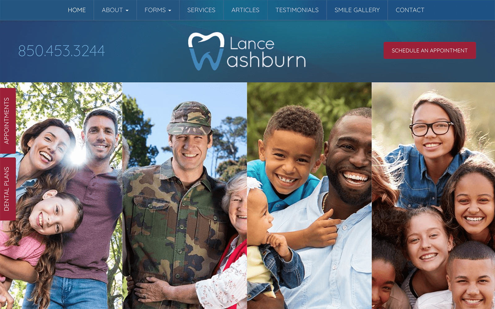
Dance Washburn Dental, located in Pensacola, Florida, is dedicated to providing the most advanced and up-to-date dental care in a comfortable and caring environment. We wanted to build a custom website design that helps celebrates these distinctions and differentiates them from other local dental practices within the area.
Overview of Design
When you enter the home page for the first time, you are immediately greeted with our rotating image gallery along with a button to schedule an appointment. We opted to go with a full-length layout rather than the traditional website design with marginal white spaces to provide the site with a professional and modern feel. The navigational menu also has drop-down elements for additional information about the office staff and services offered. Making a lasting first impression is important. We made sure to highlight the team’s mission statement and a rotating testimonial gallery on the home page. We rounded out the home page with a form to contact the office as well.
Use of Colors
For this website, in particular, we used red and blue to complement the white background. Not only does this give a sense of unity for the patients, but also gives a subtle hint of patriotism. We also incorporated a nature-related background on most of the images on the website as well.
Red is primarily used to highlight the call to action buttons to add a sense of urgency. Blue is not only synonymous with medical care but also helps create a sense of hope. Red and blue work well in combination with each other to complement the overall elements of design.
Analysis of Design Elements
The overall design of the website was made to be smooth and responsive while remaining accessible. We highlighted the call to action buttons for optimal reader engagement. We also modernized the website by featuring rich special effects. The well-organized navigation bar features drop-down elements; the testimonial gallery rotates with our parallax feature. We also went with Sans Serif font instead of the typical Times New Roman or Arial font to depict trustworthiness and approachability.
Marketing Aspect
All the images and elements of design are marketed towards a family setting. We made sure that all the images on the site were family-friendly, balancing fun with professionalism. The smile gallery features before-and-after photos from the office to show the different type of results that patients can expect from the practice. Being unable to contact Lance Washburn Dental will never be an excuse for any web visitor! We also included the office’s contact information on the top banner of each web page as well!
Image the Website Reflects
The website represents the unique and quirky attitude of the dental team, balance patient comfort and security with unity and professionalism. The patriotic colors and square borders that hold the site together give a sense of hope and safety for incoming patients. There is also a hint of humor on the site for the children – the about page features the team all wearing fake mustaches! This gives the impression that the practice is laid-back, approachable, and dependable.
Lance Washburn Dental Website Design by Optimized360
