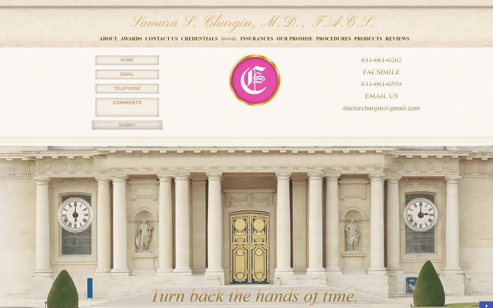
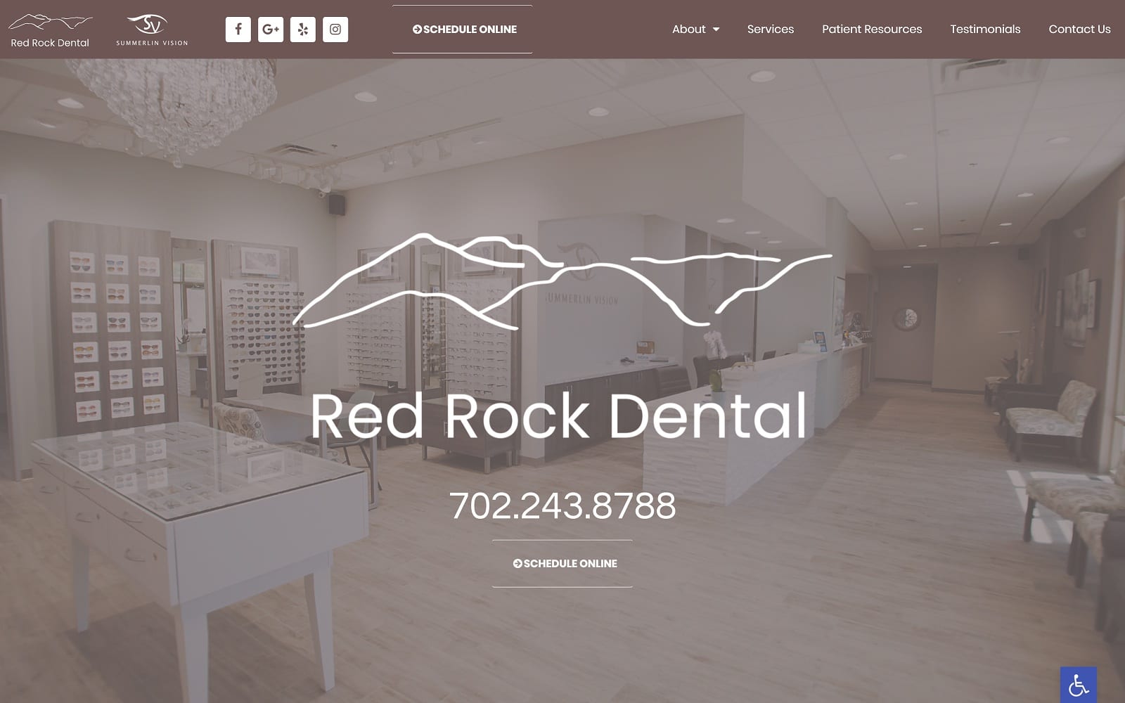
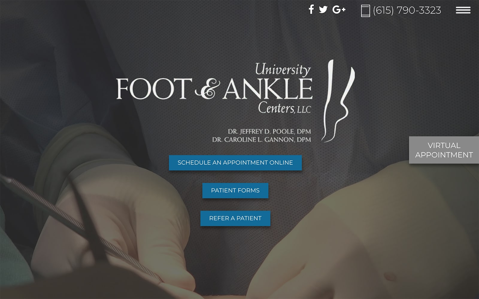
Pure elegance is captured in this design, and we were proud to work with Dr. Samara Churgin to make this one our own. The play of color, the overall design, everything about it displays a sense of refinement and dignity. Dr. Churgin wanted a website that immediately set her potential patients to dreaming of a brighter future with a beautiful exterior. Visitors are immediately greeted with the ability to connect and schedule an appointment through a variety of methods.
Overview Of The Design
The design concept was intended to bring out a bit of the creator’s personality and cultivate a sense of exceptionalism. From the gold tones to the subtle marble patterning there is a certain richness and upper-crust feel to it. Contact information is immediately presented, and that target of refinement is present in everything from the color choices to the words themselves (note the use of Facsimile instead of Fax). A client that’s speaking to an affluent population.
Use Of Colors
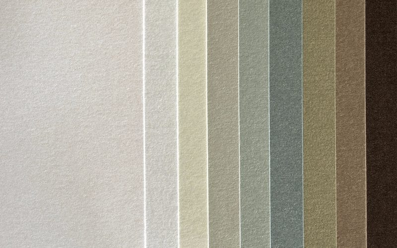
The colors used in this theme were carefully selected, from the tans and beige that create a feeling of reliability and consistency to the lighter tones that present the practice as a professional affair. Everything in this website flows together, from the header to the initial image you’re presented with. That sharp splash of magenta? It’s there to capture your attention, lift your mood, and get visitors motivated and excited about the journey you’re about to go on. As visitors move down the page, a light lavender tone is introduced that provides a gentle inspiration and peace guides the visitor on.
Analysis Of Design Elements
Clean lines, accessible information, immediate presentation of contact information. The elements involved in the design of this website are straightforward and immediate. Come in, get your treatment taken care of, and leave looking better than you arrived.
Marketing Aspect
From the moment a visitor lands on this website they’re being directed to make connections and get started. A comprehensive social media campaign is run by the client, and the links are prominently displayed in the first few moments after a visitors arrival. The opportunity to be contacted by the clinic (and get their email on your mailing list) are presented, along with a prominent set of links at the top to information about their practice and the physician.
The Image this Website Reflects
Refinement, exceptionalism, professionalism, all wrapped up in every design choice made by Dr. Churgin and the team that worked with her. This website is aimed at those who are looking to create a better life and experience through plastic surgery, and the images selected for the procedures reveal this. “You can look better, you can be better” is stated in every piece of the design of the website. For companies looking to bolster the dreams and imaginations of their visitors, the design is perfection, especially suitable for spas, aestheticians, and cosmetic surgeons.
Churgin Plastic Surgery Plastic Surgeon Website Designed by Optimized360
