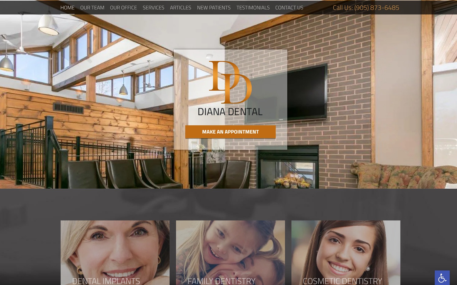
The perfect blend of rustic and refined, the Diana Dental website combines elements targeting a down-to-earth clientele that is looking for comfort in their dental practice. The warmth of the fireplace and the stability of the brick send a subtle message of reliability while the wooden backdrop is grounded. Everything about this site will appeal to those who like their dental clinics to feel just a touch less clinical and prefer a warm home-like air to their office visits.
Overview of the Design
The overall design of this website is blended, combining soothing dark tones with uplifting brown-oranges to help capture the eye. They know that customers these days are shopping around, and they want to put their best foot forward, evident in the slide-show testimonials available on the first page. They want their customers to feel comfortable, not just during their visit to the office but in their peace-of-mind that can only come from word-of-mouth. The short bio and introduction presented by Dr. Stephen Diana indicate that the staff wants to make their relationship with their clients a personal one, introducing themselves almost immediately with an image the presents a warm, friendly smile.
Use of Colors
Warmth and welcome can be seen integrated throughout this website’s color palette. There’s something about wood-grain that speaks of home and reliability, while the gray tones are used to present professionalism and facts. It’s no mistake that the bio is displayed on a background of earthy wood-grain while the services are shown on a more businesslike gray. The client is trying to display a combined image that says “We know our business, but we also want to know our patients.”. To the right market, this site is a perfect selection.
Analysis of Design Elements
The feeling of ‘small mountain town’ is present throughout this website from top to bottom. The imagery of the office itself, the stone grays and natural-grain wood, all of it has that down-to-earth feeling you get when visiting a ski-lodge. Throughout the website you’re getting suggestions that a visit to this office is a break from your busy day, a moment to stop and do a little self-care in the middle of what may otherwise be a busy day. Nothing about its design feels rushed or hurried, making it appropriate for sleepy small towns and bedroom communities. Don’t underestimate its value in a more substantial population where a promise of a breather in a busy day might be a welcome proposition.
Marketing Aspect
The marketing angle of this website is a no-pressure environment operating at a relaxed pace. There’s a comprehensive set of information available, but the lack of pressure is evident when you consider the presence of the links at the top of the page. Their size and color are clearly and deliberately understated; first-time visitors are intended to take in the site as a whole, while the links are there primarily for the convenience of return visitors. Once the visitor has taken a leisurely stroll through the website, they’re given a gentle call to action (Make an Appointment) with a nicely laid out form they can easily complete. If they’d prefer to call or visit the office the number and address are presented again at the bottom.
The Image this Website Reflects
Home, comfort, relaxation. It’s an unexpected combination for a dentist’s office, but it’s not going to cause any nervousness or sense of pressure in the visitor. This site is wanting patients to feel welcomed and maybe a little enticed to enjoy a day at the dentist. The staff, especially the dentist himself, is looking to get to know you and form a professional relationship that will be developed from mutual respect. Is that a lot to get from a simple site? Maybe, but that’s what excellent design services will get you.
Diana Dental Designed by Optimized360;Diana Dental provides a wide range of dental services but Dr. Diana has a special interest in implant dentistry. He is a member of the International Congress of Oral Implantologists, the Royal College of Dental Surgeons of Ontario, the Canadian Dental Association and, the Academy of General Dentistry. In a world of changing technology, he keeps up with constant changes in dentistry by taking continuing education courses on innovative techniques and materials in dentistry.
Features of this design are:
– Advanced slideshow
– Fillable online forms
– Specialty content


