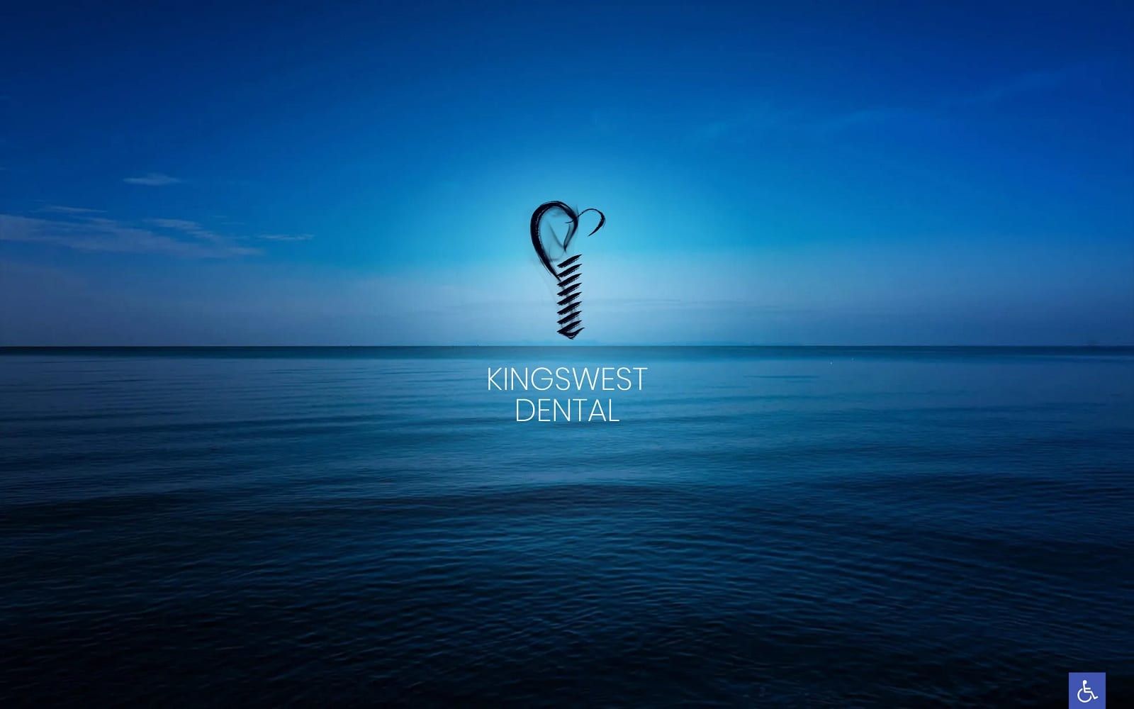
Kingswest Dental composes its web design off of the tranquil and majestic background of deep, ocean blue water, working with monochromatic colors such as bright blue, dark blue, and white to entice its users. Bright blue takes on relaxing qualities and brings freshness and light to its headers, action buttons, and service icons. Dark blue helps to compliment the bright blue, adding depth and versatility to its design. Both these colors center around its hero image, which depicts calm ocean waters that promote relaxation and nourishment. White supports the website’s use of color by accenting its text and action buttons, allowing for its content to be easily readable and comprehensive. The website’s choice in imagery nurtures these colors, all containing similar hues that promote the business’s sense of responsibility, trustworthiness, and authenticity.
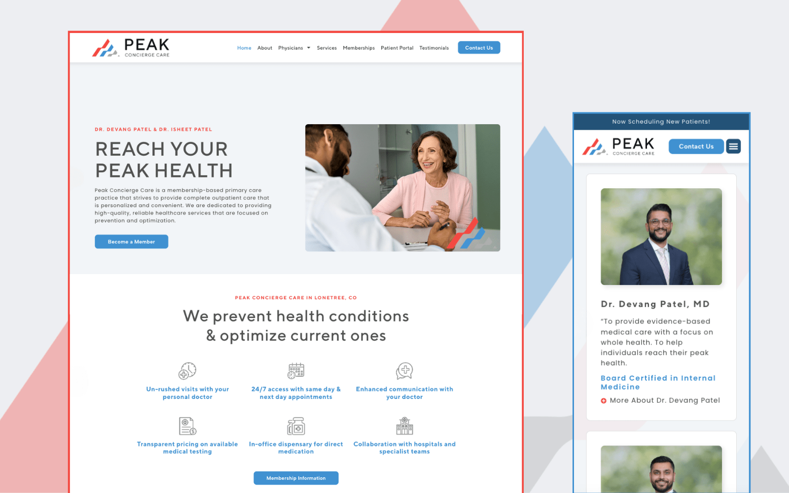
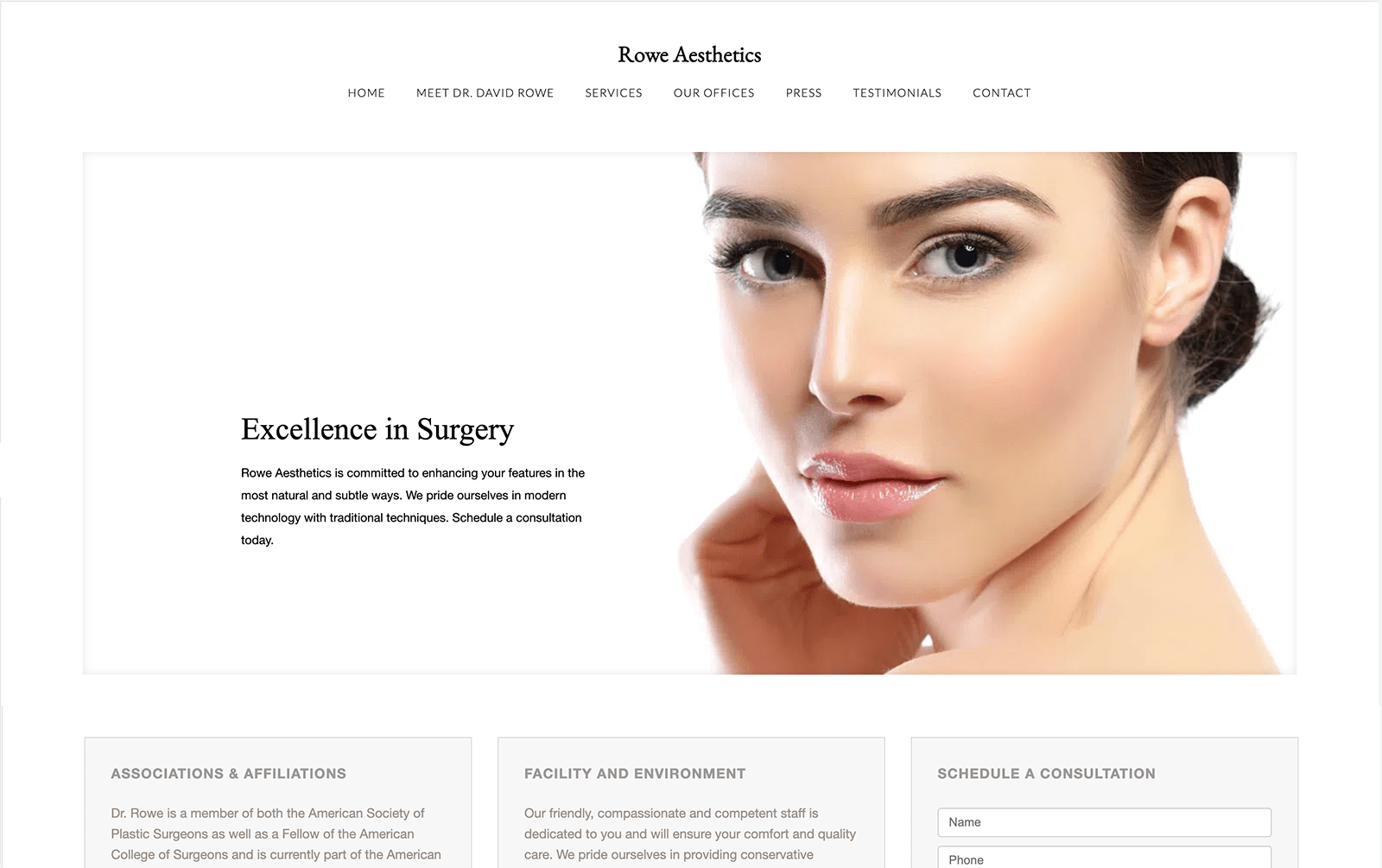
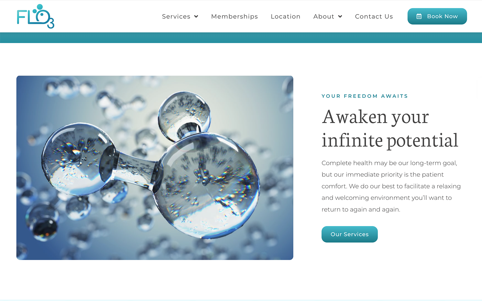
Kingswest Dental focuses on keeping its website honest, dependable, and sensible by first beginning with a large, solid blue header, which contains the company logo, phone number, and main menu services. When shrunk, the header’s main menu adjusts to a hamburger menu for easy readability. Its hero image, the center focus of the website, promotes the website’s introduction text, describing its services, and below the hero image, visitors can interact with its featured services and an action button for scheduling an appointment. All action buttons when hovered over-expand and each of its various sections contain vast amounts of action buttons to direct its users to multiple parts of its website. Many chapters also include decorative icons for a more comprehensive experience. At the footer, visitors can find the dental website’s click-to-action phone number, select main menu services, and the accessibility tool.