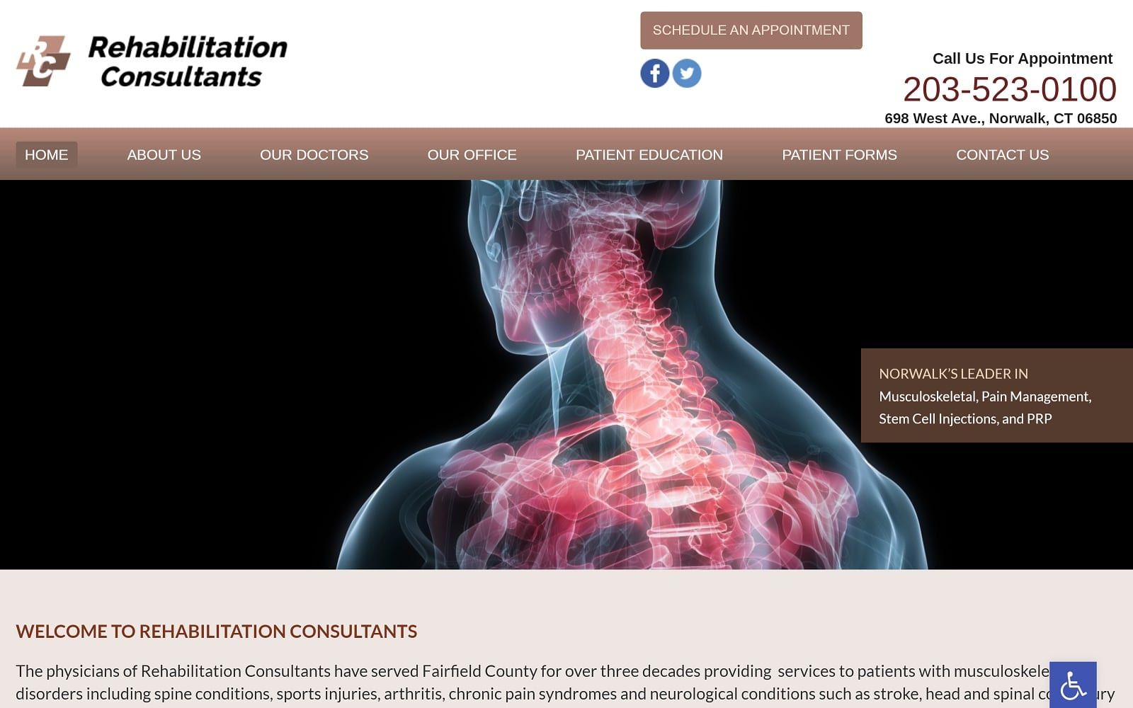

Pain Management engages its web users with universal color schemes that many modern people would associate with medical care; dark blue, bright red, and white. Traditionally, these colors are clear outliers for medical fields because of their associations with their terminology, such as code blue, code red, etc. By incorporating these colors into their design palette, an immediate sense of trust, reliability, and authority in the medical field. Pain Management, however, uses red sparingly, only using it in click-to-action links and logo associations, while the blue is used more heavily to ease and calm the user. Dark blue aims to stabilize the user, bringing a sense of security and dependability to the forefront of their image, while red works as the action color, using its intensity to attract the user towards the essential parts of the website.
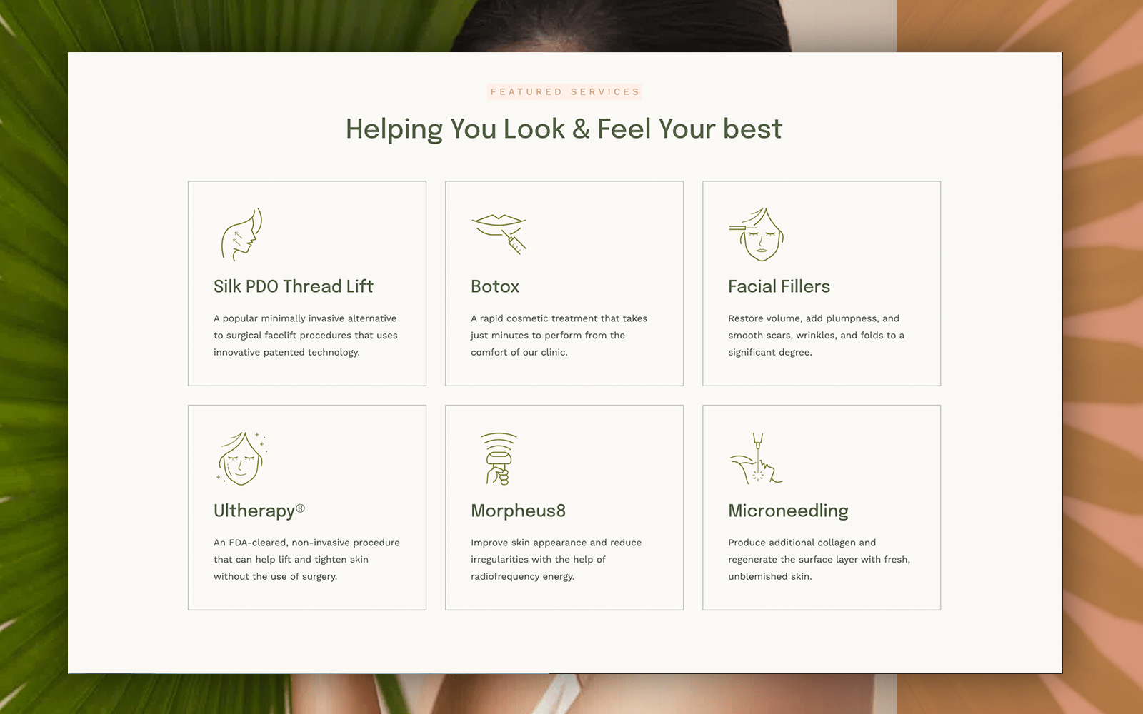
Pain Management establishes a clean surface for the user to interact with, using a white header offset by a blue border to label its business logo, main menu services, and action button. Its header also contains a click-to-action link for its service number, and its main menu services also contain social media icons for engagement. Its hero image matches the color scheme and aims to unify the colors, advertising its associated memberships and profession. Underneath, its services can be found with a panel layout, and underneath the panels, testimonials can be seen. At the footer, mission statements with a profile for the business’s head doctor can be found, as well as other relevant contact information including its social media icons, click-to-call service number, and office hours.