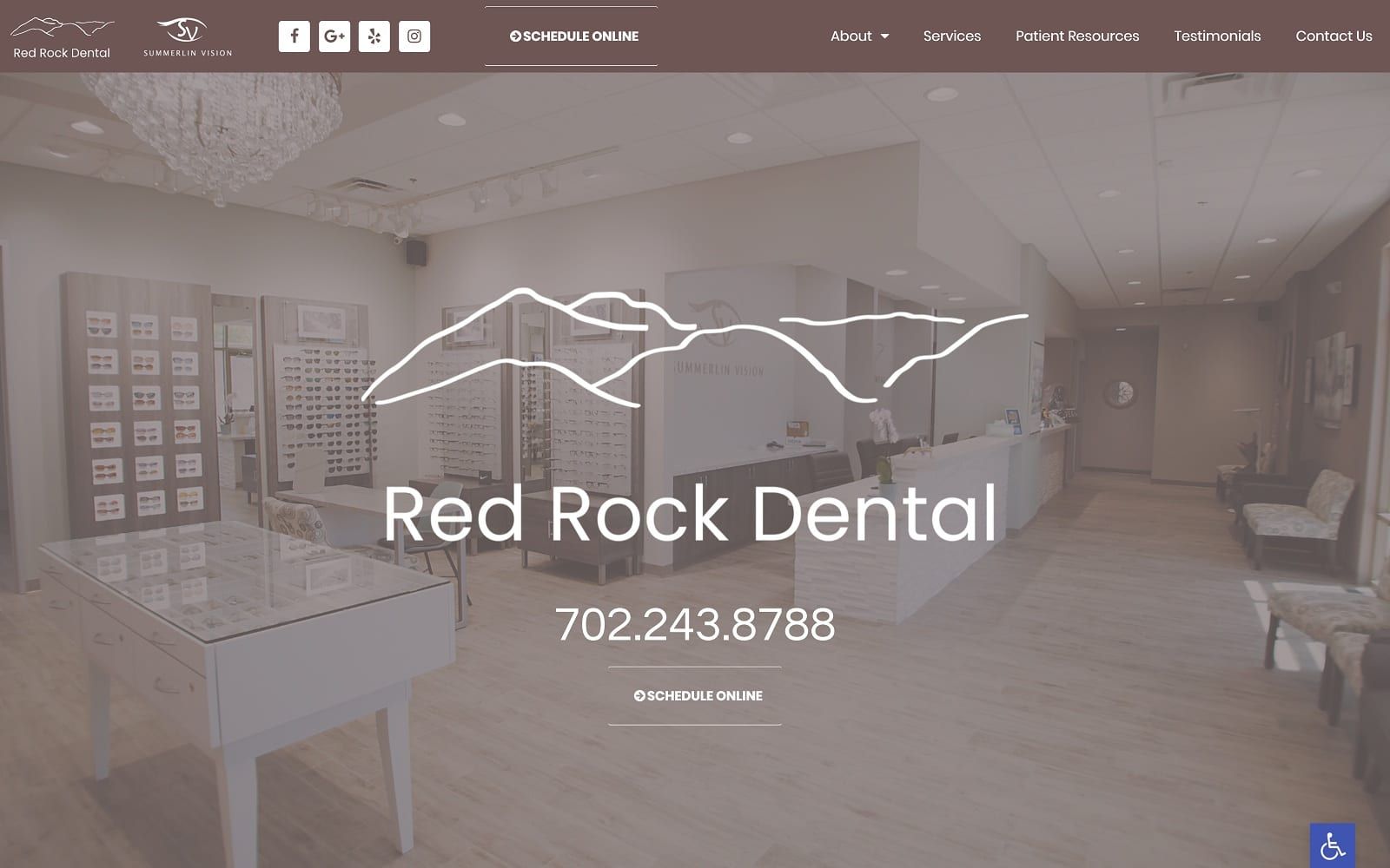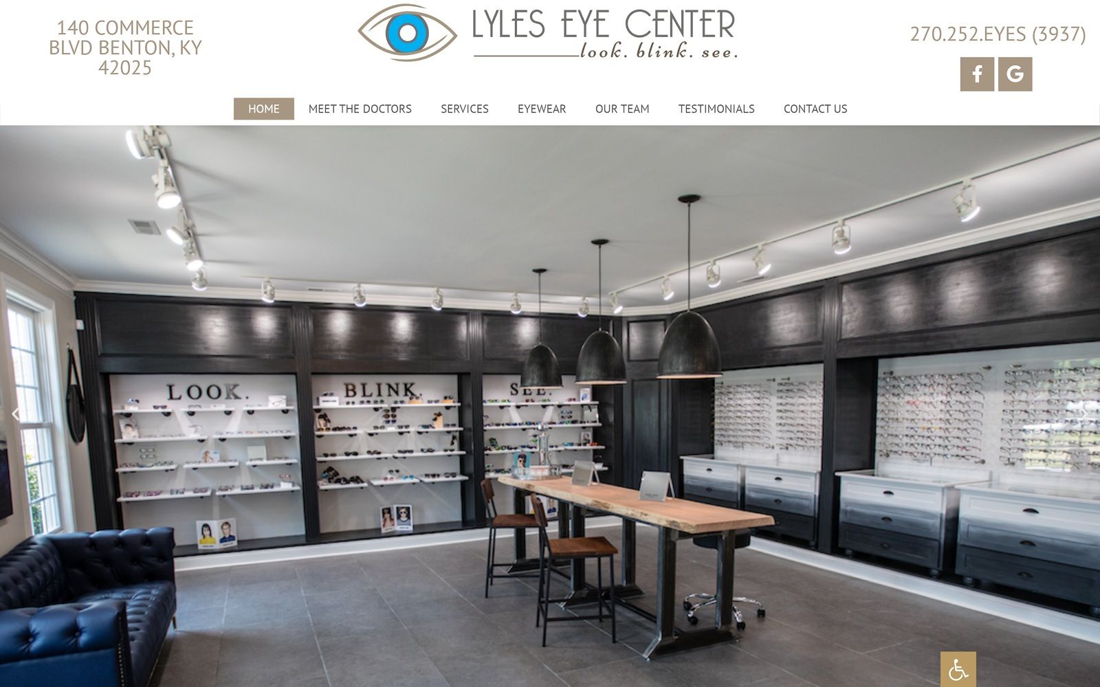
Lyles Eye Center invites its users with a simple, pleasant and familiar setting, appealing to its users by working with a color scheme of cool-gray brown, black, and white. As the primary and action color, cool-gray brown produces calming effects, neutralizing its vibrant white background and adding accents to the black. While normally used as a neutral color for the place of more bright, vibrant hues, the cool-gray brown instead takes the warmth of its brown undertones and emphasizes those warm qualities throughout the website. Because both black and cool-gray brown are incorporated sparingly into the web’s design, its clear background adds room for the website’s choice in imagery to create an impact for its users. By displaying its services and line of work through animated images, videos, and clean photography, Lyles Eye Center creates a delightful, family-friendly space for its users.
Lyles Eye Center introduces its website with a large, encompassing header, containing its essential contact information, which includes its business logo, click-to-call service number, and main menu services. Its main menu services shrink down to a hamburger menu when interacted with, and its hero image operates through a slideshow widget, using dolly zoom transitions to add slow, calming effects to its imagery. Throughout the optometry website, users can interact with arrow icons that allow the user to scroll through the page to each section. Each section also contains active hyperlinks and semi-flat panels for constant engagement. At the footer, users can find the HIPPA secure form, click-to-action location address, service number, and email address, along with the accessibility tool at the right lower corner of the website.