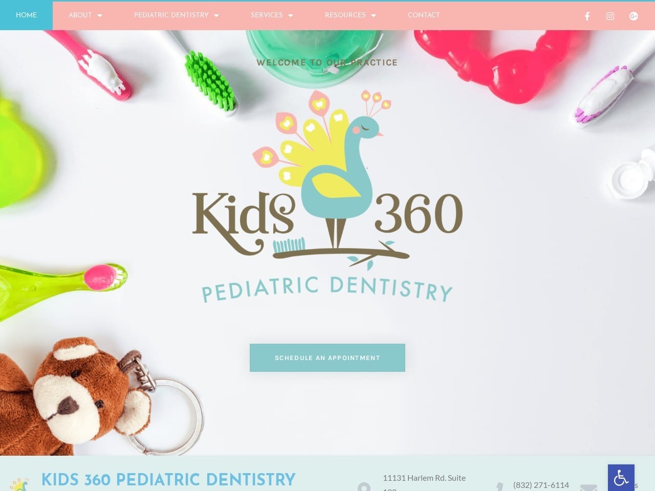
Running a business in the modern marketplace without a website is like operating without a storefront, and that’s as true for pediatric dentistry websites as it is for a local computer shop. Designing websites for pediatric dentistry can be challenging, requiring a broad set of skills across multiple disciplines to accomplish. From choosing the site’s color palette to designing a striking and memorable logo, there’s much to decide before you start. The best pediatric dentistry websites combine beautiful design with functionality and security. For any business in the medical industry, HIPAA security must be integrated into its design.
Today’s patients seek features that meet their on-the-go lifestyles, such as click-to-dial and direct-to-map functionality that gets them in touch with your office with a single click. Mobile responsiveness is also key so the site can be easily viewed on desktops and mobile devices alike. Combine these elements with downloadable patient forms, online patient registration, and HIPAA secure contact points to schedule appointments without a phone call. You’ve got a site that will meet expectations.
2023 PEDIATRICIAN DESIGNS
1. Coastal Kids Dental
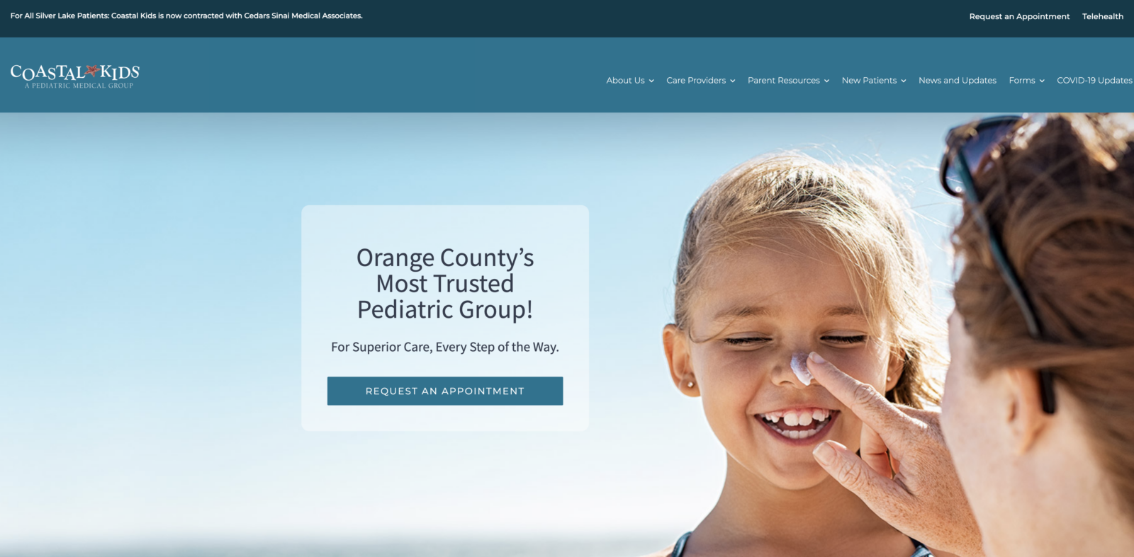
A blue design with nice imagery. Very welcoming and friendly looking. Clean navigation and straightforward layout.
2. Hoag Medical Group for Children
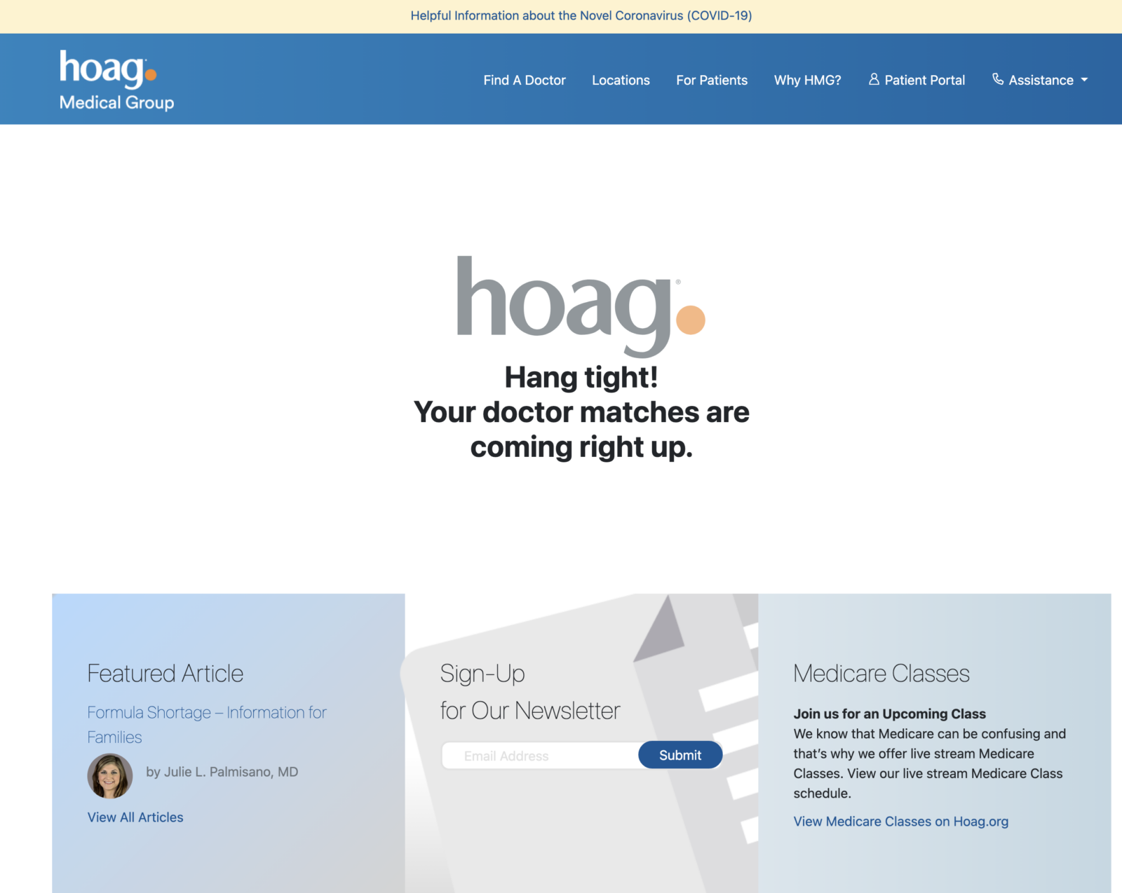
The children’s department and its doctors at Hoag. A light blue background with a nice layout. The site lacks some sophistication in some aspects, but that gives it a more welcoming feel, especially for a large medical group.
BEST PEDIATRICS WEBSITES OF 2022
Below we’ve included a collection of websites that accomplish these goals while retaining their unique character.
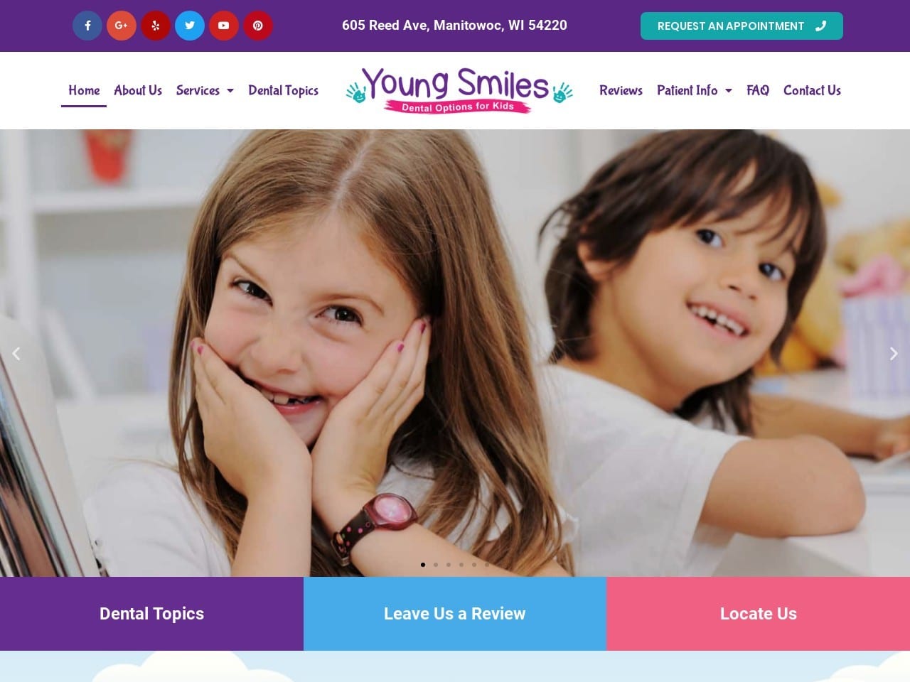
1. Young Smiles
Aesthetics
There’s no doubt in a visitor’s mind that this clinic is dedicated to caring for children’s dental needs. The vibrant color scheme combines with a slide show of relaxed parents and smiling children to show that this clinic understands the needs and concerns of its patients. The abundant use of color continues to be seen in the “Featured Services” section, where each button is a different color and marked with a playful piece of line art. The logo for the clinic takes this same approach to be memorable and relatable to its clientele with a crayon scrawl font, smiling handprints, and a colorful banner.
Functionality
Ease of use and convenience are things that appeal to parents trying to fit caring for their children’s dental health into an already busy day. Young Smiles shows an awareness of this by providing direct-to-map links, a full suite of social media channels, and a request an appointment button all immediately available in the header. The About Us and Office Tour section begins building rapport by introducing visitors to the staff while familiarizing them with the office through the use of stunning photography. The footer contains comprehensive information about doing business with the office, including office hours, direct-to-map functionality, click-to-dial, and direct-to-email links. The reviews page provides insight into the experiences of their existing patients from multiple platforms and provides an opportunity to leave one of your own. Patients looking for information without picking up the phone can use the HIPAA-compliant form provided to Book an Appointment or ask questions.
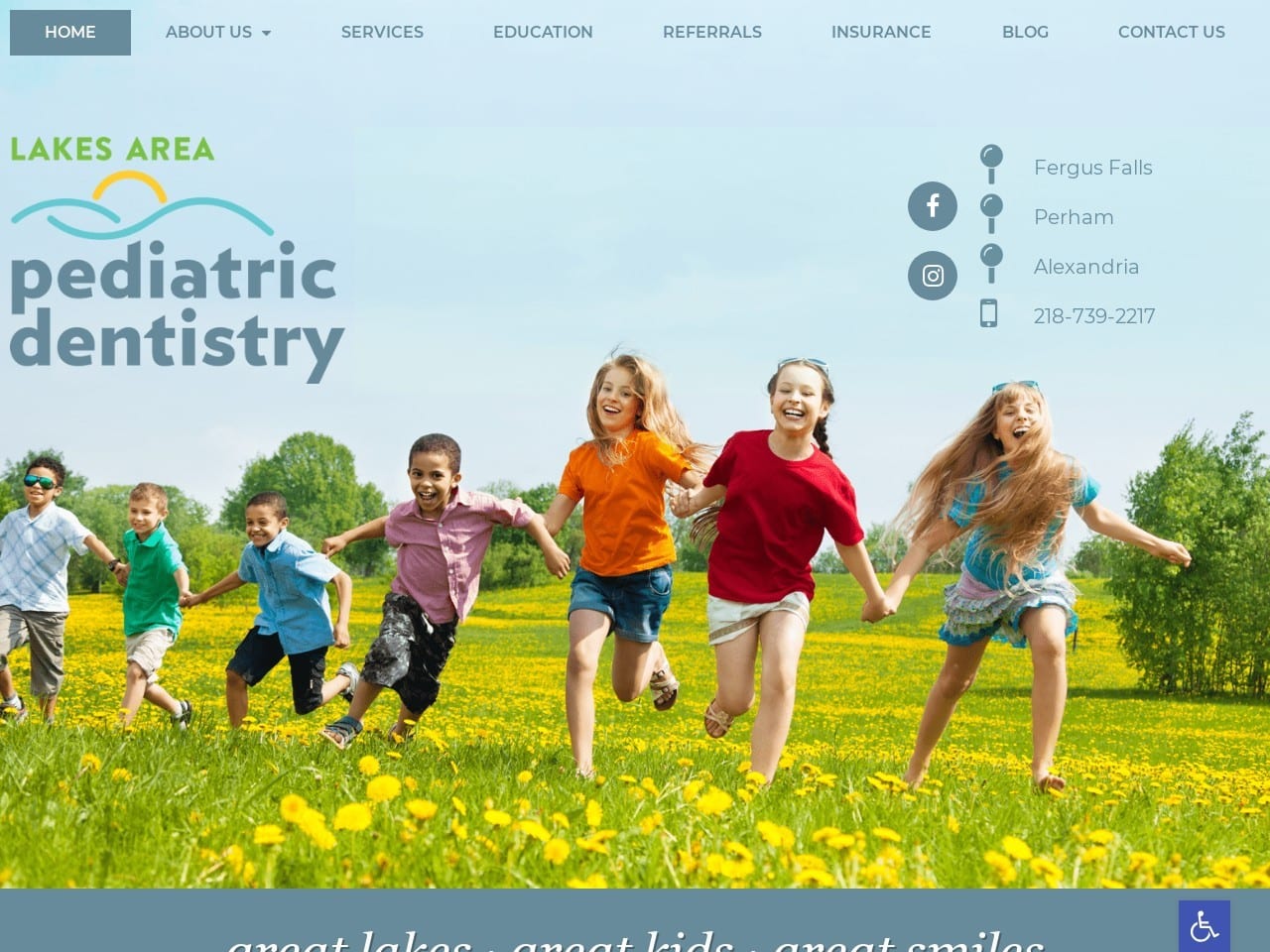
2. Lakes Area Pediatric Dentistry
Visit Lakes Area Pediatric Dentistry
Aesthetics
Lakes Area Pediatric Dentistry opens with a bright blue vista of children playing in a green field overflowing with yellow flowers. This uplifting vision of children also incorporates the color palette of the clinic and its logo. The logo’s design is recognizable and memorable while incorporating local elements to tie it to the community. The light blue background throughout the rest of the site is calming and uplifting, showcasing the images of cheerful children free of dental pain or concerns. Imagery is used sparingly but effectively throughout the site, from the excellent picture of the doctor on the Meet the Doctor button to the indicative imagery used for the Education and Services button.
Functionality
Direct-to-map functionality is incorporated into the hero image in an intuitive but unobtrusive way, with each of the clinic names serving as a hyperlink directly to google maps directions to the site. The phone number underneath the location names has click-to-dial functionality that makes it simple for mobile users to reach out to the clinic or get directions. The social media buttons for Facebook and Instagram make connecting with their social media channels just as easy for desktop users and mobile users alike. An emphasis is placed on patient education at Lakes Area Pediatric Dentistry due to their focus on children developing healthy habits. Still, also as many of their patient families include new parents. Insurance information is also clearly available to help ease the worries of parents wondering if their children’s needs will be covered.
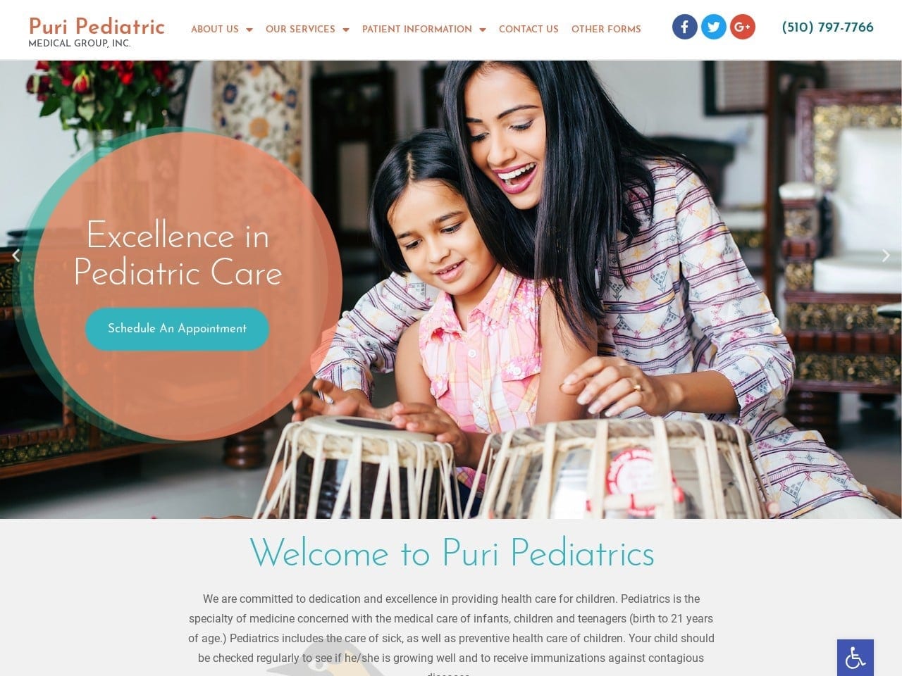
3. Puri Pediatric Medical Group, INC
Visit Puri Pediatric Medical Group, INC
Aesthetics
Bright imagery featuring families from ethnicities that comprise the primary clientele of Puri Pediatricians and the community it serves. The soft tones in its color palette create a soothing appearance, with blue evoking a sense of calm tranquility and beige bringing a neutral warmth to the site. These colors are used throughout the site, appearing in the design of the service buttons that roll over from a white and blue image to a motivating orange prompting visitors to learn more. Imagery is generously used throughout in combination with text to draw the eye and attractively convey information.
Functionality
Puri Pediatric immediately starts meeting the needs of its busy patient base by providing its phone number in the header alongside its three social media channels. Patient forms are included in a downloadable format to make it easy for the parents of patients to prepare for their visit to the clinic. A bright blue “Schedule An Appointment” button adds to this sense of convenience. The accessibility tab prominently featuring the handicap logo makes the site accessible to many patients. A scrolling selection of testimonials aids new visitors in researching the clinic and determining what type of experience they can expect during the visit. In the footer of the page can be found a direct-to-map function, as well as click-to-dial integration and a HIPAA-compliant form for reaching out to the clinic for an appointment.
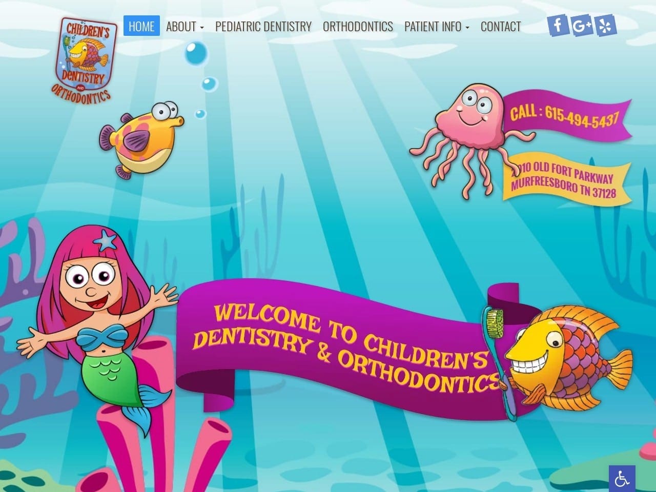
4. Children’s Pediatric Dentistry
Visit Children’s Dentistry And Orthodontics
Aesthetics
Colorful website design combines striking colors to create an experience that’s useful for parents and a joy for younger children to see. The aquatic motif of the website can help alleviate the worries and concerns of young children, and images of the clinic make it seem like a fun place for them to be. The site’s buttons integrate bright colors and whimsical icons to keep the tone consistent and give children positive feelings about their dental visits. The aquatic theme carries through to the rest of the site, including the About Us page, where staff members are introduced and additional images of the clinic. The site’s custom logo uses this same motif, combining dental themes with fish and bright primary colors for an unmistakable icon.
Functionality
Children’s Dentistry And Orthodontics website incorporates immense functionality into its whimsical website design. It starts with three links to the clinic’s social channels and includes click-to-dial and direct-to-map functionality in the action hero image. The imagery throughout the site does more than make it a visually fun experience; it also serves to help get children excited about their visit to the dentist. Busy parents will appreciate the HIPAA secure form that lets them contact the clinic for an appointment.
5. Frontier Kids Dentistry
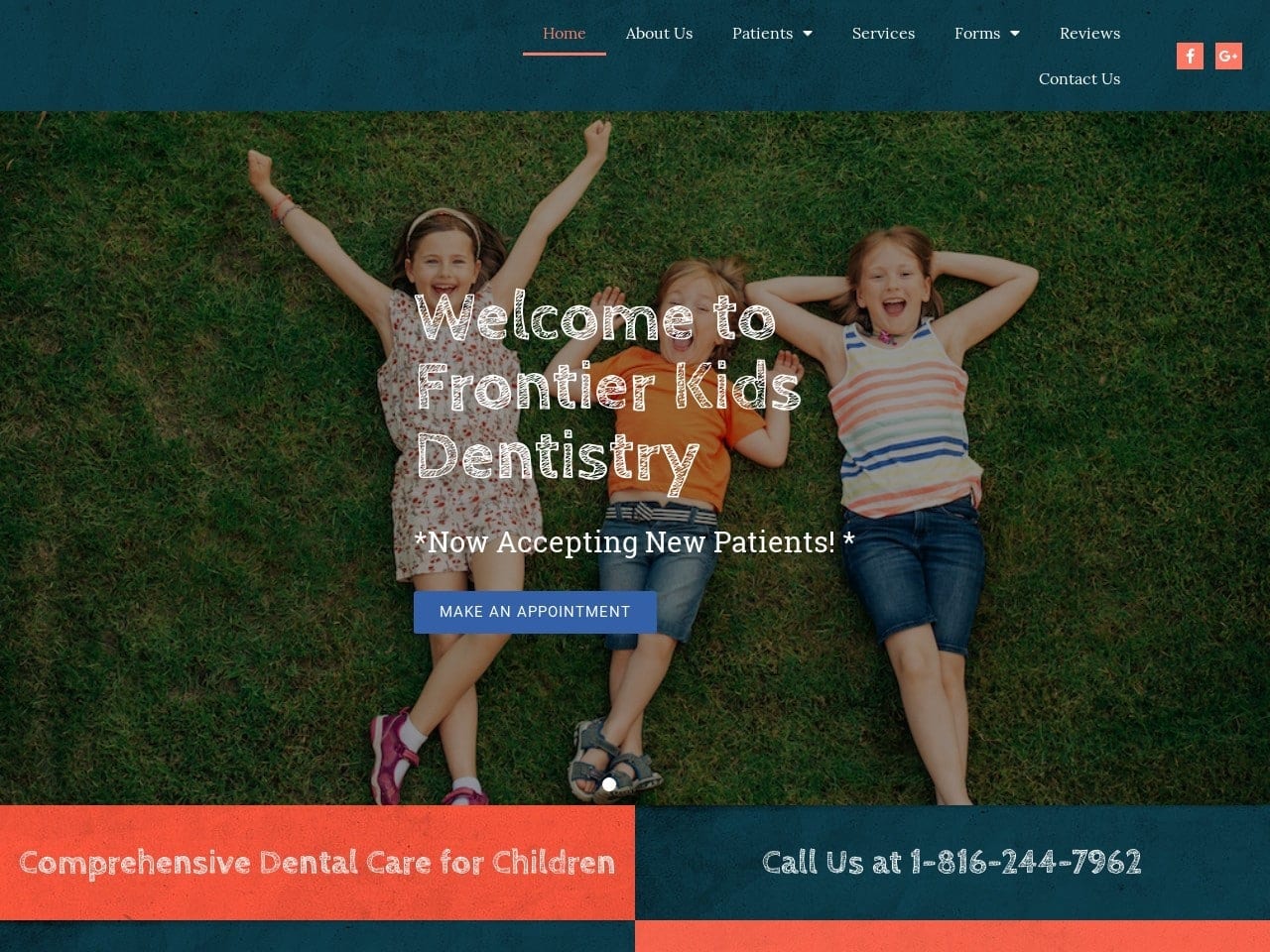
Aesthetics
Frontier Kids Dentistry uses a combination of color and texture to create a website that is visually down to earth in blue and orange. It’s not a common color combination, but properly used it can create a striking website that’s easy to read and navigate. The logo for Frontier Kids Dentistry is a brightly colored multilayered tooth combined with blue and purple text, a clearly eye-catching image that stands out in any correspondence. Blue and orange take turns throughout the site as background for text and action colors. A stunning example of orange and blue working together to draw the eye can be seen in the service navigation buttons, where blue buttons are marked with orange icons.
Functionality
Frontier Kids Dentistry doesn’t shirk on functionality, starting the page with a striking “Make an Appointment” button in white on blue and two social channel links with white on orange design. The site is also perfectly designed with a mobile-responsive design to adapt to varying screen sizes. In addition to the comprehensive menu, four immediate areas of interest to visitors are made easily reachable, including click-to-dial calling, emergency services information, and a list of the accepted insurances. Also included in the site’s design are downloadable patient forms and referral forms for dentists and physicians.
6. South Bay Kids Dentistry
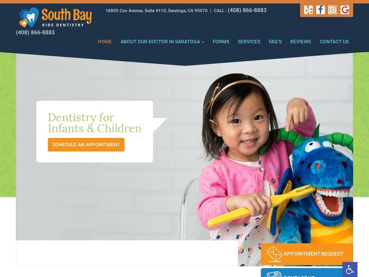
Visit South Bay Kids Dentistry
Aesthetics
Playfulness is central to the impression given when landing on the South Bay Kids Dentistry website, as is evident from the choice of image. The icon for the clinic incorporates the site’s blue, orange, and white palette to create a striking logo that will stand out in correspondence. Smiling faces and playful imagery, such as paper planes, can be found to keep the content relative to their clientele. The appointment request, contact us, and direct-to-map functions are all ensconced in a shell of bright and cheerful colors to make them easy to find.
Functionality
From the first moment the page loads, visitors can dial the office with a single click or finger swipe. Connecting with the clinic for regular updates is a breeze, with four social media buttons worked into the header. The availability to fill out reviews using a secure online form ensures that patients always have a voice and that the clinic is always listening. Online patient registration forms make getting started with the clinic as easy as can be, and even patient referrals can be handled online without any trouble. As patients reach the bottom of the page, they’ll see a list of prominently displayed office hours and a direct-to-map function that will get them flawless directions to the clinic with a click.
7. Zoo Dental Centers For Kids And Parents
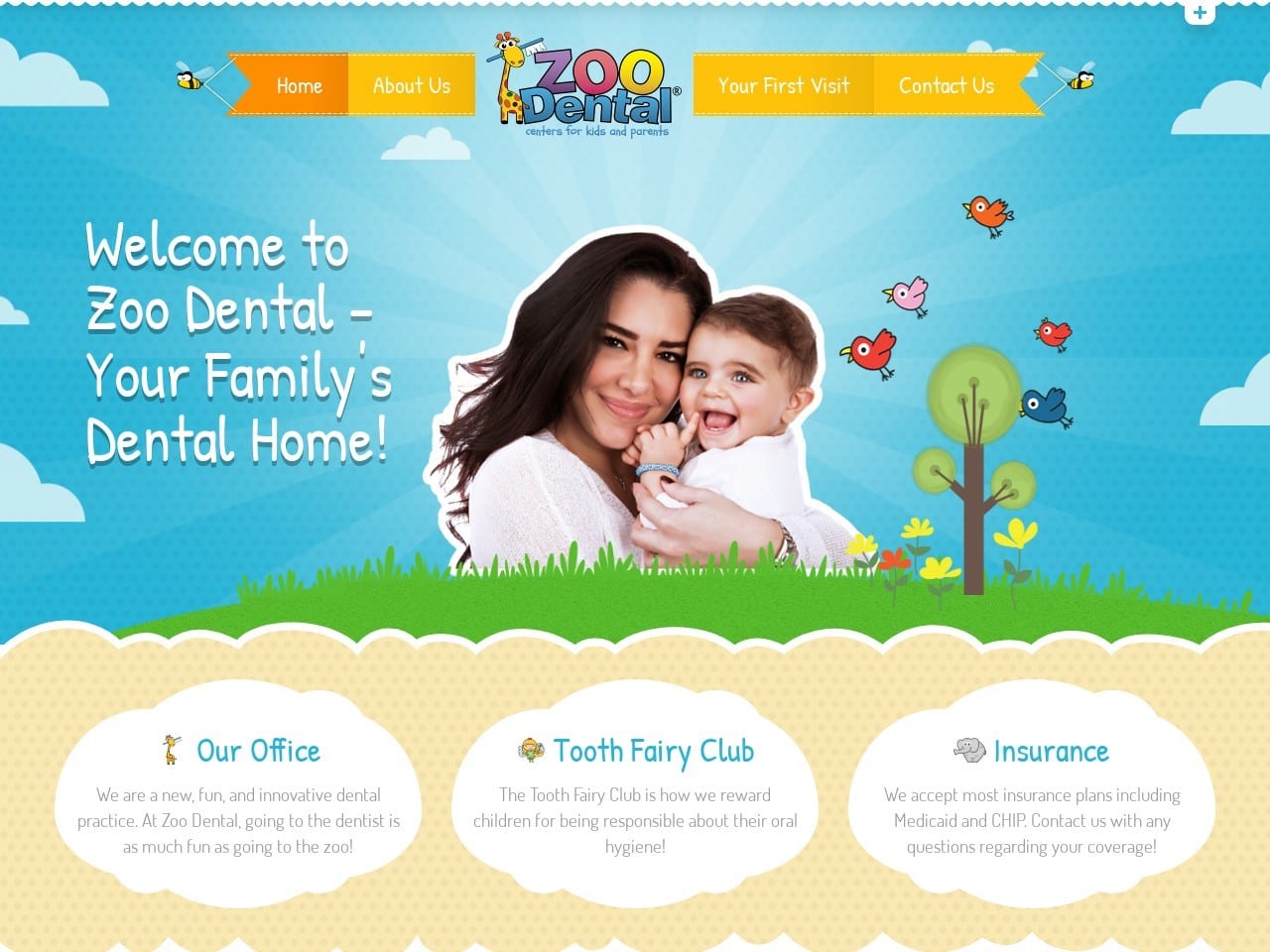
Visit Zoo Dental Centers For Kids And Parents
Aesthetics
Beautiful skies, happy animals, and billowing clouds are the central elements of Zoo Dental’s website design, with beige, green, and blue being the basis of its color palette. The use of engaging colors and kid-friendly imagery makes it clear this site is intended to ease the worries of parents and children alike. Orange and blue take center stage as action colors and attention grabbers for headlines and buttons alike. This style of artwork and whimsy is found throughout all portions of the site, from the About Us page to the Tooth Fairy Club, which encourages children to learn good oral health care habits. Images of the staff and clinic indicate that this same form of imagery can be found at their various locations, showing them to be a kid-friendly environment.
Functionality
The page opens with functions targeting new patients and encouraging them to make Zoo Dental their pediatric dental choice. It starts with a ‘Your First Visit’ tab that sends them to a page that gives information on how to prepare. The Contact Us section of the menu is split into three different locations, one for each clinic the website serves. Each page provides office hours, phone numbers, and addresses for each clinic so patients can reach out to them easily.
The bottom of the page presents a series of three links to social media platforms so patients can connect and stay up to date with the latest events and offers from the clinic. A small + sign at the top of the page opens a drop-down equipped with click-to-dial and direct-to-email functionality for ease of reaching out to the facility.
Conclusion
Every site listed above strives to accomplish the same goal, to meet their patient’s needs and make their relationship with your clinic easier and more convenient. Everyone manages to do so while presenting a website that stands out from the rest with a unique appearance that demonstrates the clinic’s personality. If you’re looking at building your website or hiring a team of professionals to do it, all of these have something to bring you on that road.
As you’re exploring other pediatric dentistry websites looking for inspiration for your own, be sure to keep a list of all the things you like, and don’t like, about those you’ve discovered. When it finally comes time to start putting your site together, this list will prove invaluable in tailoring it to your specific needs. Hiring a team of professionals is usually the best choice if you’re not having it built internally. Even hiring one for a consultation can get you a long way on the right track to a beautifully built and functional website.
Related Lists
- 7 Beautiful Cosmetic Surgery Websites
- 7 Modern Pediatric Dentist Websites
- 7 Amazing Endodontic Websites
- 7 Great Oral Surgery Websites
- 7 Best Looking Cosmetic Dentistry Websites
