Endodontists often have to work on their online presence even more than most specialties, such as establishing trust with their patients. Patients most often visiting the endodontist are more likely to deal with complex cases, including calcified roots, MB2 canal infections, and persistent endometrium damage, than normal root canals performed by a dentist won’t be able to handle.
1. West LA Endodontics
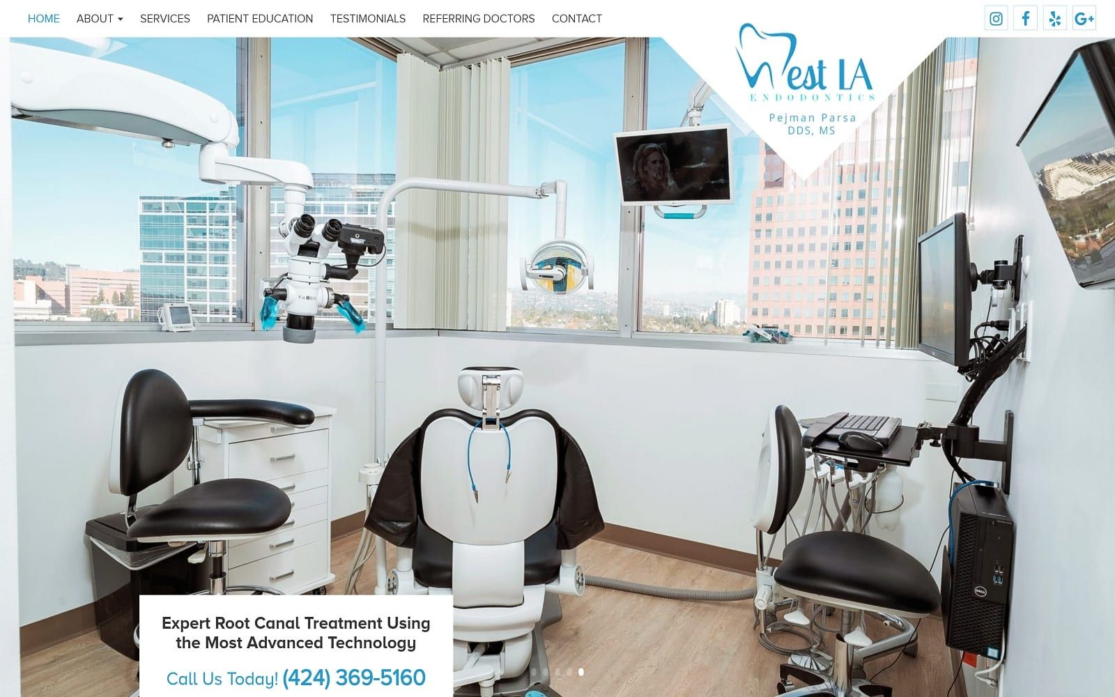
What We Love About West LA Endodontics: West LA Endodontics displays modern design combined with a California flair, using lush scenic views of Los Angeles to greet its viewers. From there, visitors can learn more about the practice, its endodontists, and other information and easily view it through clear-toned white and transparent special effects. Through minor touches of blue and gray, the website aims to provide comfort and compassion to its patients while also remaining true to its location.
2. Endodontist in Irvine, CA
Visit Endodontist in Irvine, CA
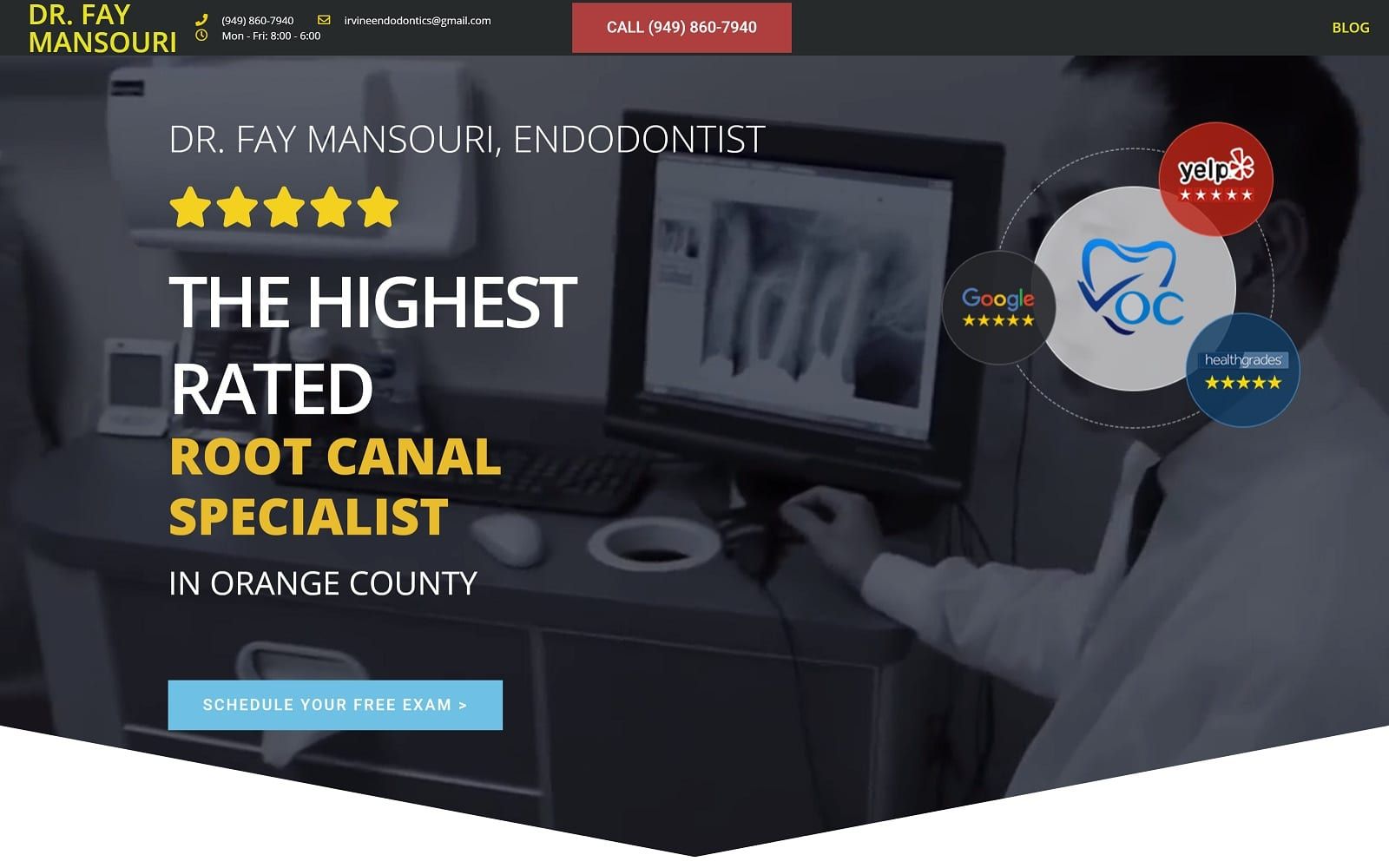
What We Love About Endodontist in Irvine, CA: Endodontist in Irvine, CA, uses interactive, modern elements that remain simple yet effective. Through the main color palette of white and blue, softer and transparent headers and separators are used throughout to align its content in the center. However, the header image uses black and lime green to continuously catch and lead its audience to the contact information and the dentist’s name. Overall, the homepage establishes its credentials immediately, giving confidence and assurance to its patients.
Find other great endodontists in Irvine.
3. Harkrider Endodontics
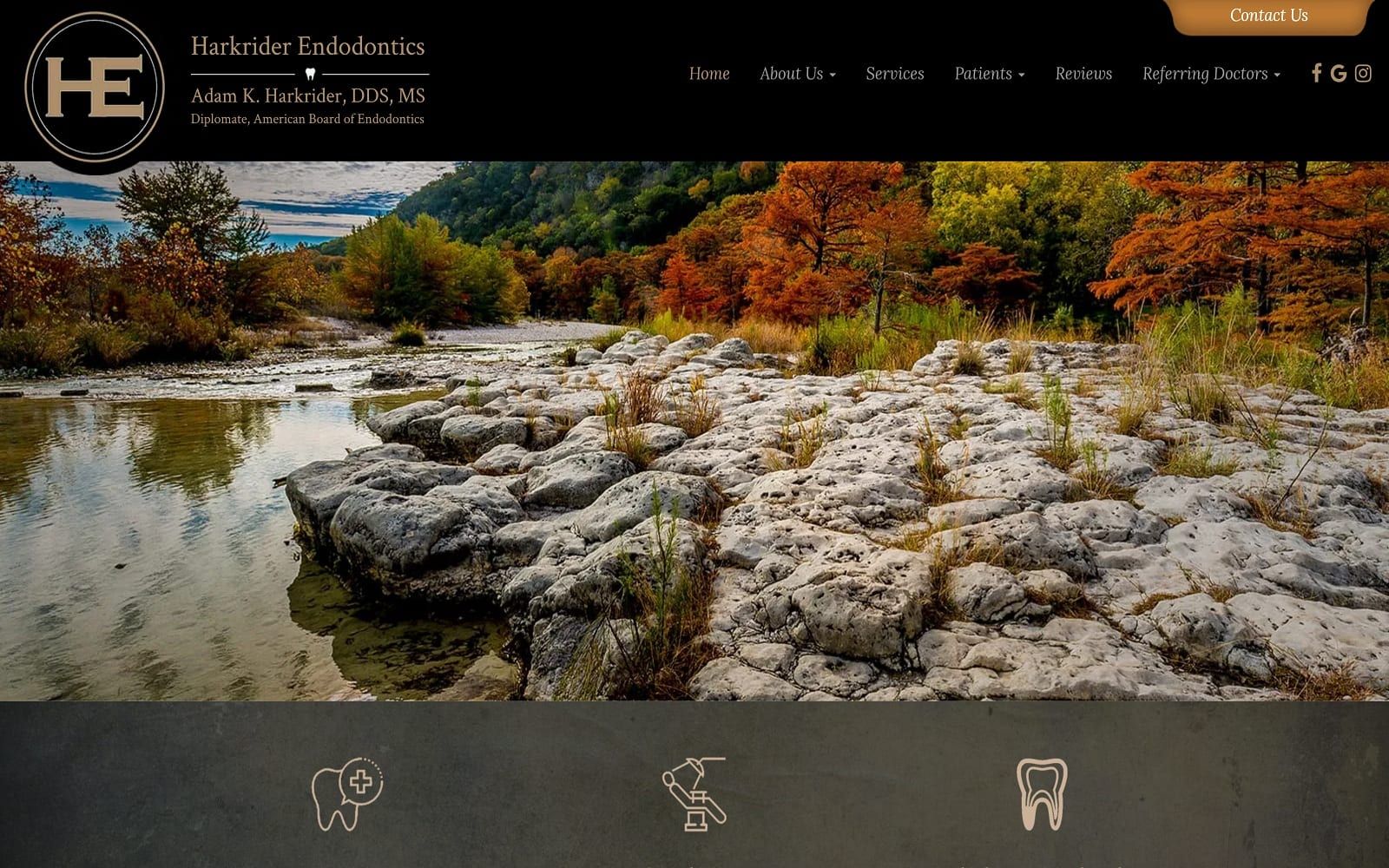
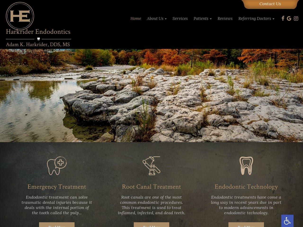
What We Love About Harkrider Endodontics: Harkrider Endodontics uses minimalism and serene nature to provide peace and tranquility to its patients. Touches of water, trees, and stones through the header image allow the homepage to invite its audience in, and throughout the website, mauve gray, black, and cream brown are used to create a sense of stability and trust. Through clean and practical application of its design elements, Harkrider Endodontics builds trust by remaining stable in its image.
4. Las Colinas Endodontics
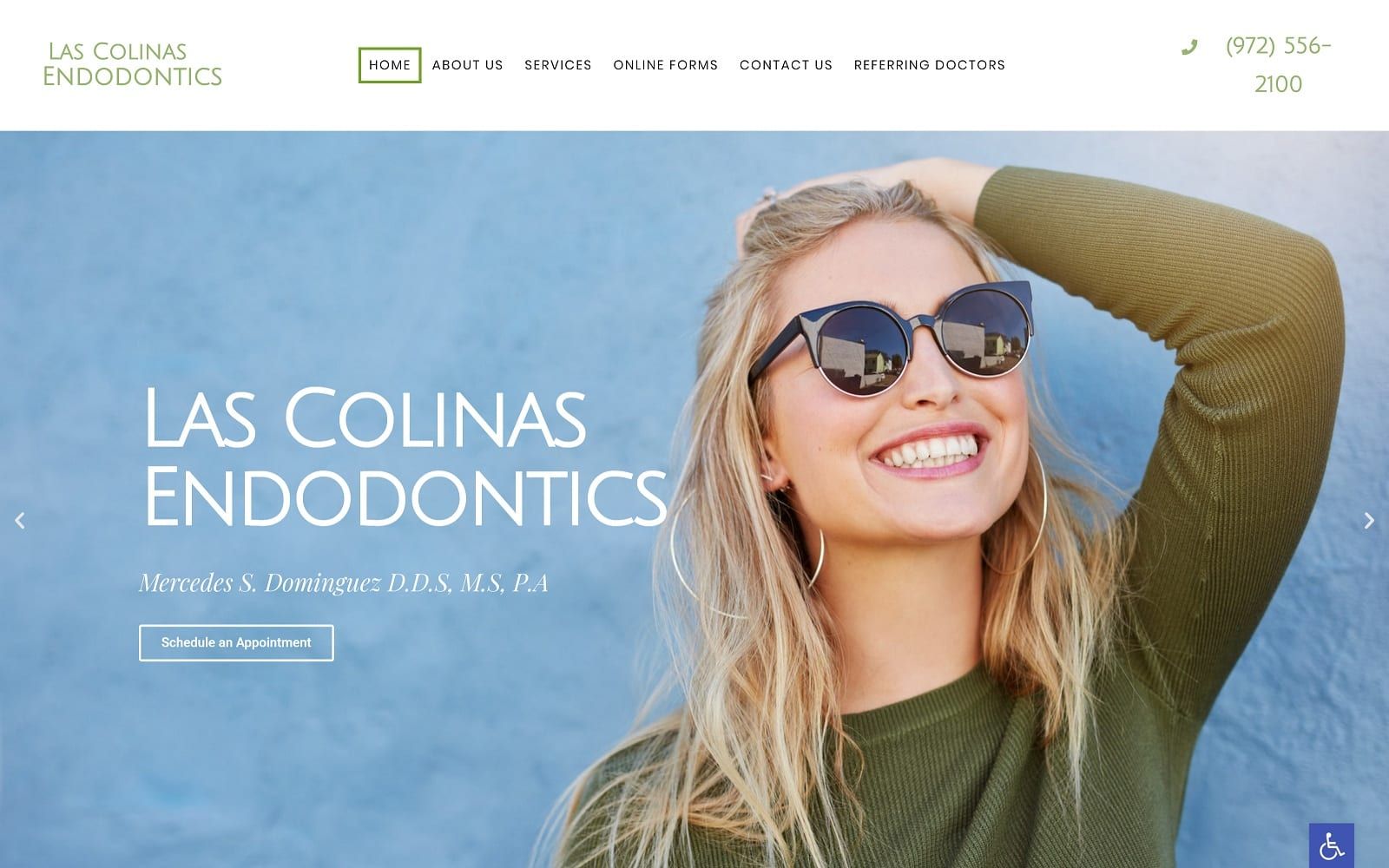
What We Love About Las Colinas Endodontics: Las Colinas Endodontics focuses on individual care as its main focus for its audience, thus sticking with calming elements such as sage green, light gray-blue, and light gray, placing its content front and center. Its imagery provides a sense of rejuvenation and warmth, and this design helps reinforce the practice’s sense of ethics in helping its patients.
5. Endodontic Specialists
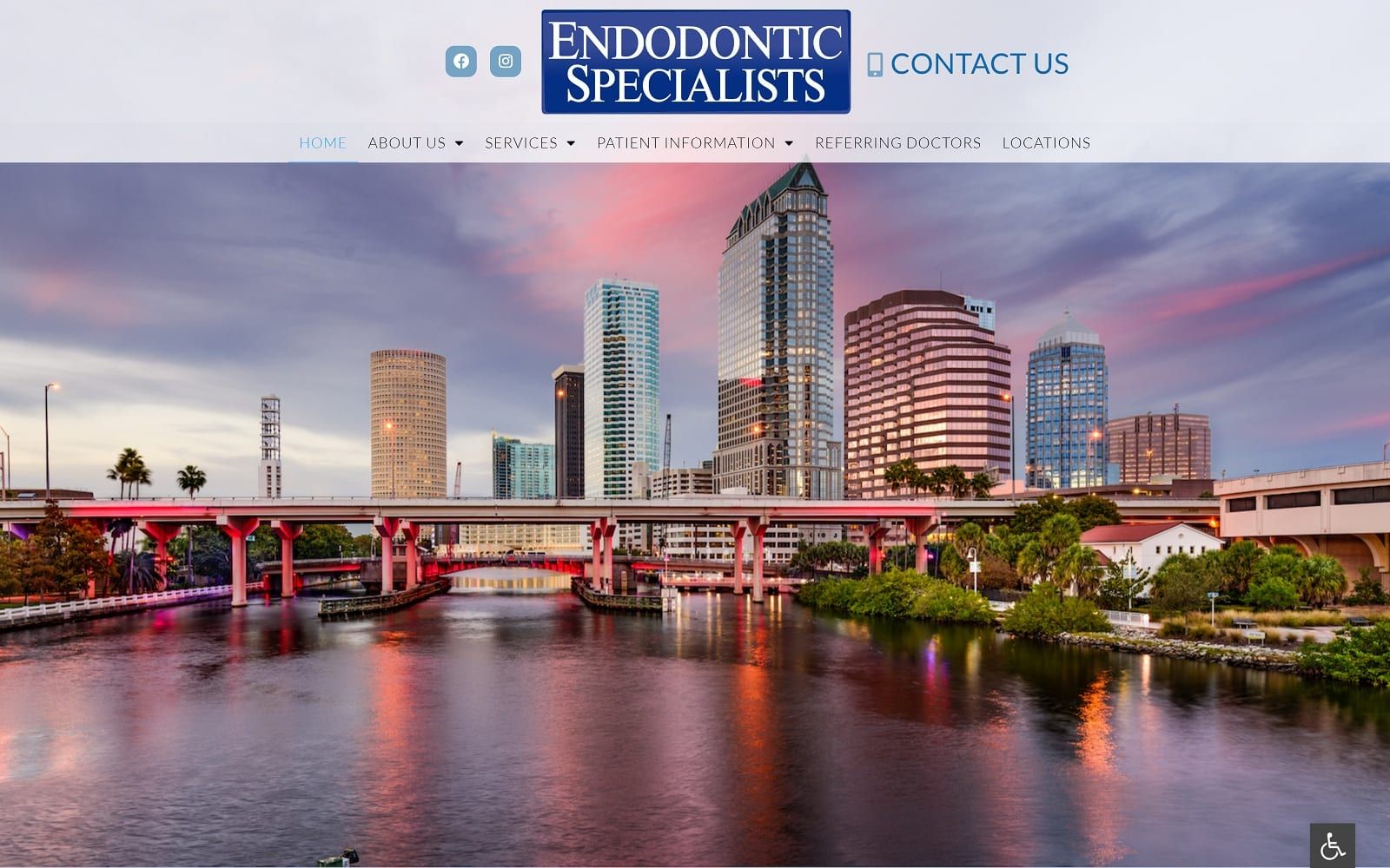
What We Love about Endodontic Specialists: Endodontic Specialists work to build locality and report when it comes to building a framework of reliability for its audience. Honing in from sunny Florida, the website uses transition slideshows, minimal text, icons, and action buttons to engage its users, all the while using light blue and transparent white to show off its content. Their website design also reinforces their state-of-the-art technology in helping patients, making their website tailored to their audience’s needs.
6. Oak Hills Endodontics
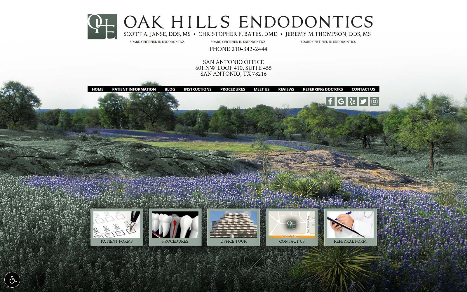
What We Love About Oak Hills Endodontics: Oak Hills truly specializes in scenic-filled web design, keeping a slideshow header the center focus of their website with beautiful, scenic imagery of fields and flowers throughout Texas. With a large header title and center-aligned menu, scrolling down allows the image to transition to the website’s information, presenting it in a simple black-on-white format. Using black and light sage green as the color scheme, Oak Hills Endodontics is a unique contender that appeals to a local Texan’s heart.
7. Modern Micro Endodontics
Visit Modern Micro Endodontics
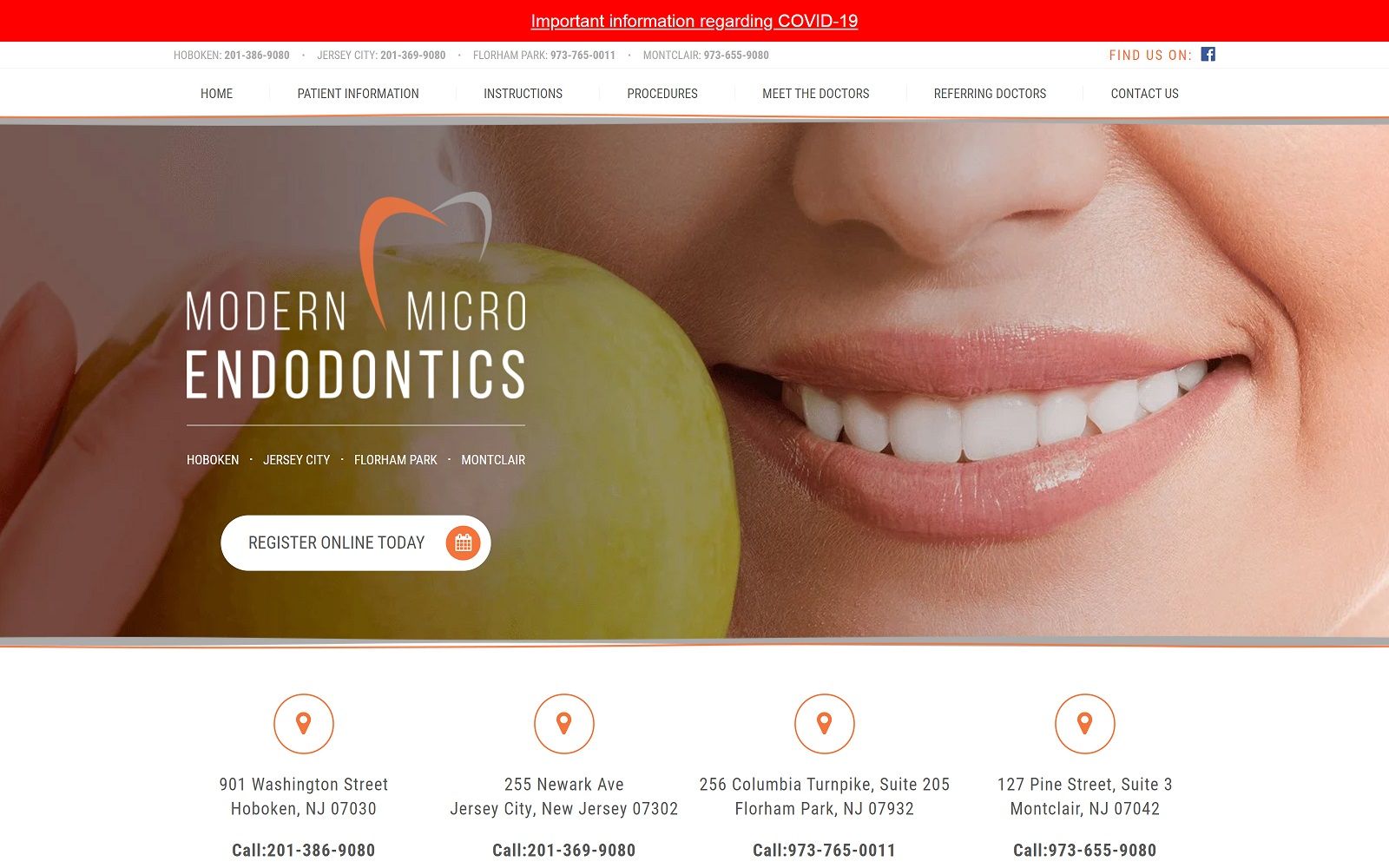
What We Love About Modern Micro Endodontics: Modern Micro Endodontics takes a highly minimalistic approach to its web design, using a color theme of orange, gray, and white to highlight their root canal services. Using a standard enlarged header image, action buttons, and numerous hyperlinks, the website presents its information clearly to allow users to have easy access contacting their multiple locations and helping patients better understand their services. Overall, this website’s design creates a highly engaging experience for new users wanting to learn more.
Learn more about our endodontic website design services here.
TOP ENDODONTIST WEBSITES OF 2020
Having a digital presence is an essential part of any modern business, and endodontic services are no exception. Website design is a deceptively complex process involving integrating multiple disciplines and skill sets to create something that captures the eye, functions seamlessly, and truly represents the business it’s designed for. Endodontic specialists can use their site to provide information about their clinic. This includes valuable data regarding an endodontic diagnosis, implants, and more.
Endodontic website design starts with knowing your target clients and how you make the best first impression on them. Everything from your logo’s design to your color choices impacts visiting patients’ reactions to your clinic. Functionality and security go hand in hand, allowing visitors to reach out to the clinic while knowing their information is protected. Mobile use is already prevalent, and studies show it’s rising. Any modern business that hopes to reach its digital public needs to have mobile responsiveness central to its design. Relevant elements include click-to-dial and direct-to-map functions.
Below we compiled several examples of endodontic website design that show how these concepts can be put to work while still retaining a sense of individuality that makes your clinic memorable.
1. North Texas Endodontics Associates
Visit North Texas Endodontics Associates
Aesthetics
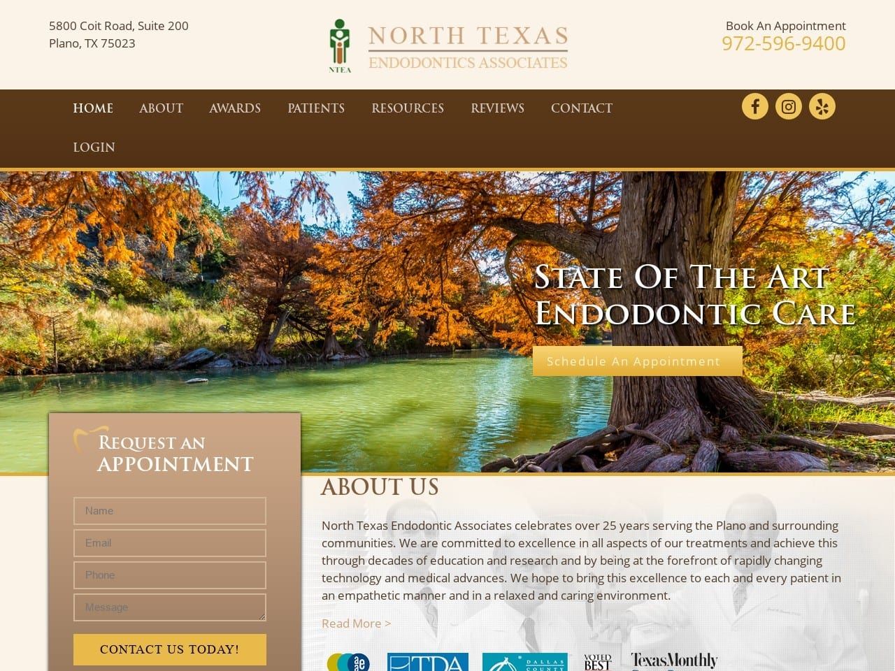
North Texas Endodontics combines pink and brown (both colors with a lot of red) with golden yellow to create a theme that feels like crisp autumn. Their hero image ties this all together for a striking landing page that’s hard to ignore. Brown brings a grounding warmth to the site that pairs with the nurturing association of pink to create a feeling of firm serenity that speaks to patients affected by dental anxiety. The shade of golden yellow selected draws the eye to action points throughout the site without being overbearing or hard on the eyes. The logo brings all the colors of the site together with clever design. This indicates that this clinic serves patients of all ages and will be there with them as they and their families grow.
Functionality
Functionality is integrated into the website’s design without impacting its open nature or cluttering the page. Located in the header can be found click-to-dial functionality that integrates with mobile devices to make reaching out to the clinic a breeze. A prominently featured HIPAA secure form invites visitors to become patients by contacting the clinic for more information. At the same time, the attractively positioned button on the hero image provides immediate appointment scheduling. Visitors and patients can connect with the clinic’s social media platform through the three links at the top identifiable by their media platform logo. A patient portal is available through the drop-down menu and is a convenient way for doctors to log in and use the site’s resources.
2. Dominion Endodontics
Aesthetics
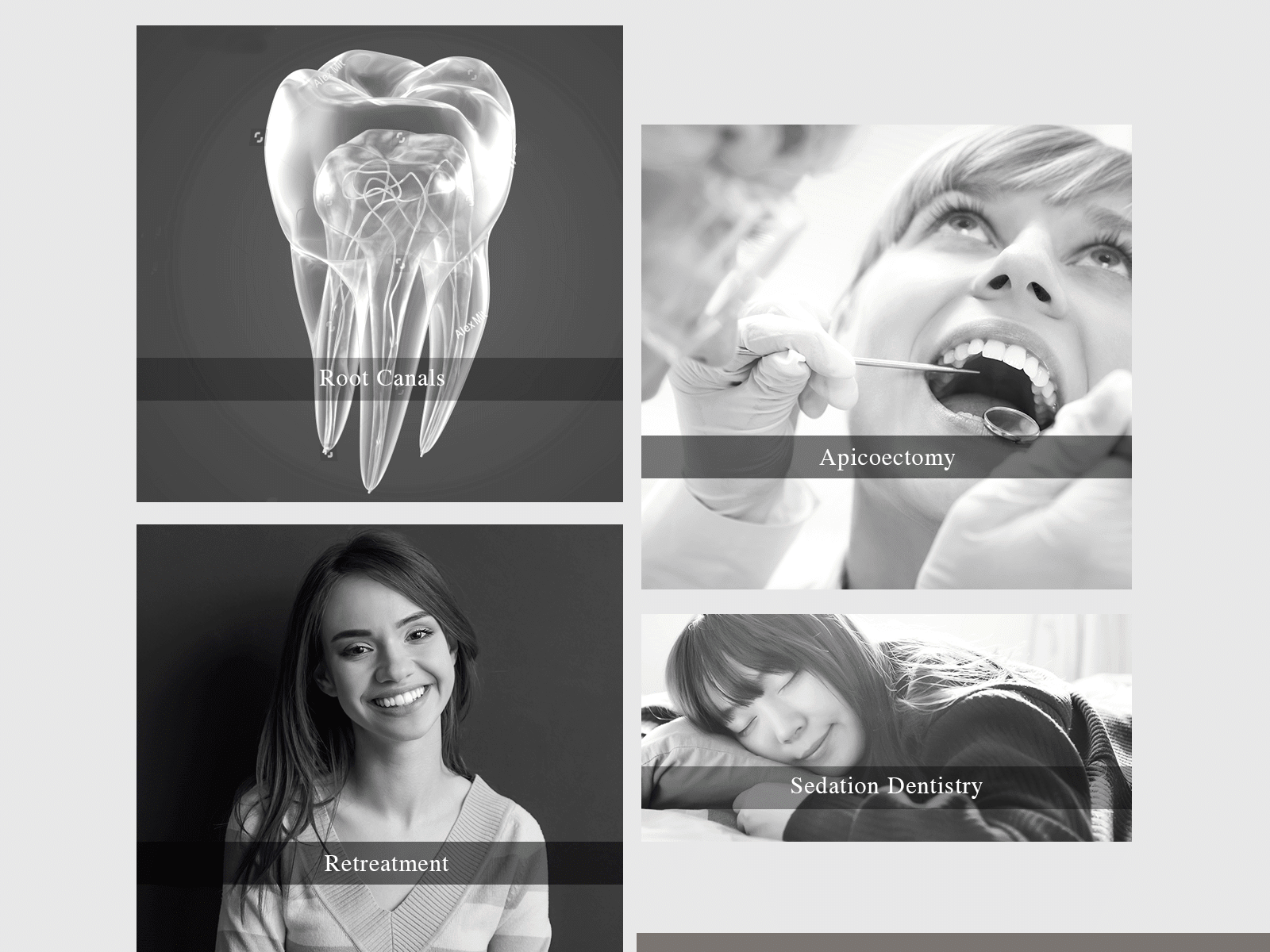
Dominion Endodontic’s focused on a design that indicated it’s an up-to-date and tech-savvy method of caring for its patients. It starts with using imagery that suggests a modern or futuristic approach to patient care. The logo carries the site’s colors well and shares the sharp modernistic feel of the rest of the site, being both informative and artistic in equal measure. In addition to their striking appearance, the buttons that direct patients to information about various services transform when they are moused over to provide even more information in the same space. The blue, white, and black color palette the site uses enhances the clinic’s image as a modern, professional, and sophisticated center for getting endodontic care.
Functionality
Functionality is integrated seamlessly into the site’s design and is easily accessible without overbearing the site’s appearance. Click-to-dial and click-to-call functionality is featured in the page’s header, providing instant office access by phone or in person. This feature of mobile-friendly design remains prominent throughout the site, starting with a hamburger menu. This element begins placed underneath the scrolling images of the physicians at the clinic. It then slips seamlessly to the top of the screen to make navigation from anywhere within the site easy. That same click-to-call and direct-to-map functionality are also found at the bottom of the main page, directly beneath a HIPAA-compliant form that permits visitors to reach out to the clinic for an appointment securely.
3. Harkrider Endodontics
Aesthetics
Harkrider Endodontics went with a very earthy theme for its design, combining dark earthen colors highlighted with stone textures and a touch of beige. Their logo design is striking and simple and carries out the earthen/stone themes present in the site’s design by having a slight engraved feel to it, evident in the simple lines and stark font used. Thanks to a mobile-friendly design, the site layout takes equal advantage of a wider-screen format and slimmer mobile windows. Each service section is headed by a stylized icon related to each service, while the beige buttons stand out to invite the visitor to gather deeper information about the site. Outside of these icons and initial images, the site is quite an image light, using a minimalistic approach to its overall design.
Functionality
The menu is the heart of functionality within this site, providing easy access to any point of the site. In addition, patients and referring physicians will find they have immediate access to the forms they need. Patients can fill out their forms before entering the office, while physicians can submit a referral through the website or print out a paper copy. Even better, doctors can create an account on their physician’s portal and provide additional information there. All forms are available directly on the site are secured behind HIPAA-grade security to keep patients’ private information safe and secure on their site. Click dial and direct-to-map functionality can be found at the base of the page, along with links to their social media platforms to help visitors, patients, and physicians alike stay in touch.
4. Hamilton Mill Endodontics
Visit Hamilton Mill Endodontics
Aesthetics
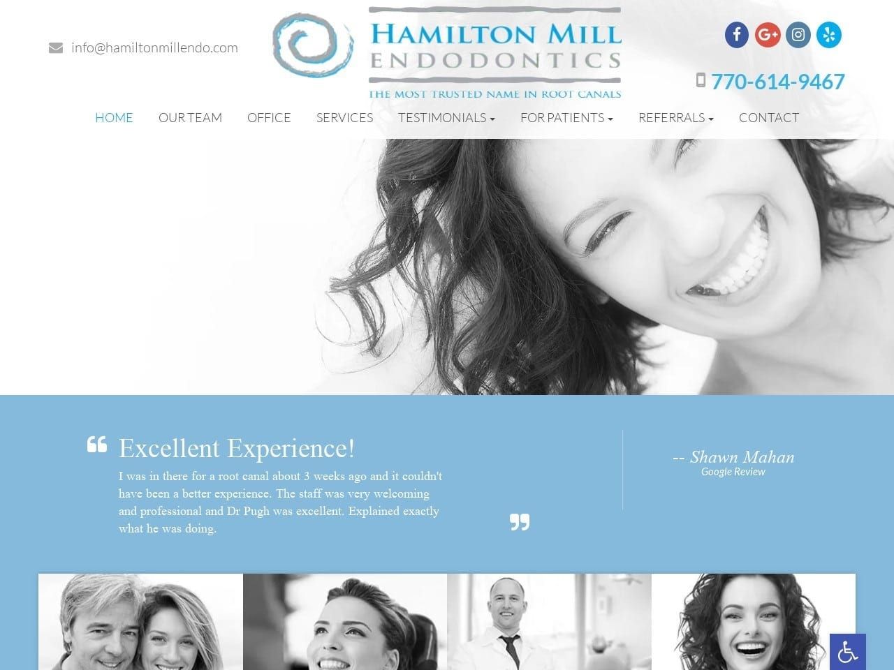
Blue, white, and gray form the foundation of Hamilton Mill Endodontic’s website, forming a bright and welcoming platform for the clinic. Blue is known in website design to be both calming and inspiring hope, feelings patients considering endodontic treatment are often craving. Gray gives the site a coolly professional touch, while white serves as an excellent background and contrast to both. The use of gray can be found cleverly integrated as an attention-getting tool. As visitors mouse over buttons to the various information and services available on the site, the images used to mark these sections change from gray to eye-catching color. The site also uses stylish fonts that give it an equal parts artistic and elegant feel. This same description certainly fits the design of its logo, which includes the clinic’s name and a gray on a blue spiral that is attention-grabbing.
Functionality
Mobile integration had a decided influence on the layout and design of this website, though both form and function are excellent on either mobile or desktop formats. Contact information is immediately presented to the end user at the top of the screen, emphasizing the convenience of email and social media platforms. Accessibility options are easy to find thanks to the blue tab bearing the universal handicap symbol that can be clicked to put the site in reach of the differently-abled. Scrolling reviews are an excellent way of maximizing available space and demonstrating the satisfaction of the current patient base.
5. Irvine Endodontics
Aesthetics
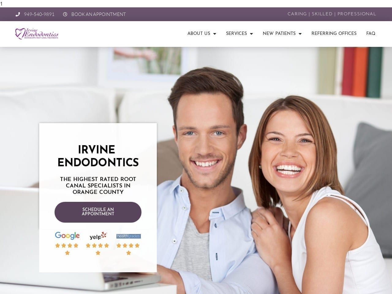
Purple is an unusual shade in web design, and it takes a daring site to take advantage of its strengths. Associated with sophistication and creativity, purple can be considered an odd choice for endodontic web design. However, as this website displays, it can be truly stunning and eye-catching in the right situations. The entire layout of this site has an artistic angle, with flowing waves replacing straight lines for section divisions with the stylized clip-art style images used to mark each section. The slide show uses a series of images to build rapport with visitors by using staff members, patients, and pictures of the office. The site’s layout changes to accommodate both mobile and desktop viewing, simplifying its overall design on smaller screens to retain function without sacrificing form.
Functionality
For all its artistic flair, this site doesn’t sacrifice functionality for appearance. The first option made open to visitors is the ability to reach out to the clinic to schedule an appointment. As they explore further down the page, they’ll discover convenient links to patient forms, expanded information on their provided services, preparation guides for first visits, and what to do when an emergency appointment is needed. Purple is used as an action color for the buttons, drawing the eye and making it easy for the visitor to reach the desired part of the site. Further, down the site, an opportunity to build rapport with the staff is presented in the form of stylish pictures bearing links to expanded views of their profile. As the site ends, testimonials and direct links to sites that collect reviews from healthcare patients are provided.
6. Wisconsin Endodontic Group S.G.
Visit Wisconsin Endodontic Group S.G.
Aesthetics
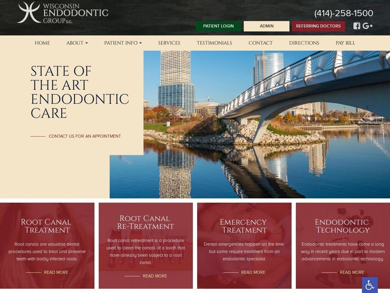
This website’s composition does an excellent job of communication professionalism while providing a big-city sense of locality. Red is a bold choice of color on a website, as it can overwhelm everything else easily. Cunning design instead takes advantage of the color’s motivating and eye-catching power by setting it against a background of pink with subtle use of green. Red’s motivational influence drives visitors to take action, while the nurturing association of pink gives them the confidence they’ll be in good and caring hands. Imagery and video are used to introduce patients to the clinic and its staff, starting the rapport-building process early. Green is used as the color for the header text. It also serves as the background for the HIPAA secure contact form at the bottom of the first page.
Functionality
Ease of access was clearly a primary concern as this site was being conceived, and evidence of this can be found in the prominently available accessibility settings. Further examples of this design concept can be found in the click-to-dial functionality included immediately at the top of the page, along with access to the patient and referring doctor portals. These all ensure that return visitors to the site can get access to what they need without hunting around immediately. Wisconsin Endodontic also emphasizes the importance of patient education with a section dedicated to this purpose, along with videos and easy-to-navigate service sections. With multiple locations, the direct-to-map functionality included in this site is more important than ever. Visitors need to click the map associated with their clinic of choice, and they’re instantly provided with directions to get them on their way.
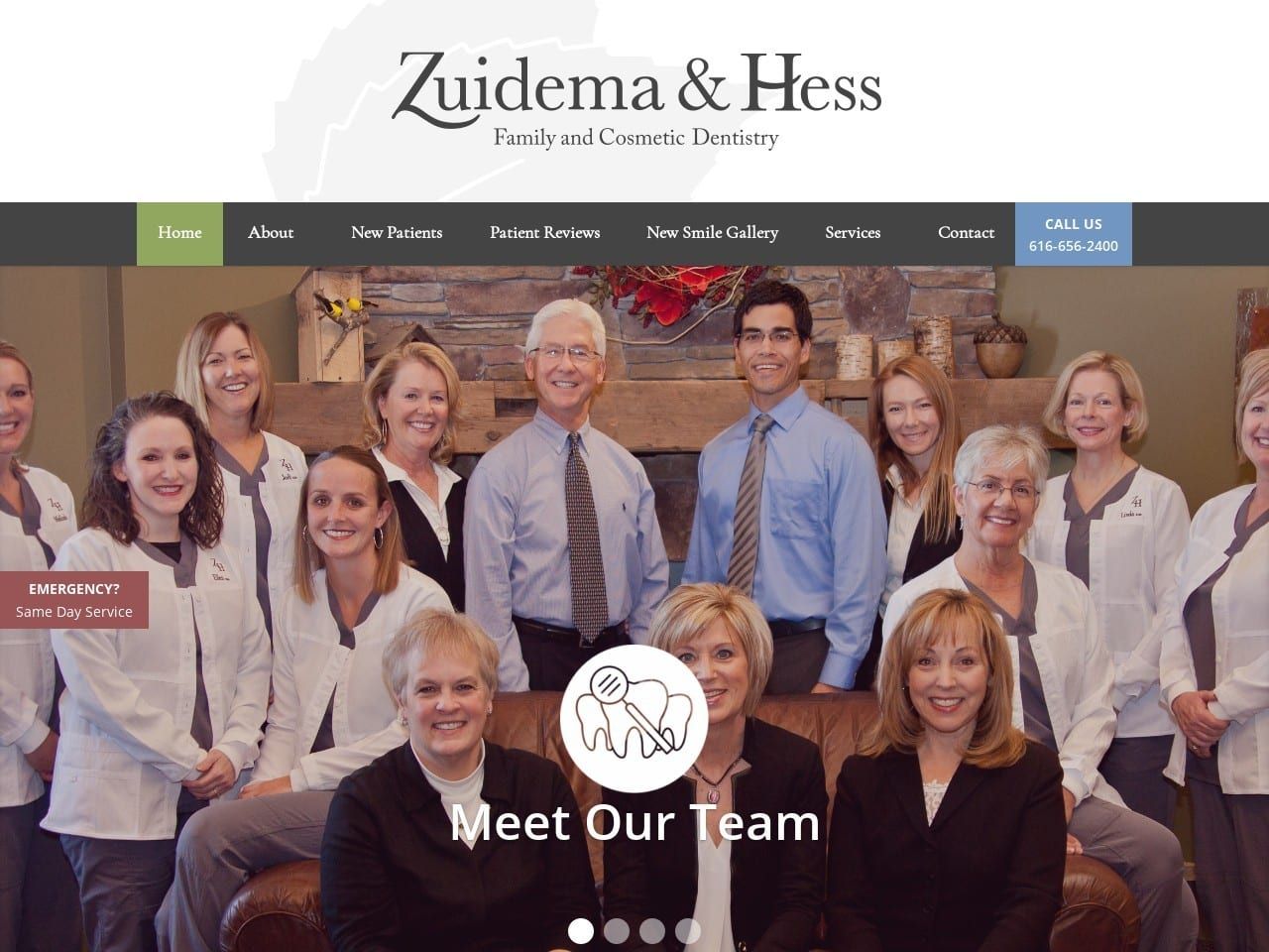
7. Zuidema & Hess Family and Cosmetic Dentistry
Visit Zuidema & Hess Family and Cosmetic Dentistry
Aesthetics
Zuidema & Hess took a fundamental approach to their website design, preferring an open and spacious design to a more compact look. This has resulted in a site being open and easy to read and doesn’t instill any sense of pressure on the end user. The background is a very basic white shade, with a bluish-black and green used for other purposes. Green is the action color of choice for Zuidema & Hess, highlighting buttons where visitors can take immediate action. Their logo leans on the same simplicity as the rest of the site’s design, simply being a leaf and its shadow above the clinic name. This clinic’s site is a study in what it means to provide more with less, which also makes it comfortably viewable on mobile devices and desktops.
Functionality
A simple design does not imply a full suite of functional elements for the end user. New patients will find immediate access to instructions on preparing for the first visit, including referrals and other essentials. The New smile gallery shows the results of their work in striking imagery that will instill confidence in potential clients. Scheduling an appointment is a breeze through the same interface. As patients scroll through the site, they’ll find powerful mobile integration options, including click-to-dial and direct-to-map functionality that’s essential to any modern physician’s office.
The Essentials For Your Endodontic Practice Website
Your website is worth the investment, but what should you focus on as an endodontic business? As everyone moves towards digital platforms, keeping your practice updated is a worthwhile investment that will give you the upper advantage over others. If you want a starter on where to begin, we’re here to outline some essentials to focus on for your business growth:
- Detailed Service Pages: For endodontists, it’s all about assuring your patients, and having service pages that outline your services in intricate detail can help provide your audience with valuable information. Root canals, calcified root canal treatments, regular removal of abscesses, and other services you provide should be explained to give them confidence.
- Consistent Blog Content: Blog content will show that you are active and engaged with your field of expertise. While your homepage and service pages will outline the core aspects of your business, your blog content will show your knowledge in its true light.
- Positive Testimonials/Reviews: What people say online can have power, and when it comes to your business, the level of trust they provide in you will depend on your testimonials. Showcasing your testimonials on your website and providing hyperlinks to your reviews can help build up your reputation.
- Mobile-Friendly Design: Overall, no matter how many design elements you incorporate, if it isn’t mobile-friendly, then you’ll lose your audience. Make sure that all pages throughout your website are mobile-friendly and SEO optimized to help with internet searches for your future patients.
When building your website, hiring professional help through agencies such as Optimized360 can give you the upper edge you need to keep up with your patient. See how we became the #1 Endodontic Website Design Company.
Conclusion
No one example given above is the perfect endodontic website, but that’s simply because such a thing doesn’t exist. Each example highlights what makes that clinic unique and an understanding of the client base that it serves. From simple and down-home to sophisticated big-city, these sites are all developed around a common theme that is invisible when executed correctly. That concept is a patient-focused design that doesn’t come from building from an endodontic website template. Remember to build a list when you’re exploring websites for inspiration on how to build yours. This list should include all the elements that caught your eye, the good and the bad. When you finally sit down with a web design team, you’ll have everything you need to make your site stand out among the crowd.
