Elevate your Practice to New Heights with our complete guide
Regardless of who is building your website, some general guidelines should be followed in the process of developing your new website or redoing your existing one. The digital presentation of your practice needs to be as impressive as your real practice. Otherwise, an opportunity is lost. Don’t miss the collection of priceless advice from your colleagues at the end.
What a custom website communicates?
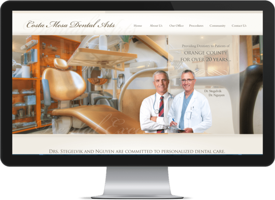
- Your Brand Identity: Your website design should reflect your brand identity and personality. This includes your website’s colors, fonts, overall style, and, hopefully, a custom logo.
- Your Professionalism: A well-designed dental website can convey a sense of professionalism and trustworthiness. A clean, modern, and easy-to-navigate website can help establish credibility with potential patients.
- Your Values: Your website design can communicate your values and what sets your practice apart from others. For example, if your practice is focused on eco-friendliness, your website design may incorporate elements that reflect this value.
- Your Services: Your website design can help visitors understand your services and how you can help them. By using clear and concise headings and visual elements, you can effectively communicate your services to visitors.
Overall, your website design is a powerful tool for communicating your brand and values to potential patients. By carefully designing your website, you can effectively convey your message and establish trust and credibility with visitors.
The main steps in the design process

Here are the main steps in designing a custom website:
- Define Your Goals: Targeting leads, showcasing work, or providing information. Or perhaps all.
- Research Your Audience: It’s important to understand your target audience.
- Prepare material: Get professional photos of your team and office done. List procedures.
- Create a Wireframe: A wireframe visually represents the structure and needed elements.
- Design the Look and Feel: Decide about the overall layout, colors, and fonts.
- Produce Content: Including high-quality and helpful text, images, and videos.
- Test and Launch: Test on all devices and with all browsers.

Single-page dental website versus multi-page design
Custom design VS a template
Advantages of a custom dental website
- Unique Design: A custom website allows you to create a unique and distinct look that sets your dental practice apart from others. This can help establish your brand and make a strong first impression on potential patients.
- Customized Functionality: You can add any features or functionality you need with a custom website. This can include appointment scheduling, patient forms, and your dental practice management software integration.
- Improved SEO: Patient engagement is one of the most important factors in determining your rank. In other words, when patients spend more time on your website, you will get a better ranking. A beautiful custom design is always a reason for visitors to stay longer. O360 provides dental SEO services.
- Increased Control: A custom website allows you to have complete control over the design and functionality, so you can make changes and updates as needed without being restricted by pre-designed templates.
- Enhanced Security: A custom website can be built with increased security measures protecting your practice and patient’s information. SSL and HTTPS protocols are examples of security.
Overall, a fully custom dental website designed from scratch can provide a tailored and professional online presence that effectively represents your practice and meets the specific needs of your patients.
Disadvantages of dental website templates
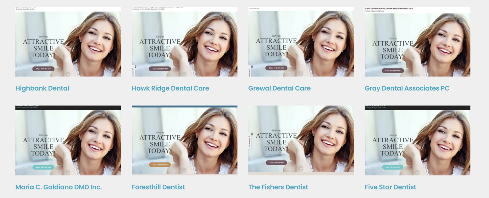
- Can’t stand out: When you pick a design that hundreds of others have selected before, there is no way to visually stand out and claim any unique features that can be supported on your website.
- Lack of Customization: Template websites often come with limited options for customization, so you may not be able to fully tailor the design and functionality to your practice’s specific needs.
- Limited SEO Potential: Template websites may not be optimized for search engines, which can negatively impact your search engine rankings and reduce the amount of organic traffic you receive.
- Lack of Control: With a template website, you are limited to the features and options that are already built into the template. This can make it difficult to make changes or updates as needed.
- Poor User Experience: Template websites may not offer a seamless and intuitive user experience, which can turn potential patients away and negatively impact your practice’s online reputation.
- Unprofessional Look: Template websites can often look generic and unprofessional, undermining your dental practice’s credibility and professionalism.
- Branding loss: You can spend thousands of years building your brand based on your template design, and one day, a brand new dentist opens a practice next door and buys the exact same design and branding from your template design company!
Simply look at these hundreds of practices that are using the same design from the same company and judge the idea of choosing a dental template by yourself.

Overall, while template websites may be a quick and cost-effective solution, they often come with significant limitations that can negatively impact your online presence and the effectiveness of your website.
If you still want to go with a template, here are the top 5 dental website template options.
Important pages for a custom dental website

A dental website should include the following pages at the least:
- Homepage: This is the first page visitors will see when they arrive at your website, so making a strong first impression is important. Your homepage should provide an overview of your practice and your services and include a clear call to action for visitors to learn more or make an appointment.
- About Us: This section should provide more information about your practice, including your team, philosophy, and location. This is a great opportunity to showcase your expertise and establish trust with potential patients.
- Services: This section should provide a detailed overview of your services, including general dentistry, cosmetic dentistry, and any specialized services. You should also include information on insurance policies and payment options.
- Patient Resources: This section should provide valuable information for existing and potential patients, including appointment scheduling, patient forms, and educational resources.
- Testimonials: This section should feature reviews and testimonials from satisfied patients, which can help establish trust and credibility with potential patients. Learn how to build a reputation for your dental website.
- Contact Us: This section should include your practice’s contact information, including your address, phone number, and email. You should also include a contact form for patients to easily get in touch with you. A link to a map or an interactive map is also a must.
Overall, a well-designed dental website should provide a comprehensive overview of your practice and services and offer patients valuable resources and information.
Important sections of a home page
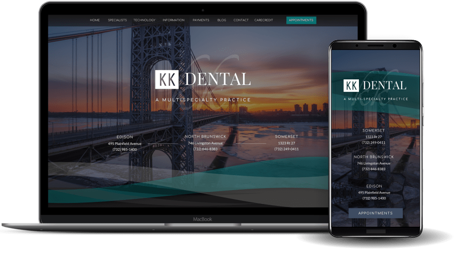
The sections needed on a custom website homepage will depend on your dental practice’s specific needs and goals. However, here are some common elements that may be included:
- Header: This section typically includes your logo and the main navigation menu, providing an easy way for visitors to navigate your website.
- Hero Image: This is a large, attention-grabbing image or dental video that is often featured at the top of the homepage. It should convey the essence of your practice and encourage visitors to take action.
- Introduction: This section should briefly overview your practice and services, highlighting what differentiates you from other dental practices.
- Call to Action: This button or link encourages visitors to take a specific action, such as making an appointment or learning more about your services.
- Services: This section should provide an overview of your services, including general dentistry, cosmetic dentistry, and any specialized services.
- Testimonials: This section should feature reviews and testimonials from satisfied patients, which can help establish trust and credibility with potential patients.
- Footer: This section typically includes your practice’s contact information, links to social media profiles, and any additional information or resources you want to provide visitors.
- Other options sections can include
- Intro video: A custom production showing a tour of the practice and sharing important highlights about the team and services provided. Learn the main advantages of using videos.
- Contact form: A quick way of getting in touch or asking questions. Make sure that you are using a HIPAA-Compliant form.
- Technology: Highlight the unique aspects of technology used in practice.
- Intro video: A custom production showing a tour of the practice and sharing important highlights about the team and services provided. Learn the main advantages of using videos.
1) Header design best practices

Here are some best practices to follow when designing a website header and top navigation:
- Keep It Simple: The header and top navigation should be easy to understand and use, so avoid using too many links or complex navigation structures.
- Use Clear Labels: Use clear and concise labels for your top navigation links, so visitors can easily understand what each link leads to.
- Use Consistent Styles: Use consistent styles throughout your website, including in your header and top navigation, to create a cohesive and professional look.
- Use Responsive Design: With more and more users accessing the internet on their phones, it’s important to ensure that your header and top navigation are responsive and look good on mobile devices. See examples of great mobile-responsive websites.
- Use Drop-Down Menus: If you have many links, consider using drop-down menus to help organize them and keep your top navigation clean and uncluttered.
- Use a Search Bar: A search bar can be useful for visitors looking for specific information on your website. Consider adding one to your header or top navigation.
Overall, a well-designed header and top navigation should be simple, clear, and easy to use, helping visitors navigate your website and easily find the information they need.
2) Hero design best practices

Here are some best practices for designing a website hero:
- Use High-Quality Images: A hero image should be visually appealing and convey the essence of your practice. Use high-quality images that are clear and free of distractions. Where to find great images for your website.
- Keep It Simple: A hero image should be easy to understand and interpret, so avoid using too many elements or cluttered compositions.
- Use Contrasting Colors: Use contrasting colors to make your hero image stand out and draw the eye. Avoid using colors that blend in with the background or make it difficult to read any text that is overlaid on the image. See some great designs with blue themes.
- Use a Call to Action: A hero image is a great opportunity to encourage visitors to take action, such as making an appointment or learning more about your services. Use a clear, concise call to action that stands out against the image.
- Optimize for Mobile: With more and more users accessing the internet on their phones, it’s important to ensure that your hero image looks good on mobile devices. This may involve using a different image or adjusting the layout to ensure that it looks good on smaller screens.
Overall, a well-designed hero image should be visually appealing, easy to understand and encourage visitors to take action.
3) Writing the best intro for your website

A good intro to your website should provide a clear and concise overview of your practice and your services and encourage visitors to explore your website further. Here are some tips for writing a good intro:
- Keep It Short and Sweet: An intro should be brief and concise, so avoid using too many words or complex language.
- Use a Strong Headline: A strong headline is the first thing that visitors will see when they arrive at your website, so make it count. Use a headline that clearly communicates what your practice is all about and encourages visitors to keep reading.
- Use a Compelling Subheading: A subheading should provide more detail about your practice and your services and should be written to engage visitors and encourage them to explore your website further.
- Include a Call to Action: An intro is a great opportunity to encourage visitors to take action, such as making an appointment or learning more about your services. Use a clear and concise call to action that stands out against the rest of the text.
- Use Bullet Points: Bullet points can be useful for highlighting key points and making your intro easy to scan and read.
- Optimize for SEO: An intro is a great place to include keywords that will help you rank higher in search results, so consider incorporating relevant keywords while still writing naturally and engagingly.
A good intro should be brief, engaging, and clearly communicate your practice’s value to potential patients.
4) How to choose the best call to action?

Call to action (CTA) are buttons or links encouraging visitors to take a specific action, such as making an appointment or learning more about your services. Here are some best practices for writing CTAs on your website:
- Use Actionable Language: Use verbs that clearly communicate the action that visitors should take, such as “schedule an appointment” or “learn more.”
- Make It Clear: A CTA should be clear and easy to understand, so avoid using too many words or complex language.
- Use a Button: A button is a visually appealing and attention-grabbing way to present a CTA. Use a button that stands out against the rest of the page and is easy to click.
- Use a Contrasting Color: Use a color that contrasts with the rest of the page to make your CTA stand out and draw the eye. Learn the psychology of using colors in web design.
- Use Placement: Position your CTA in a prominent location on the page, such as above the fold or near the bottom of the page.
- Test Different Variations: It can be helpful to test different variations of your CTA, such as different languages or placements, to see which performs best.
Overall, a well-written CTA should be clear, actionable, and visually appealing, encouraging visitors to take the desired action.
See the ultimate website design check list.
5) How to highlight services on the home page?
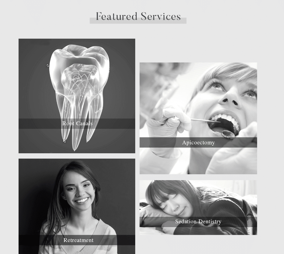
Here are some best practices for highlighting the top services on your website’s homepage:
- Choose Your Top Services: Decide which services are most important to highlight on your homepage. These may include general dentistry, cosmetic dentistry, and any specialized services that you offer.
- Use Headings and Subheadings: Use headings and subheadings to clearly communicate what each service is and how it can benefit patients.
- Use Bullet Points: Bullet points are useful for highlighting key points and making it easy for visitors to scan and understand your services.
- Use Images: Visuals can help bring your services to life and make them more engaging. Consider using images or graphics to illustrate your services.
- Use a Call to Action: Encourage visitors to learn more about your services or make an appointment by including a call to action, such as a button or link.
- Use White Space: Use white space to give your services room to breathe and make them easier to read.
A well-designed service section should clearly and concisely highlight your top services and encourage visitors to take action.
6) The best way of displaying testimonials on the home page
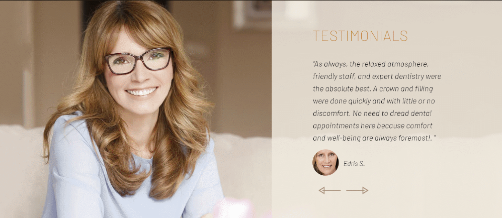
Testimonials can be a powerful way to establish trust and credibility with potential patients, so choosing and displaying them effectively on your website’s homepage is important. Here are some tips:
- Choose Relevant Testimonials: Choose reviews that are relevant to your practice and your services. Preferably from patients who have had treatments of your highlighted services.
- Use a Mix of Short and Long Testimonials: Use a mix of short and long testimonials to provide variety and keep things interesting. Short reviews cover the main selling points, and long ones for those who want more details.
- Cover main concerns: There are common concerns and decision friction for patients seeking a new dentist. Your reviews can address those cleverly. Some examples are cost, comfort, pain-free treatment, expertise, and patient satisfaction. Each testimonial can address one or two of these friction points.
- Include Images: If possible, images of patients sharing the testimonials is a great idea.
- Use a Slider: A slider can allow room for more testimonials in one section.
- Use Social Proof: Consider using social media to showcase your testimonials. Some plugins allow importing of the reviews directly from sites like Yelp or Google. However, those options may result in a random display of reviews that are not ideal.
Testimonial sections should provide a mix of relevant and engaging testimonials that help establish trust and credibility with potential patients.

Use of Colors in Design

The colors used on a custom dental website should be carefully chosen to create a professional, cohesive look that reflects your practice’s brand. The color palette used should be developed during your brand development. You may want to use some variations of your main colors for your website. Therefore it is important to understand the psychological effect of each color in the design.
Blue
Blue is often associated with trust, reliability, and stability. It is a popular color for corporate websites and is often used to convey a professional and trustworthy image. Blue is a popular color in healthcare design. See blue website examples.
Green
Green is often associated with nature, growth, and sustainability. It is a calming and refreshing color and is often used to convey a sense of balance and harmony. The shade of green used makes a big difference. A more traditional green may be a good choice for a financial service, but for healthcare, you may want to use a more spa-like green, especially for a dental spa. Green website examples.
Purple
Purple is often associated with creativity, spirituality, and luxury. It is a sophisticated and elegant color and is often used to convey a sense of exclusivity and luxury. Purple works for orthodontists and pediatric dentists very well. Purple website examples.

Red
Red is often associated with passion, energy, and excitement. It is a bold and attention-grabbing color often used to create a sense of urgency or highlight important information. Using a lot of red on a dental website may increase anxiety, so if you like to use red, try to use it as an accent and not a main color. Red website examples.
Yellow
Yellow is often associated with happiness, cheerfulness, and optimism. It is a vibrant and cheerful color often used to convey a sense of playfulness or grab attention. Yellow may be a weak color without much advantage in a dental website unless it is used in small sections and as part of the whole design. Yellow website examples.
How to choose a font for a dental website

Like colors, fonts are also mostly used during brand development, but a website may need additional fonts, and the pairs used still need to follow some principles.
- Use Professional Fonts: Choose fonts that are professional and easy to read, such as Arial, Times New Roman, Calibri, or their modern variations. Avoid using overly decorative or hard-to-read fonts, as they may appear unprofessional unless they are for small sections or specific purposes like a coupon. or a call-to-action bar.
- Use a Mix of Fonts: Use a mix of fonts to create visual interest and hierarchy. For example, you may use a sans-serif font for headings and a serif font for body text.
- Use Fonts That Convey Your Brand: Make sure the fonts used are the same as your brand or a good match. Even if there is contrast, some pairs provide a better contrast group. You can use the Font Pairing Tools from Canva or Google.
- Use Legible Font Sizes: Remember the first goal of the website is to provide information. It is frustrating for people when they can read the site comfortably. This can be due to small font size or lack of sufficient contrast.
Learn how to choose a great font set for your website.
Writing great content for your website

The content of your site should be well-written, informative, and engaging. That helps to establish trust and credibility with potential patients. We have shared some suggestions here:
- Audience: Write your content with your target audience in mind. Consider their needs, concerns, and questions. You can use the Answer the Public website for ideas on potential questions people may have for each procedure.
- Language: Use simple and clear language. Avoid using jargon or complex and long sentences that may confuse your visitors.
- Format: Use headings and subheadings to break up your content and make it easier to scan and read.
- Bullet Points: Bullet points are useful for highlighting key points and making your content easier to read.
- Media: Visuals can help bring your content to life and make it more engaging. Consider using images, graphics, and videos to make your content more versatile and interesting.
- SEO: Optimize your content for search.
Learn more about how to write a great dental blog.
How much should I invest?

These are some market averages:
Basic Templates
Like what you can get from GoDaddy, Wix, and FourSquare, these sites can cost anywhere from $50 per month to $200 to $300 monthly. You may see advertisement prices of $10 or $20 per month. But, for a dental website, by the time you add necessary security features, backup, decent speed and file size, domain name, HIPAA compliance, and other features, it easily adds up to more than that.
Specialty Template
The cost of an average template-based dental website is a $2000 initial fee plus $70 per month. Although you may find cheaper options, they often lack basic functionality.
Custom Design by Non-Dental
There is an initial fee and a monthly fee. The initial fee varies a lot. You may be dealing with a teenager in India or a high-end agency in Manhattan. But a decent site would cost at least $2,000 to $3,000 by individuals and $8,000 to $20,000 if a reputable agency does it. Remember that with these types of companies, you must provide content and ensure everything complies with HIPAA and other healthcare-related laws.
Custom Design by Dental Specialty companies
These are companies like O360.com that offer truly custom designs from scratch and are focused on dentistry. Therefore the websites come with everything a dentist needs, from specialty content and images to compliance with HIPAA and other relevant regulations.
The initial fee for these types of websites starts around d $5,000 and goes as high as $15,000 depending on the customization needed.
Conclusion
In conclusion, designing a custom website for a dentist has many advantages over using a template or pre-made website.
6 reasons a template website can hurt your practice.
A custom website allows you to control your website’s look and feel full and tailor it to your practice’s brand and goals. While designing a custom website requires more time and resources, it can pay off in the long run with a higher conversion rate.
Click here to see some examples of custom dental websites
Advice from other dentists
We have interviewed close to 100 dentists and asked them about their experience with their dental websites. Here are the pointers they shared:

Pediatric Dentist
1. Pay attention to the details of design elements. It is a great investment, and your time will directly result in new patients calling more. I promise you.
- Choose colors that appeal to a broad range of people and evoke positive emotions, such as warm colors like orange, yellow, and gold.
- Include friendly faces of team members to build trust and put potential patients at ease.
- Use soft shapes like circles and ovals to guide the reader’s eyes and create a warm and inviting feel.
- Ensure the content is friendly and inviting, focusing on the benefits of choosing the practice, and easy to navigate.
- Highlight the value of the team and equipment, introducing team members and showing the investment in professional and appealing technology.
- Maintain a warm and friendly web presence to attract new patients and provide information to current ones.

Oral Surgeon
2. My do’s and don’ts through your website development process. I learned them the hard way!
- Do: Mobile-responsive design is key – your website should look clean and refined on a tablet or phone as it does on a desktop computer.
- Do Not: Make content difficult to find – ensure ease of navigability and respect for the patient’s time.
- Do: Provide regular and fresh content – regularly updated content reflects changing technology and what the future holds for your dental practice.
- Do Not: Fall behind – Google cares about fresh content, and regularly posting new content is a metric that affects your ranking.
- Do: Provide venues for patient engagement – provide feedback forms, ways to set up appointments, or respond to questions through a social media campaign.
- Do Not: Limit how patients can reach you and your practice – provide plenty of information options and arrange appointments.
- Do: Motivate through information – ensure patients can find information about services, concerns, best practices, etc.
- Do Not: Sell it too hard – avoid pushing the hard sell; balance is vital.

3. Good design really can help your dental site soar
- A good dental website designer can greatly impact the site’s credibility and user experience.
- A credible website typically has an FAQ section, easy-to-find contact information, and a clear and user-friendly layout that aligns with the website’s marketing strategy.
- The website should also be updated regularly and have fresh content, such as through a blog.
- Clutter should be avoided, and simplicity and a clean layout with effective use of white space should be embraced.
- The website should also be responsive and adjust to different screen sizes, especially as more visitors come from mobile devices.
- Pop-ups should be avoided, as they are annoying and can negatively impact the user experience.

Cosmetic Dentist
4. Before doing my new website, I researched the web design trends of 2022 that apply to dentists, and this is a summary that I hope will be helpful to you:
- Keeping it simple:
- Elegant flat designs
- Large negative space
- Images instead of infographics
- Nostalgia for another time:
- Retro fonts and typography
- Visible borders
- Iconography and illustrated graphics
- Location-based identity:
- Local images
- Graphics mixed with text
- Location identity
- Micro-animations, hover effects, and interactivity:
- Animated text
- Shapes/graphics sliding in and out of view
- Cursor effects
- Oversized text overlays and “scrolly-telling”:
- Overlaying text
- Main focus on oversized text
- Inclusivity and accessibility:
- Update gender and pronoun selections
- Self-identify staff pronouns
- Easy-to-decipher fonts for visual impairments
- Light/Dark mode options
- Mobile app-like experiences:
- Mobile friendly
- Geometric shapes easy on the eyes and fingers
- Swiping mechanisms

Periodontist
5. My list of recommendations may seem obvious, but I have seen so many websites of my peers missing one or more of these items that I think it is worth repeating.
- Build a modern website optimized for mobile devices with clear calls to action and easy-to-navigate menus.
- Advertise specialized care, the new patient offers, and what sets your practice apart.
- Use patient testimonials and referral programs to build trust.
- Provide 24/7 appointment booking options.
- Add a personal touch to your website to make it a welcoming and trustworthy place for visitors.
- Highlight the services you provide, accept insurance of all types, open after hours, use new technologies, and specialize in pediatric dentistry, if applicable.

Family Therapist
6. These are facts that guided our design process:
- A clean website design is important to keep visitors focused on the message.
- Large, impactful “hero” images can instantly connect visitors with the brand.
- Unique and meaningful color choices are important in establishing the practice’s personality.
- Bold typography is a way to stand out from competitors and express the practice’s personality.
- 69% of media time is spent on smartphones, making a mobile-responsive website crucial.
- Google drives 96% of mobile search traffic, making SEO alignment important.
- Using videos on the website can increase engagement and lead to viral sharing.

General Dentist
7. When designing a dental website, you should expect the following:
- The ability to attract new patients
- Listing of specialties, services, bios…
- A map of your location, online forms, and contact info
- A way to breed loyalty and foster community
- A process for handling inquiries, including a HIPAA-compliant email system
- The ability to collect and display online reviews and testimonials from happy patients.

Marketing Director
8. Cloud hosting for dental websites
- Cloud hosting is a natural progression from traditional server hosting.
- Cloud hosting is possible through cloud computing, where clients rent virtual service networks.
- Cloud hosting is more reliable than dedicated or shared hosting, as multiple servers are involved in data storage and retrieval.
- Cloud hosting is flexible and adaptable, with resources available for spikes in website traffic.
- Cloud hosting is more cost-effective than dedicated or shared hosting, as clients only pay for what they use.
- Cloud hosting has an easy initial set-up, saves time creating instances, and only requires the configuration of servers.
- Cloud hosting is more reliable than dedicated or shared hosting in case of server crashes.
- The top benefits of cloud hosting include reliability, scalability, flexibility, cost-effectiveness, and easy initial setup.

Front Office Staff
9. Here are six tips for creating a clean and professional dental website design:
- Use straight lines to create a professional look.
- Have a call to action (CTA) on every website page with conversational text that naturally leads the potential client into a call for the product.
- Use a small color palette and neutral colors to create an easy visual.
- Maintain an uncluttered layout and consistent design throughout the whole site.
- Use simple fonts that are easy to read and professional.
- Ensure clean backend coding for optimal search engine optimization.

Office Manager
10. Endodontist website ideas
- Endodontists need to focus on marketing to grow their practice.
- Marketing is done through online and inbound channels.
- Online marketing targets the right audience through online channels like social media, search engines, and websites.
- Inbound marketing is about creating content that people are searching for and presenting it as a solution to their questions.
- Outbound marketing, which includes TV commercials and print ads, is not as targeted or effective as the other two types.
- Endodontic website design is most effective when combined with targeted online marketing.
- Search engine optimization (SEO) is the process of creating quality content that answers people’s queries, and it’s a long-term marketing strategy.
- Pay-per-click (PPC) advertising is immediate and helps attract people to a website while waiting for SEO content to take effect.
- Social media is a powerful tool for endodontists to engage with potential patients and has many popular platforms, such as Facebook, Twitter, YouTube, and Instagram.
- Online reviews are critical to managing a practice’s reputation, and they are taken seriously by potential patients who use them to gauge the quality of a practice.

Endodontist
12. Why are quality images important for your website?
- Having high-quality images and videos on your dental website can improve the user experience and boost your SEO rankings.
- Visuals are processed by the brain much faster than text, and the first 10 seconds of a user’s visit to your site are critical in determining whether they will stay or leave.
- Professional photos, either original or stock, should be used instead of low-quality photos or selfies taken by staff.
- Photos of people should be targeted to your specific demographic and avoid generic images.
- Positive images of smiling, happy, and confident people should be used, while before-and-after photos should be avoided.
- Fewer, stronger photos are more effective than too many small, redundant ones.
- High-quality photos can be taken with a smartphone or by hiring a professional photographer, and stock photography can also be used.
- The main goal is to ensure the best user experience on your dental website by using high-quality images, original content, and SEO strategies.

General Dentist
13. Important points about pediatric dentist websites
- Pediatric dental websites need to be kid-friendly as children are the primary customers.
- A website that appeals to children can be a distinguishing factor between pediatric dental practices.
- Design elements like bright colors, fun illustrations, and pictures of other children can make the website more attractive to children.
- Incorporating fun and childish elements like animals or trains with teeth can make a big difference in how children experience the website.
- The website should also balance appealing to children and providing important information for parents, including quick contact information, access to forms, a section about the doctor, and online scheduling.
- Pediatric dental websites can have a healthy combination of content to attract parents and design elements to get children excited about their visit to the dentist.

Cosmetic Dentist
14. The importance of online scheduling capability
- A website is important for healthcare professionals to make it easier for patients to make appointments and access information.
- Content is the main factor for the success of a website, but the layout is also important to make it user-friendly on all screen sizes.
- Creating content can be difficult without knowing the audience and communicating with them effectively.
- Important features to include on a healthcare website are an FAQ page, contact page, call-to-action buttons, blog posts, privacy policy, and easy navigation.
- Well-designed buttons for making/changing appointments, accessing information, and filling out forms can lead to a better reputation and more sales.
- Organizing content can be difficult, but covering all aspects on one website is the best solution to keep visitors returning.
- Visibility is important for a website to generate traffic, and WordPress is a widely used and easy platform to optimize for search engines.

General Dentist
15. Why is SSL security needed for your dental website?
In today’s digital age, having an online presence is essential for dental practices, but with it comes the constant threat of hackers. One way to protect your patient’s sensitive information and establish trust with them is by using SSL, or Secure Sockets Layer, encryption. SSL encrypts data that moves between your website and the host’s server, making it unreadable to hackers even if they intercept it.
Websites using SSL are recognizable by using “https” with a lock symbol, and they rank higher in search engine results due to improved SEO. It is important to use officially recognized encryption SSL certificates, such as Trustico, to ensure optimal security for your website.
Even small dental practices are potential targets for hackers, and SSL security is necessary to comply with HIPAA regulations. Failure to comply can result in fines, which can be avoided by using an SSL certificate.
In conclusion, using SSL encryption to secure your dental website provides numerous benefits for your practice and is a modern necessity to protect your patients’ personal information.

Team Leader
16. Is WordPress better than HTML for my dental site?
- Technology has made it easier for patients to make appointments and access healthcare information online.
- Healthcare professionals who do not have a website risk losing patients who prefer the convenience of online access to information and appointments.
- Good website content is essential for success, emphasizing understanding the target audience and communicating effectively with them.
- Creating a website on WordPress is a user-friendly option for healthcare professionals, with customizable themes and easy navigation.
- Key features for healthcare websites include an FAQ page, contact page, call-to-action buttons, newsletter copy, blog posts, legal disclaimers, and easy navigation.
- Simplifying website design, using well-designed buttons, and organizing content effectively can improve website traffic and reputation.
- Using WordPress can improve website visibility in search engines, as it is a widely used platform that is easy to design and navigate.

Marketing Staff
17. Marketing your dental website through a clean design
- Dental marketing is crucial for the success of every practice.
- A clear marketing plan helps to set goals and establish the path to achieve them.
- One of the key components of dental marketing is a clean website design that keeps the message at the front and center.
- User experience is crucial for keeping people happy and interested in visiting the practice.
- To create a clean design, unnecessary elements should be removed, and the focus should be on content while avoiding trendy layouts and designs.
- Negative space is important to guide the eyes to the message, and a color scheme should be chosen carefully.
- The importance of each component should determine the layout, and the placement of the most important content should be above the fold.
- Navigation should be clean and consistent with clear categories, while call-to-action buttons are crucial for conversions and should be designed carefully.


