Pain management clinics have plenty of challenges ahead to be able to address chronic pain in their patients. Today’s current marketing practices often cast less than appealing shadows on pain management clinics due to how few conversations take place about the realities of living with chronic pain. For these clinics, making an effort to present an educational resource for patients, removing high expectations, and providing patients with long-term plans to address and manage their pain can set the tone right and attract new patients. To do this, though, effective marketing plans are essential to that success.
Marketing plans, however, don’t always consider how to combine these goals with modern tactics. Website design for pain management clinics has to present the best level of professionalism possible alongside a trustworthy approach to promote and develop your practice to suit your patients best. Hence, when it comes to medical websites, they represent your first interaction with your community. To look further into this subject, we’re going to explore some of the best pain management websites to see how they market their practice:
1. Delaware Valley Pain & Spine Institute

Visit Delaware Valley Pain & Spine Institute
How This Website Makes An Impact: Delaware Valley Pain & Spine Institute attempts to appeal to its local audience through a responsive website with a professional, simple aesthetic. Through a color palette of blue, gray, and black, the website creates a place of productivity and stimulating energy while also keeping to a classic look with trims of black and gray. Its imagery is energetic, promoting healing and reliability. Within site, action buttons, hamburger menus, and testimonials provide new patients with information about the practice. Thus, this practice provides a unique charm, catering to multiple areas of pain management to help the community at large.
How to build the best pain management website
2. Integrity Interventional Pain Management

Visit Integrity Interventional Pain Management
How This Website Makes An Impact: Integrity Interventional Pain Management opens up with a slideshow, showcasing personal, friendly images and immediately creating an impact. Its large header draws in new patients to create an identifying point. Throughout the website, narrow sections help direct patients further into the website while providing an educational focus for their services. Its color choices incorporate shades of blue to create a calming atmosphere. Overall, this practice focuses on integrity as its primary focus when helping patients, and its website presents that through its organization and imagery. Check here to see how O360 and its Pain Management Website Designers can help you build a similar website.
3. Interventional Pain Institute
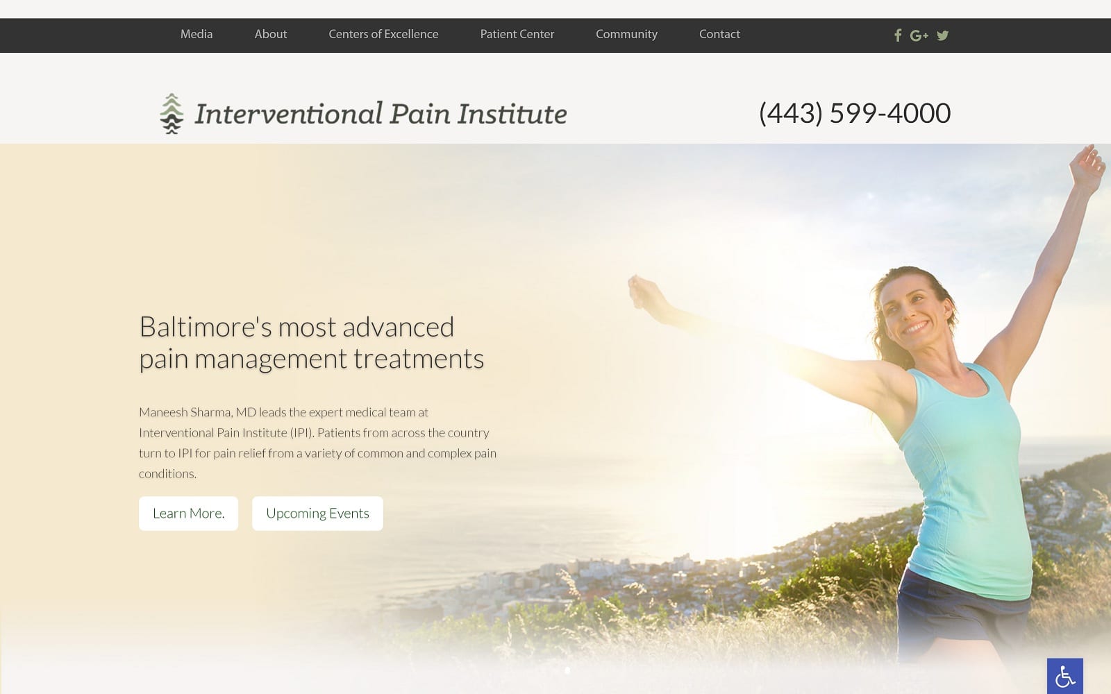
Visit Interventional Pain Institute
How This Website Makes An Impact: Despite its simplicity, Interventional Pain Institute believes less regarding web design is more. Its header image encompasses the entirety of the website, relating the concept of pain to its pain management clinic. Its brand logo is the primary focus, using neutral colors to subdue itself from the core message. Along with the front header image, descriptive text, and an action button are presented to create an opportunity for immediate engagement. For new patients, these factors help establish an instantaneous connection without trying to impress and create new places for the patients to explore their practice at their own pace.
4. Rehabilitation Consultants
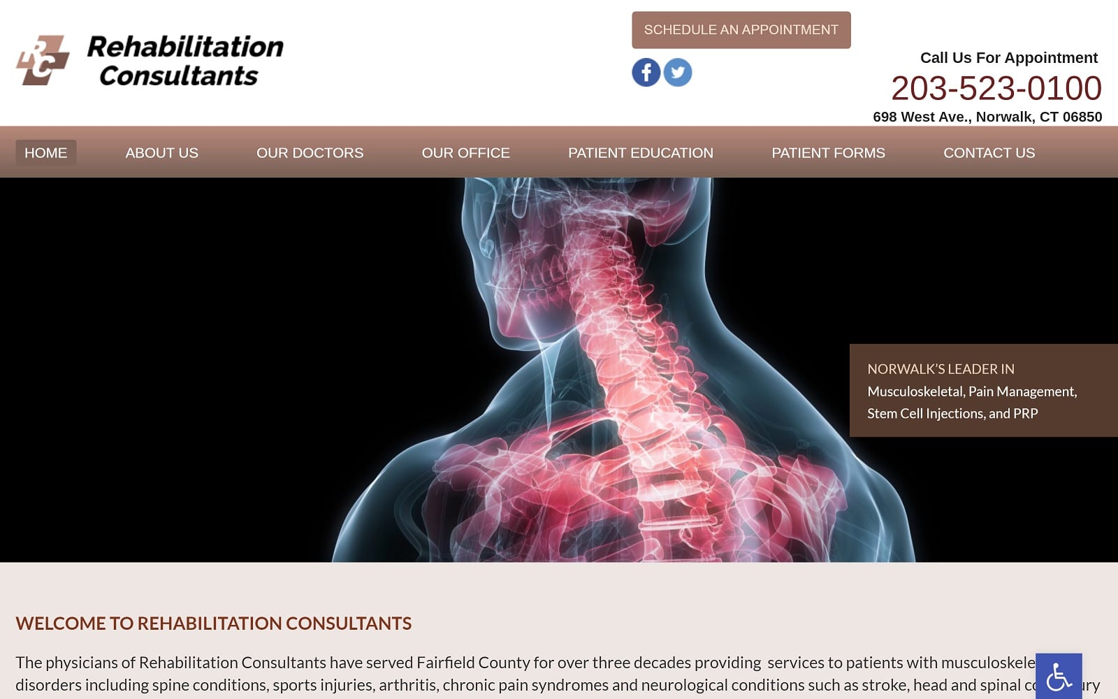
Visit Rehabilitation Consultants
How This Website Makes An Impact: Rehabilitation Consultants Act similarly to the previous website. Instead of using static images, it rotates highly active and engaging images in a slideshow header. Its color palette uses light chestnut browns and light pinks to greet new patients and uses numerous action buttons to attract these patients to various aspects of its website. Its images provide the personal and professional aspects of its practice while simply presenting its consultations and services without overwhelming the viewer.
5. RTP Chiropractic
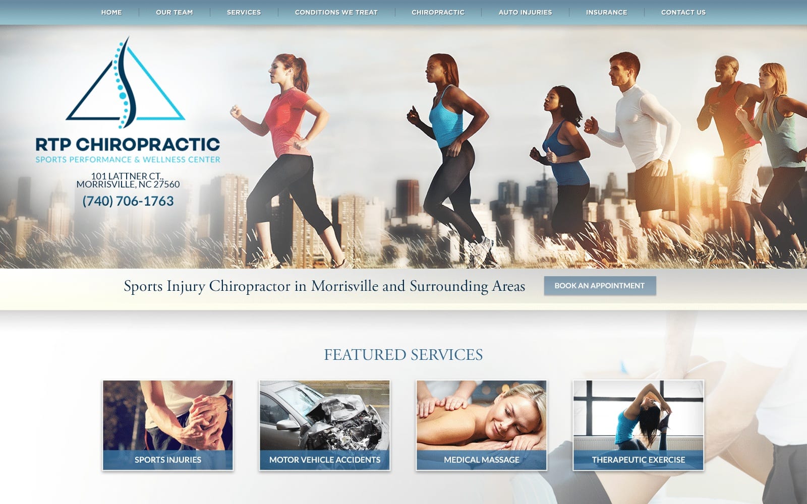
How This Website Makes An Impact: RTP Chiropractic takes a unique approach to web design, incorporating both the header image and practice logo in one section, allowing the headers and subsections to take less precedence. Its primary image uses whimsical, light, airy imagery to promote calmness and healing, and the website’s color palette helps connect this imagery to the overall image of the practice. From there, the website incorporates service images, hyperlinks, and action buttons to further envelop new patients into the core values of the website. It allows them to explore what RTP Chiropractic can do for them.
6. Pain & Spine Center of Charlottesville
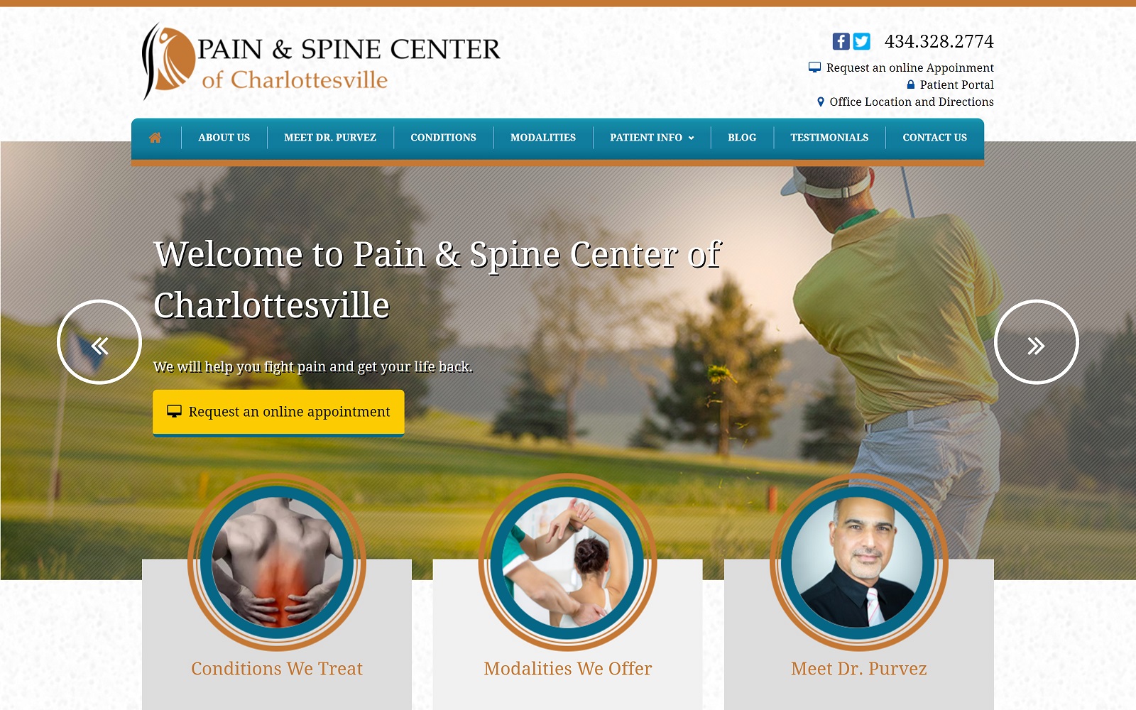
Visit the Pain & Spine Center of Charlottesville
How This Website Makes An Impact: The Pain & Spine Center of Charlottesville removes the traditional appeal to medical aesthetics and personalizes its website with warm oranges and yellows combined with light blues. The contrast between its warm oranges and cool blues helps distinguish the website’s immersive charm and plays with icons heavily to engage new patients further. Through large text, action buttons, and circular-shaped borders, the website establishes a personal connection between themselves and their patients, implying a sense of community with their compassionate care.
7. MidSouth Pain Treatment Center
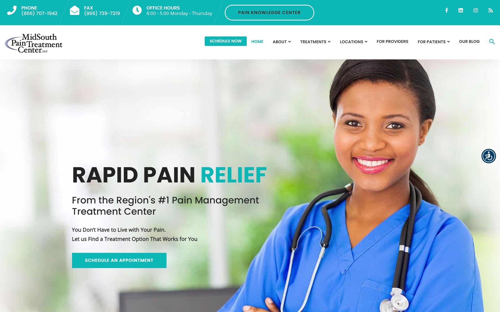
Visit MidSouth Pain Treatment Center
How This Website Makes An Impact: MidSouth Pain Treatment Center refines its website to focus on dynamically presenting its information, using bright teals to direct patients throughout the website and friendly, clean imagery to provide a sense of authority and reliability. Icons help list valuable information and direct patients to other areas of their website. Their large text and use of whitespace provide a clearer view for new patients to take in their treatment options, testimonials, and contact pages.
Developing a Marketing Plan From The Ground Up
Pain management often gets a back reputation, considering how the topic can be personalized for many patients. Marketing strategies in these fields must focus on speaking to patients directly rather than as a sales pitch to appeal to new patients needing care. As we have previously seen, a website can do much of the heavy lifting. But how that website translates to your practice should always be considered, especially if you’re planning long-term.
To truly assess how viable your marketing plan is, it’s important to look at the problems facing your practice, some of which can include:
- Poor Patient Experience
- Changing Payment Structures
- Lack of Technology For Treatments
- HIPAA-Compliant
- Financial Instability
Assessing these issues will help you move beyond the challenges and can act as a starting point for your marketing plan.
