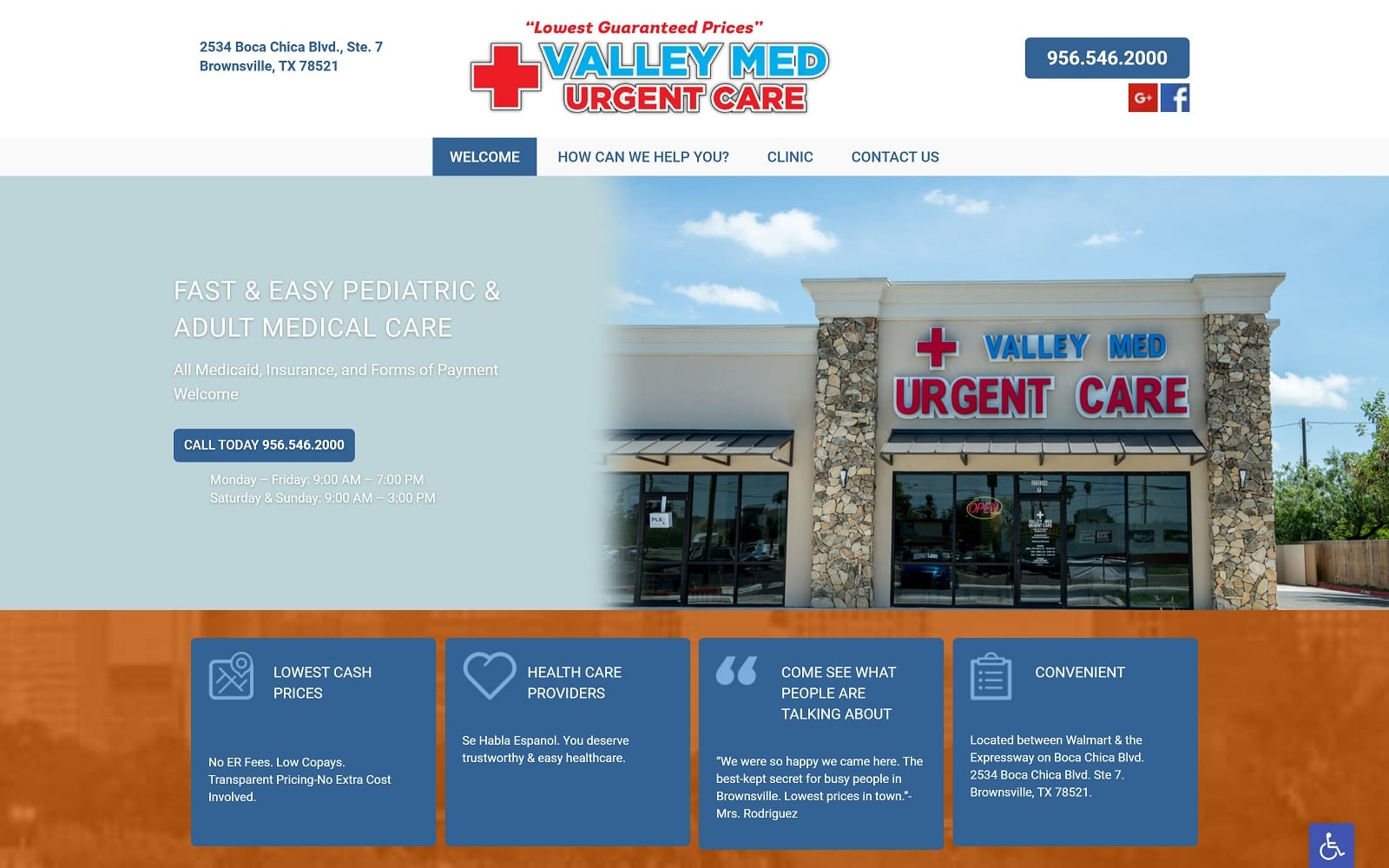
Valley Med Urgent Care provides its urgent care services throughout Texas at several locations. Their website is catered to help patients get optimal care at an optimal price. We made sure to customize a website design that would appeal to both the older and younger audiences while making everything easily accessible and navigational.
Design Overview
To follow suit with the urgent care specialty, we went with a full-width layout design that would get incoming patients the necessary information without all the glitz and glam. As patients enter the website, they are introduced to a rotating image gallery using parallax effects. Right below, we included several redirect links to different areas of the website such as testimonials, services offered, and contact information.
Use of Color
Throughout the website, we used a mixture of both blue and red to create an optimal contrasting color theme. Red and blue are also synonymous with urgent care. Red serves to highlight certain calls to action while blue serves as the primary text color. When used in conjunction, blending blue and red create a sense of urgency and hope from the Texas natives.
We also created a simple but effective personalized logo that used the very same color theme as well. Color plays a huge role in creating emotions or feelings. Here are some other websites Optimized360 has designed that implement a blue or red color theme to create a sense of urgency and hope.
Image the Website Represents
All the images and visuals are family-oriented and represent the hospitality of Valley Med Urgent Care. The clinic tab features an actual image of the office itself. This can also come in handy when patients want to actually visit the urgent care center. Having a physical image of the office building can be quite useful when stuck in a tough predicament.
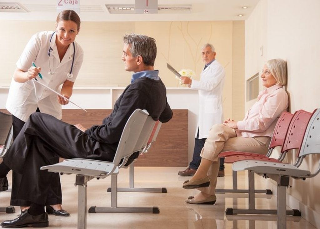
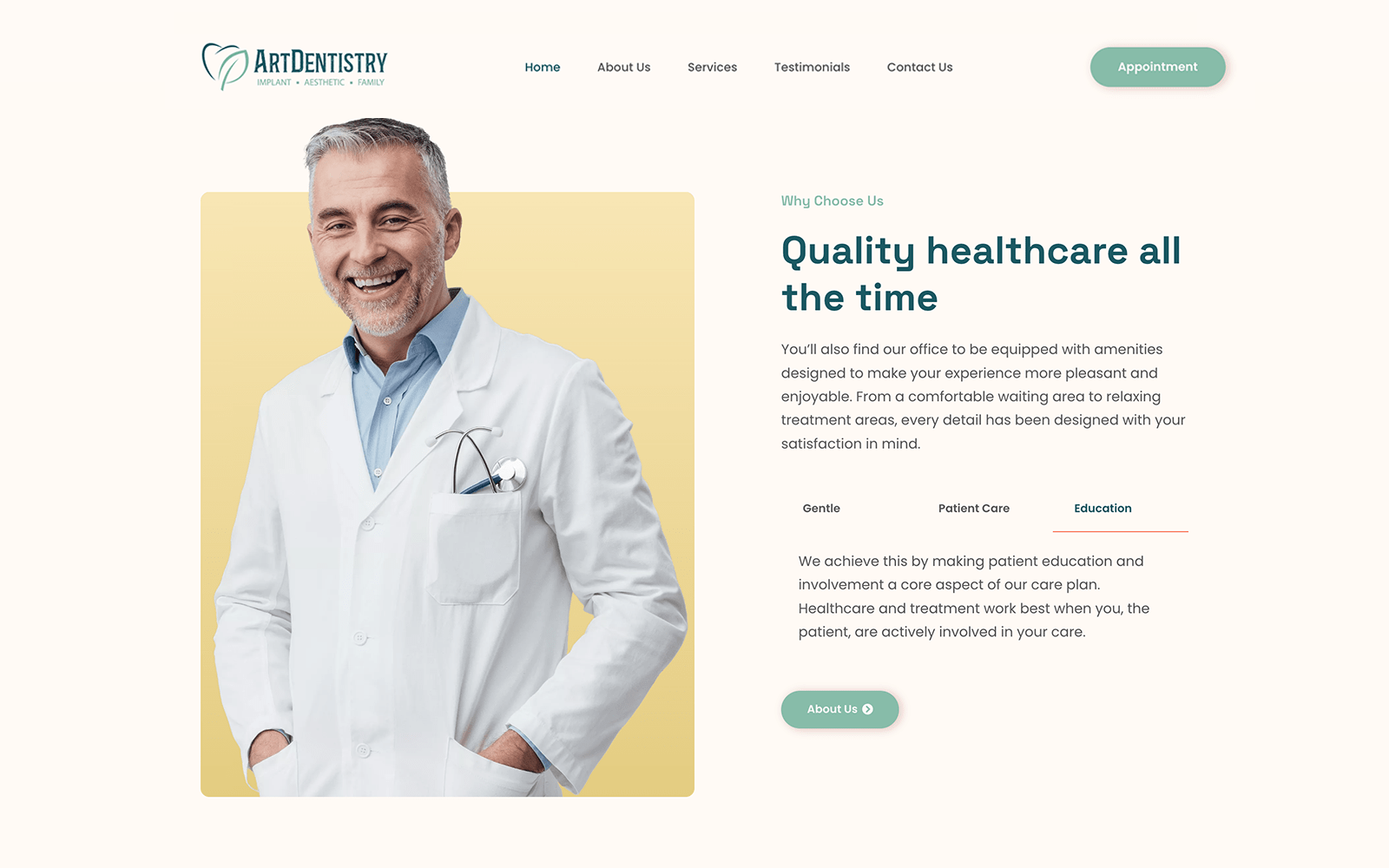
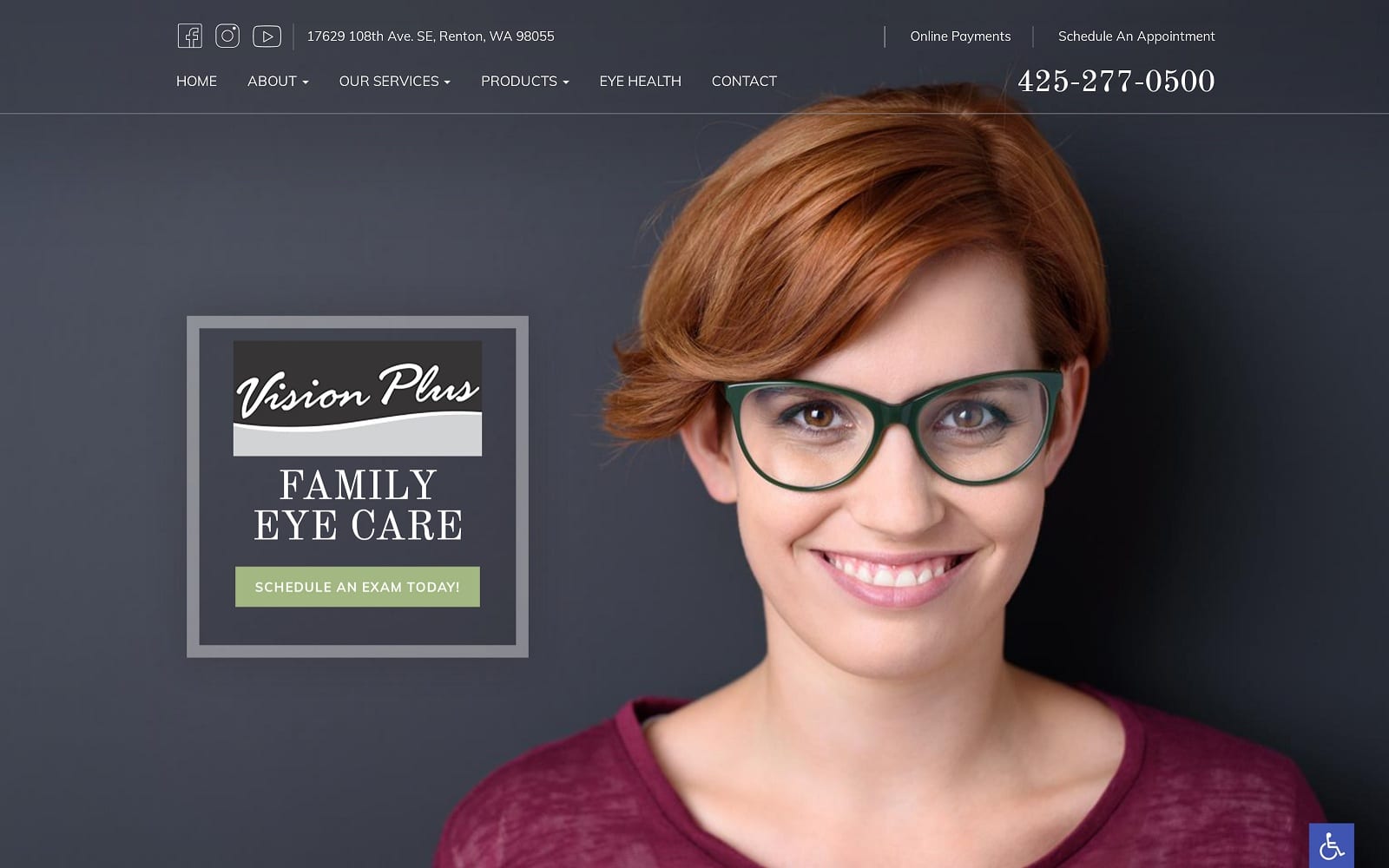
The home page features smiling patients that welcome the readers inside the site. When dealing with an urgent care specialty, it is important to use images that will give readers a sense of hope and ease the nerves.
Elements of Design
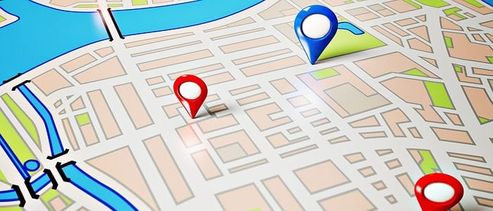
Although simple, the navigation menu is always available to the site visitors. Under the how can we help you? tab, we included all the services offered by the urgent care specialists. At the bottom of every web page, we also included a map and directions to the office as well.
Navigating through the website is a breeze. We kept all the pictures and images all evenly spaced through the use of a traditional white background. When used correctly, white space on any website can provide ample breathing room to help digest the content in front of the patients.
Read more about the importance of using white space on any website, HERE.
Marketing Aspect
For mobile-friendliness, we included a widget at the top of each and every webpage that redirect patients to a direct call line with the urgent care office. This can make or break an emergency when every second count. We also included the Valley Med’s Google and Facebook page next to the call line for good measure.
With urgent care services, it is all about helping patients get to what the need quickly. The simple, spacious site layout allows for optimal navigation and gets patients in and out as quickly as possible.
