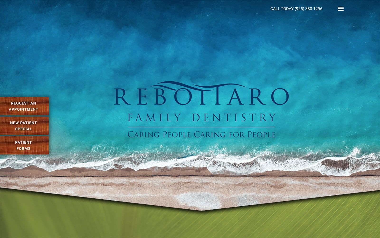
Nature becomes the primary theme of Rebottaro’s ambiance, embracing the tranquility that nature provides and turning its qualities into a personalized asset. Its composition consists of using bright colors found in nature, including brown, amber, azure blue, and olive green, all delicately combined to create a stunning construction in its dentistry design. Its hues appeal to masculine traits, as the almost seamless interaction of the website’s photography interacts with the color scheme to create a sturdy, reliable source of information while appealing to growth and healing as its standard. Both brown and amber typically offer a sense of reservation but used as the action colors when contrasted with the cool tones of both the blue and olive green help convey stability and maturity to its visitors.
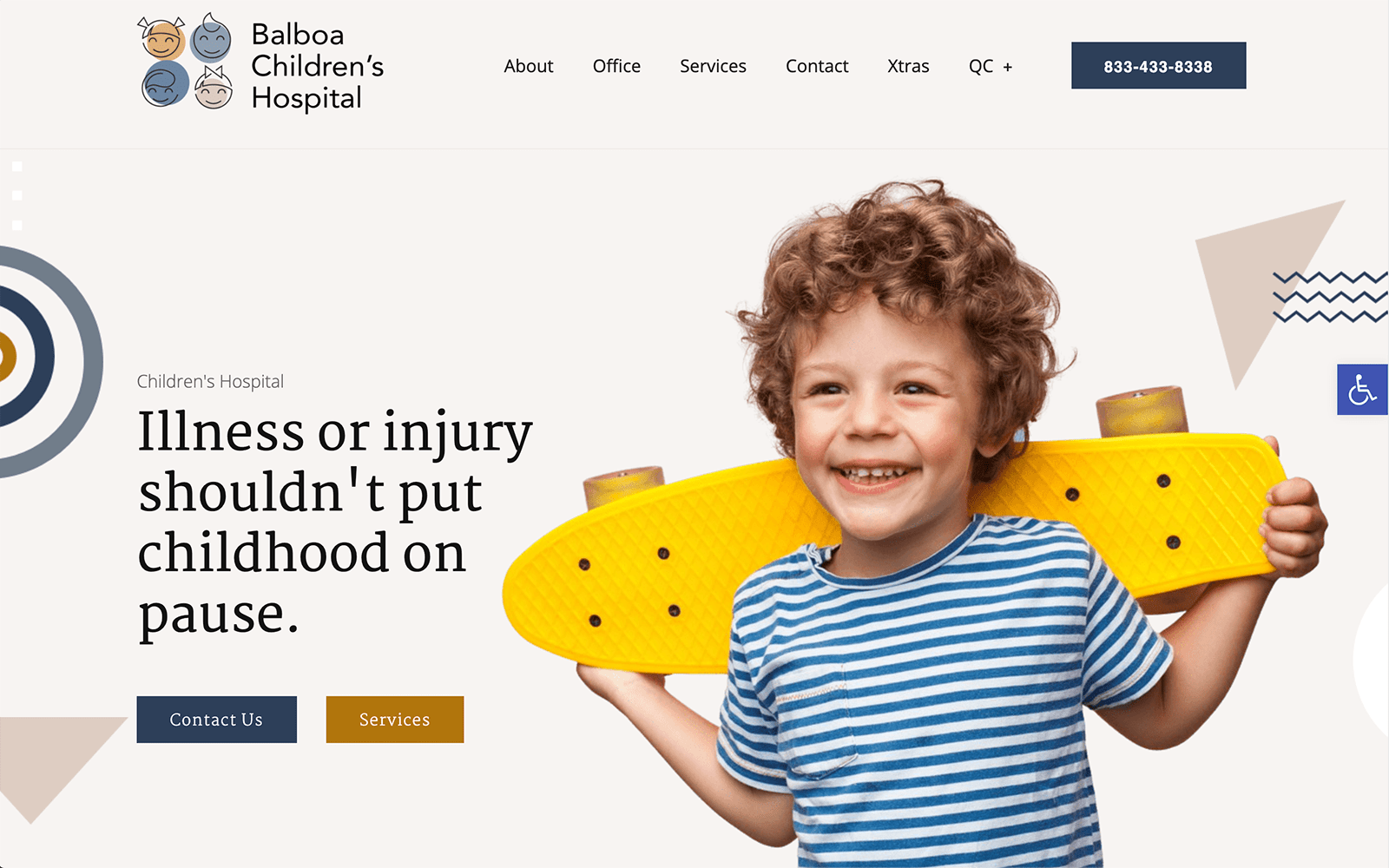
Instead of practicing the use of sectioned headers, a drop-down menu helps to incorporate the website’s services, allowing the scenery of the header image to take center stage and the action buttons on the left side to be emphasized. In the upper right corner, a click-to-call link can be found for accessible communication. Each action button is shadowed and highlighted to attract the visitor, and by using darker, cooler tones, the page’s sections are widened and expanded across the home page to create a seamless transition. Along the lower right side, an accessibility tool can be used, and the footer page contains web plugins for its google maps application and HIPPA contact us form. The white text helps bind and connect the website, making all the information present to be easily readable and interactive.