Vision Plus is dedicated to servicing one of our most essential functions: eyesight. True to their motive of helping clients experience superior vision care, we followed suit by creating a website that would match the attention to service and quality provided by one of the fastest growing optometry clinics in the Renton and Kent area. Just like eye health, the devil is in the details.
Overview of Design
Since Vision Plus was already established in the local Washington community, our main duty was to spread that same love and education to the general public through website trafficking. As with all healthcare specialist, we wanted to ensure that credentials, testimonials, and informationals were easily accessible. We designed the navigation menu in a compact yet extensive fashion to accommodate.
Use of Color

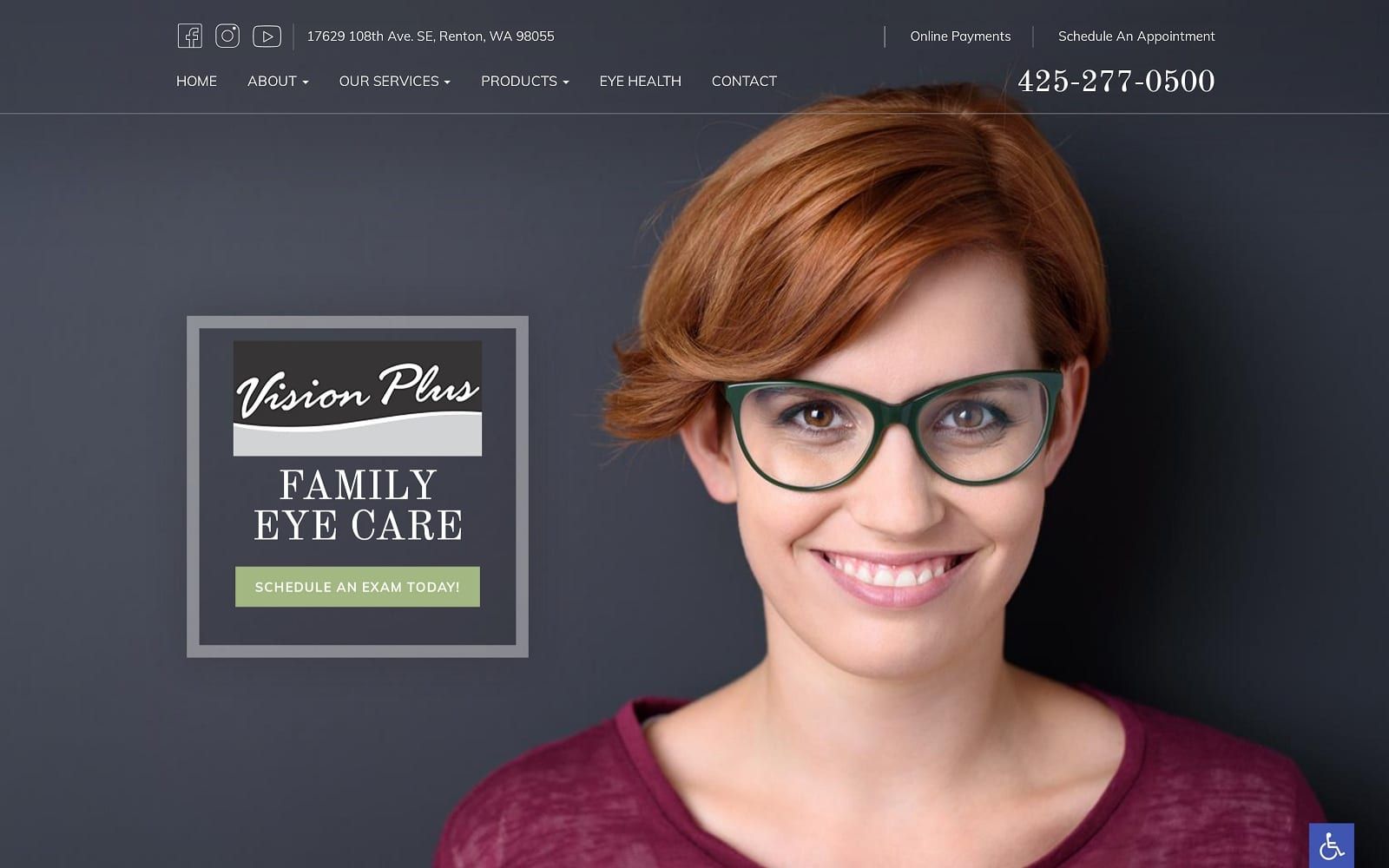
To keep the interface smooth and easily readable, we incorporated the use of primarily green and black over a white background. Black font over white allows the readers to access all the services and information they need without having to struggle along the way. The use of green color is used to dimly highlight links and other calls to action. Green also provides a subtle expression of comfort without being overbearing. The positive color selection and happy expressions send out a sense of assurance to the visitor about the website as well as the practice as a whole.
Design Elements
With all the different elements used in building a successful website, we made sure to keep all information properly spaced out. No matter where you go on the website, the navigation bar and contact info will always be readily available near the top banner of the web page. We also placed a link to the online payments option near the top banner for additional accessibility as well. Not many eye vision services offer online payment. It is another quality in Vision Plus’s resume that proves that they truly are all about servicing the patients first.

Under the eye health tab on the navigation menu, you will find helpful information all about eye exams and their different uses. We added a touch of personal flair by creating a page for the doctors themselves underneath the about tab. Each doctor has a personal section dedicated to their education history and a little bit about themselves outside of work. There is also a picture to help patients connect with the doctors before swinging by the office as well. Since eye care is such an important factor in our day to day lives, you want to be taken care of by the best professionals available. Knowing a bit about the team can be the difference between a skeptical patient and a committed patient.
Marketing Aspect

On any page on the website, you will notice that the widgets leading to their social media accounts are always readily displayed. In addition, the location and hours of the office are available on the homepage. There is even an integrative map to help patients find the office. The services tab details the different treatment and preventative care they cater to. The information about their services is confiding and informative. The writing is quick and to the point to catch a potential lead. To supplement all of this, there are pictures that help reflect the positive nature of the website.C
Image the Website Represents
This website presents an engaging and welcoming design for a practice that’s all about its patients. With the balance of colors throughout the site and its ease of navigation, your patients are going to have a relaxed experience perusing your site that will set the stage for their visit to your office. Vision is extremely important. When you factor in the fact that most people tend to neglect their eyesight, this means that making a welcoming first impression is crucial. We made sure that the hero image would immediately capture the approachable vibe that stems from the Washington natives.