New design idea

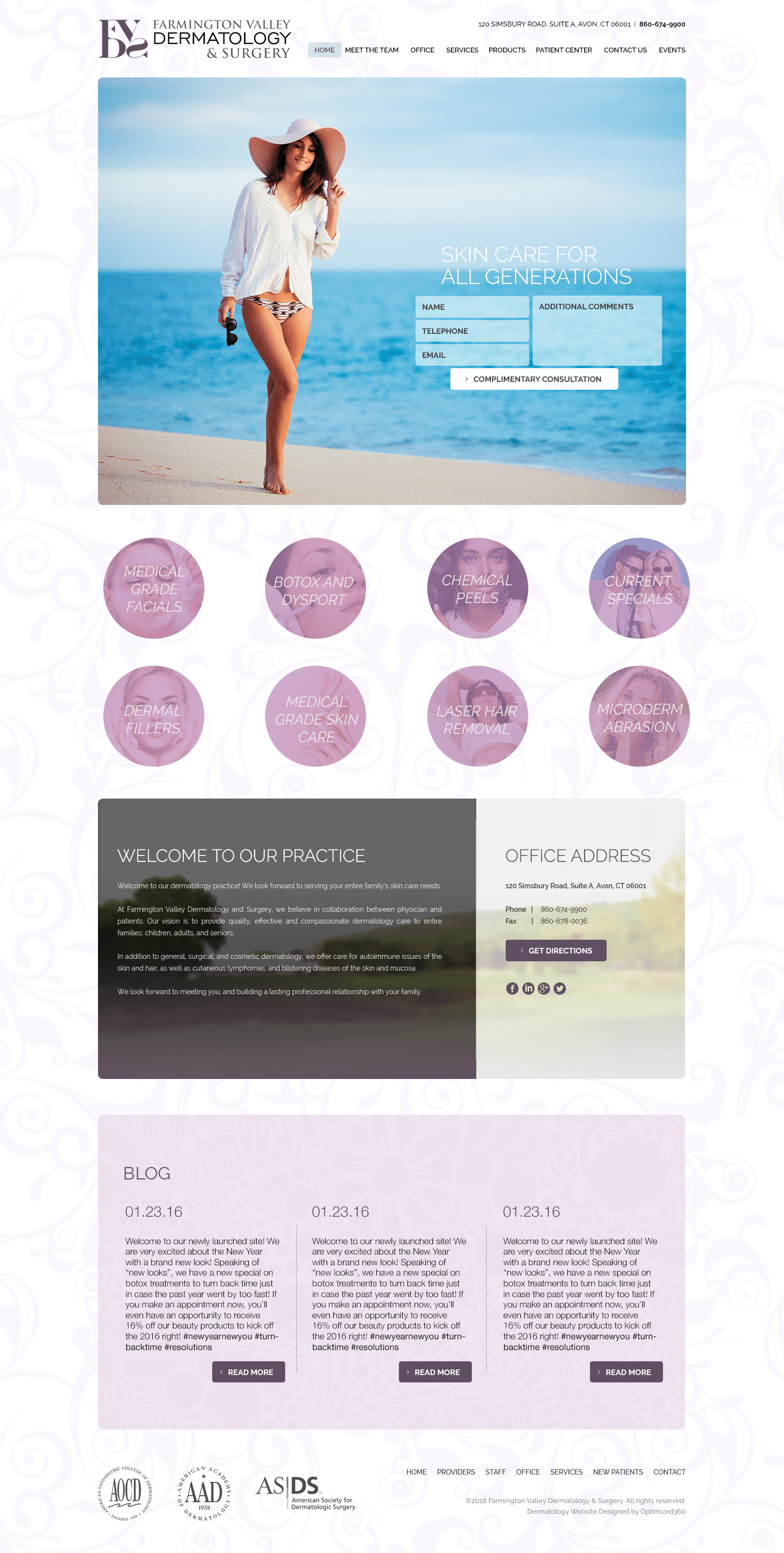
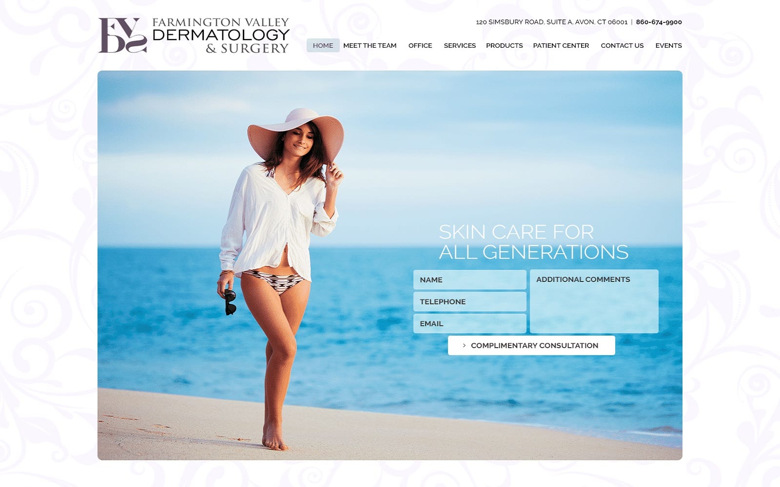
Farmington Valley Dermatology & Surgery embodies soothing, elegant qualities and takes advantage of its cool-toned color palette to convey those sentiments. Farmington Valley refines its dermatology website design with a color palette of lilac, purple haze, and light blue to gently accent its tasteful choices in background imagery and layout. Lilac and purple haze both contain nostalgia and affection; both colors keen on the expression of compassion and grace. Light blue takes on as the tertiary color of the palette, conveying a sense of reliability and relaxation. Its imagery focuses on the aesthetic of beautiful skin, utilizing the calming effects of the beachside to entice the user and attract them to their website. Each aspect of the website’s content features gentle, ethereal aspects of beauty, and layers its elements in such a way that it’s made to inspire a dream-like state, creating intrigue as its main influence for engagement.
Farmington Valley Dermatology & Surgery steer its users with an almost non-existent header, which contains information such as its business brand logo, main menu services, and click-to-call service number. Its hero image, rather than spreading across the page, instead sits at the center of the page, encompassing the website’s introduction text and HIPPA secure form for direct communication with its users. Below the hero image, its services are layered with a lilac panel, and when hovered over, removes the panel to reveal the image representing the service. Below its services, its mission statement is place alongside social media icons and an action button, which hyperlinks to a google maps page for their location. At the footer, action buttons and previews show their blog content, and repeat their main menu services and show their associated memberships for credibility.


