This project is under development

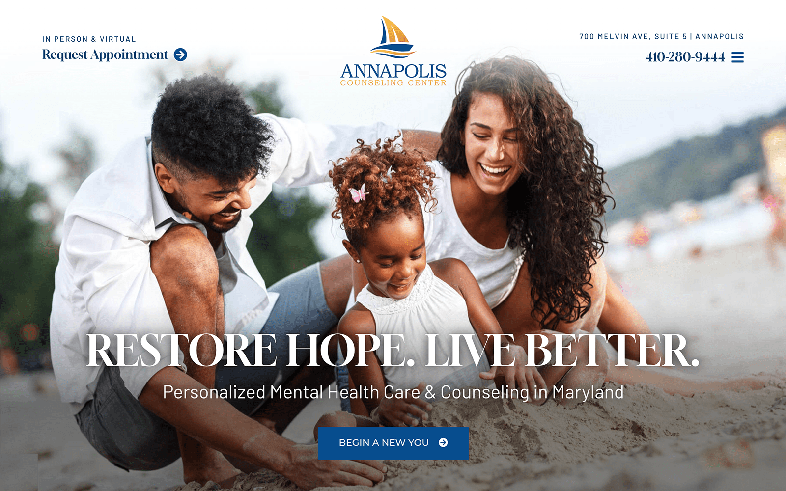
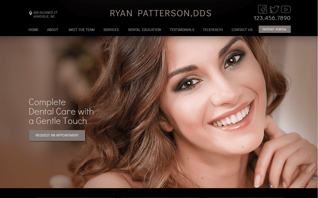
Dr. Ryan Paterson appeals to the sleek, elegance of black, and allures its users with a color palette of gray-toned brown, black, and gunmetal gray. The gray-toned brown embodies a robust, neutral tone that brings out the warmth of what many normally would consider being heavily neutral overall. This color ultimately relies heavily on the darkness of black and its cooler-toned gunmetal gray as its hinging point and flows throughout the website in such a way that it brings out the warm, chocolate browns and nudes from the hero image. The hero image takes the central stage as its central focus, giving users the impression of friendly, delicate, and high-end care. Its modish and graceful appearance allows for its users to become allured by the website’s sleek design elements and imagery, giving them the opportunity to take in the entirety of the website and what it has to offer.
Dr. Paterson exerts its influence by presenting its black, solid header, which contains its address, main menu services, business brand name, and click-to-call service number. The header also includes social media icons and a patient portal for immediate access and connection to their services. The hero image expands across the page and contains the website’s introduction text and an action button for appointment scheduling. Underneath the hero image, semi-flat panels display its services and lead to the website’s mission statement and testimonials. Below the testimonials, users can interact with the HIPPA secure form and google maps widget for engagement. In the footer, users can find quick links to the dental website‘s pages, click-to-call service numbers and email addresses, and the business’s social media icons.