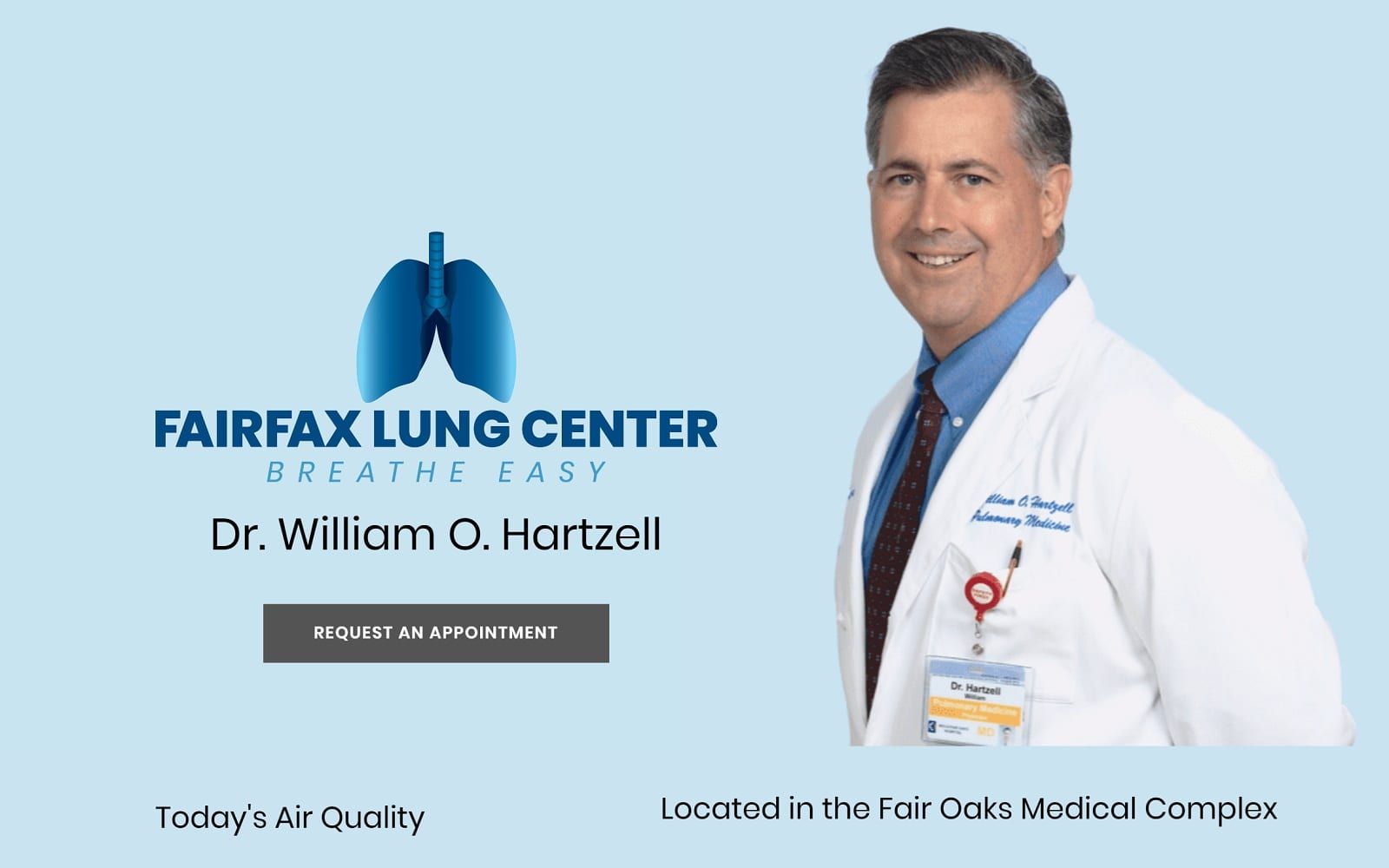
Friendly, generous, and gratifyingly undemanding of the visitor, the Fairfax Lung Center medical website design focuses on simplicity as its core design element with baby blues, mixed-toned grays, and dark navy blues. Baby blue provides a crisp and clean look to the overall website as it dominates the background scheme of the home page, while the website uses medium grays and dark blues as both the action colors and accent colors. What predominantly takes over the design scheme of the website is its use of imagery to decorate and accent many of the widgets and sections present. Almost all of the page’s interaction comes from semi-flat schemes, and its select choices in what information it presents give the overall website a straightforward, effortless, and yet also pleasant experience.
Without over-complicating, the page, the website’s main menu section takes up three-quarters of the page, orientated on the left-hand side. The main menu section incorporates the business logo, address, click-to-call number, and other various information related to their services, new patient forms, and FAQs. By choosing not to integrate parts of the main menu section throughout the home page, the min center of the home page can be utilized with other important aspects that Fairfax Lung Center focuses on, such as the current air quality widget, semi-flat sections for certain conditions they treat, and its google maps widget. On the lower left-hand side of the page, the accessibility tool can be found and interacted with, allowing visitors to adjust text, grayscale, and change contrast.