The University Oral Surgery Center in Los Angeles is dedicated to surgical dental work – wisdom teeth, dental implants, grafting, and anesthesia. When dealing with any sort of surgical specialty, we always want to develop a website that will reflect professionalism and trust. Surgery is a big deal! We guarantee that all patients will feel respected and secure when entering the website.
Design Overview
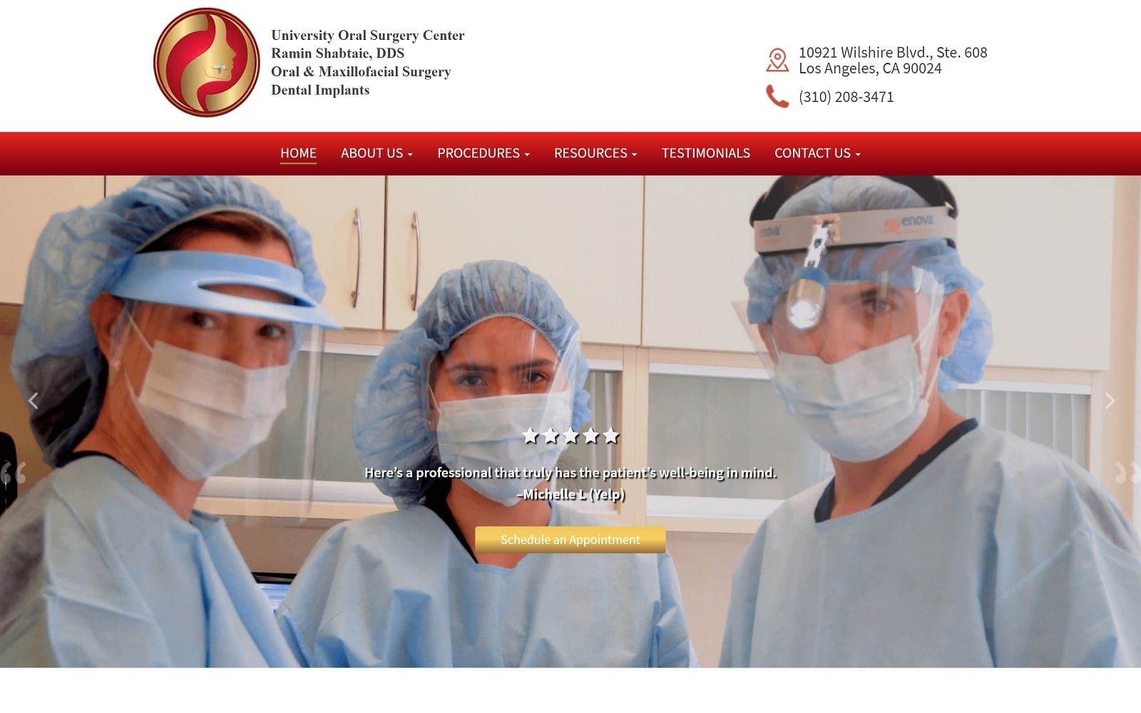
Patients who visit a surgical website typically want answers to their procedures or to explore new options. First impressions matter – especially for surgeons! Our modern, full-width layout allows patients to cruise for information on the site without hassle or trouble. We also highlighted rotating testimonials to add another layer of credibility to the website. To top it off, we also understand that visuals can make or break a decision to have surgery. We applied images depicting professionalism and care throughout the website.
Use of Colors
Surgical specialties and healthcare, in general, MUST radiate professionalism and respect. We used a red theme when creating the website to reflect the importance of surgery. Red indicates urgency – a feeling that patients certainly can relate to when visiting the website. We balanced the red highlights with a white background to add a sense of formality. White is also synonymous with the white lab coats that are often seen in the images throughout the site.
Analysis of Design Elements
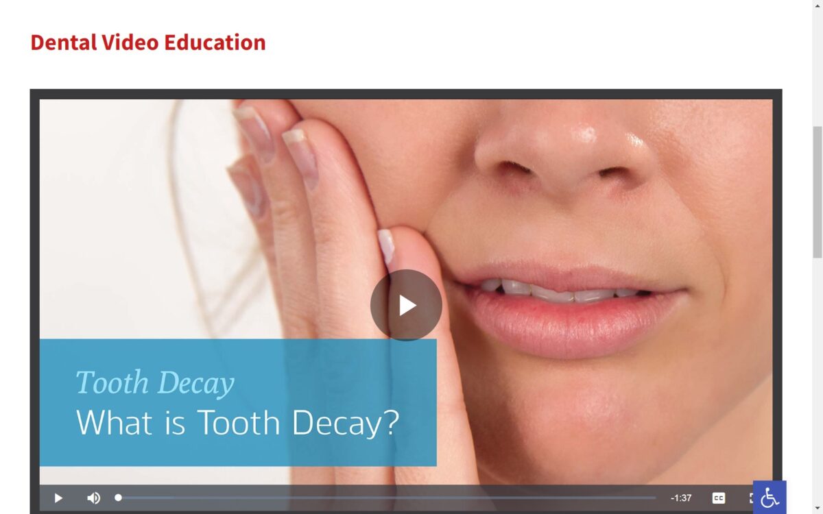
The main goal of the website is to inform and educate patients to give them a sense of relief and commitment to the procedure. We designed elements of the site accordingly. The slideshow of images within the header provide hope and demonstrates the services offered. There are also resources for the patients located on the navigation menu. Patient informational videos also demonstrate additional in-depth information for visitors to view.
With surgery, timing is everything. The website is responsive to both desktop and mobile platforms and adjusts to the devices accordingly. We also understand that disables patients may visit the website as well. We included ADApt on the website to ensure that patients with disabilities would have an optimal viewing experience as well. SSL Security is also implemented on the website as well!
Marketing Aspect
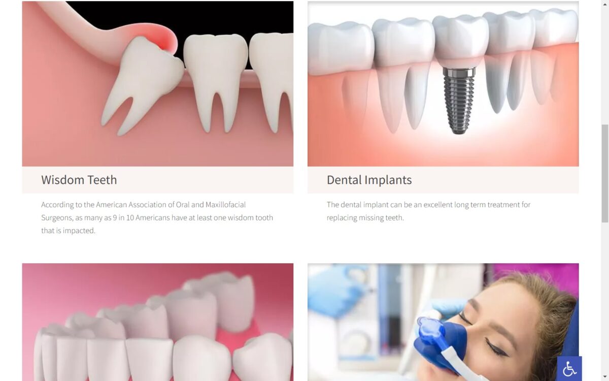
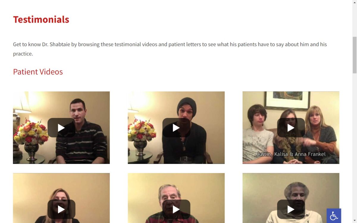
The testimonials tab on the navigation menu is the home to multiple reviews from real patients. We have also made it easier than ever to schedule an appointment by implementing a link to an appointment page on the homepage. Under the procedures tab, patients can view every procedure in fine detail. Some procedures are even paired with videos as well.
Image the Website Reflects
Overall, the website’s goal is to inform and educate. The images, videos, and color theme all complement the goal. The typography is formal and welcoming. Nothing seems extremely rushed or forced. There are also images of certificates on the site to flex the credibility of the professionals involved. The website is a clear reflection of the professional manner that all the surgeons at the University Oral Center operate under.
University Oral Surgery Center Oral Surgeon Website Designed by Optimized360
