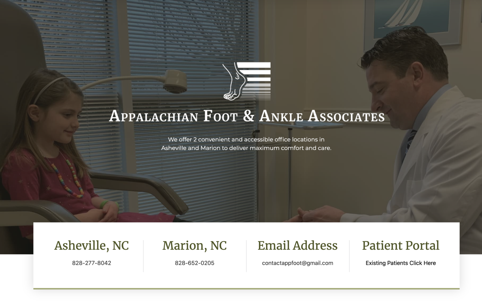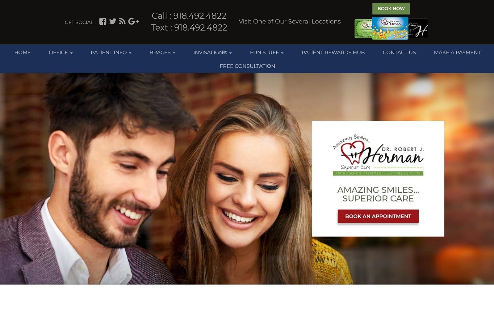
The website sets a welcoming warm tone for the visitor right from the beginning. The landing page of the website provides a unique combination of soothing base pictures which gives an assurance of satisfaction to the visitor. The easy access to book an appointment on the home page is also a factor that is appealing to the visitors hence fulfilling their aim of the visit.

Overview of the Design
The background pictures are an eye-catching factor about this website. While scrolling down the home page, the pictures at Dr. Herman’s intro and testimonial column remain static which gives a unique look to the home page. This positioning is a clever way of highlighting information by keeping it interesting. The website itself is easily accessible; all the information being well lined out. Columns like ‘fun stuff’ and ‘reward hub’ intrigue the visitor.

One prominent feature of the website is the location maps of all the offices provided at the end of the homepage. This makes it very easy even for a less tech-savvy customer to see and set the navigation to his preferred office location.
To read more about some of the website design rules also designers should be following, click HERE!
Use of Colors
The color palette chosen is the optimum combination of soft and bright giving a soothing essence to the whole website. It gives a sense of security and at homely vibe. It represents the very nature of Dr. Herman and how he treats his patients at his facility. The people in the pictures are a happy couple, a smiling girl representing the happy clientele that Dr. Herman has. The positive color selection and happy expression send out a sense of assurance to the visitor about the website as well as Dr. Herman’s practice. The whole vibe symbolizes Dr. Herman’s way of working.

Analysis of Design Elements
Actions speak louder than words and that is what Dr. Herman’s website represents. The website is kept simple and easily accessible to the visitors for smooth navigation. The elaborate menu is not given as most of the times it becomes a hurdle rather than help. No extra pop-ups are used on the website to avoid clutter hence giving the website a fresh and clean look like the Teeth of Dr. Herman’s patients. All the necessary information can be accessed from the home page itself.
Marketing Aspect

The marketing aspect of this website is on point. The website gives due focus to the prominent clients i.e. children. There is a separate column of fun stuff to attract the little angels. Even fun activities like earning rewards option by playing games are available on the website. Rewards cards are available in different color and taste palettes of different genre of patients.
Image the Website Reflects
The website reflects a warm, positive and safe place like home. The fresh soft-color palette pictures are attractive and inviting. The visitors feel a sense of connection with the doctor through those smiling faces on the website. One important aspect of the website is that it succeeds in creating the homely vibe making the visitor easy and comfortable to visit the facility without the scare of a hospital.
Dr. Robert J. Herman Orthodontist Website Designed by Optimized360