Website under construction
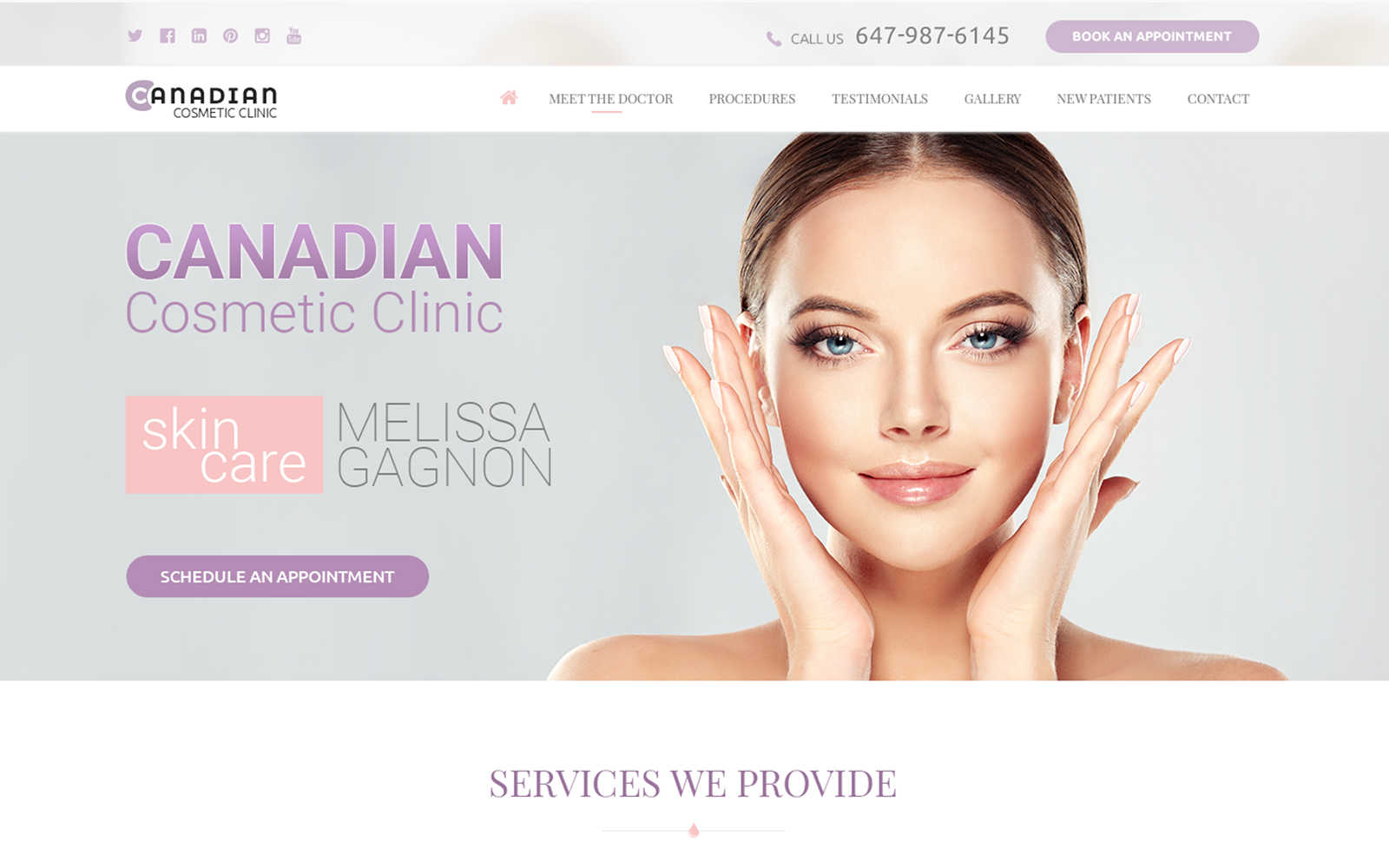
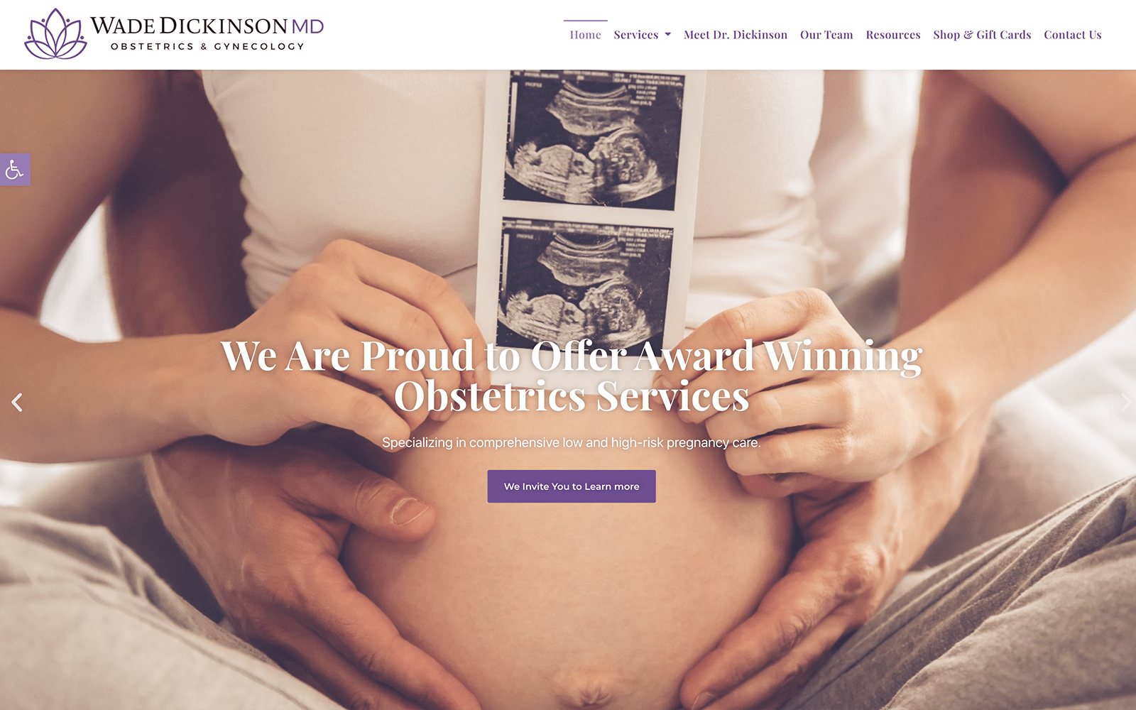
Sugar Land’s OBGYN services are beautifully represented using an engaging color palette reflective of the services they offer. Purple, pink, and white are the foundation of its design, representing independence, nurture, and purity. Each of these colors is reflect the journey patients face on the road to motherhood. Splashes of orange are used throughout the site to catch the eye and direct the visitors eye to places where they can take action, engaging with the clinic. Their striking logo uses a heart motif to stylize a mother holding her child in an unmistakable eye-catching design.
Patient information and education are key elements to Sugar Land’s website, with abundant access to their records and patient information being present the moment they land on the site. The FAQ section is designed to provide patients with the most pressing information most new mothers want to know about a prospective OBGYN facility. The Secure Patient Record Access section helps mothers take control of their care by giving them access to each step of their treatment process on the way to, and after, birth. Patients trying to reach out to the clinic will be able to do so by using the click-to-dial functionality present in the hero image, while those seeking directions can use the direct-to-map option built into the address.
