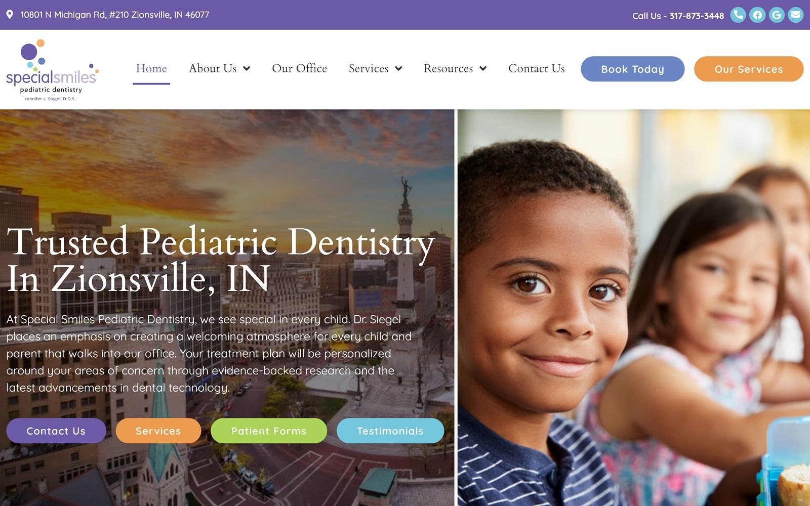

The focus of Dr. Satterfield’s practice is immediately evident to visitors with the children presented in the hero image of the pediatric website. The site uses its striking green/blue/white color palette to break the site into easily digestible sections that are easy to navigate. The alternating palette means each color takes its turn as an action color, while striking white remains the primary color for text. The service links are nicely stylized dental images that are mouse-over responsive, flipping to give additional information to the viewer. The testimonial section is presented on a white background with black text, overlaid on an image of the clinic’s interior. This helps to connect these testimonials with the child-friendly environment shown in the photos.
This website is a great example of mobile-responsive design, with its layout transitioning seamlessly from traditional platforms to mobile viewing. Returning patients seeking to quickly connect with the clinic will benefit from the click-to-dial functionality presented in the site’s header. Those seeking information will find the hamburger menu easy and intuitive to navigate. The mission statement is presented up front to help patients begin building rapport with the office, an essential element for parents trusting the clinic with their child’s dental needs. The site also clearly presents information about the sites specialty, building confident in patient’s that this is the place to go for cleft palate needs. The footer of the site provides instant access to direct-to-map features as well as office hours and social media connections.