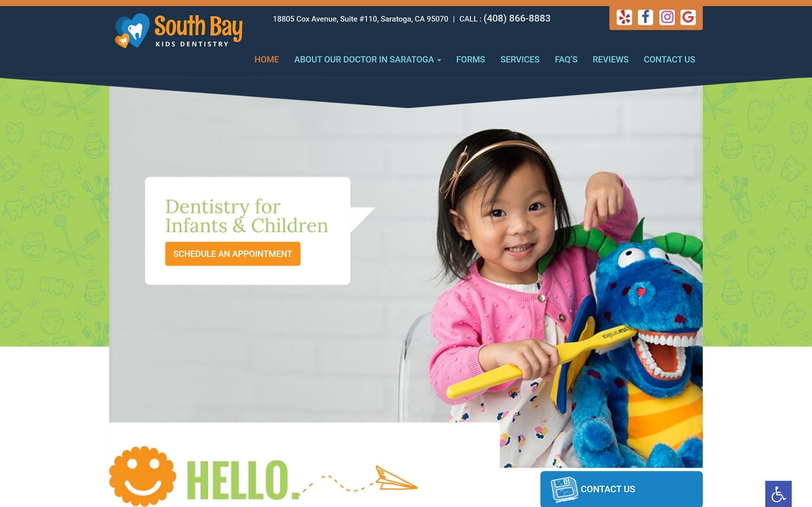
South Bay Kids Dentistry serves the children of its community and does so with a focus on friendly, open designs and a welcoming atmosphere. When your patients are a precious commodity, you want to make sure they’re comfortable and happy during a visit to your office. This starts with the website you present to the world.
Overview Of The Design
It’s bright; it’s fun, it’s welcoming. All of these elements will come together to help ease the anxiety of children viewing the site while telling their parents that these dentists know their business. Quick access to scheduling shows they respect a busy parents time while social media links are a testament to the importance of ongoing information about dental and oral care. A quick mention is made of how the office will accommodate the patients while they wait, speaking of amenities that will ensure they spend their wait happily distracted and comfortable.
Use Of Colors
When you’re targeting children with your pediatric website design, you want to use bright, bold colors that boost confidence in patients who might be nervous about seeing the dentist. Bright smiling faces and comforting blues bring this site a fun and playful air that encourages little customers to look forward to their visit. For parents of those patients, it sends a message to a child-friendly environment who understands the needs of their real customers.
Analysis Of Design Elements
Bright open smiles, happy children, and a playground of color come together in this design to make the information palatable to parents and invisible to the children. The child’s eyes will be drawn to the aesthetic design, with imagery showing happy children taking care of their favorite pets chompers. Scheduling an appointment can be done without making a phone call, helping to alleviate the child’s concerns by avoiding the anxiety that can come with expecting a dental visit. The placement of the social media and review links indicate that they’re eager to get their current and future clients in touch with a flow of information and invited into this clinics community.
Marketing Aspect
This website is targeting parents of young children, rather than those with adolescent family members. Immediate access is given to scheduling an appointment and getting additional information, helping to streamline the journey from getting on the site to connecting in the office. Phone numbers and addresses help to join the site with its local community. Additionally, there is a list of insurance companies that the provider accepts, drawing hits and also informing parents without a lot of looking around.
The Image this Website Reflects
A playful environment with a clientele of child patients. Subtle undertones in the site help to bring it an air of sophistication and trust, small touches that ensure that parents visiting the site will understand that while it is made by children, it’s run by professionals. This site tells a parent that they’ll be taking their child to a warm, playful environment specifically geared to handle the concerns that face children and their parents during hospital visits.
South Bay Kids Dentistry Designed by Optimized360


