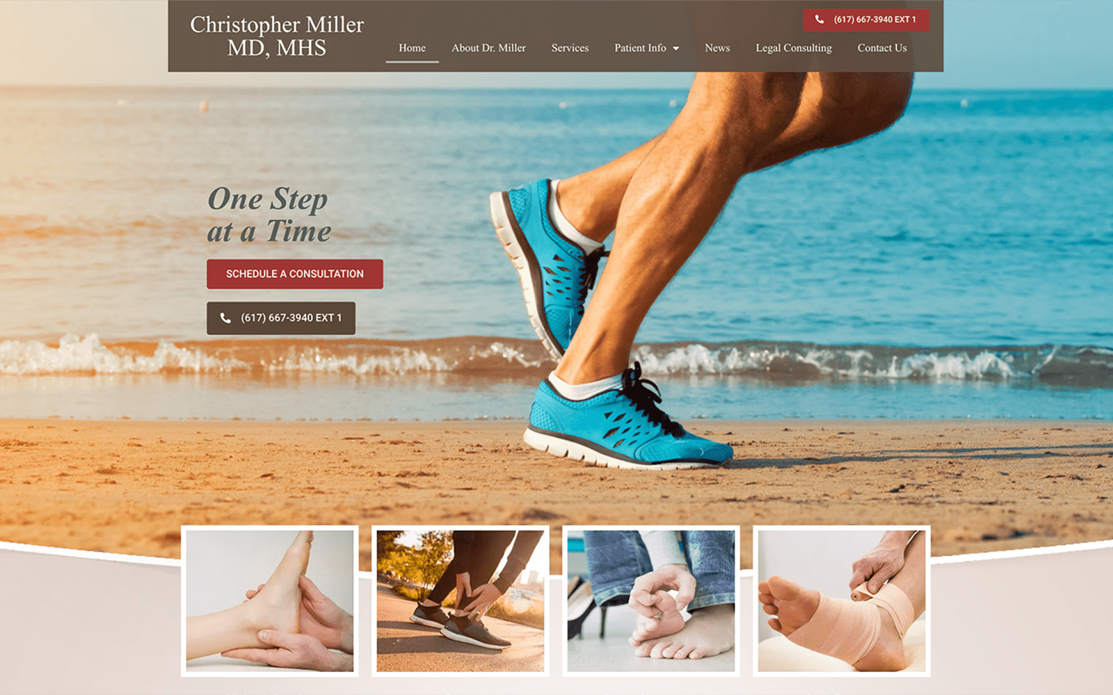
Orthopedic foot and ankle surgeons look to provide their patients with an extension of care through minimally invasive techniques and physical therapy. When working with orthopedic surgeons, we understand that their patient base is already actively searching for pain relief. It is our job to help welcome those potential patients into Dr. Miller’s website through various design elements that will help increase his patient retention and online presence. Dr. Miller’s website (christopherpmillermd.com) is a great example of potential web designs for those specializing in orthopedics.
Overview of the Design
Upon first glance, Dr. Miller’s website is not only clean but spacious as well. Every inch of the website serves a purpose. Whether it is to inform his patients or to provide a call to action, it is important to lead your patients throughout the different pages of the website. Looking at the homepage alone, we have all the essential items patients are looking for: a hero image the shows the specialty of the practice, a button that invites patients to schedule a consultation, featured services, a short bio for credibility, testimonials, a contact form – and much more. The end goal of any website is to direct or convince your incoming traffic to make their way into your physical office. We hit all the checkmarks on the homepage alone.
Use of Colors

Nothing spells professional like a simple, clean color palette. We stuck to a simple beige color theme to ensure that all the text and images were not overlooked. Patients want to be informed about how you can help them. Sometimes less is more; just like Dr. Miller’s website. For the images, we stuck to the more vibrant side – allowing us to add a bit of flavor to the clean color palette. When you find the perfect harmony between text and images, you create a powerful contrast that is both modern and informative.
Design Elements
Dr. Miller has three separate locations, all within Boston. We made sure to highlight this fact by implementing different interactive Google Maps to help patients get to the best hospital within their range. We also added associations and social media links on the bottom of the homepage to help sooth patients and connect with Dr. Miller on a larger platform. The contact page has all the official information one would need, along with a contact form to help patients get in touch with the practice. We laced all the design elements together with some motion and entrance effects that help add a bit of flair to the website.

Marketing Aspect
Testimonials are a great way to provide credibility and influence on a patient’s decision to visit an office. We made sure testimonials were prominently displayed on the homepage with a slider. The navigation menu acts as your main directional resource throughout the website engagement. Dr. Miller also provides legal consulting; we made sure to market these additional services by giving it it’s own tab on the menu. The call to action buttons are also labeled in red. Red is known to be an action color, the perfect color to use when you want web viewers to interact with it. Last but not least, we made sure that the three practice address’s would never be overlooked by having them featured on the header on top of each web page.

Image the Website Reflects
Dr. Miller’s website is a great example of how less is sometimes more. The simplistic color theme and the different design elements all flow together to help create a marketable website that is sure to bring Dr. Miller’s practice more patients. When patients enter the website, they immediately understand the practice at hand and the different services offered. Overall, the website reflects a warm image that will sooth patients looking for ankle and foot relief.