New design idea

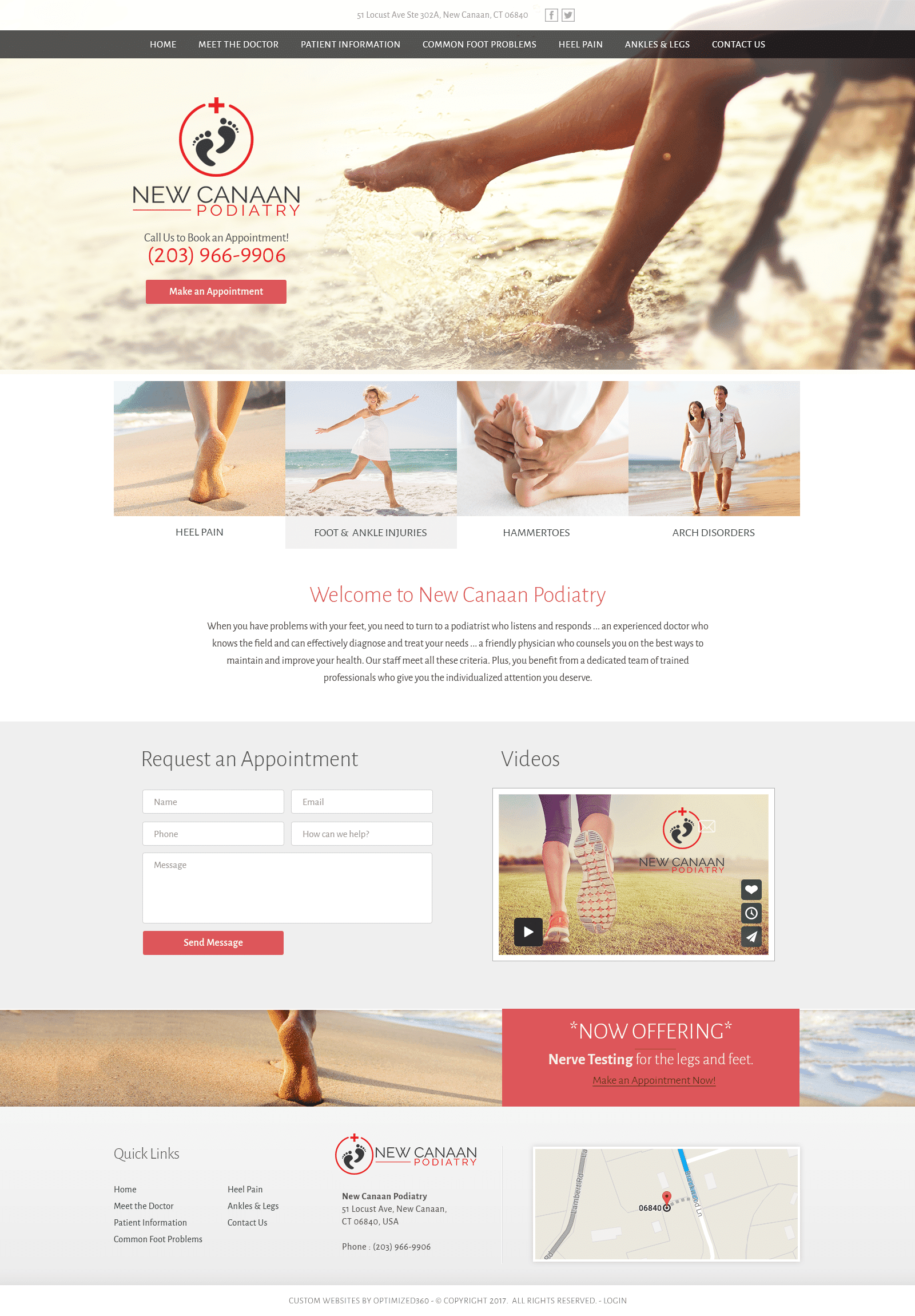
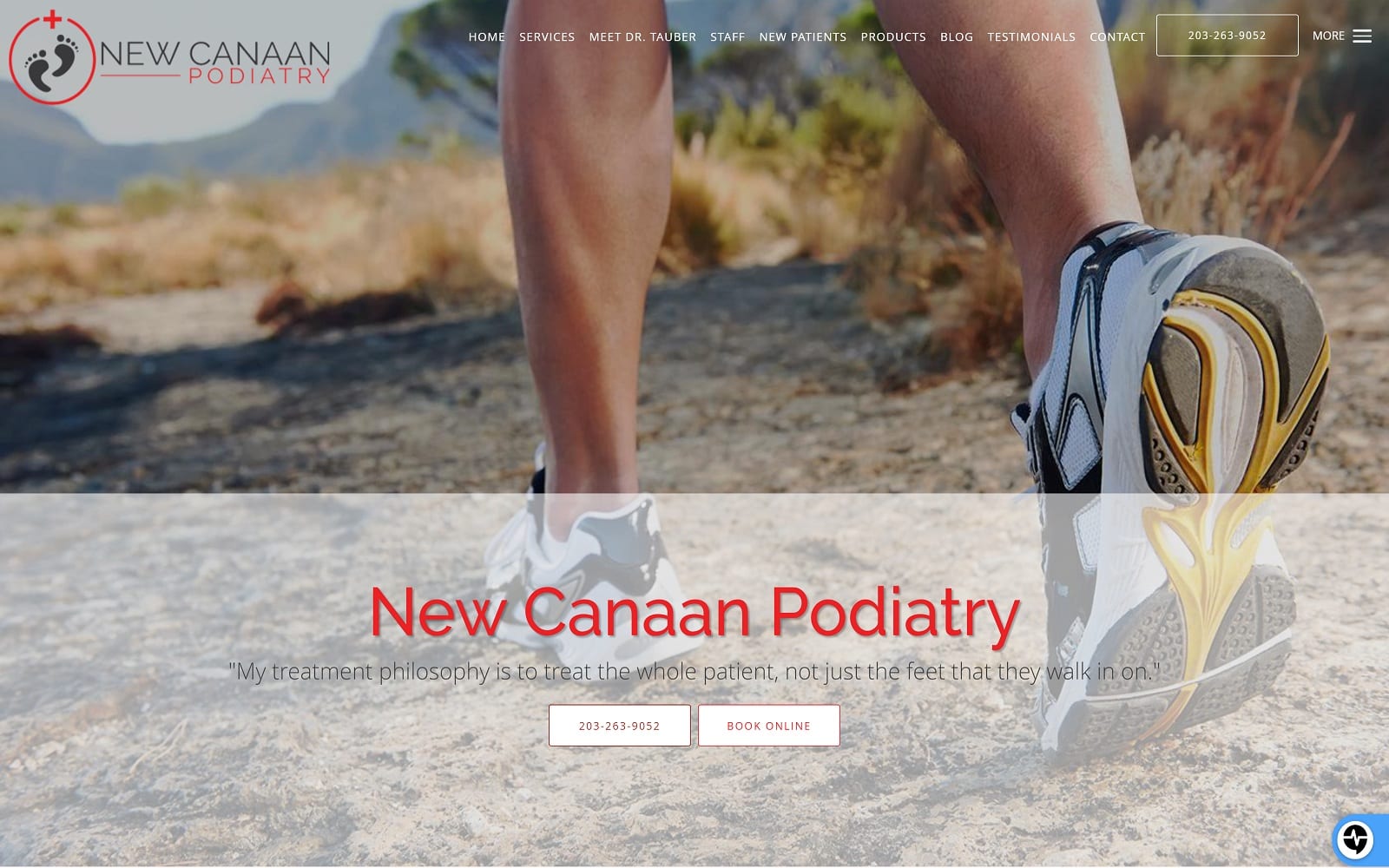
New Canaan Podiatry appeals to the sensual side of its services, captivating its audiences with pastel reds, charcoal black, and white smoke to intrigue and entice. Pastel red contains the same impressions of red, such as passion, energy, and intensity, but subdues it with muted tones to create softness, which can convey a sense of compassion and understanding. Accented with colors such as charcoal black, which communicates elegance and mystery, and white smoke, which represents freshness and new beginnings, its color scheme is neutralized for delicacy and muted impressions. Combine the effects of these colors with the beach-themed, dreamy imagery; New Canaan Podiatry focuses heavily on its faint impressions, which in turn convey a sense of sophistication and empathy, as all of its design functions aim towards more inclusive, benevolent services.
New Canaan Podiatry introduces its podiatry website with a subtle, transparent header, containing social media icons, its address, and main menu services. Its hero image contains the business brand, click-to-call phone number, and action button for immediate contact. With minimal amounts of divisions, the website pairs its services, highlighted with semi-flat design with its mission statement. Each section combines certain aspects, such as its HIPPA secure for, video interaction, and special promotions, into a simple set up for clear functionality. Its footer contains its google maps widget, as well as its various contact information related to its services, including its location address, click-to-call phone number, and quick links. At the bottom of the footer, visitors can find the website’s copyright information.


