New design idea

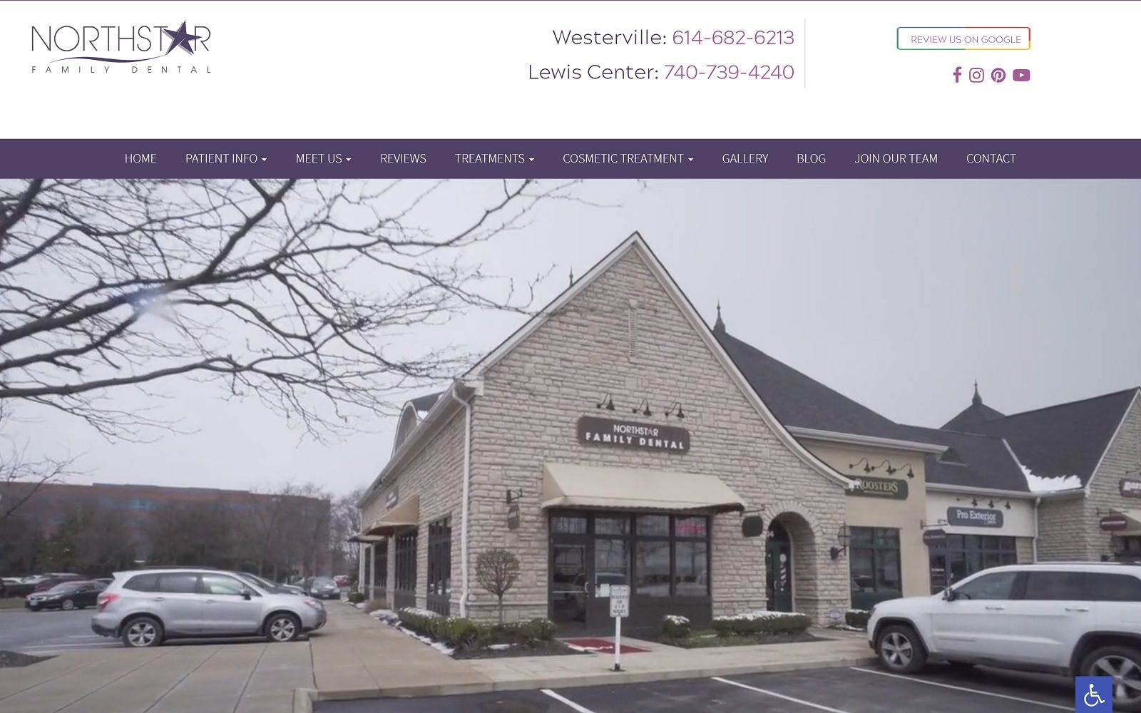
With a soft beige with peach undertones and warm brown, Northstar utilizes authentic and natural themes to convey reliability, efficiency, and, most of all, comfort. As a neutral shade, beige pairs well with brown, and thus helps to set off the brown as the transition color between sections. The website incorporates a warm, golden brown, which is considered to be a highly earthy and healing color, as the action color throughout the site. Brown helps to stylize the website and form unity throughout all of its transitions. Its color scheme helps emphasize the website’s photography and imagery to communicate a relaxing, friendly atmosphere.
Among the neutral-colored header image, the dental website uses a drop-down menu to allow patients to explore its features. The header image contains a click-to-action button as an overlay across the picture and a banner with its social media icons and click-to-call hyperlink. Each of its sections is monochromatic until hovered over, outlining the website’s services. Its office section highlights key text with bullet points, and its testimonials use a slideshow widget to showcase its reviews. At the footer of the page, both interactive videos, a HIPPA contact us form, and a reoccurring click-to-action button re-centers the focus of the website and then refurbishes it with additional links to the Northstar’s address, phone number, and social media icons. Its main menu section, while previously used under the drop menu bar, is placed at the bottom of the footer, allowing visitors to connect to the site without repetitive scrolling.