Overview of the Design
Massih Orthodontics aims to be at the forefront of orthodontic care and treatment with cutting-edge services and technology that set them apart from the competition. We wanted to build a custom orthodontic website that celebrates those distinctions and differentiates Massih Orthodontics from other local orthodontic offices.
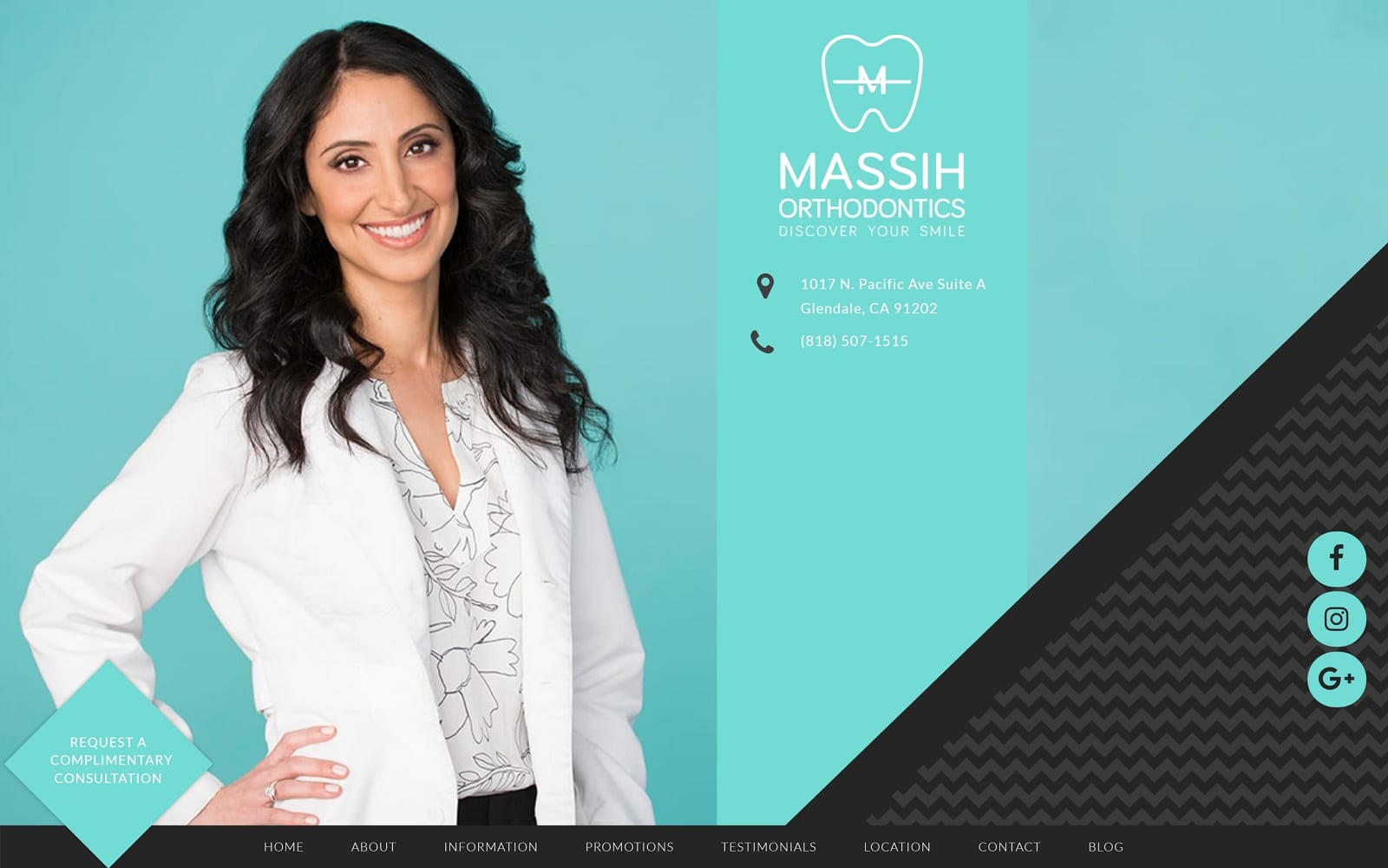
This website has a quirky yet modern appeal, ensuring it stands out and makes a memorable impression. We moved the navigation bar below the header image, which depicts a welcoming photo of Dr. Massih herself. Next, we created a brief welcome and a secondary custom menu bar that redirects to various website areas, such as a before-and-after gallery and FAQs page.
Use of Colors
This website is set against green, turquoise, and black backgrounds. These colors contrast with bold geometric patterns to create a stand-out design. The colors are cheerful and modern, giving the impression that Massih Orthodontics is a progressive practice that is setting new standards for care. Learn more about the psychology of using colors in web design.
Analysis of Design Elements
Building a custom website for orthodontists means interpreting the image and vision of the office and depicting it in a way that represents the practice well. For this site, we opted for a full-width layout that best uses all the visible space on the viewer’s screen. It is highly responsive and functional across many viewing platforms, including desktops, tablets, and smartphones.
We created diamond-shaped tiles that redirect to various website areas and change colors when selected. We also integrated an interactive map into the practice to help first-time visitors find the office. As a bonus, we allowed new and existing patients to download patient forms directly from the website to help reduce office wait times.
See examples of other modern orthodontic websites.
Marketing Aspect
We included many different marketing elements within this design, including an invitation to schedule a consultation directly from the home page. We also integrated positive patient reviews throughout the website and a before-and-after gallery to show the types of results that patients may expect from this practice. Finally, we included links to the practice’s social media accounts so that new, existing, and future patients can stay connected with the office between visits.
Image the Website Represents
This website represents the unique and quirky image of Massih Orthodontics, which balances fun with professionalism. The bright colors and geometric shapes take the place of actual images. Dr. Massih herself welcomes visitors to the page, giving the impression that the orthodontist is a laid-back, approachable people-person.
If you have another dental specialty, check our dental website design service.


