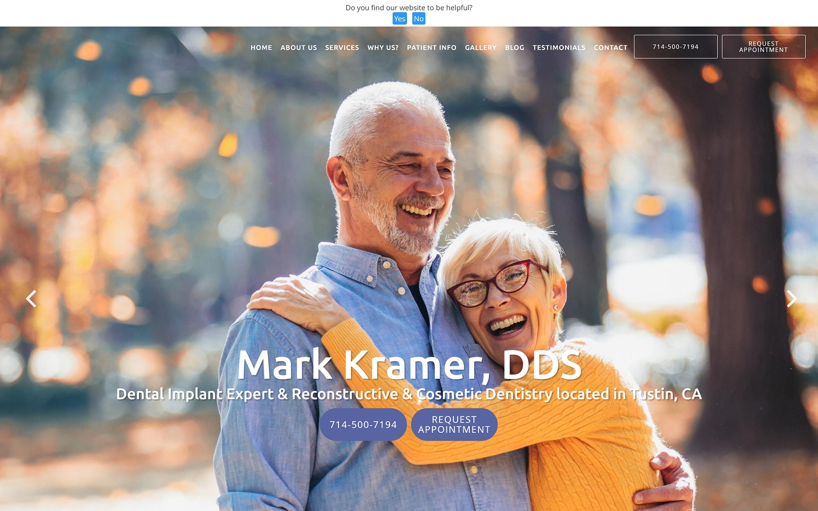
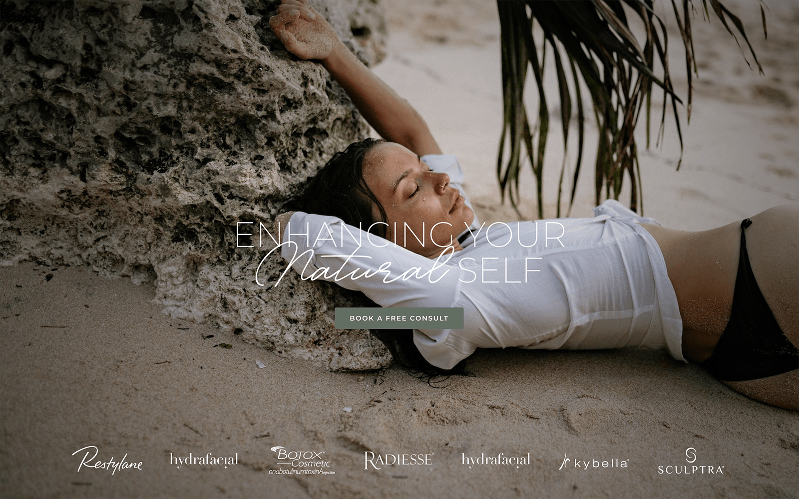
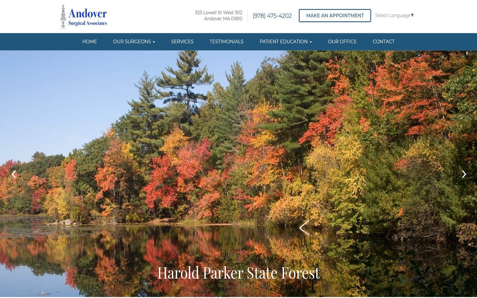
The website of Mark Kramer DDS uses a simple color scheme almost entirely consisting of shades of blue, with the occasional splash of white used to bring contrast and attract the eye to important action points. The hero image slide-show displays a collection of images that brighten their experience with smiles from relatable faces. The testimonials page is an exercise in simplicity, providing links to multiple social media outlets where reviews and comments about patients’ past experience with the specialty clinic have been shared for public consumption. The office page displays beautiful images of the clinic alongside information about its operating hours. Nothing on the website is overdone or overloaded and is simply elegant on both large format screens and mobile devices alike.
Along with being an excellent aesthetic choice for viewers of the website, the imagery used also subtly indicates the clientele the clinic typically serves. Mature patients and those in the later years of life will see familiar faces that help them connect with the clinic, and younger family members in the image are notable for their absence. The gallery is used to set expectations for future patients regarding the results they can expect from the services the clinic provides. As visitors near the end of the page, they’ll encounter a HIPAA secure form they can use to reach out to the clinic without concern over their personal data being released. The mobile-responsive nature of the website transforms the traditional menu into a static hamburger menu accessibility at any point during mobile users browsing.


