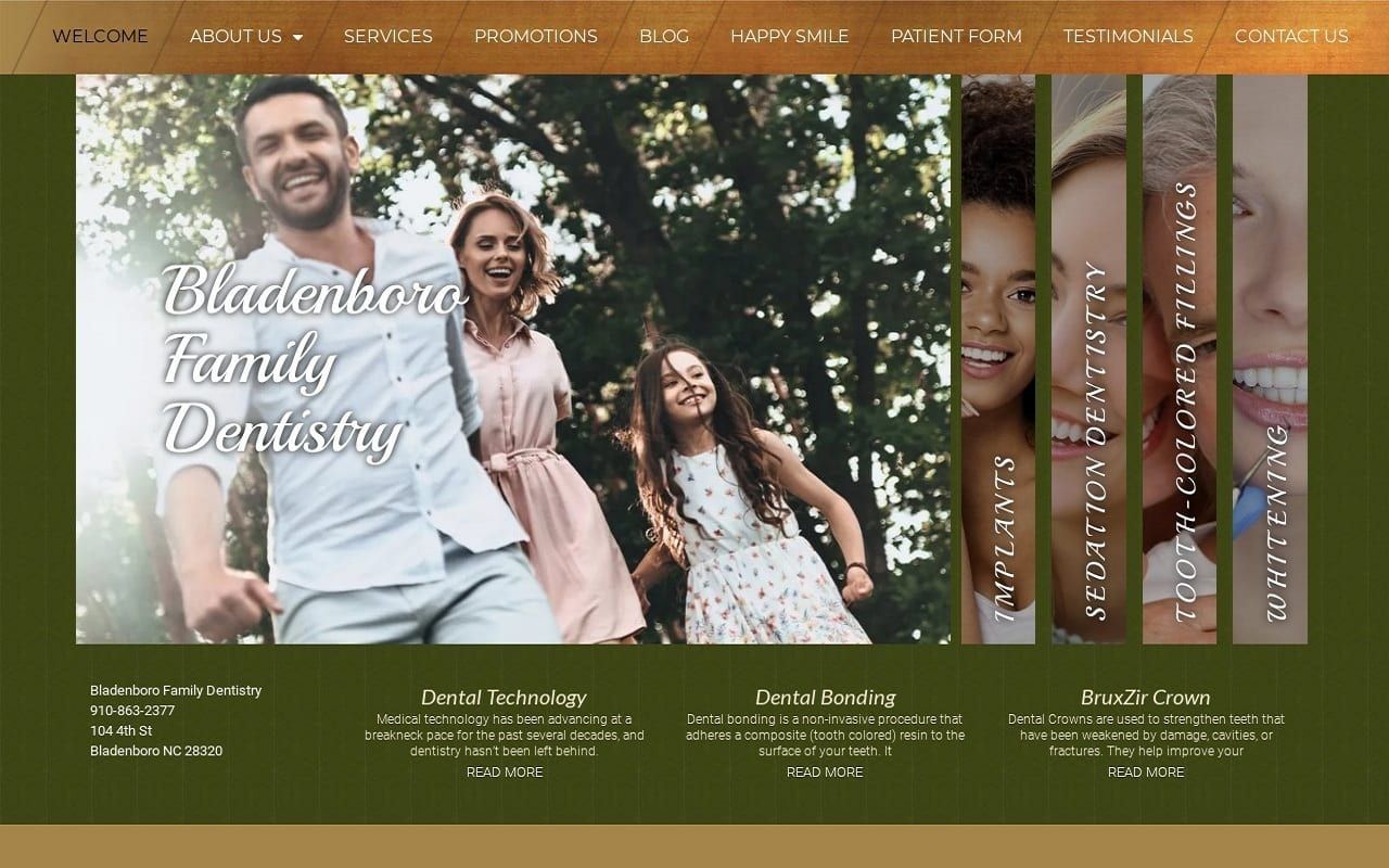
Bladenboro Family Dentistry wanted a site that felt down to earth and calming, and we think this color palette and design hit the mark. This aspect, combined with the streamlined and minimalist nature of the rest of the site ensures clients will easily find what they’re looking for without having to time waiting for the site to load. The overall approach keeps in mind the clientele of the tiny town of Bladenboro North Carolina and the lives they lead.
Overview Of The Design
When designing a site for a client, it’s vital that you keep the location their customers call home in mind. The proper approach to a cosmopolitan customer base is different than those from a small town like Bladenboro. This knowledge resulted in the straight-forward design found in the Bladenboro Family Dentistry site.
Use Of Colors
The people of Bladenboro have long made a life built on harvesting the natural resources of their area and agricultural interests, leading the color scheme choices. The brown, beige, and green design is reminiscent of the environment from which they draw their living, and the places that families in the area spend their time in recreation.
• Contrast – While touching on things near and dear to the viewer is important, it’s also essential that the selected colors have good contrast to make navigation of the site and taking in its contents enjoyable. The gentle contrast between green, beige, and brown creates a visual aspect to the site that flows beautifully and makes reading comfortable in any lighting.
• Community Ties – Green is known for its associations with nature and vitality, as well as the beautiful vistas that surround the small town of Bladenboro, while the brown speaks to the down-to-earth nature of the practice at Bladenboro Family Dentistry. Beige’s neutral properties tie it all together to give the impression of a home-style practice with its feet firmly planted in the community.
Analysis Of Design Elements
Bladenboro Family Dentistry has a design based in simplicity, taking steps throughout to avoid unnecessary complexity. From it’s use of open space to the placement of information on the site, it’s clear that it was intended to be accessible and easy to use. The site’s design also took into account the inconsistent and often limited internet access of the local community, resulting in a lightweight design intended to load quickly on multiple devices and bandwidths.
• Space – Both a function of and the result of the bandwidth realities in the Bladenboro area, the site has an open and unrestricted usage of space in its design. No video imagery or complex interfaces to be found, the whole site can be navigated through clicking one of four buttons.
• Navigation – Everything you need to know about the services they offer and making an appointment can be found on the homepage to keep visiting lightweight on bandwidth and easy to navigate. The website is heavily utilized for delivery of information, but four image links are immediately available if you’re interested in learning about different aspects of their services.
• About Us – The About Us aspect of this page is accessible through the hamburger menu that makes an appearance at the top of the page, dropping down a series of links to various areas within the site. After learning about your team, there’s a Contact Form included to make jumping into an appointment easy.
• Contact Information – Contact Information, from phone numbers to the office’s address, is all easily accessible from the home page as part of its minimalist design.
Marketing Aspect
The hamburger menu is an essential part of the sites marketing design, as full menus have been shown to be less well received by viewers. It also helps to keep the page open and clean and is the best way of providing menu access to mobile users. Imagery on the site helps connect the office to the local community while the prevalence of easily accessible access information makes calling for an appointment a breeze.
![]()
The Image this Website Reflects
This website reflects an office that is in touch with its community on multiple levels, from the powers that drive their lives to the accessibility of technology and bandwidth within the Bladen County, NC region. Everything about the site is accessible without being overpowering or pushy, and it’s design provides the perfect open and welcoming air to encourage without pressuring. Home, community, and a connection to nature are all present in this site, making it ideal for the community it serves.