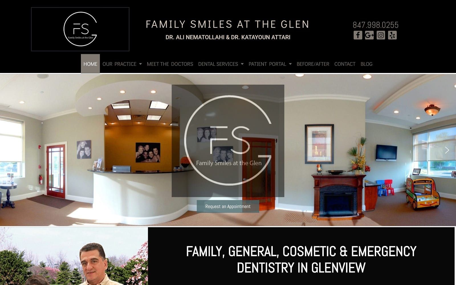
This site was brought to us with a single request “Elegance through simplicity”, and we built everything from there. Family Smiles At The Glen is a dental practice in Glenview, IL with a unique name and an open and welcoming atmosphere to its clientele. We wanted the website to represent this dental practice in a way that it deserved, and we think we’ve succeeded.
Overview Of The Design
The basis of the design was a beautiful company logo that was integral in our color choices for the website. The webpage was meant to be simple, so we ensured that the home page wasn’t overloaded with links or imagery while still maintaining a substantial amount of information in an easily digestible format.
Use Of Colors
Simplicity and elegance don’t require garish colors or complex designs to capture the eye, they can do it through eye-catching contrasts and insightful planning. The foundation of the Family Smiles At The Glen website are black, grey, and white, a rainbow in monochrome that lends itself perfectly to the atmosphere we were looking to create.
• Contrast – Black is a neutral color used in website design to lend an air of sophistication and elegance, while white brings thoughts of clean white teeth with the grey adds a formal quality to the site.
• Action Oriented – The use of grey to highlight the action buttons on the site provides a bright contrast to draw attention to them and encourage viewers to click through.
• Community Ties – Images of the business’s location and the area surrounding it serve to tie the website to the community by providing familiar sights for its visitors.

Analysis Of Design Elements
The design aspects of Family Smiles At The Glen include some essential aspects that help bring out its accessibility and makes information easy to find.
• Space – The layout of the site presents information in an orderly fashion without overloading any particular section, giving a relaxed and accessible air to it without intimidating the viewer.
• Navigation – Finding your way through the site is relatively simple thanks to the presence of the hamburger menu at the top and bottom of the page. Additionally links throughout the page help guide the visitor to pertinent information without their needing to spend a lot of additional time searching.
• About Us – The ‘About Us’ page on this site has been rebranded to be more welcoming, an invitation to ‘meet the doctors’ playing a primary role. This helps to make the experience for the visitor a personal one.
Marketing Aspect
Family Smiles At The Glen includes a number of marketing aspects to help facilitate the conversion of visitors into customers.
• Contact Information – Providing easy access to your contact information is vital in marketing, as the compulsion to call for an appointment can be fleeting and you don’t want to miss that window. This site provides copious opportunities for the visitor to contact the staff easily, providing email information, phone numbers, and even an address.
• Inviting Them To The Office – There’s an additional section on this design that is a clever addition, an opportunity for the visitor to ‘Take An Office Tour’ from the comfort of their home office.
The Image this Website Reflects
Family Smiles At The Glen represents a friendly and welcoming dental practice that is focused on providing good information, an open accessibility to their reviews, and a new place for your family to seek their care. The information is available and open, inviting visitors to make contact and turn their search for a new dentist into their first appointment.