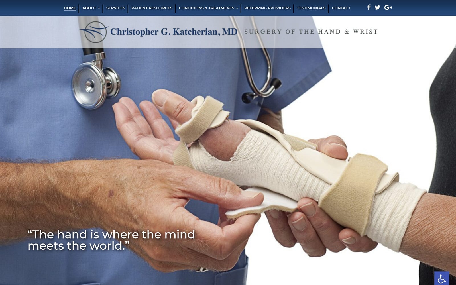
Dr. Christopher Karcherian manages and runs both hand and wrist surgical offices in Irvine and Los Alamitos. With a focus on hand, wrist, upper extremity, and microsurgery work, we made sure to design a one-of-a-kind website that would fit well with his particular niche. Not every doctor specializes in the hands or wrists. When you are looking for a specific sort of surgery, you have to look for a doctor with the right qualifications for the job. We made sure that our website would highlight Dr. K’s strong suits and experience in the upper extremity industry.
Design Overview
For this unique design, we operated on a full-width layout rather than a traditional site with marginal white space on the sides. The home page navigational menu spans the upper portions of the page, navigating to additional information about the practice, Dr. K., and his services. Further, into the home page, visitors have the opportunity to meet Dr. Hadaegh himself and locate the most common form of wrist and hand injuries. Finally, we rounded out the home page with direct links to special services and the option to make an appointment.
Use of Color
To complement the healthcare industry, we went with a simple but effective color theme that used both white and blue. When you head into any healthcare site, you want to feel invited and calm. Blue helps add a memorable aesthetic around all the fancy design elements. Blue, when set amid a field of white, can create a sort of contrast that is neither both harsh nor extremely delicate. It is the perfect balance of pop and eye-catching. Since the office is located in Irvine, we understand how picky the demographic can be. We made sure to match the color to blend in with all the additional design elements.
Design Elements
The modern, rotating image gallery on the home page is a great way to introduce incoming web-visitors of a good note. The navigation bar is home to a plethora of information. Located right above our customized logo, the navigation bar serves to educate and inform about all the different issues and risk factors that come with wrist and hand issues. The patient resources and conditions & treatment tab both seek to inform readers.
All the images on the website are professional and skillfully taken. There are even pictures of Dr. K. himself. A personal and professional image can go a long way in creating a longstanding patient-doctor relationship. We all want to be able to relate and connect with someone who is taking care of us. All of the visual aspects on the site serves to speak to the city and the population it serves. The information on every web page is complete and extensive while still being easily digestible. The wide background provides an optimal reading environment for incoming patients – space is expertly managed to cater to the frame and image sizing and formatting.
Marketing Aspect
All the pictures and videos on the website are a clear reflection of the hustle and work that goes into handling each hand and wrist procedure. We have included a convenient contact form at the bottom of each page as a call to action. We made sure that all the text boxes were placed strategically to the point where nothing was particularly overpowering. Everything is legible and clear for viewership.
When designing any website, navigation and design are key to engaging customers. We made sure to incorporate only the best professional shots to enhance the reader’s attention. Dentistry is all about the details; so is optimal website design. With all the information on the website, it can be quite easy to get lost in the midst of things. Luckily, the navigation bar is always available and just a few clicks away. The contact page features a simple contact form to discuss any further issues with Dr. K as well.


