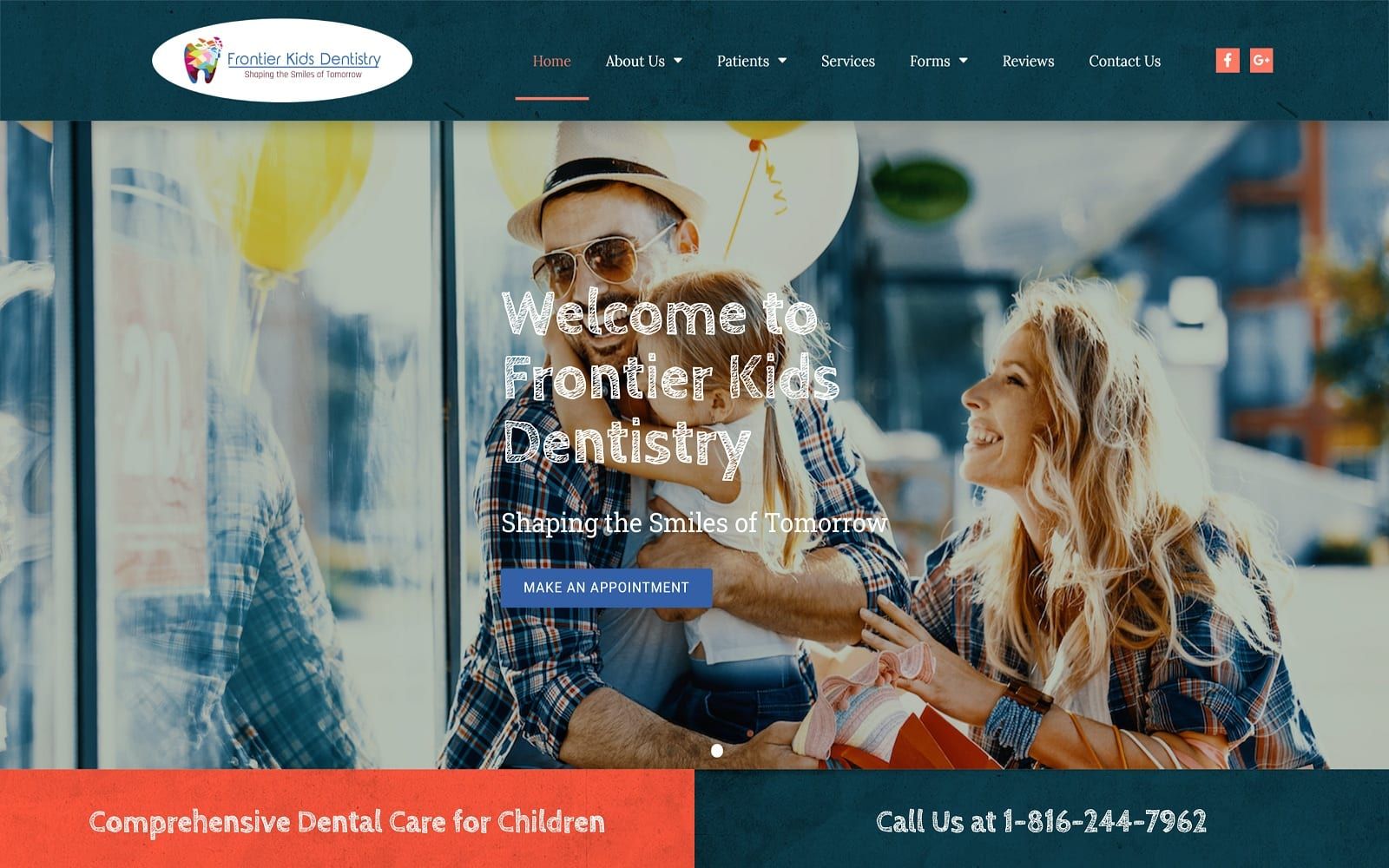
Playful fonts and bright colors intermixed with dark neutrals help define the pediatric dentistry website’s theme as bubbly, tender, amicable, enthusiastic, and even humorous. As the background color, a dark, patterned midnight blue with gray undertones helps to neutralize the website’s intense color choices, which include burnt sienna and rose. As an inviting color palette, burnt sienna provides an earthy, fresh feel, and is a commonly associated color with children. Its application of a select action color, where rose, appears as a highlight color for the action button. The rest of the page plays with subtle filters over colors such as ivory and the midnight blue. Combine that with the creative, Crayola-ques text and fun animation effects, the website caters to children and parents, bridging the gap between entertaining and trustworthy.
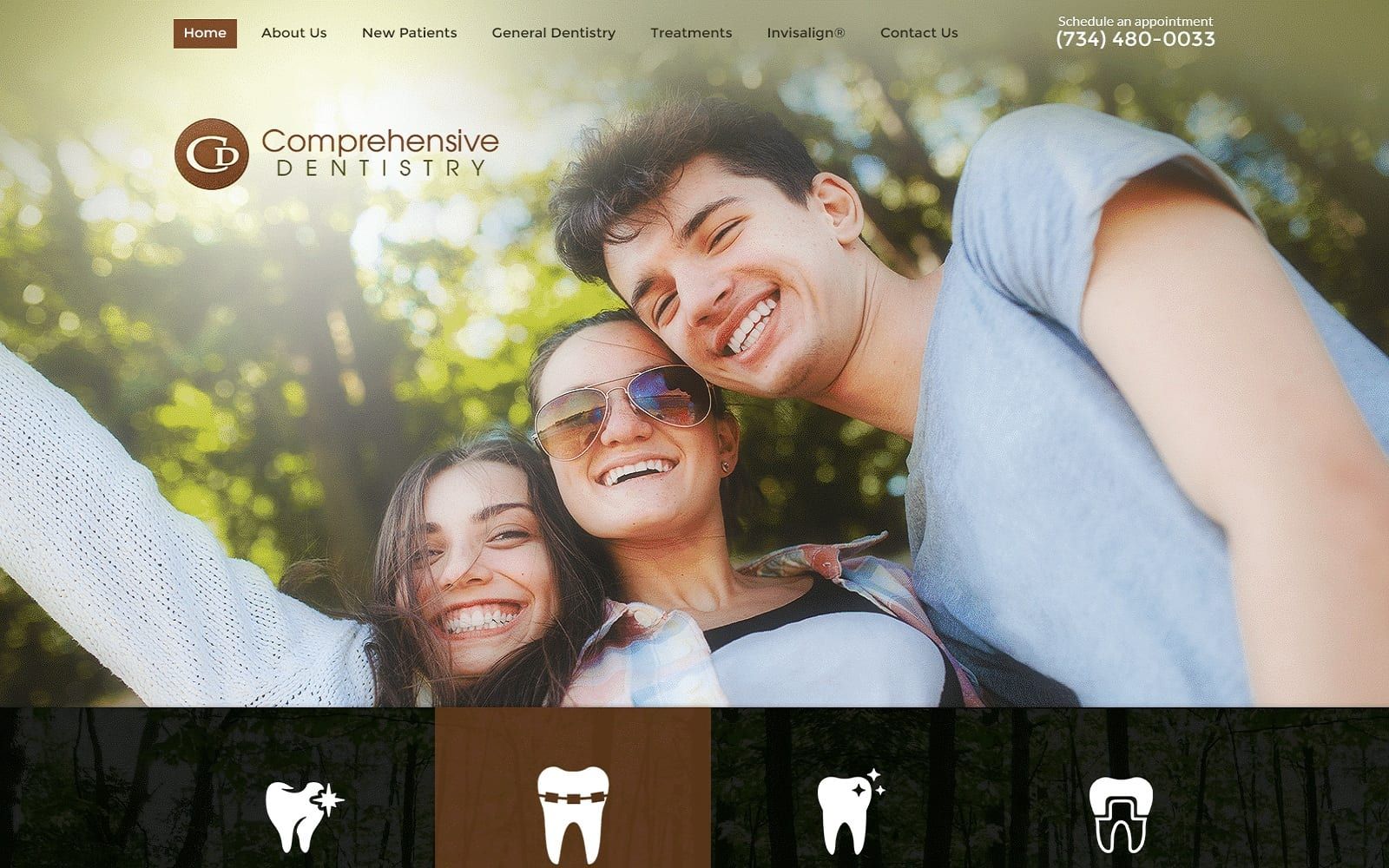
A towering header dominates the first section of the website, outlining its main menu section and business logo. The hero image consists of a slideshow, where each picture is highlighted with text and the rose-tinted action buttons when hovered over. Below, the header image contains sections of action buttons, including a click-to-call number. Many of its parts contain internal hyperlinks throughout for easy navigation, and its services section incorporates icons that animate when hovered over. Below the services, the next section includes a newsletter subscription application, as the footer maintains essential contact information related to services, hours of operation, and location. All of the text listed have bullet point icons, and the text contains click-to-call numbers, click-to-action email addresses, and click-to-action addresses for immediate contact.