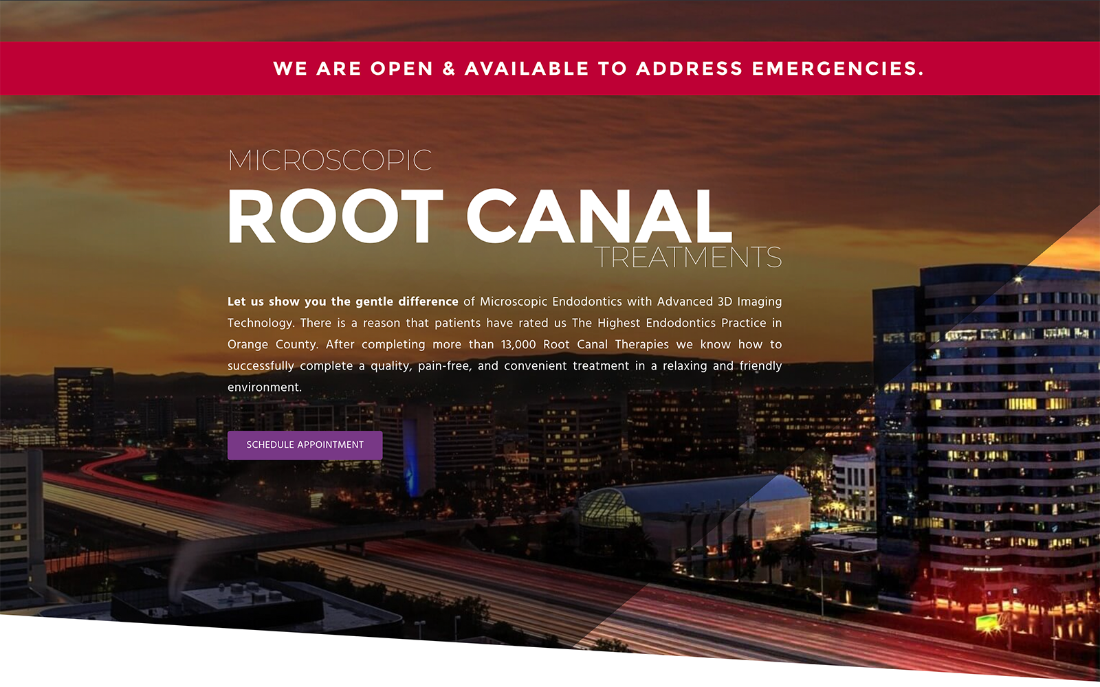
This endodontic website takes a direct and high tech approach to connecting with the prospective patient and showing them what they have to offer. Irvine Endodontics is a client who was ready to try something different and daring in their approach, and that’s what had us settle on using actual video from their clinic in their homepage design. From the very moment a visitor lands on this website they’re in the clinic, connecting with the dentists, and picturing themselves in that office.
Overview Of The Design
This website focuses heavily on this practice’s reputation in the community, presenting the visitor immediately with options to fact check and reputation check the clinic’s claims. They want their visitors to know that they have the respect of their community and that their patients have been happy, a practice that demonstrates they have nothing to hide. They also demonstrate their interest in connecting with the patient by providing an introductory video, a practice not seen in many clinics and one that has powerful conversion ability.
Use Of Colors
The initial impact a visitor receives when they visit this website is a splash of brightly colored links to sites that will verify the Irvine Endodontics reputation in the community. The video background creates interest and draws the patient in, but its gray-scale presentation doesn’t detract from the impact of those links, or the bright orange make-an-appointment button at the bottom. The color selection for this appointment link is based on research that shows that orange and yellow drive visitors to action, in this case, clicking that link.
Analysis Of Design Elements
There are a few subtle things at play with the design of this website, some of them less obvious than others. After you’ve been introduced to the office, it isn’t the last time you’re presented with a set of eyes that encourages connection. While the image of the microscope showcases the technology they use in their procedures, it also is presented in a way that is suggestive of a pair of eyes focused on the viewer. The shape of the microscope’s design is reminiscent of an old friend with compassion for your plight and passes that sense of comfort to the visitor.
Marketing Aspect
This website is focused on showcasing the endodontic office’s reputation and experience and utilizing it as a selling point to the visitor. Links to reputation sites, ratings and experience indicators, and a breakdown of what the practitioner has to offer those who choose her clinic are all showcased, immediately followed by a list of the organizations they’re a part of. Throughout it, all SEO elements are utilized in headers.
The Image this Website Reflects
A compassionate and friendly practice who is actively a part of the community and relies heavily on its reputation to attract visitors and new clients. They want you to know from the beginning that you’re coming to a clinic that will provide you with the best service you can hope for, with an expert hand that will ensure your procedure gets completed as gently and successfully as possible the first time through.
Irvine Endodontics pride themselves in offering the best of the best service to their patients. They specialize in root canal treatment, root canal retreatment, and microsurgery of the root for teeth that have had failed or complicated root canal treatments. They have many great reviews that reflect their wonderful performance. To enhance the experience with them, Optimized360 has designed an Endodontic website that is compact and very easy to navigate through. We have an exclusive design for them along with specialty content. The website editor is easy to use for those who want to add a video or customize other aspects of their website.


