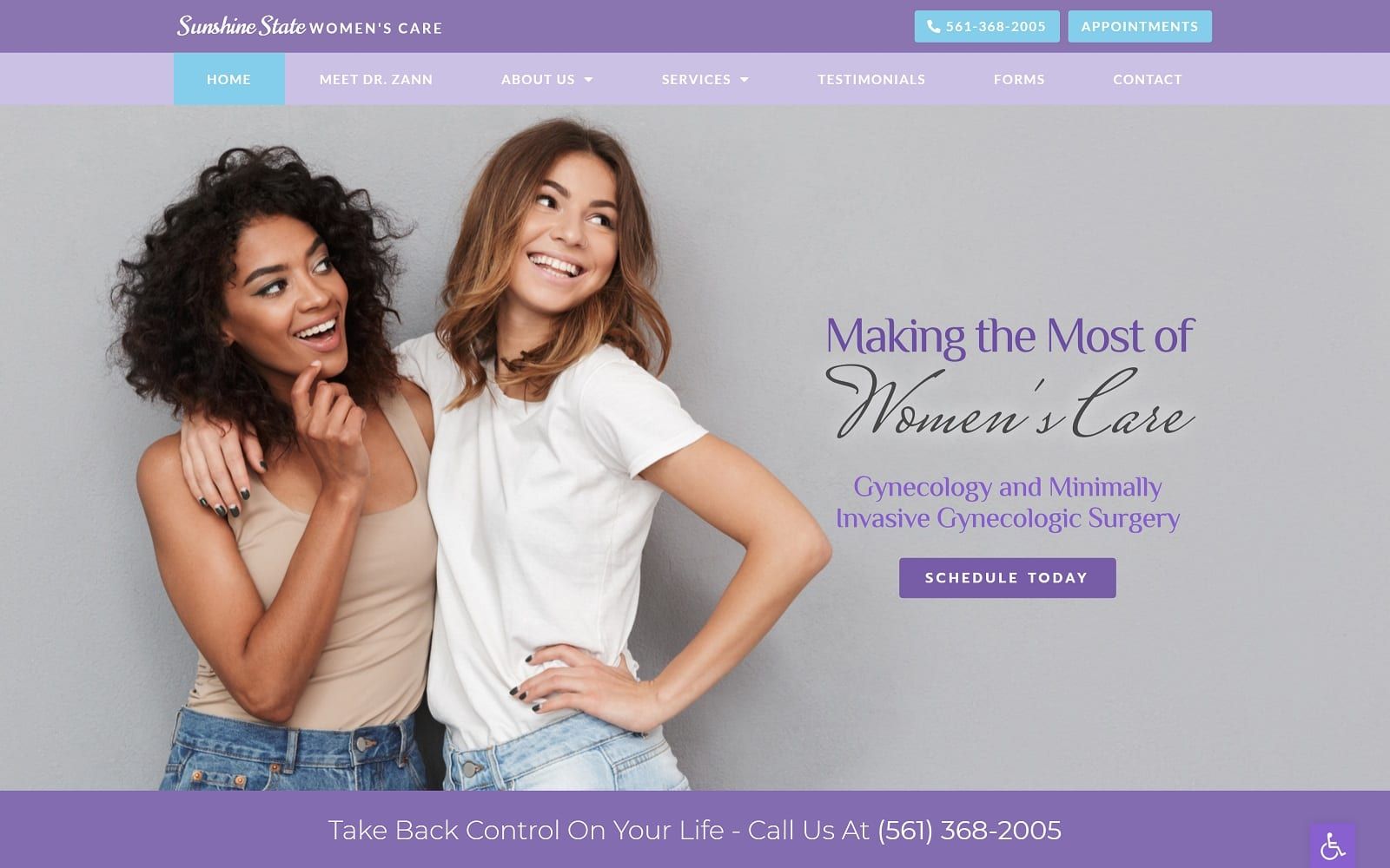
Light periwinkle and bright purple define the core capabilities of Sunshine State Women’s Care, bringing balance, stimulation, and sentimental feminine qualities. Both cool and warm, periwinkle communicates tenderness and softness, as its vibrant purple counterpart promotes seriousness, professionalism, and high-quality. When services are highlighted or emphasized, saturated robin’s egg blue and royal blue promote tranquility and are used as the action color to direct visitors towards the website. Its subtle text font choice creates contrast with its images and background colors and thus creates a highly attractive design that’s delicate and endearing. By choosing cooler, more popular colors, the website incorporates many positive traits of professionalism while using purple to attract women as its targeted audience, encouraging accessibility, understanding, and quality feminine care.
The top header of the website contains click-to-actions buttons for smooth interaction. The subheader includes hyperlinks to the website’s services, patient forms, and contact information. The header image overlay by a call-to-action button to schedule, and through combining pictures with hyperlink buttons, visitors can interact with the website’s service pages without feeling overwhelmed. By incorporating visual icons to help identify its services and bright photography to orientate the viewer, the website ensures comfort through its compatible web functionality. The footer contains a HIPPA contact us form, click-to-call action links, and other quick links related to the site to re-orientate the visitor back to the page. Through its centered aligned subsections and use of hyperlink buttons, visitors can interact with the site with the accessibility too and flowing header for immediate connection.