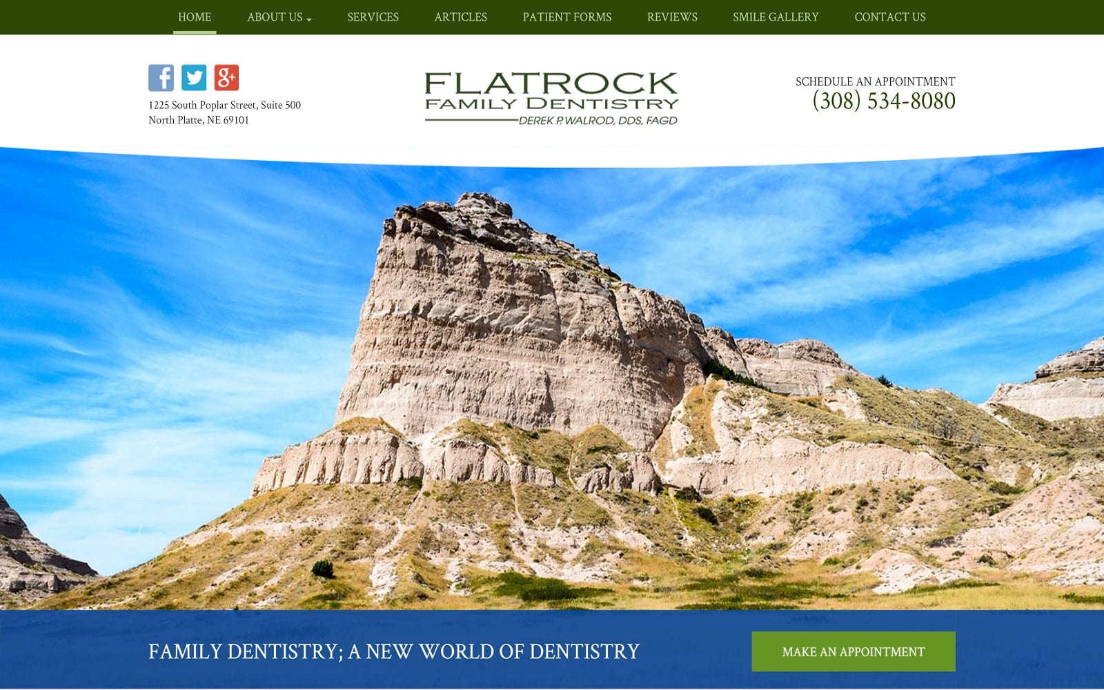
Bright open vistas, a breath of fresh air, and a natural approach. With one glance you can draw a solid impression of the kind of people you’ll be working with when you stop by this dental office. The majesty of the nature photography works perfectly with the tagline “Family Dentistry, A New World of Dentistry” indicating that while their core practice is based on sturdy traditional dentistry, they’re open-minded about adopting new dental practices to better serve their patients.
Overview Of The Design
The design is open, clean, and professional with a focus on their adoption of the most recent forms of dental technology and practices. Potential patients who visit this site are ready to make an appointment and come in for their routine treatments and are knowledgeable about what they’re after. Additional information and staff are available, but the understated presentation at the top of the home page indicates that these are secondary considerations.
Use Of Colors

The color scheme brings an instant sensation of lightness and calm, feelings that some patients desperately need when considering getting dental treatment. The green and blue come together to present a sense of tranquility and trust in the visitor, making them feel confident and comfortable with the facility being represented. The lightest colors help to install a feeling of professionalism and reliability, something that is genuinely valued by patients from all backgrounds.
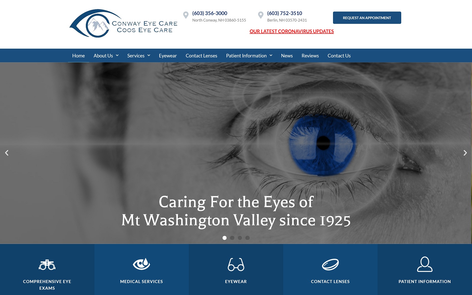
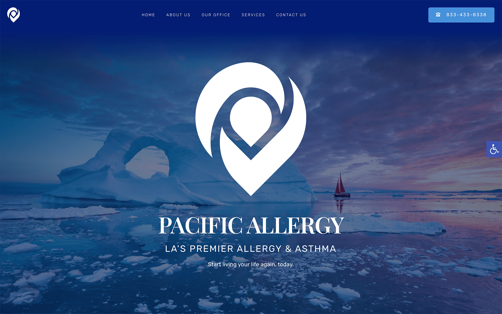
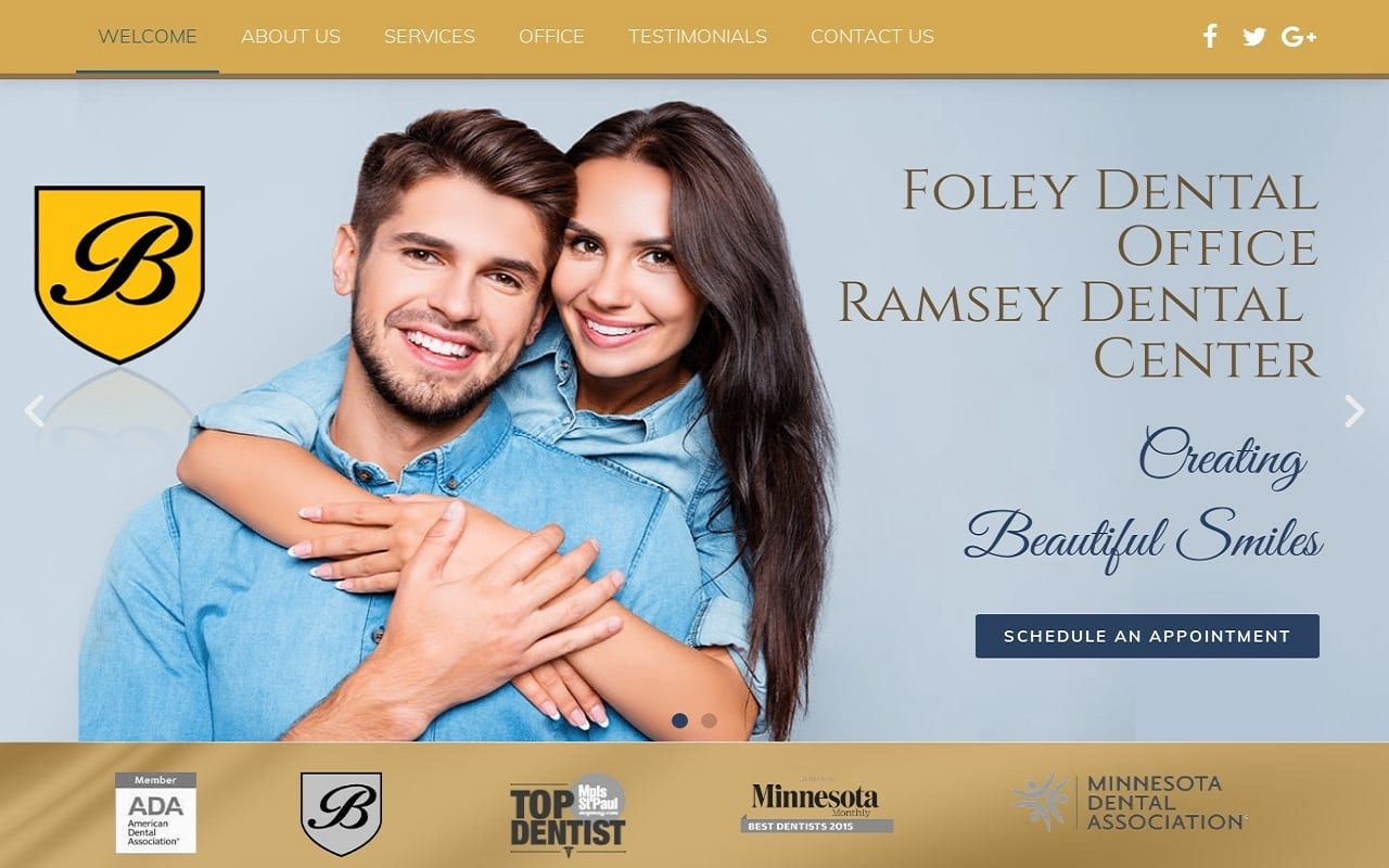
Here are some other examples of websites Optimized360 has successfully delivered to their clients that implement the color green.
Children’s International Medical Group
Analysis Of Design Elements
The design of this site is very open and bright with a streamlined approach, at no point is there too much information presented, the overall feeling being one of efficiency and minimalism. Websites like this will appeal to professionals from every walk of life, encouraging them to bring their friends and family in for reliable and consistent treatment. Contact information, including a map showing the area around the location, are displayed in a very low-key format, nothing is up and in your face. This demonstrates a sense of respect for the visitor and indicates that the site is aimed at patients who know what they want and are looking for providers that understand that.
Marketing Aspect

This website is aimed a professional level of customer service, especially white-collar workers who are busy and want the best level of service utilizing the latest techniques. Links to social media are provided near the base of the site, along with informative articles and directions to the location. The big selling points presented here are their professionalism and the quality of the equipment they offer, while comments about their personal touch are secondary. While this would be a turn-off for some clients, professionals are looking for a more detached, and far less personal, relationship with their healthcare providers.
The Image this Website Reflects

The website’s design indicates it’s aimed at a more mature audience, as the phone number and address are provided immediately, while links to social media are offered at the bottom. While it will appeal to professionals regardless of generation, this client was looking to target a mature or aging population. The overall target audience is professionals looking to get services done in a clinical environment with the latest technologies. While a pleasant experience is desired, it is nearly secondary to getting their needs met in the office, and getting back out and about their day
