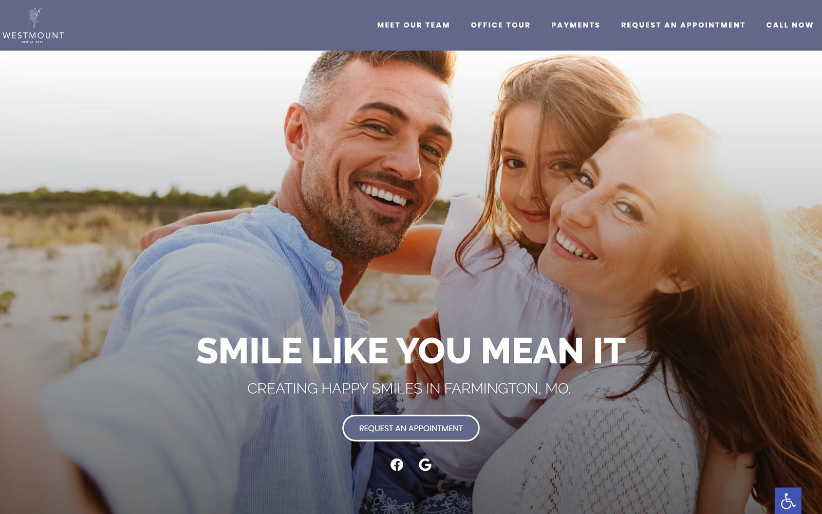
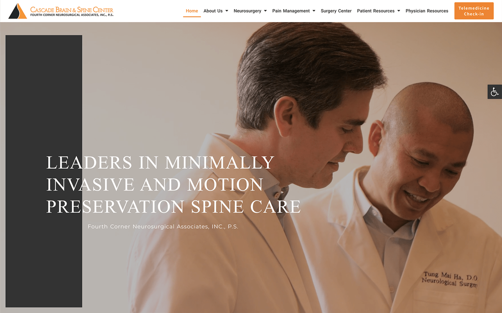
Westmount Dental Arts are dedicated to providing the Parkland community with excellent dentistry from a practice that treats them like family. Dr. Thomas LaMartina wanted a design that distinguished his practice from numerous other dental websites. The use of dark colors along with white space gives the site a classy feeling. The main feature that sets Dr. LaMartina’s website apart from the competition is simplicity. There is no navigation menu on the home page; the home page holds all the information that a navigation menu would have. This gives the patients easy access to all the information they need – all on a single page.
Overview of Design
For this unique design, we operated on a full-width layout rather than a traditional site with marginal white space on the sides. When you first enter the site, you will notice the personalized logo on the top banner of the page. Under the personalized logo, we have included a professional image of Dr. LaMartina himself. His mission to treat his patients like family is displayed through the various services his team offers. At the bottom of the home page, there are also multiple featured testimonials from satisfied patients. To hold all this information together, we used square borders to make the site more symmetrical and appropriately scaled.
Use of Color
To highlight Dr. LaMartina’s professionalism and dedication to the industry, we implemented a dark color scheme. The black background fits in with the surrounding images on the home page. We splashed in a hint of gold to add a subtle sleek touch as well. Gold coloring was used in various spots along the website to highlight important service information. The office’s contact information and the button to book an appointment are both in gold. When you click the individual services, you immediately notice the simple but legible font. A simple font along with a spacious white background allows for the optimal reading experience.
Design Elements
The simplicity of Dr. LaMartina’s website is one of the key design elements. The pictures on the website add a personable feel to the office space. There are pictures of Dr. LaMartina and the office itself. When you dive into the individual pages, the site’s navigation bar becomes available. The navigation bar is home to Dr. LaMartina’s smile gallery – a before-and-after visual testimonial. The smile gallery helps show off the team’s experience and success in the dental industry. The patient reviews tab helps give first-time visitors an eye-catching display of previous reviews. This helps give the practice a more friendly and personable reputation.
Marketing Aspect
Westmount Dental Arts offers an amazing deal when it comes to new patients. Initial visits for all new patients are just $99. This includes a full set of x-rays and a complete exam! They also help provide all the patient forms underneath the information tab. Not only does this time, but money as well. Patients spend less time in the waiting rooms and more time being examined. For patients looking for a dental-savings membership, Westmount has you covered. They offer something known as The Smile Advantage Program that provides patients with the dental care they deserve. For an annual fee, patients get examinations, x-rays, and cleanings at a reduced rate. On top of all the discounts and incentives, Westmount is also an in-network provider for multiple dental insurances. This means that they welcome a variety of dental insurances and can take online bill payments as well.


