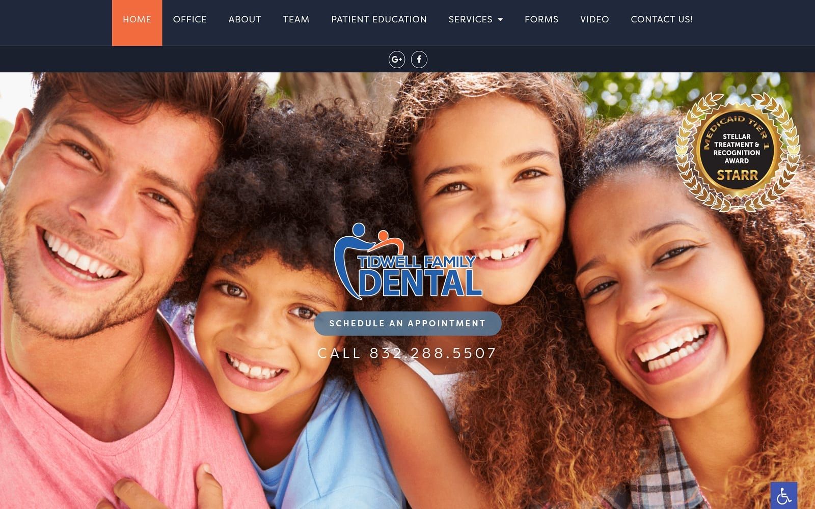
Tidwell Family Dental works with complementary colors in varying shades to create sharp contrast and intensity. Dark navy blue first helps accent and define the page’s aesthetic with deep reminiscence, which can inspire impressions of honesty, reliability, and maturity. Meanwhile, tangerine orange plays on the deepness of the navy blue, bringing youth, happiness, and energy to its webspace. While Tidwell Family Dental incorporates these complimentary colors to showcase its versatility, each color placement is shown conservatively in its engagement. By working with design elements that expand on the space given, the website caters to families by ensuring trust, reliability, and responsibility in its dental services. The site sticks to essential elements, such as layered overlaps of color upon the text, slideshows, and large text, to communicate efficiently with its audience and create a professional, respectable business.
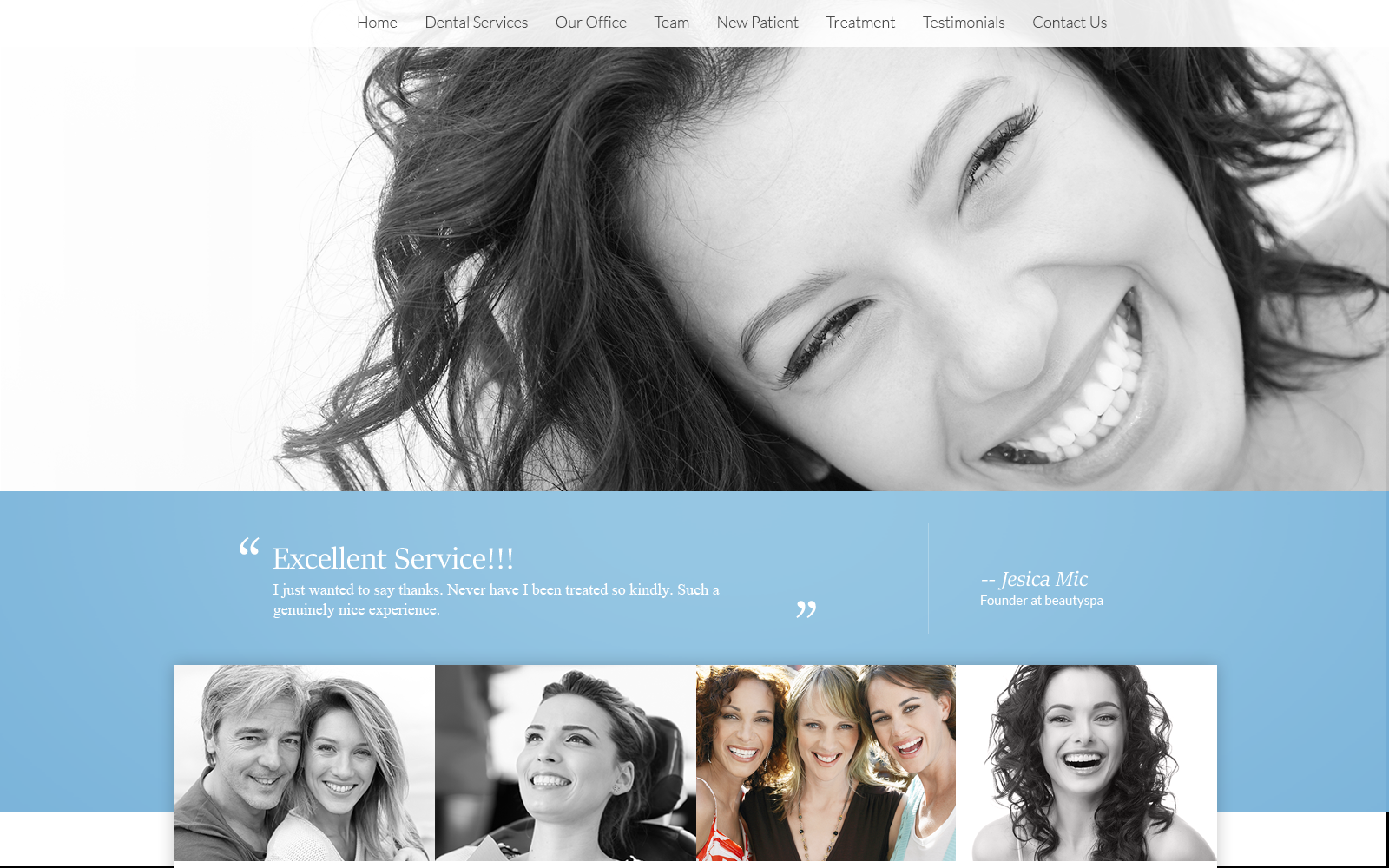
Tidwell Family Dental uses a towering header, showcasing the website’s main menu services. Its hero image expands across the page and contains the business logo, action button, phone number, and news notifications for current updates. Each section thereafter contains an intermixing of icons, images, and text in large and small fonts for engagement, switching from one complementary color to another for contrast. Its testimonial section details its reviews with a slideshow widget alongside an image that fades into the background. Each section also contains action buttons for interlinking. Near the footer of the page, visitors can find the google maps widget, HIPPA secure form, and contact information, which includes its address, phone number, and email. Along the lower right side of the home page, visitors can interact with the accessibility tool.