Overview of the Design
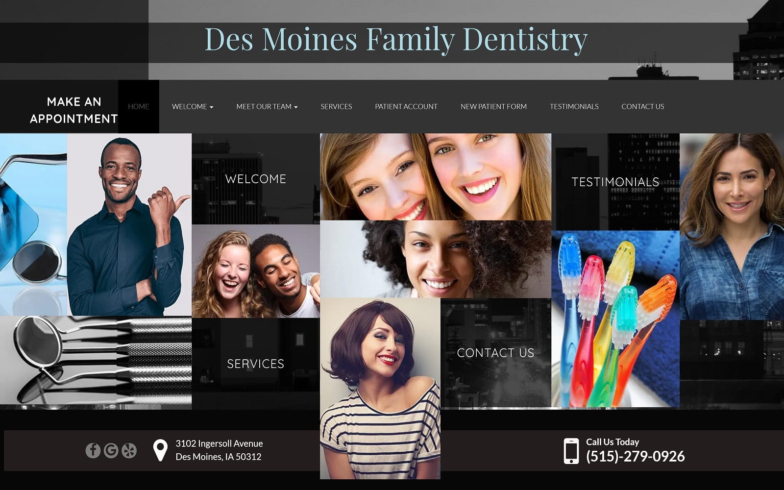
The Des Moines Family Dentistry website is the visual definition of an urban-sleek, modern design. For a general dentist, you must have something that sets you apart if you want to stand out from the competition. We accomplished that with this design, giving visitors a visual experience that they will not get from any other Des Moines area dentist.
For this website, we eliminated the traditional navigational menu bar, instead opting for a single visual tile-based menu that absorbs most of the home page. From there, visitors are directed to various areas of the website, including an area about the office and the services it offers. For the convenience of patients, we also included the option to download new patient forms so as to minimize appointment-day paperwork and wait times.
Use of Colors
Black is the predominant color within this website. Though difficult to pull off, we achieved a beautiful balance of intrigue and excitement by blending various shades and gradients of black and gray to set the background for the wild pops of color within the home page menu.
The black tones give the website a sense of professionalism and authority, providing the impression that this represents a business that engenders respect in its field. The grey undertones contrast well with the black and represent the cleanliness you can expect at their clinic as well as the purity that will be brought to your skin by their treatments. When used in unison with some of the colorful images on the website, the color theme of black and grey do a great job at capturing the visitor’s attention.
Analysis of Design Elements
This website boasts a full-width layout that leaves no room for wasted ‘white space’ on the home page. To modernize the site, we also included a three-dimensional effect that makes the foreground of the home page appear to move independently from the beautiful, custom background. Another unique feature is the condensed home page that eliminates excessive text and other features in favor of a succinct, full-page menu option. Finally, one of the most impressive features of this website is the extensive service’s library we included, providing long explanations about the types of conditions treated at the practices, as well as the types of treatments and services available.
Marketing Aspect
The very first opportunity site visitors have is to make an appointment. Additional opportunities are also available to contact the practice by phone. For those still comparing local dentists, we included a dedicated patient testimonial section that spotlights positive reviews from real patients. The website is also equipped with ADApt technology – ensuring that potentially disabled patients get the full website experience as well. The ADA logo is conveniently located on the bottom right of each web page and allows patients that require additional assistance to adjust the text and images accordingly.
Image the Website Represents
The entire home page of this custom dental website is a nod to locals who will immediately notice the Des Moines skyline. This helps to ground the practice and may even help new patients feel more at home and comfortable scheduling a first-time appointment. The remainder of the website is also highly visual, featuring very modern images of youthful patients who are stylish and smiling in every photo.
Des Moines Family Dentistry Website Designed by Optimized360
