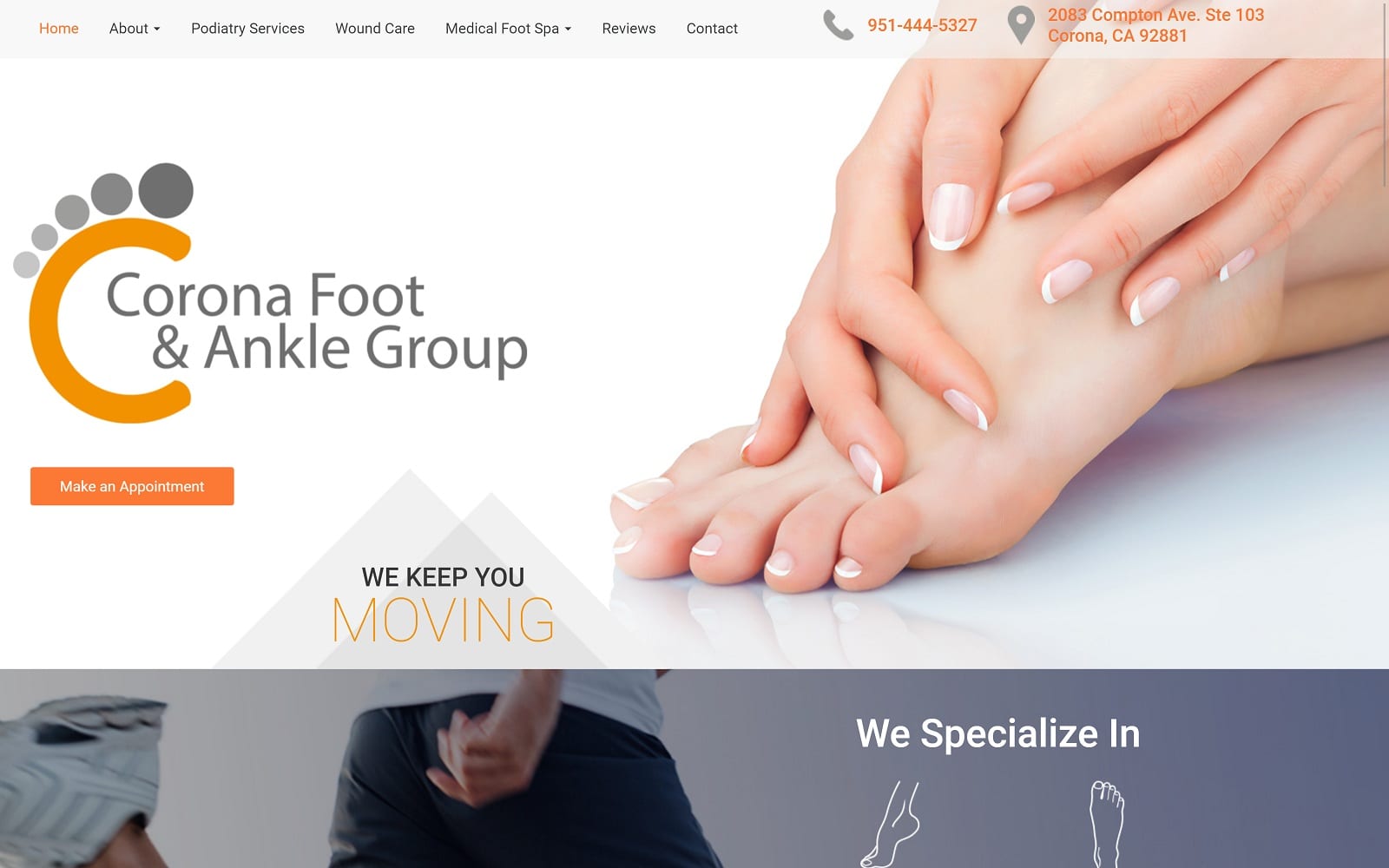
Corona Foot & Ankle Group’s motto is we keep you moving. When dealing with any foot or ankle specialty, you always want to provide patients with the determination and energy to commit to an appointment. We designed the Corona natives with a website that was energetic but also reassuring.
Design Overview
Held together through our use of square borders, we made sure that patients who entered the site would immediately find what they were looking for. All the different services offered are conveniently located on our drop-down navigation menu. We also included several calls to actions on the homepage to get the ball rolling (no pun intended) for patients in need of ankle and foot therapy.
Use of Colors
The website is set against a wide, white background while using orange to highlight the call to actions and other important information on the website. The white background allows for optimal reading from the viewers to get them the help they deserve. The orange serves as an aesthetic contrast that conveys determination and energy. The mixture of orange and white make for a great modern, and professional website design.
Analysis of Design Elements
Images are a great way to convey a certain message to your audience. We implemented images within the background along with the services ready. Not only does this help the site stand out against the competition, but also helps add a touch of personality to the specialty. We opted to skip all the special effects found on other websites to keep the website responsive and clean for both desktop and mobile users. We let the imagery talk for us in this case. Illustrations call tell much more than just words hidden behind special effects. The team’s blog page also features several articles that help patients tackle their own issues, starting at home – each blog being equipped with an informative image as well!
Marketing Aspect
We highlighted the team’s target market for people who are active and fit by reflecting that exact image on our use of visuals. We also kept note of the advanced technology used at the office and highlighted it within the homepage. The homepage also features different certifications that add credibility to the therapy office. When dealing with foot and ankle pain, we understand that going to a specialist takes time and costs money. People would much rather walk off the pain or see a doctor for inadequate treatment. We provided testimonials and reviews to help convince the visitors otherwise. No treatment is more adequate than professional foot therapy!
Image the Website Reflects
The design elements and visuals used on the website reflect the active target audience that would visit the website. We made sure that the website was innovative and unique with the use of our color theme and visuals. We also made sure that patients would feel comfortable and at ease through the use of testimonials and reviews as well.
Corona Foot & Ankle Group Podiatry Website Designed by Optimized360


