Convenience and expediency are evident in Dr. Rowe’s practice, and his website, with a focus on the convenient locations you can receive services at and the high-quality work that will be done. The primary element that Dr. Rowe wanted to transmit to his patients is the sterility of his environment and how comfortable you’ll be during and after the procedure. This focus on convenience extends to a clear offering of what forms of payment are accepted and what types of insurance plans are accepted.
Overview Of The Design
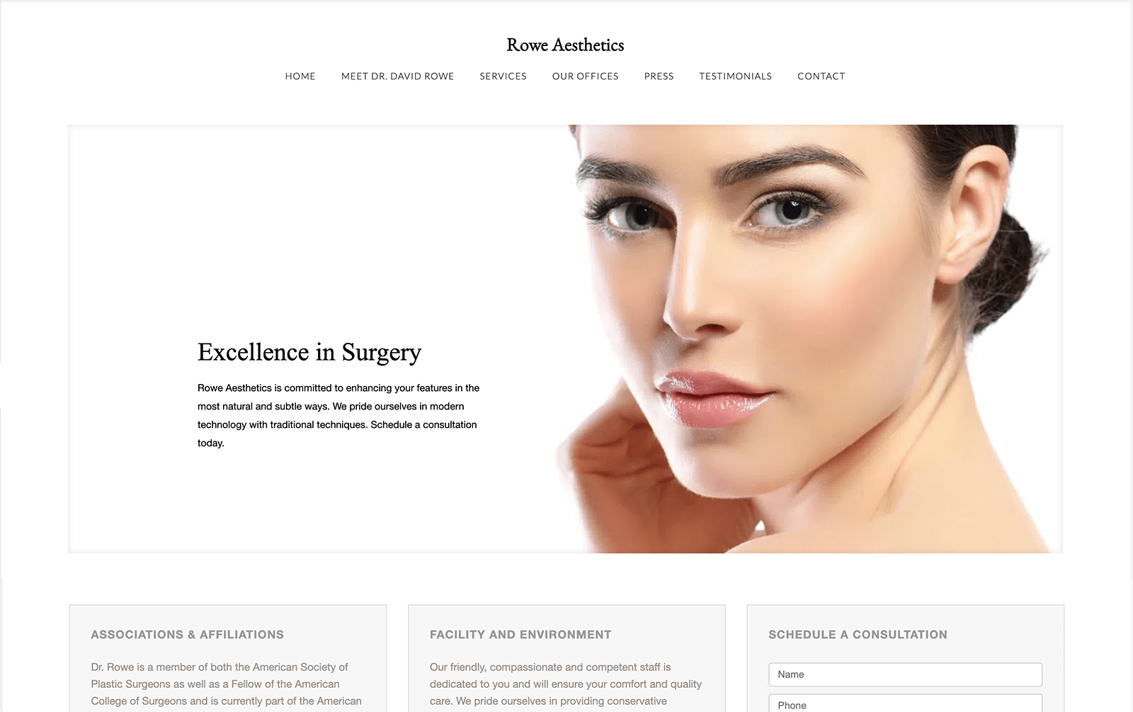
Simplicity and minimalism are the hearts of this website’s design, with nothing to distract a visitor from the information presented or the services that can be offered. These kinds of websites are aimed at those visitors who have a clear understanding of the services sites like these offer and are here to make sure this aesthetician is the right one for them. Upon arrival you’re immediately introduced to the doctor’s credentials and experience, letting you know who Dr. Rowe is and what he has to offer.
Use Of Colors
Rowe Aesthetics is an example of understated color making a powerful statement. On this website, color use is minimal, letting the images take a prominent place in the minds of the viewers. Clients who visit this website will be drawn in by the flesh tones demonstrating the phenomenal results of the aesthetician’s art. As a base color white provides a sense of purity and innocence, feelings that are closely associated with youth. Combined with the warm, healthy skin tones of youthful complexions it creates precisely the story a visitor looking for these services needs.
Analysis Of Design Elements
The overall design of this website is quite minimalist, focusing on simple images and a black and white motif. Using models as the primary visual draws on the site makes the viewer concentrate on the potential results of the procedures they’re looking into. Information about the procedures is presented directly, making it a short trip from site landing to learning about what they can do for you.
Marketing Aspect
At the bottom of the page you’ll find an immediate link to a consultation form, information about the what organizations the facility is affiliated with, and addresses for each of their offices, helping to draw in searches for aestheticians in that area. Once visitors have reached the site they get quick access to the services the facility can provide, and how to make an appointment
The Image this Website Reflects
This website reflects a direct, no-nonsense approach to aesthetic surgery and treatments, with the entire focus on landing being on the youthful features of the central image. This sets the visitors imagination in motion dreaming of what results they can expect from receiving Dr. Rowe’s services. There is little frivolous here, little that is unnecessary or that clutters the page. Direct, straightforward, and informative are the key themes of this site.
Kim Rosen, DDS Designed by Optimized360
