New design idea

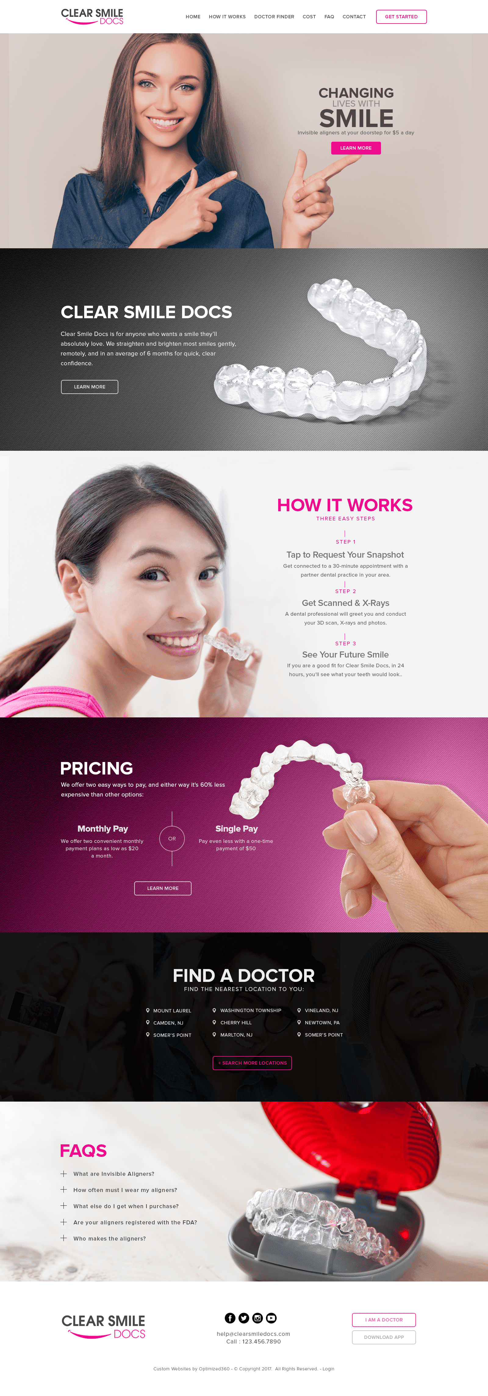
Clear Smiles Dental stands resolved, working with a color palette consisting of magenta pink, jet black, and gray to draw attention from its users. Magenta pink promotes harmony and balance, and the dental website capitalizes on these themes by incorporating it as the action color. When used as an action color, magenta pink creates perceptions often associated with movement, thus indicating to users to interact with and cooperate with the web site. The dynamic radiance of magenta is offset by neutral colors such as black and gray to tone down its impressions, forming a sleek, polished home page that’s inviting and appealing to view. Its design elements, which include icons, see-through action buttons, and bright imagery, form an organized space for users to interact with the website and eliminates any unnecessary elements that would interfere with the website’s information.
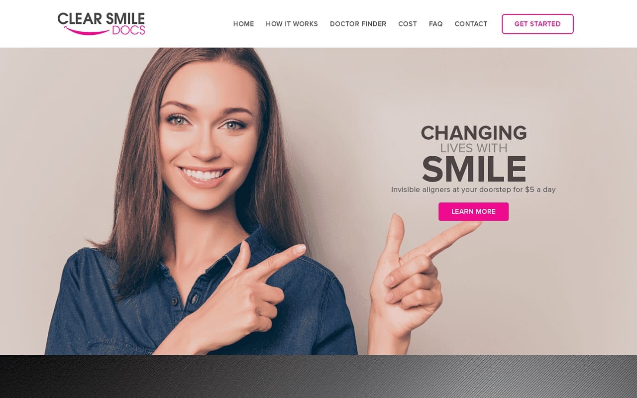
Clear Smiles Dental begins with a solid, white header, consisting of the business logo, main menu services, and action button. Instead of forming its website to one hero image, each section throughout the page incorporates dynamic images, all of which accommodate the user with action buttons, information, and other design elements. Some divisions include bullet points for clarity, icons for engagement, and active photography for distinct impressions. Its FAQ section activates when clicked on, and expands to include more information relevant to the questions at hand. The footer revisits the engagement levels of the header, containing information related to its social media icons, click-to-call service number, and business logo. It also engages with users by giving options, such as doctors’ portals and app download applications.


