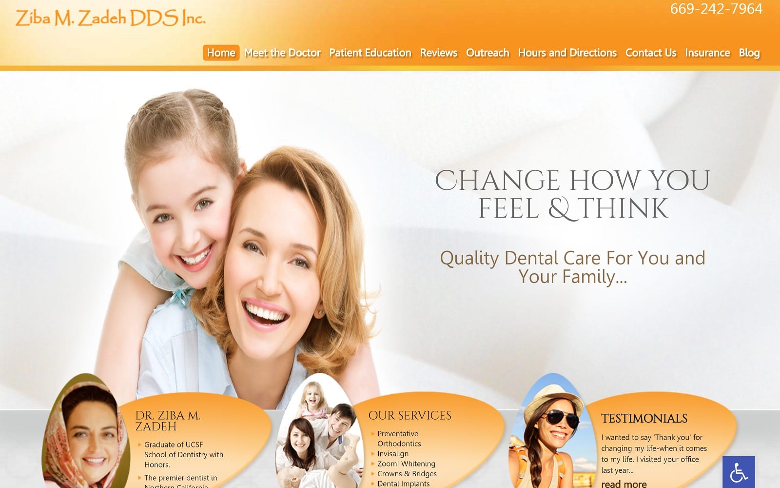
When Dr. Zadeh got in touch with us to ask us to design a website for her dental practice, it was made it clear that they wanted a bright, inviting website that excites the visitor about getting started on their dental journey. We met that challenge and introduced stake holders within the dental office with our design team to work out the details; the result is a cheerful, uplifting website that makes you feel better just looking at it. Robust design techniques came together with Dr. Zadeh’s vision to create a welcoming, uplifting dental site that invites the viewer to come in and improve their life.
Overview Of The Design
The first element that strikes a visitor to this site is the intense warmth and brightness that rolls off the page. From the cheerful dispositions of the people in the slideshow to the bright summertime colors everything about this page brings a splash of energy and enthusiasm to the world. Here you’re guaranteed to find traditional dentistry combined with modern technology, with an old-world dedication to service and family.
Use Of Colors
Bright oranges, shining whites, shimmering yellows, they all come together to fill the heart and mind of the web visitor with excitement, energy, enthusiasm, and the gentle comfort of a summer day. The color schemes of everything from the informational bubbles for the doctor herself and the services she offers to the background of the images were all carefully selected to support that central theme. Coming to Beautiful Smile Dental is a trip to be anticipated, and experience to be enjoyed. The entire color scheme comes together to incite action and confidence in the visitor.
Analysis Of Design Elements
After being hit with an uplifting and invigorating landing page, you’re welcomed into the Beautiful Smile Dental family with a clear introduction to the doctor and her staff. The presentation of the clinic’s goals and philosophies about their relationship with their clients makes it clear this is an office that looks forward to serving your family for years to come.
Marketing Aspect
It’s important to take every element of this page into account to understand who its targeting and how it drives conversions. Physicians offices tend to tailor their sites to target a particular type of patient looking for a specific connection with their client. This particular website provides a warm opening with images depicting families, talks about relationships, and only then are you presented with all the necessary information to make contact and start your relationship with their dental office. Everything before that is education and welcoming, something which will draw in the right clients like flies.
The Image this Website Reflects
A warm and welcoming environment centered on providing generational dental care for years to come. The goal for this website was to create an inviting design that was targeting growing families, and both the client and we feel it hits the nail right on the head. From the color scheme to the selection of images the website is attractive, comfortable, and uplifting while remaining targeted on family practice.
Optimized360 also helps Beautiful Smile Dental with their dental online marketing needs.
Beautiful Smile Dental Designed by Optimized360


