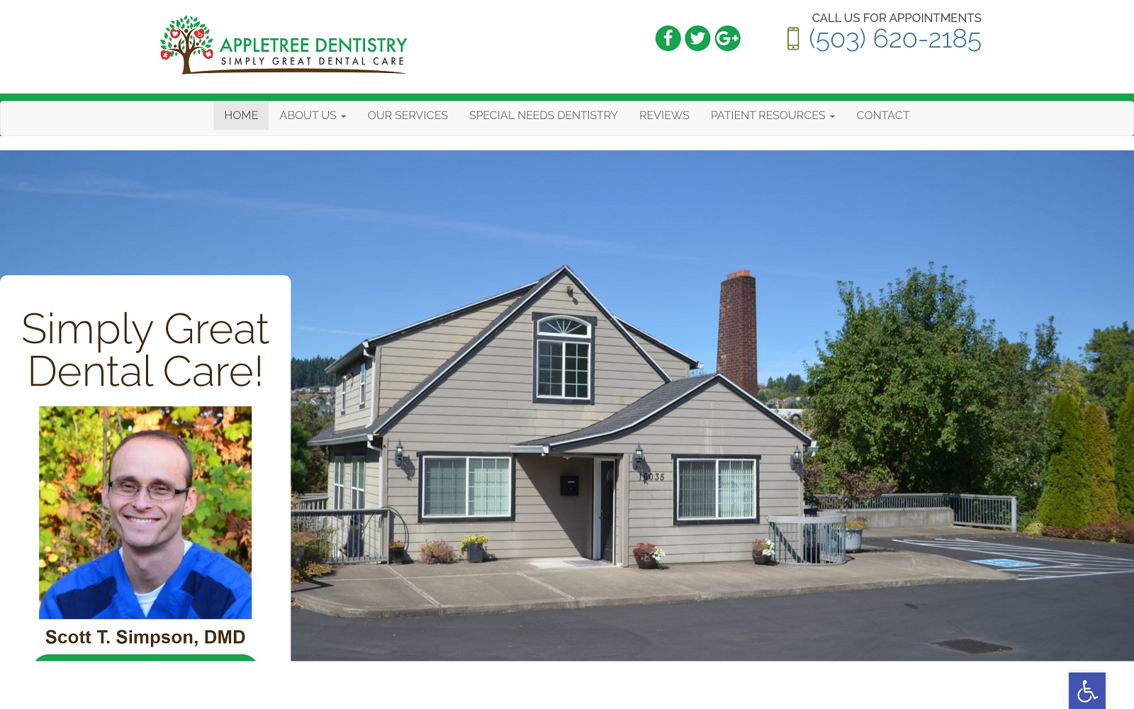
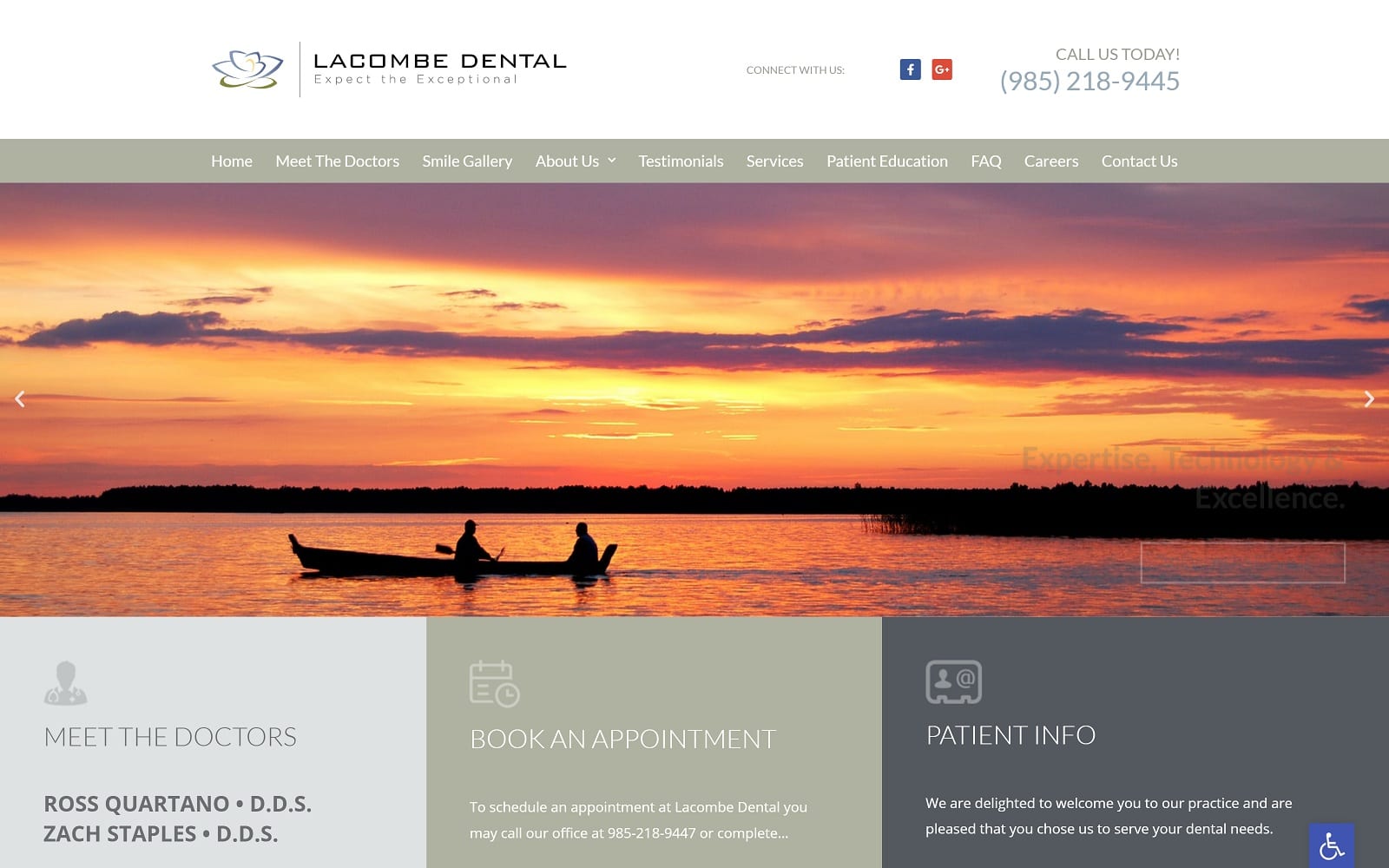
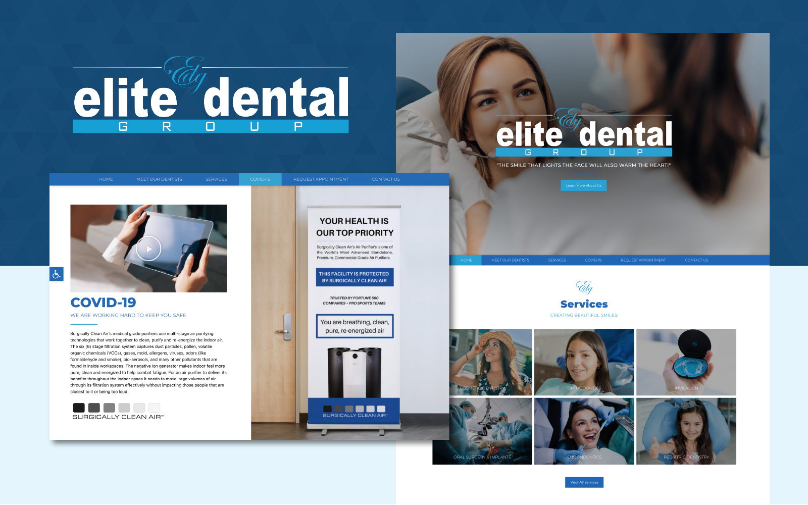
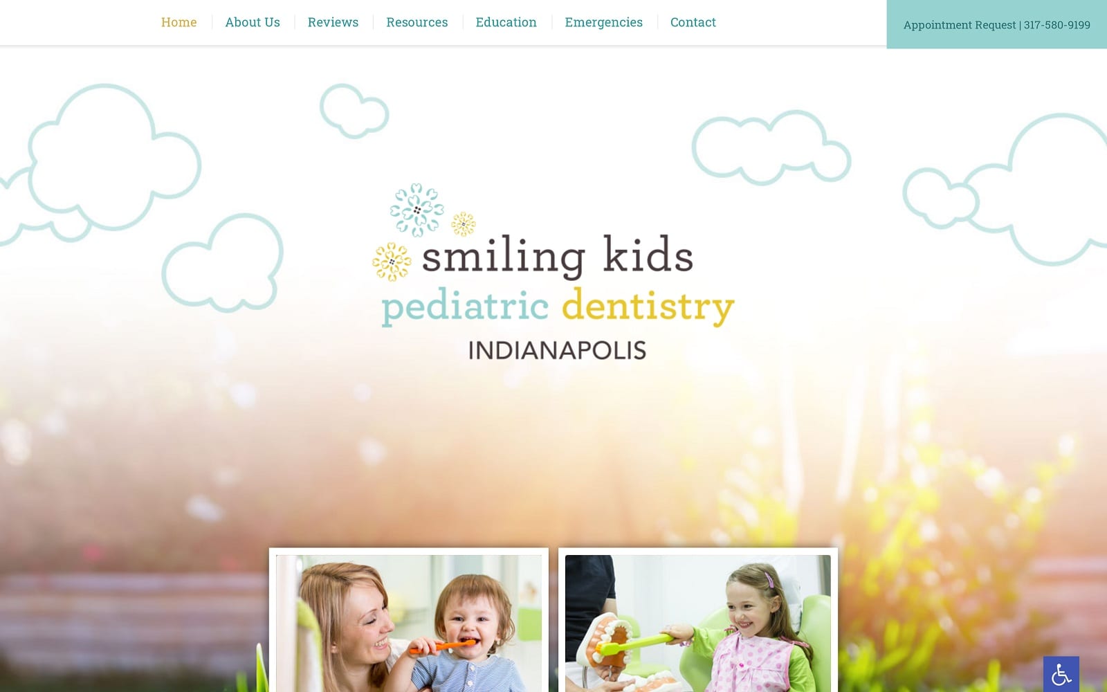
Appletree Dentistry loves apples! From the color theme to the images on the website, Appletree is dedicated to providing great dental care through and through. Focusing on general dentistry, the Oregon natives understand that dental work can be frightening. We focused on easing any sort of anxiety by providing Appletree with a smooth, professional website that would help patients choose Appletree Dentistry over other dental providers.
Design Overview
We opted to go with a full-length layout rather than the traditional website design with marginal white spaces to provide the site with a professional and modern feel. The navigational menu also has drop-down elements for additional information about the office staff and services offered. Making a lasting first impression is important. We made sure to highlight the team’s mission statement and a rotating testimonial gallery on the home page. We rounded out the home page with a form to contact the office as well.
Use of Colors
Apples, apples everywhere! To play off the name of the dentistry, we used a green color palette that would be synonymous with the apple. The different hues of green on the website convey growth and comfort. The natural tones also give a very refreshing feeling to the website as well. We also used green in the images to match the color theme. Green represents hope, growth, and harmony – all the things patients seek on any mental health website.
Analysis of Design Elements
Appletree Dentistry features a full-width style, meaning that it covers a majority of a screen when loaded. In addition, pictures and visual imagery is a key aspect of this website. Just like dental work, the devil is in the details. We made sure to incorporate professional still-shots and quality dentistry photos throughout the web page. The full-width display also compliments the elegant and classy style that any general dentist aspires for on their website. Using a combination of informational content, videos, and social media, Appletree cooks together a perfect recipe for both younger and older audiences!
Marketing Aspect
Overall. the website’s nature thematics in addition to the extremely simplistic display is great for both the young and old audience. Everything is accessible and easy to find along the wood and olive green color-way. This helps to minimize traffic buffering and unnecessary loading times as the website is direct and to the point – patients are the number one priority. The team at Appletree Dentistry make that clear through a direct reflection of their website.

We also featured the team’s previous testimonials and smile gallery on the navigation menu. Placing testimonials on your site is a great way to make a standout impression on skeptical web-visitors. Testimonials and before-and-after visuals place credibility and proof of results in your work and experience. We also use testimonials on our very own website as well!
Image the Website Reflects
Complete with patient forms and referrals, the Oregon natives ensure that from the beginning of the dental journal to the last dental treatment, patient satisfaction is the team’s first priority. The website reflects warmth and friendliness. From the entire website’s theme based on the apple to the ADApt option, Appletree Dentistry understands that patient satisfaction is absolutely critical to the success of any dental office.
Appletree Dentistry Dentist Website Designed by Optimized360


